max
Anita Autorino
Brand & packaging designer for cosmetic & lifestyle brands
- $50k+
- Earned
- 20x
- Hired
- 4.98
- Rating
- 1.8K
- Followers


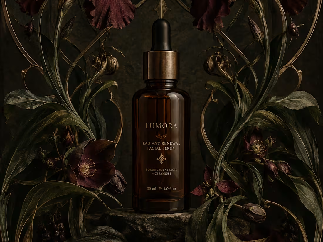
What would happen if a modern skincare product had to communicate without the visual language we associate with beauty today?
Instead, I went back to Art Nouveau, where typography, illustration, architecture, and ornament were treated as one visual system.
The subject actually felt surprisingly natural for the era. Art Nouveau was heavily inspired by nature, craftsmanship, beauty, and organic forms, all ideas that still show up constantly in skincare branding today.
One rule I refused to break: the decoration had to belong to the composition. It couldn't just be added on top to make something “look vintage.”
So... what modern product would you love to see reimagined in another design era? 👀
26
66
2.8K

Why do half the skincare and fashion brands launching this year look like they share the same designer?
Serif logotype, tight tracking, one accent color. ✅ It reads as elevated the first time. By the twentieth brand, it reads as a template, not a decision.
Safe typography isn't neutral, it's a choice too, sometimes one that avoids taking a position 🤭.
So I designed a set of mockups with custom letterforms built to argue the opposite: type with weight, texture, and enough attitude to hold its ground on a shelf full of quiet logos. 💅
What's the last fashion or skincare brand whose type actually made you stop scrolling?
9
44
1.3K

Do you want to generate consistent, eye catching images and mockups like these for your wellness or cosmetic industry clients?
I’ve been creating AI-generated packaging and lifestyle imagery, and I recently made a few updates to my Brand Image Prompt Kit for Skincare Brands.
If you’re tired of getting random results that look nothing like your brand or are inconsistent, this product ✨ will help ✨
Includes 4 core prompt scenarios, and 20+ ready to use images.
🔗 Brand Image Prompt Kit (https://contra.com/products/jStCKO3s-brand-image-prompt-kit-for-skincare-brands?utm_source=chatgpt.com)
16
36
1.8K
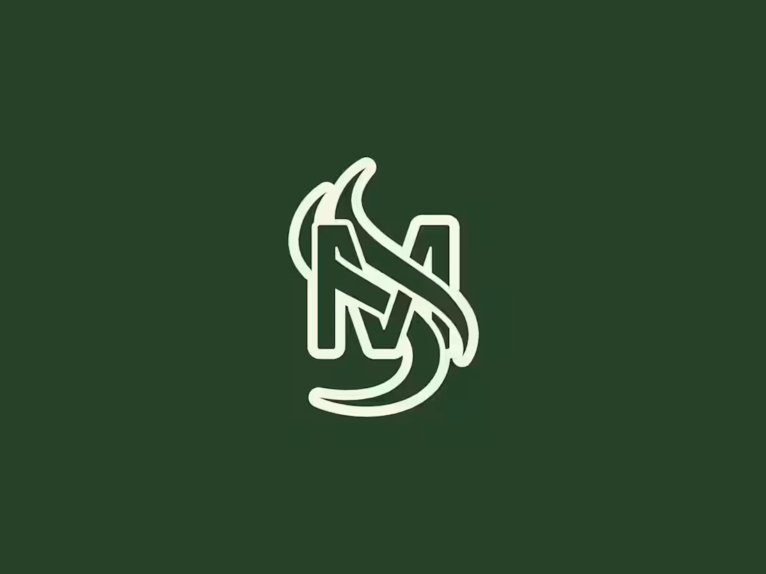
Logo design exploration from the last few months.
Some locked, others discarded.
39
94
4.1K