max
Anita Autorino
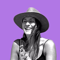
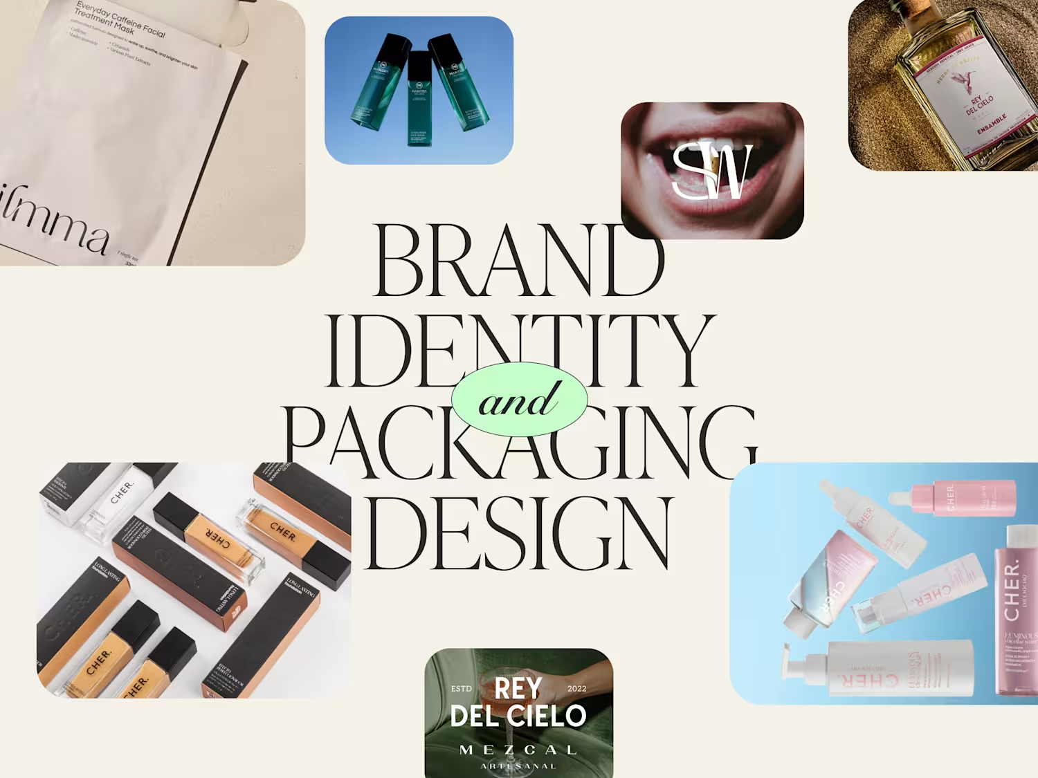
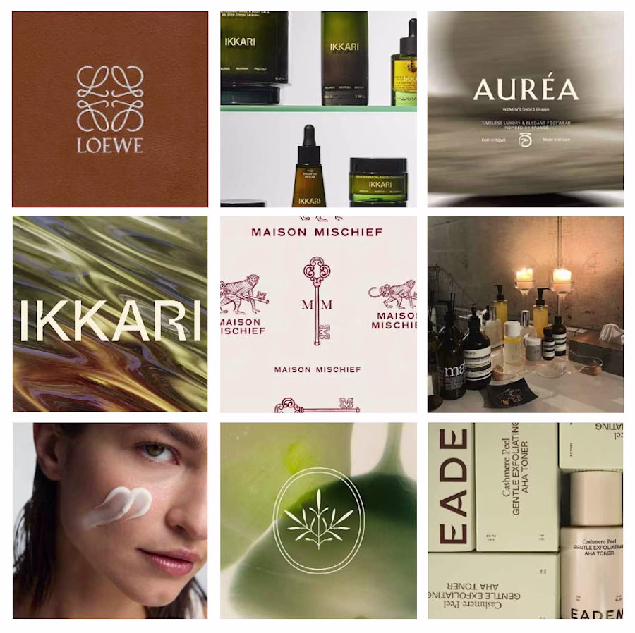
Brand & packaging designer for cosmetic & lifestyle brands
- $25k+
- Earned
- 19x
- Hired
- 4.98
- Rating
- 1.4K
- Followers
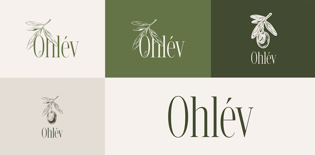
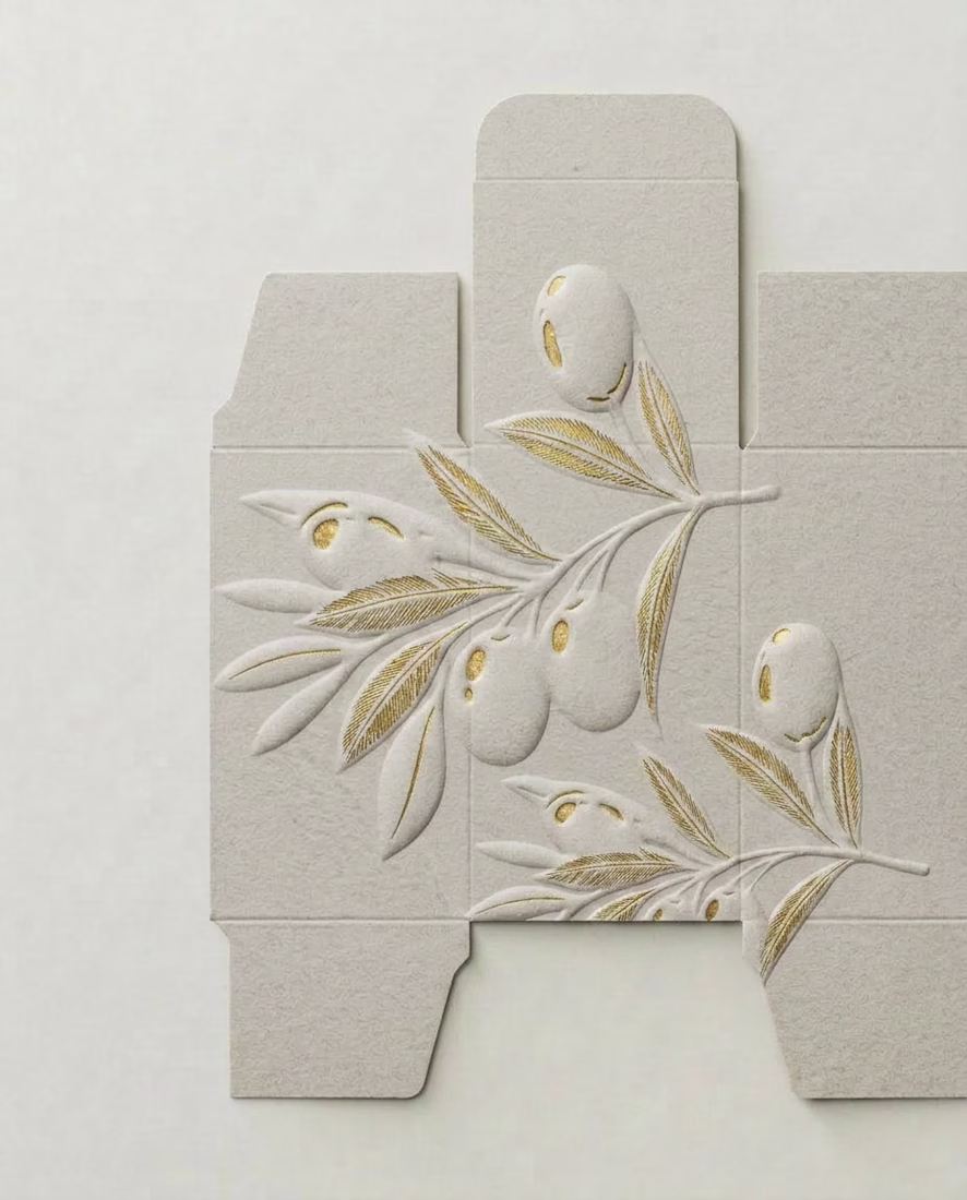
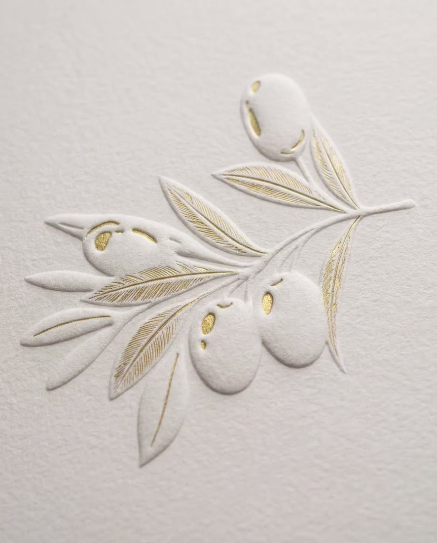
How do you design a skincare brand inspired by olives… without making it look like olive oil? 🤔 🤌🏼 That's the challenge I'm currently working through!
The hero ingredient naturally brings to mind food, kitchens, and grocery shelves. But this brand belongs in a premium skincare...
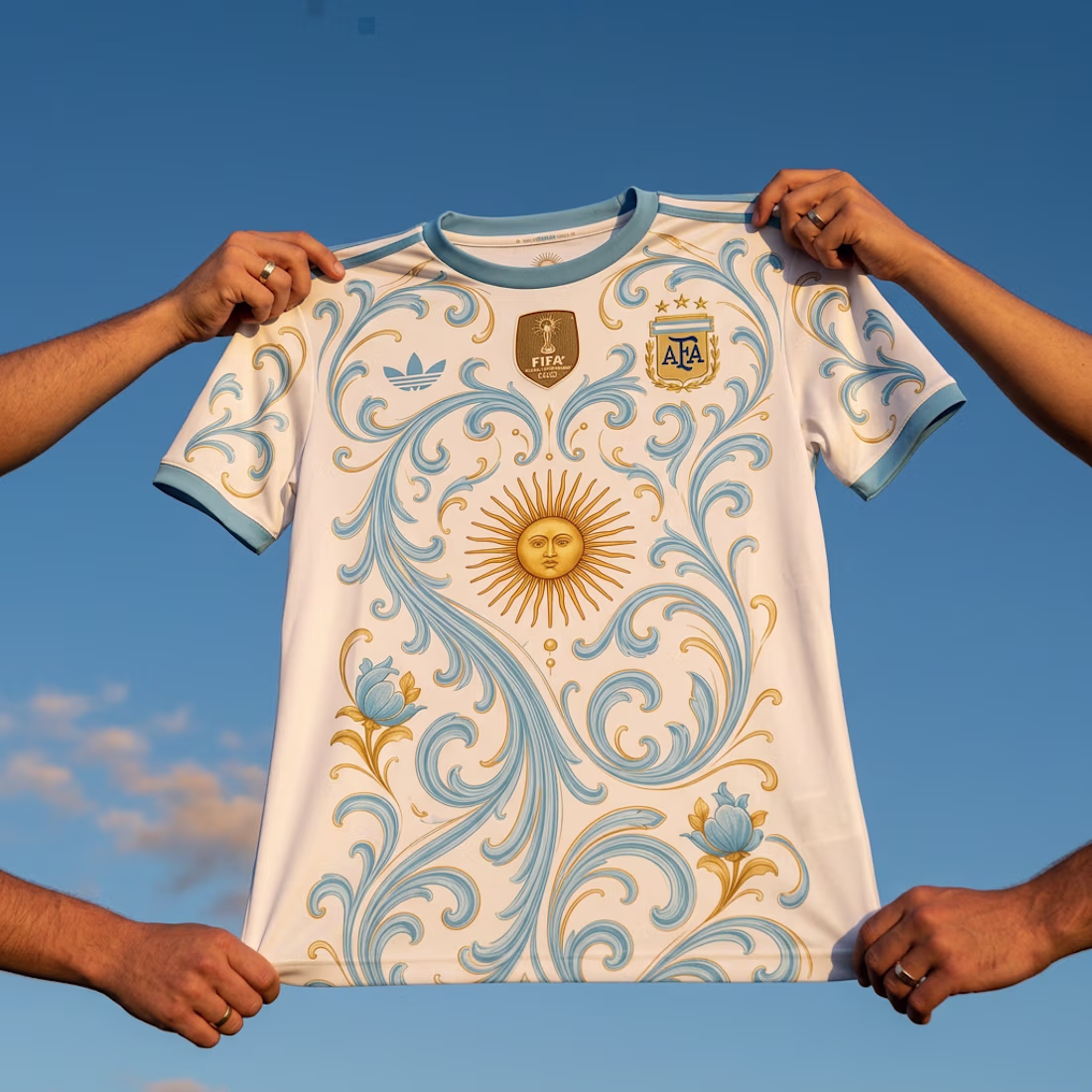
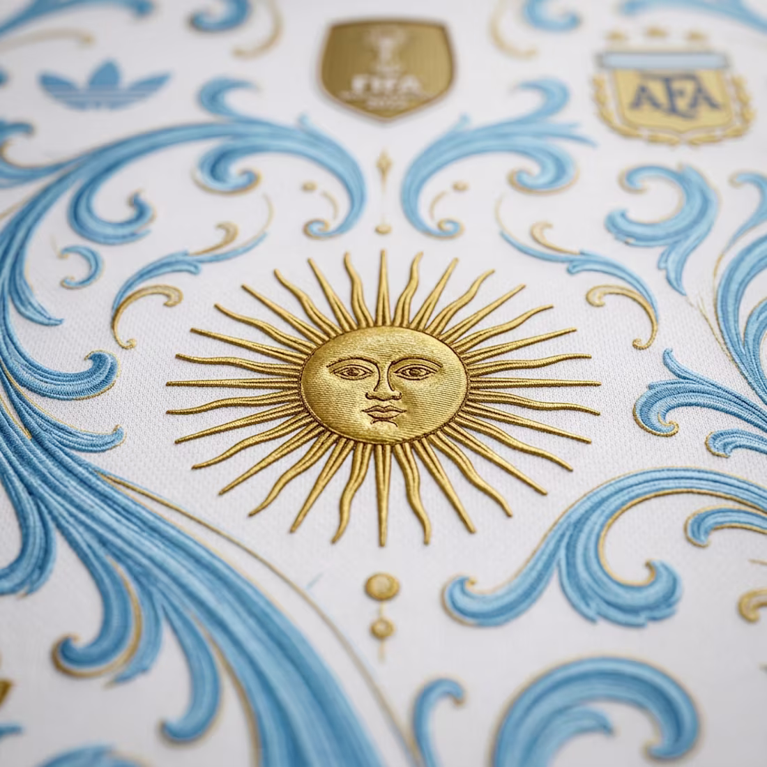
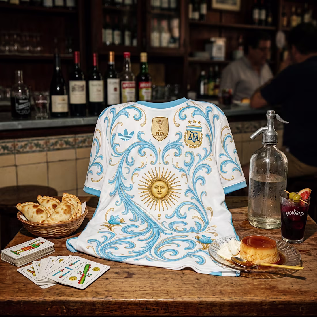
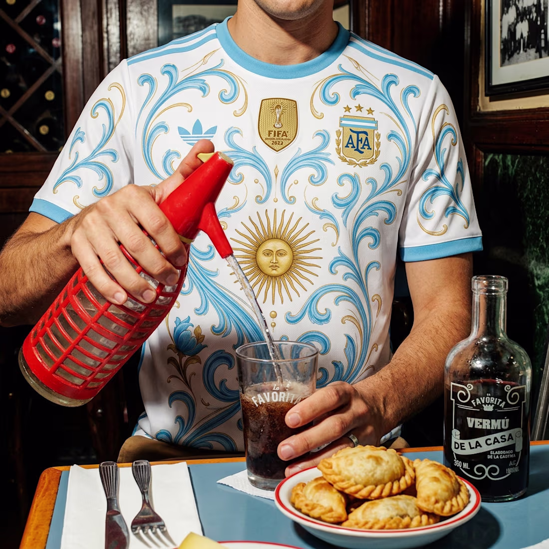
After yesterday's heart attack of a match... 😅🇦🇷 I couldn't resist redesigning Argentina's World Cup jersey.
I took inspiration from fileteado porteño, the Sol de Mayo, and placed the kit in some of the most Argentine settings I could think of, from a classic bodegón to...
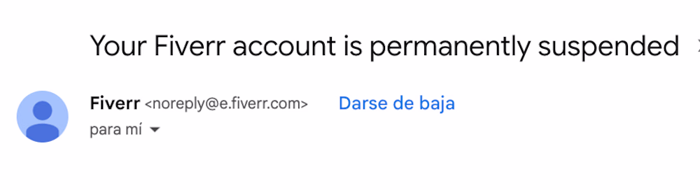
Well... Fiverr finally suspended my account. 😂
Honestly, I think we both moved on a while ago.
In the meantime, I brought some clients over to Contra, earned the referral bonuses, and now I get to focus on a platform that doesn't take 20% of every project.
Sometimes getting kicked out is just the universe helping you commit.
Happy Monday! Here's a start of the week hot take:
Designers don't have creative block. They have decision fatigue.
After making hundreds of tiny decisions every day, your brain eventually says "that's enough."
How do you deal with that?
Client Red flags, AI Edition
🚩 Comes with a full brief made entirely of AI-generated designs.
🚩 Wants a custom brand identity, but only if it looks exactly like the AI images they generated.
🚩 Runs every concept that you created (the professional designer) through AI for "design...