
pro
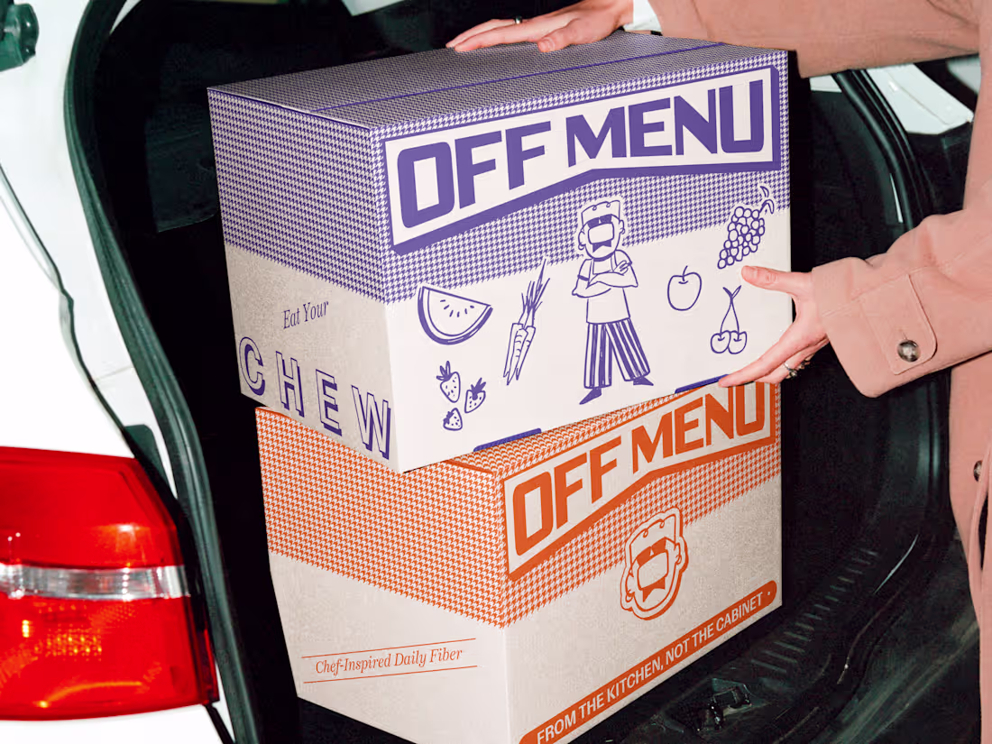
Off Menu is re-plating daily supplements, starting with fiber that tastes better, works harder, and finally gets treated like the main course.
- Naming
- Custom Character Design
- Brand Identity
- Website
1
77

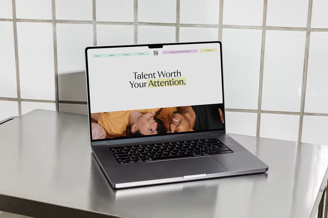
Heartwood is a personalized team wellbeing platform for modern companies.
- Brand Identity
- Naming
- Website
- Digital Illustrations
0
66
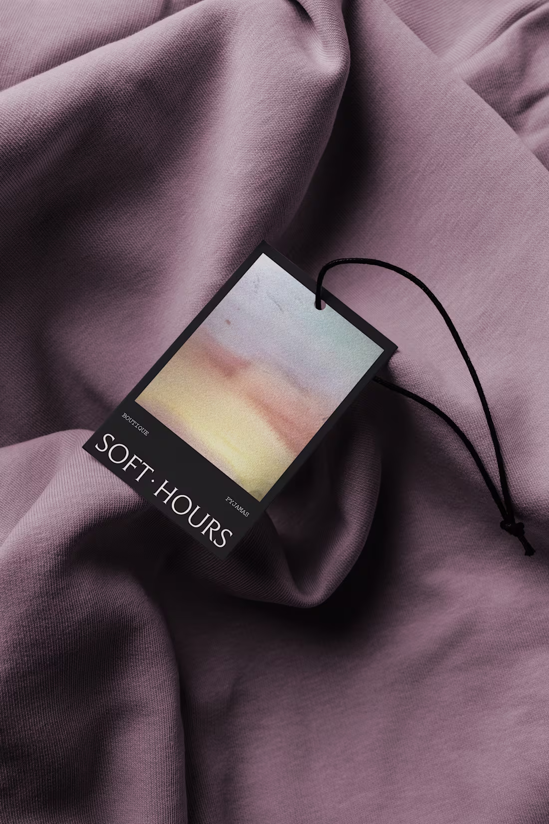
Soft Hours offers boutique Pyjamas meant to be worn for the first hour and the last.
- Brand Identity
- Web Design
- Naming
- Custom Watercolor Illustrations
0
68
There is what looks right on paper, and there is what is right in practice. Subtext helps companies tell the difference.
- Naming
- Brand Identity
- Website
0
70
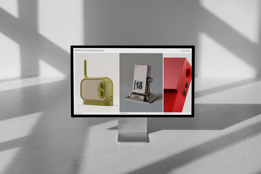
Arc88 is an industrial design practice built around thoughtful problem-solving, product clarity, and real-world viability.
- Brand Identity
- Website Design
0
54
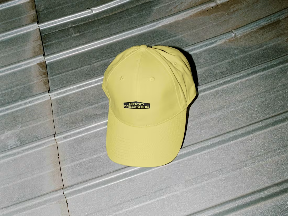
Good Measure needed a brand that could stand out in a space that, from a branding perspective, is pretty boring. Home services and contracting are crowded, template-heavy, and trust-driven, so you either blend in or you earn attention fast.
5
232
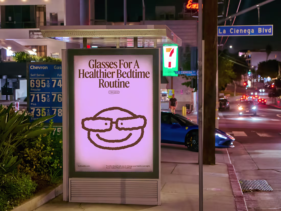
Complete Branding for Freddie, a company focused on making Red Light Glasses for After-Hours people, creating a mental shift by cutting harsh light at night, because Tomorrow Starts Tonight.
7
25
377
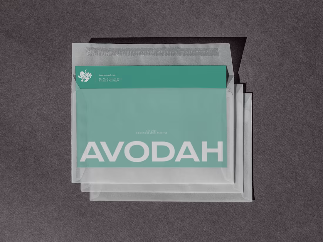
Rebrand for Avodah Legal. Avodah helps ambitious founders move through transactions, disputes, and strategic counsel with clear direction and practical wisdom because leadership requires courage.
2
219
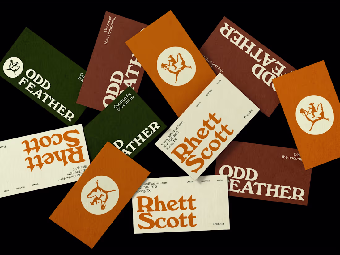
Oddfeather started with a Texas farmer raising incredibly unique chickens and wanting a brand that felt as distinct as the birds themselves. We developed a quirky, memorable name paired with a clean, cheeky identity and hand-painted illustrations of the chickens. It struck the balance between artisan and approachable, giving him a visual story that could stand out at farmers markets, artisan events, and local shops. The brand gave him the personality and polish to build recognition in a category that usually feels generic.
8
35
634
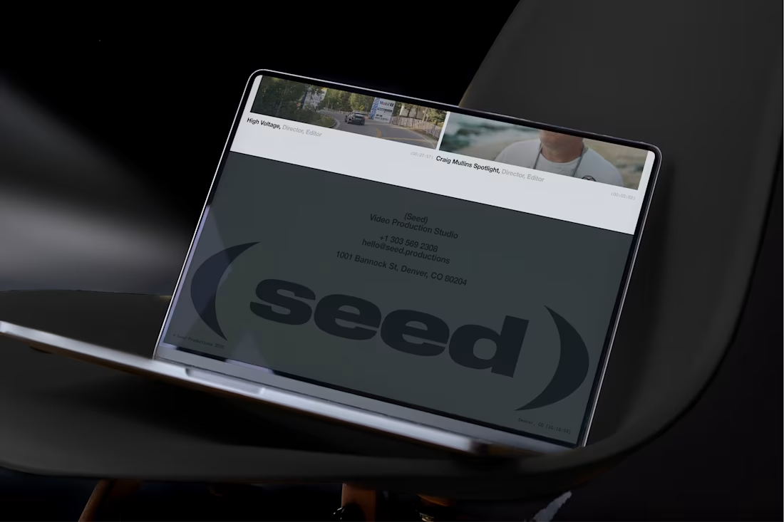
Seed came to us right as their word of mouth started doing what it does when you are actually good, the work spread fast, and the business outgrew the brand. They needed an identity that matched their momentum, with brave clarity and zero cheese, especially with a name that could easily slide into childish territory. We built a straightforward, adult, forward-looking system anchored by an abstract mark that can live in motion, which gave them room for storytelling without gimmicks. The result was a tangible brand that backs up the hype, sets the mood in every pitch, and helps close the deal.
11
25
481
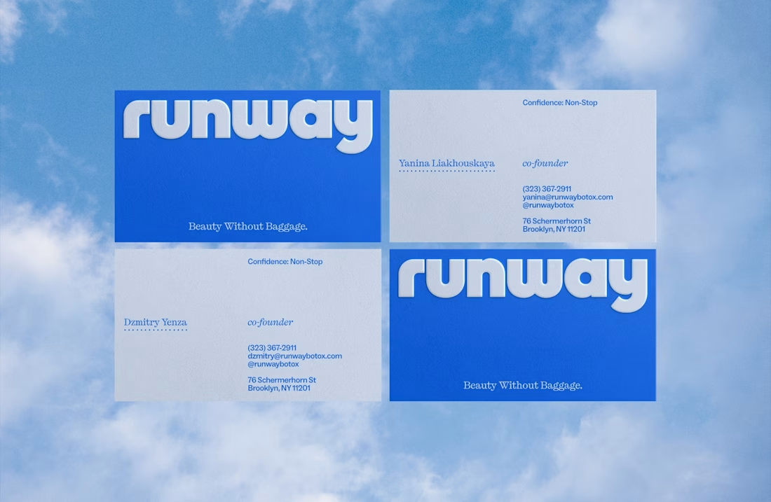
Runway came to us with a deceptively hard challenge: make Botox feel fun and simple without losing trust. Most brands go sterile because they think serious equals credible. We did the opposite, building a playful but premium world, because trust is earned through great design, not a cold tone. Leaning into bright color and retro energy, we created a retro-futurist identity that nods to aviation and motion, then shaped it into a cohesive system that’s memorable, ownable, and built to scale. The result is a premium brand people remember, and a foundation they can expand without starting over.
3
381
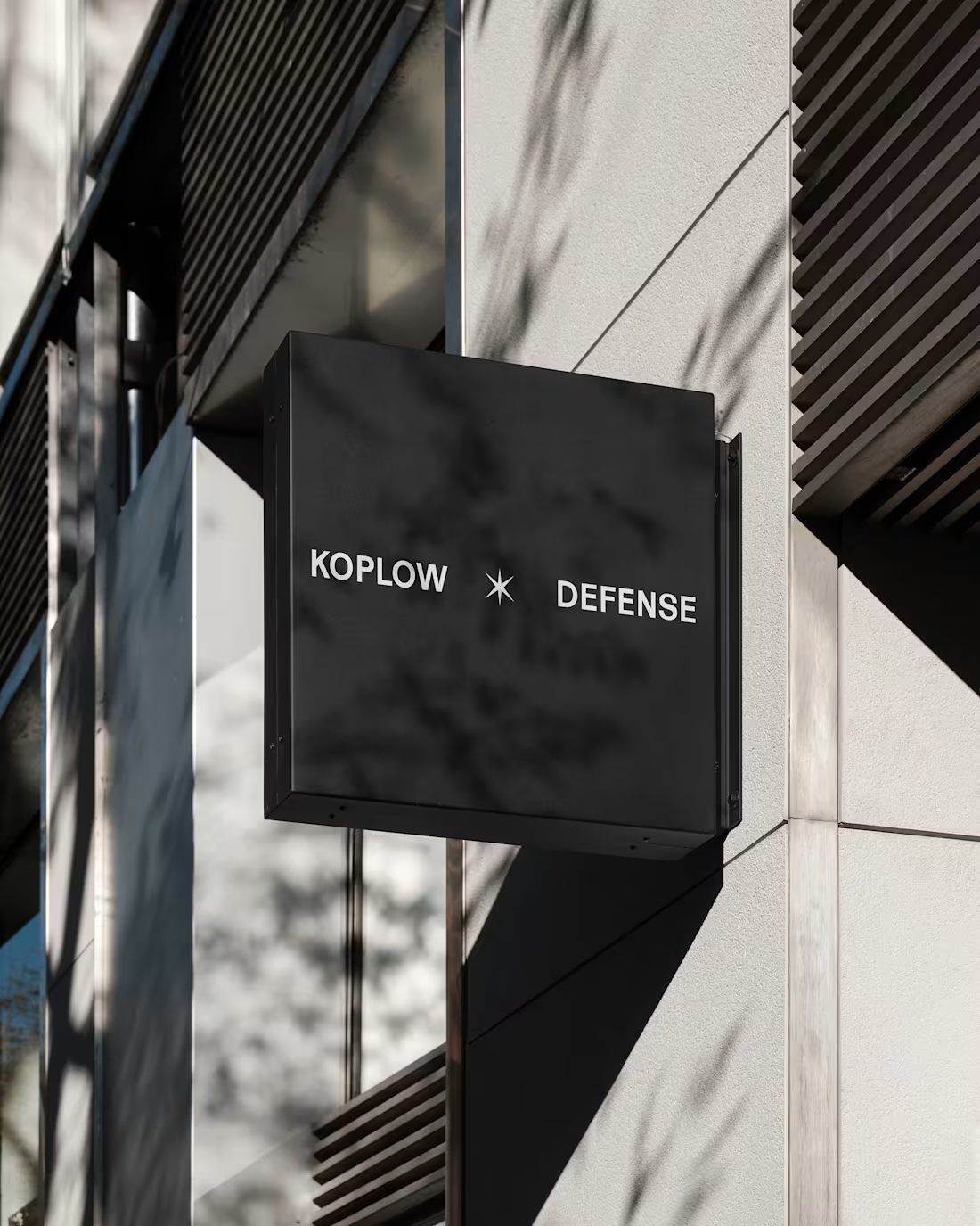
Lawrence Koplow, an Arizona criminal defense attorney known for taking on the kinds of cases the system would rather push through, came to us wanting a brand that actually looked and sounded like the way he practices law. He needed an identity that could hold that edge while still feeling rigorous and premium. We repositioned his practice from a single-issue DUI site to Koplow Defense—a justice-forward brand built around high-stakes charges, a limited-caseload model, and a simple promise: sharp defense for serious cases. The new identity feels precise and strategically built for the moments when the state throws its full weight at someone.
3
19
391
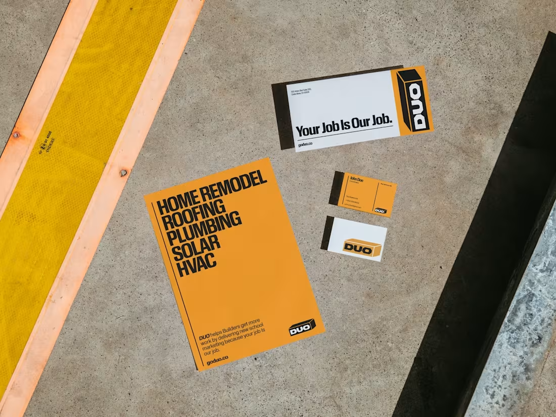
Duo is a marketing company for home service businesses, and even with an internal design and development team, they wanted an outside perspective and some real weight taken off their plate. Instead of treating it like a light refresh, we went all-in on a broader rebrand with world building that feels familiar to their audience, bold, utilitarian, and shelf-ready, like it belongs in the Home Depot universe. We created a design system built for entrepreneurs who value clarity, confidence, and function over flair. What they got was a brand that speaks their clients’ language instantly, and a visual world that makes future marketing decisions faster, easier, and way more consistent.
2
270
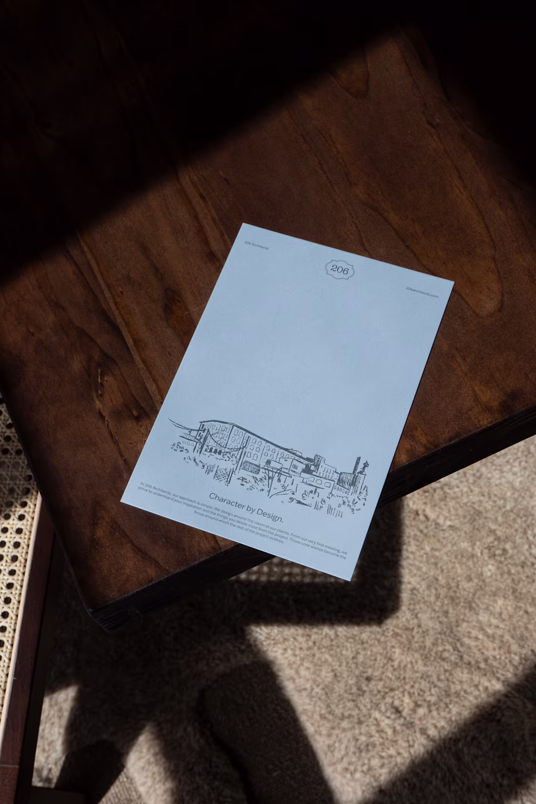
206 Architects is an Elkin, North Carolina studio led by architect Joe Seipel-Parks, shaped by years of practice in historic Beaufort before returning home to build a firm that spans residential, hospitality, and preservation-minded work. They initially came in needing conference-ready materials and a light refresh, but the bigger opportunity was clear: their existing look leaned generic-modern, while their actual work had far more character, craft, and local story.
3
8
331
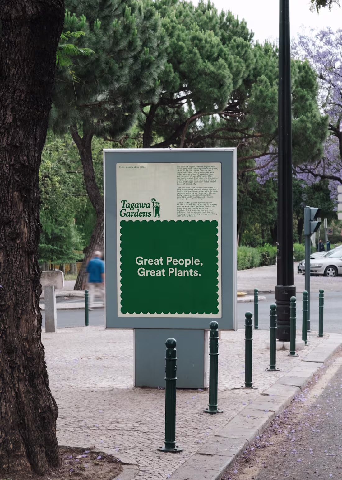
Tagawa Gardens is a historic Colorado garden center with deep roots in roses, built over decades of serving locals who know it by heart. They came to us with a tricky challenge: attract a new generation and modernize the experience without losing the trust, warmth, and legacy that made Tagawa what it is.
1
270
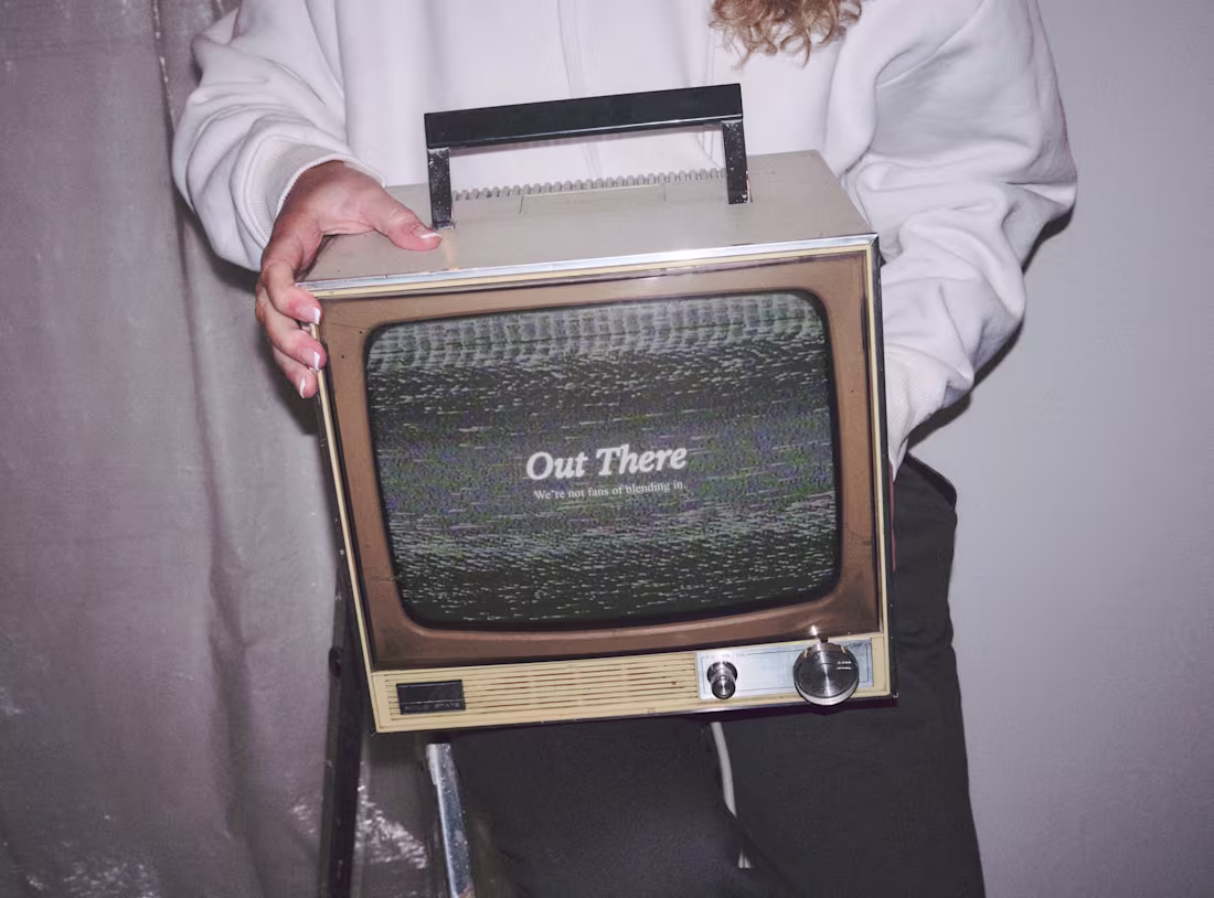
Out There
1
44
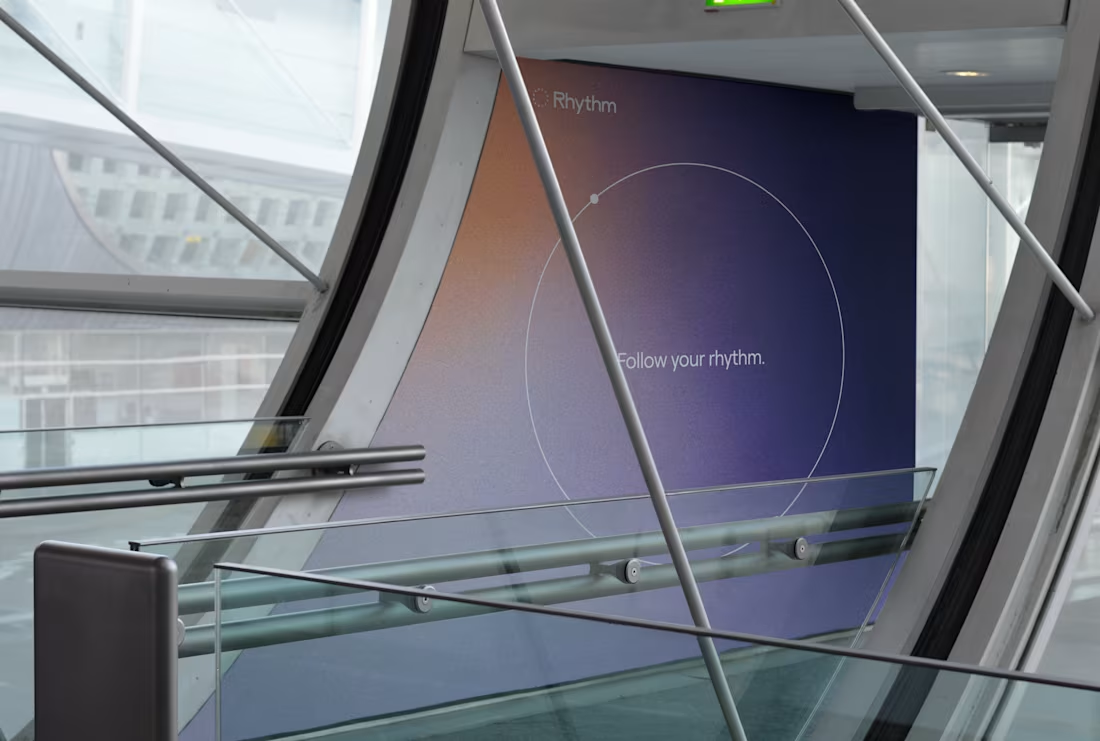
Rhythm
7
46
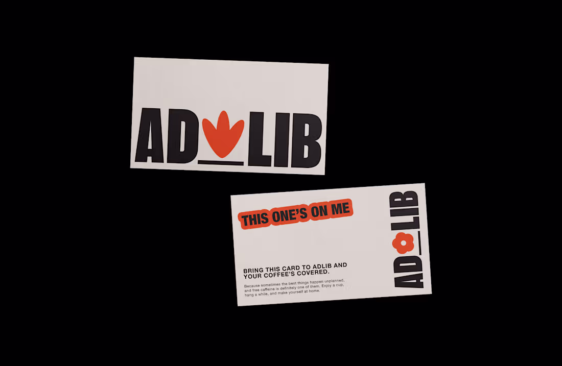
Ad Lib
15
98
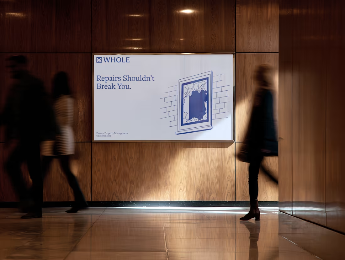
Whole Property Management
1
22
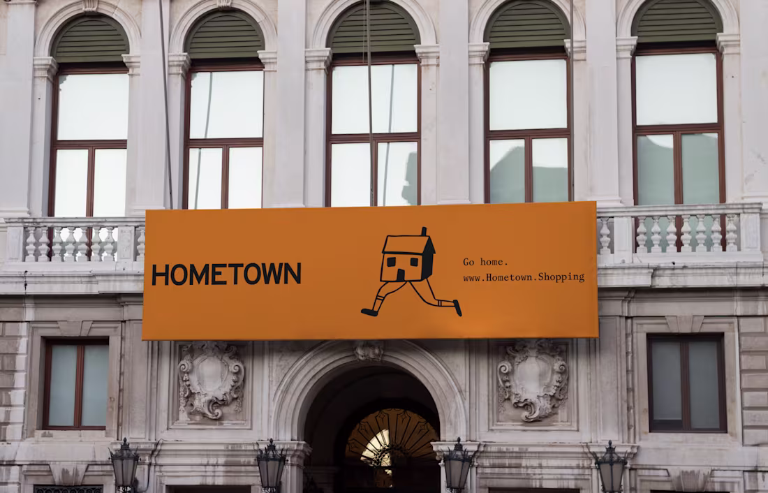
Hometown
0
18
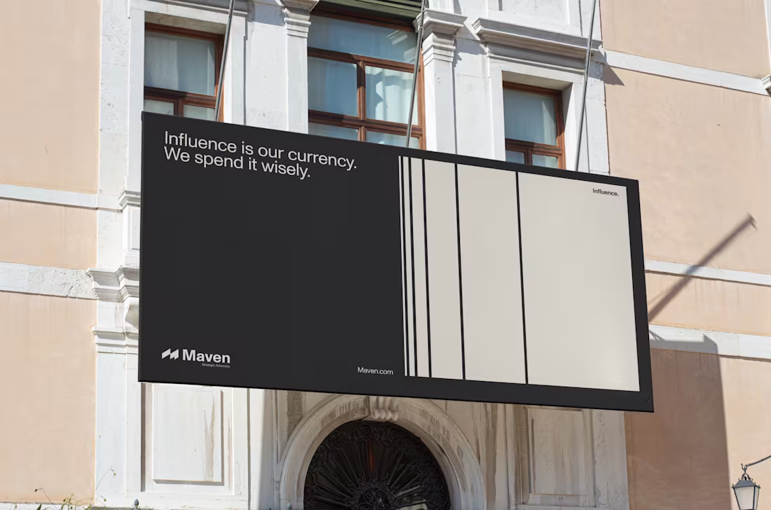
Maven
15
63
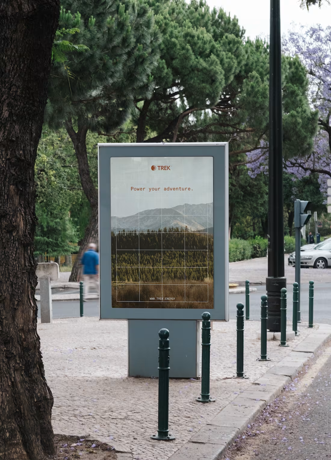
Trek
0
12
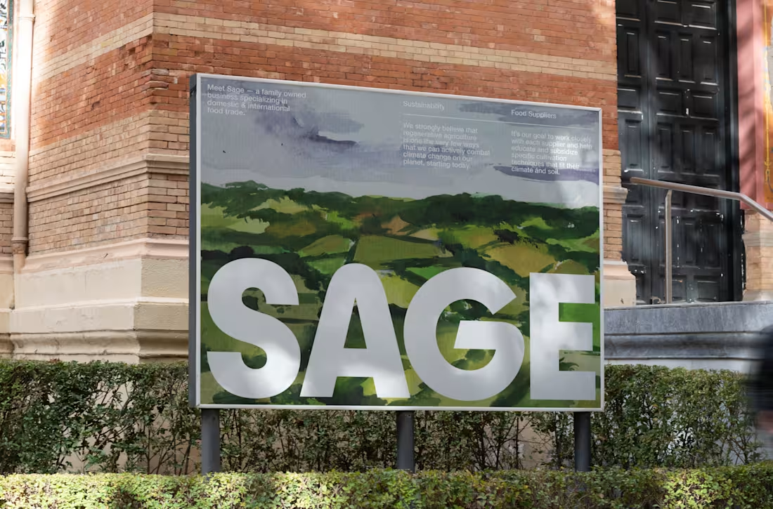
Sage
0
13
Pickleballers Nextdoor
0
14
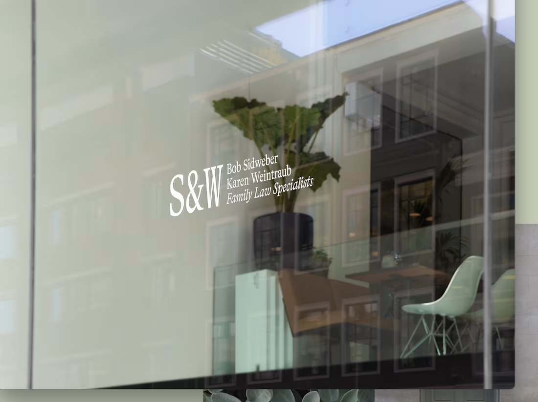
S&W
0
5
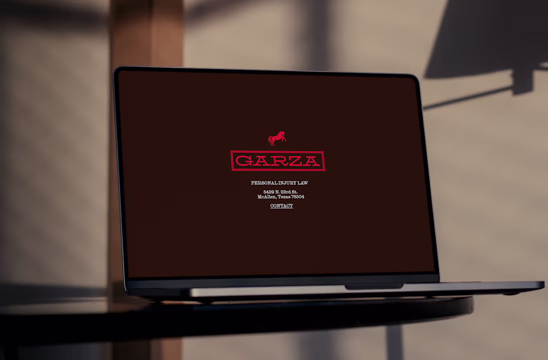
Garza
0
4
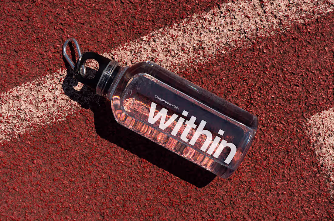
Within
11
106
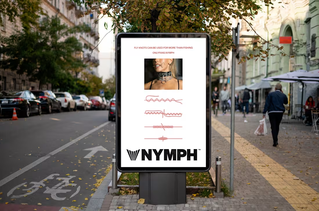
Nymph
0
12
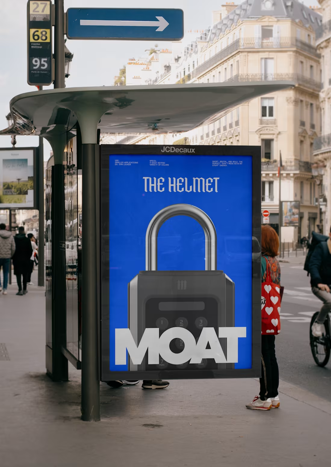
MOAT
0
7
Lex Politica
0
6
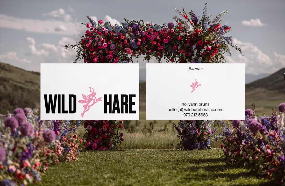
Wild Hare
1
20
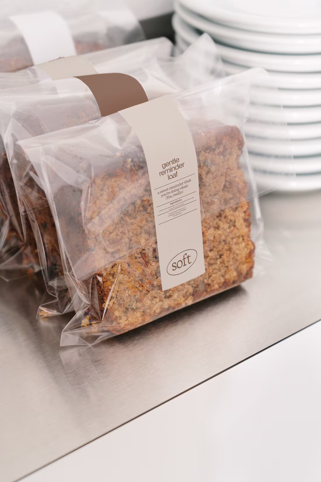
Soft
0
21
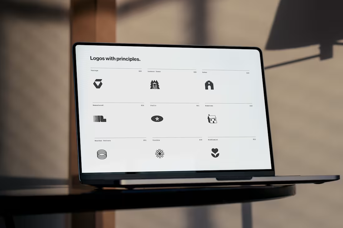
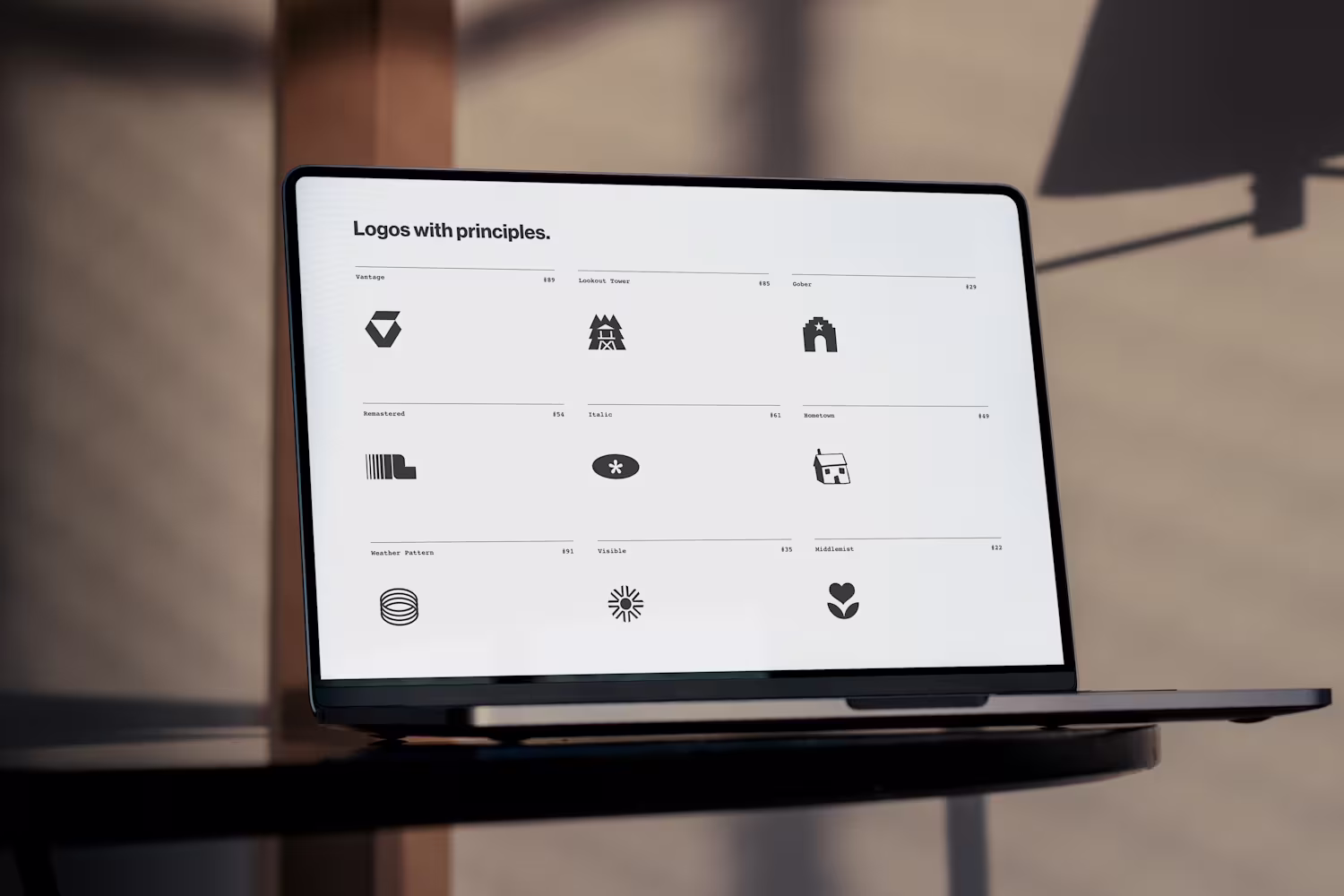
Logo Collection
0
72
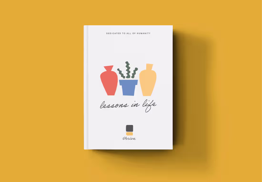
Thrive Preschool
0
27
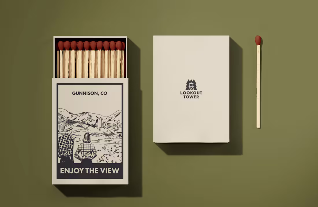
Lookout Tower
1
38
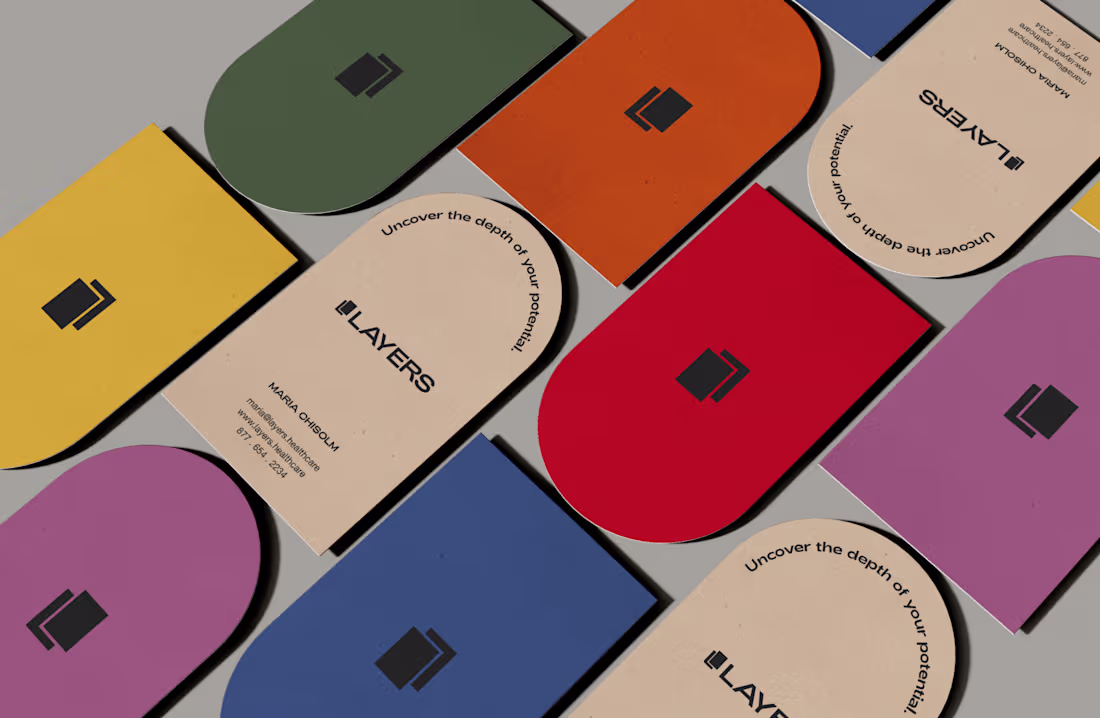
Layers
3
37
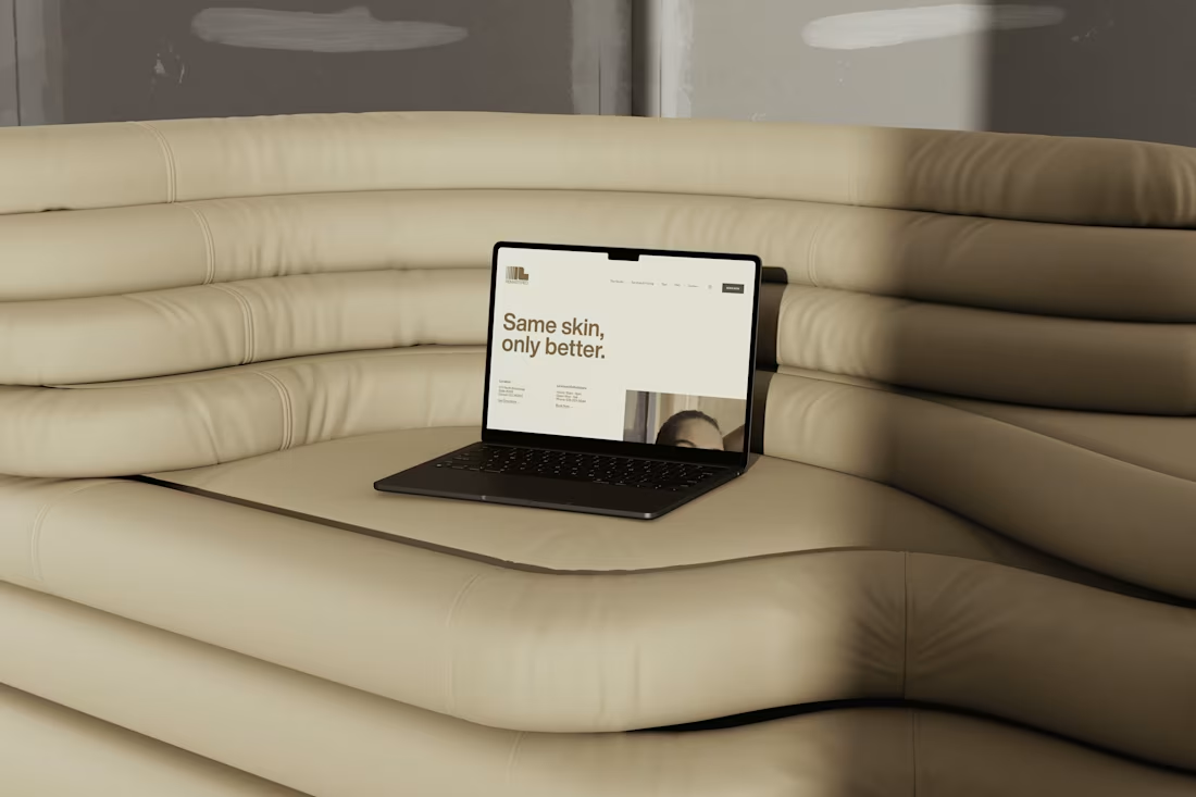
Remastered
17
119
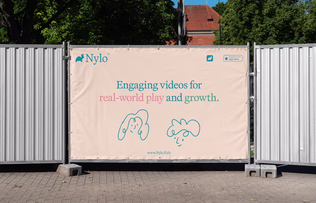
Nylo
16
107
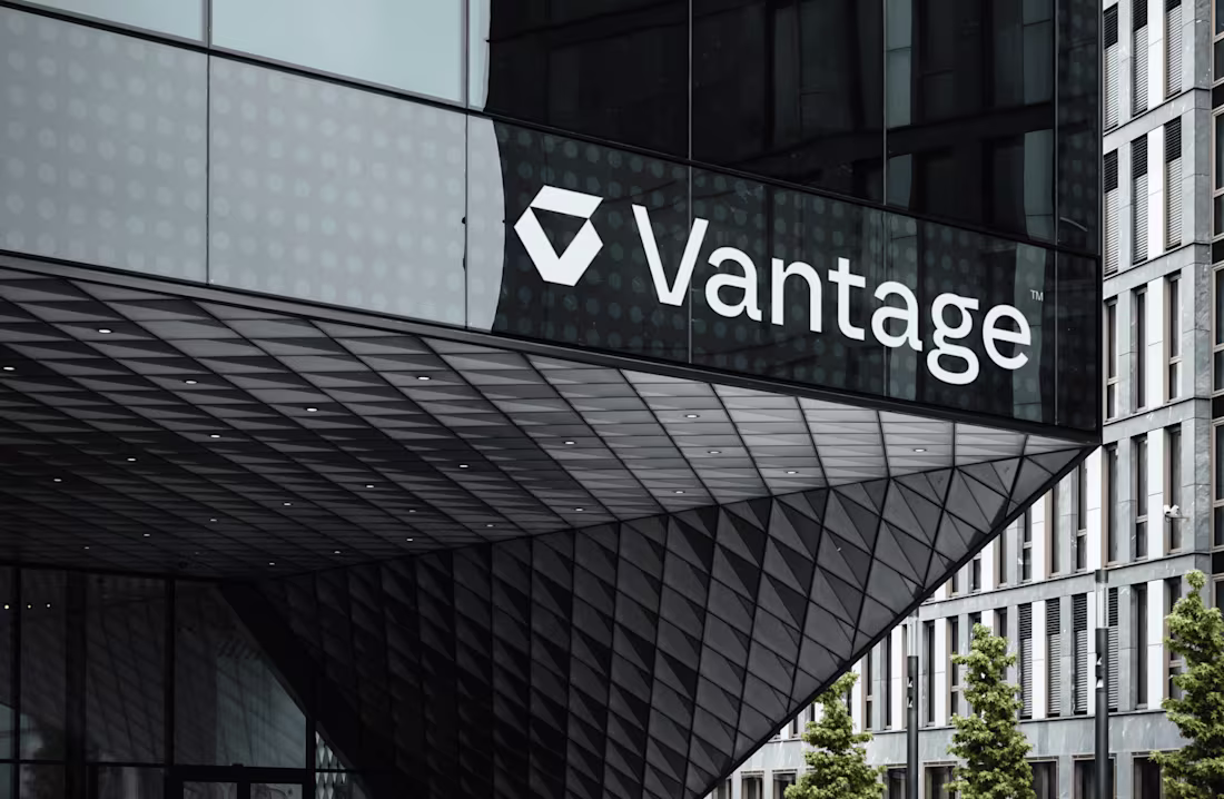
Vantage
2
34
Italic
8
98
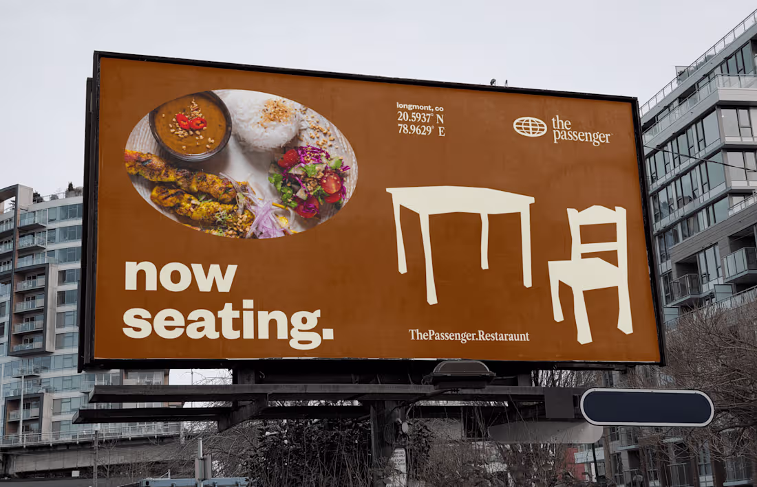
The Passenger
15
89
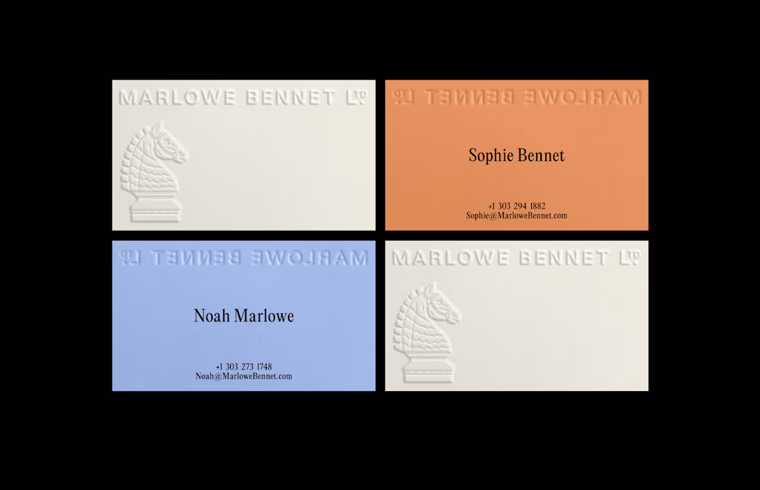
Marlowe Bennet LTD.
2
25
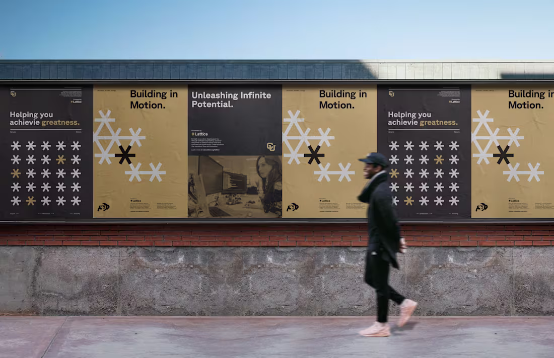
CU Boulder - Lattice
1
27
Belzer Law Firm
2
139
Weather Pattern
6
114
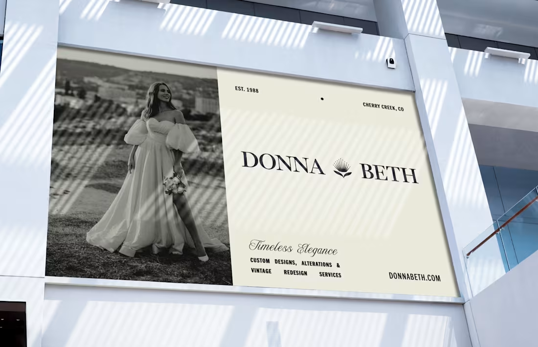
Donna Beth
0
25
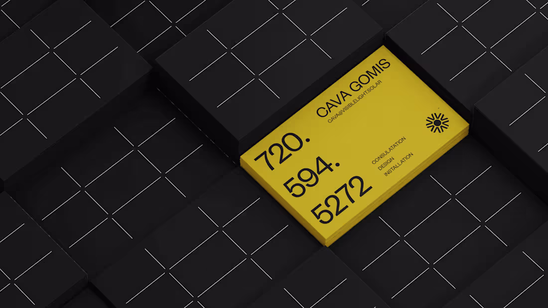
Visible
0
52
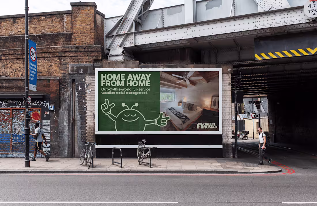
Green Nomad
43
380
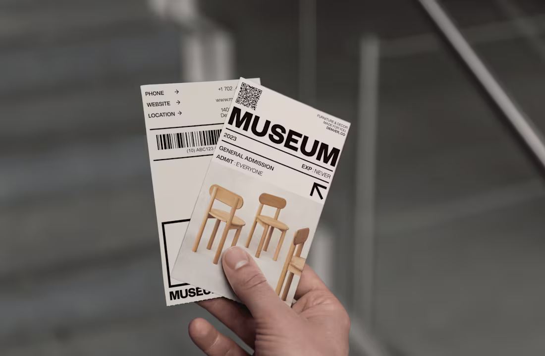
Museum
1
53
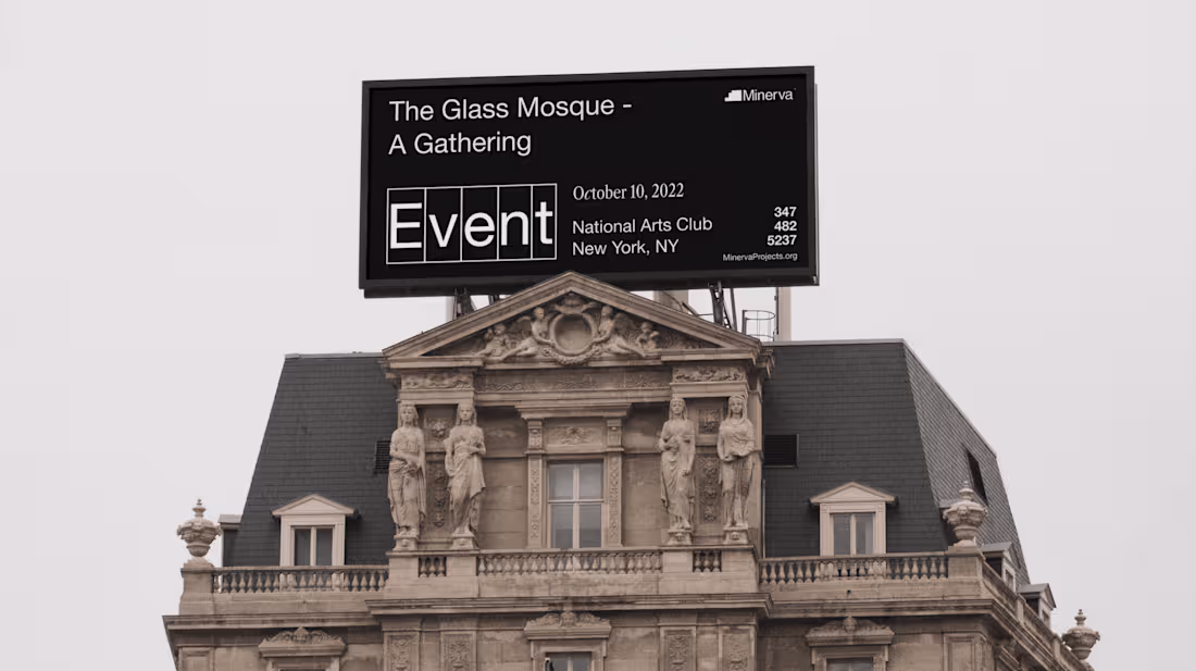
Minerva
6
52
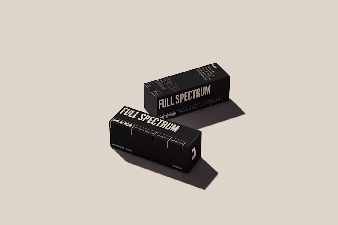
The Work
0
47