pro
Aleksandar Coric
Brand Identity Designer | Logos & Visual Systems


MODUS Build - Brand Identity & Web Design
Coming from an architectural background, I approached MODUS Build with a particular appreciation for precision, proportion, and thoughtful design.
The challenge was to create a distinctive identity that communicates these values without...


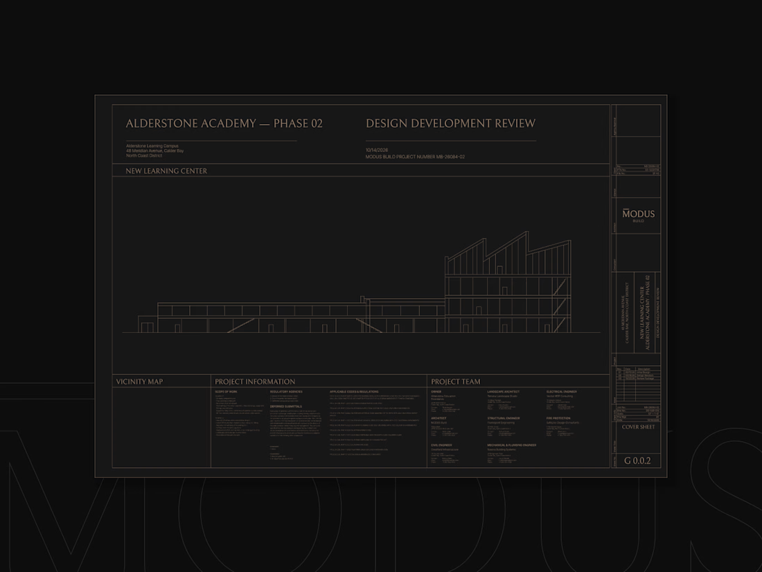
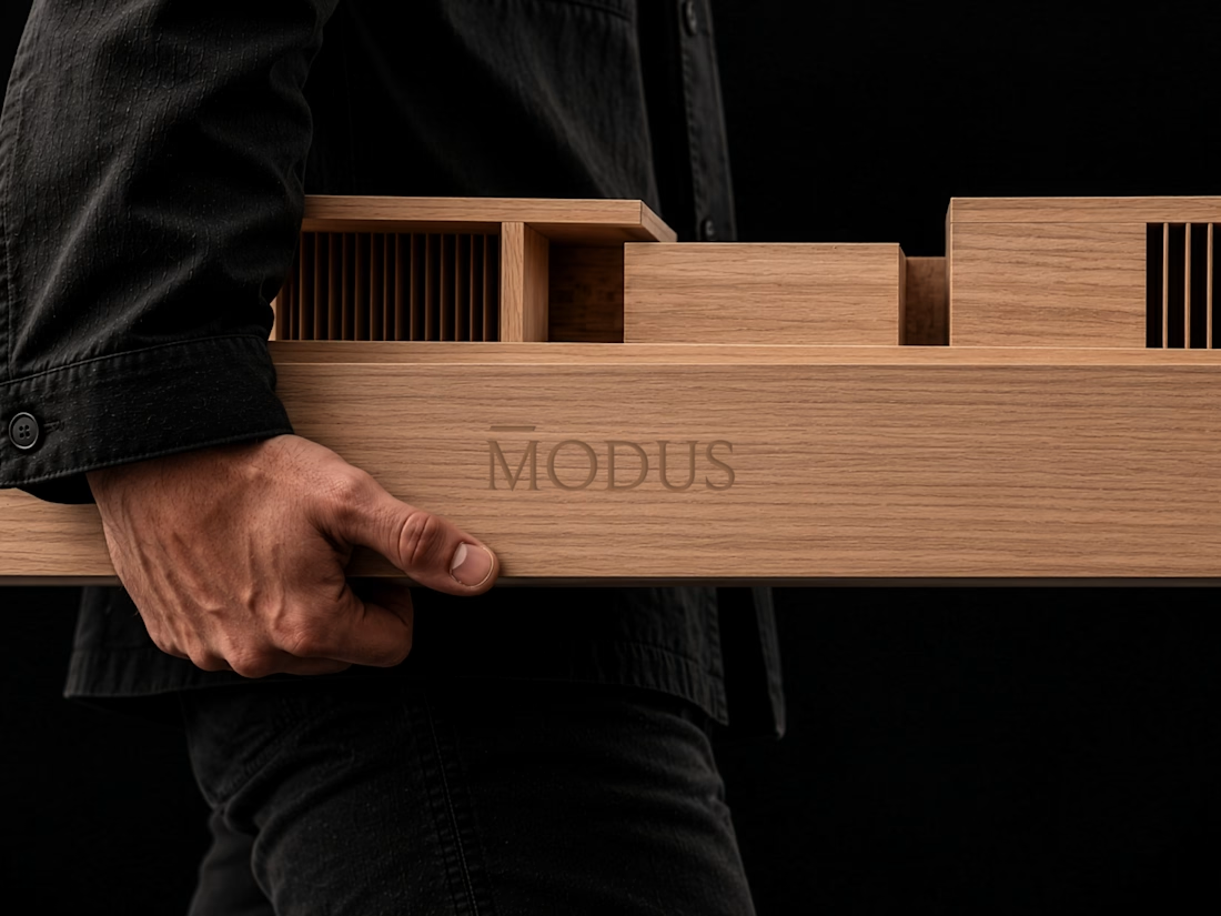
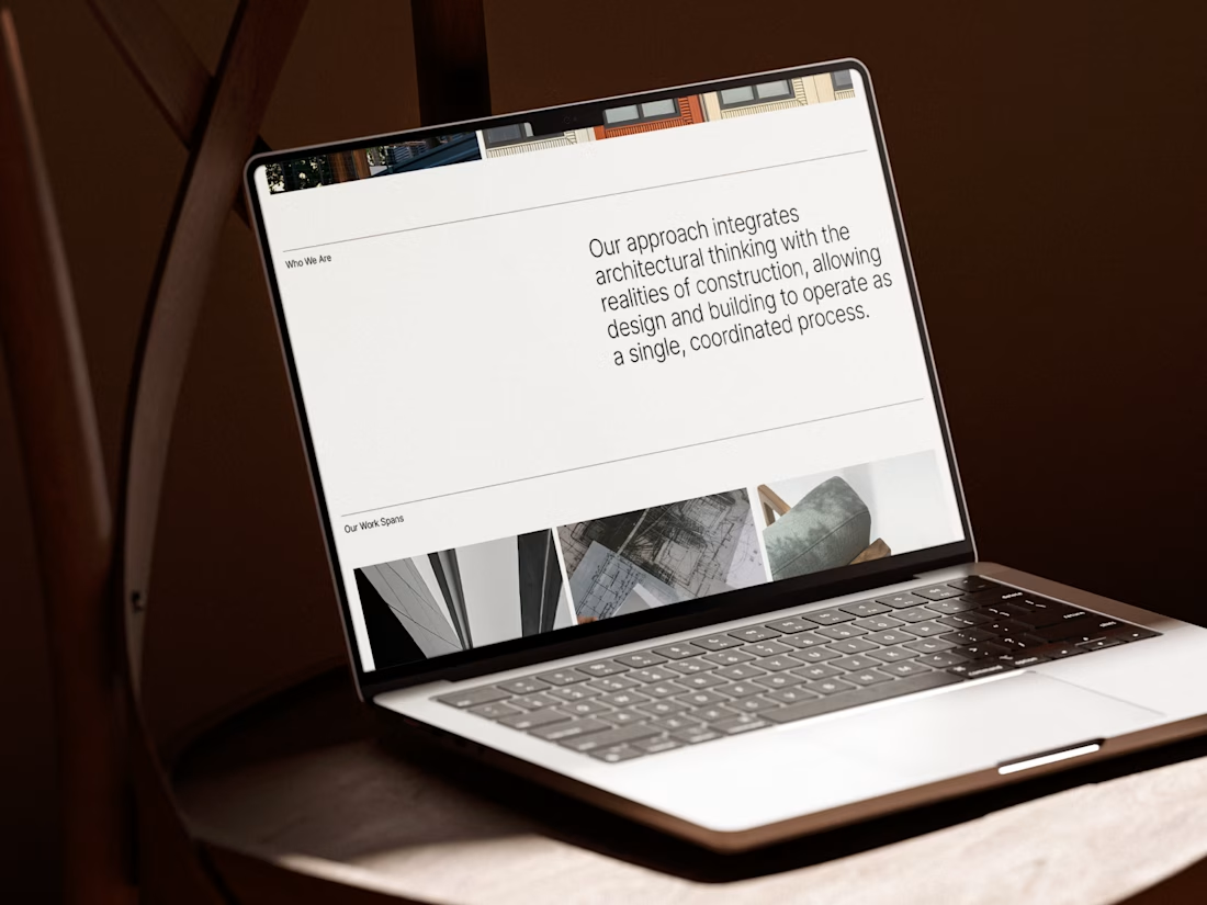
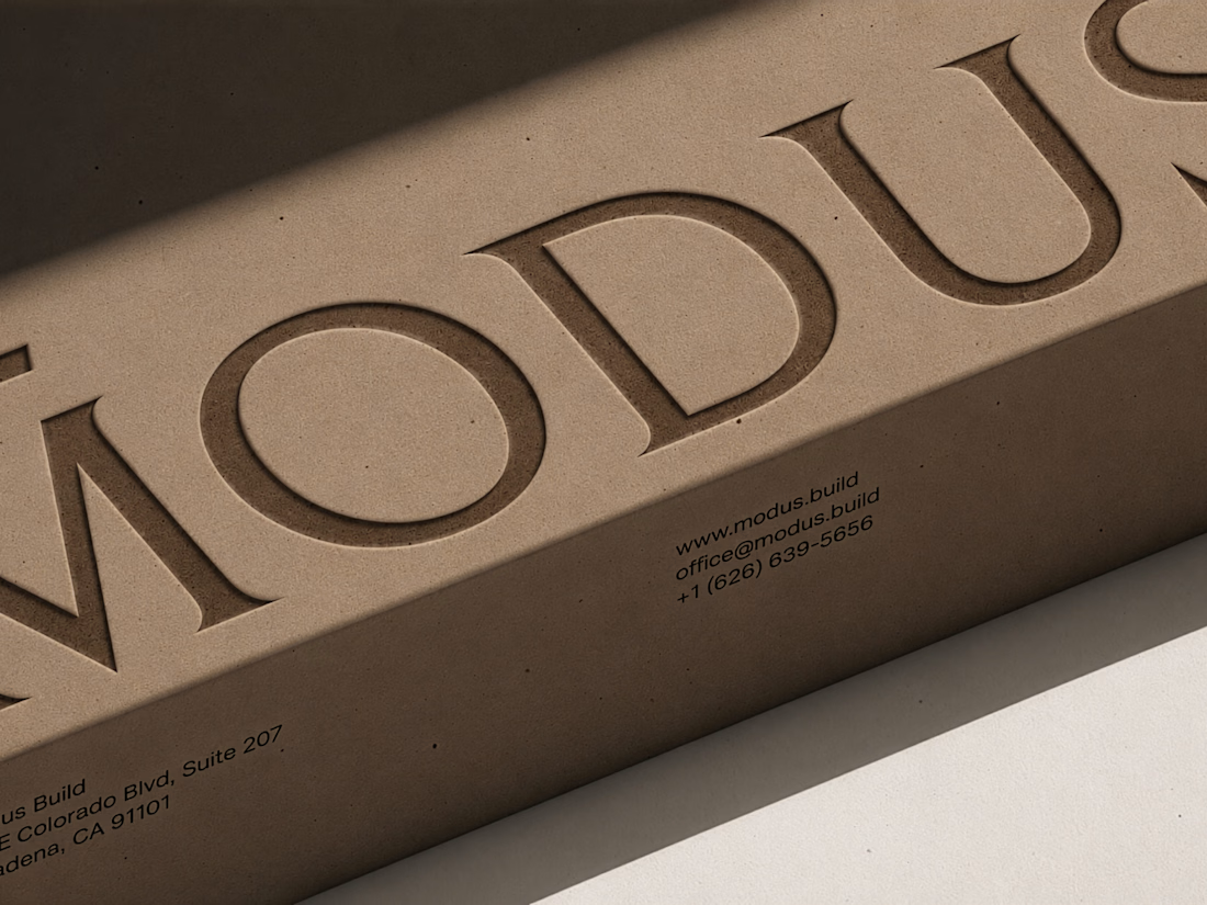
Before you build the future, you need to define it.
What happens when a brand needs to reflect not just where a company stands today, but where it's heading tomorrow?
A recent branding project let me explore exactly that.
Here's a little sneak peek. Full case study coming soon.
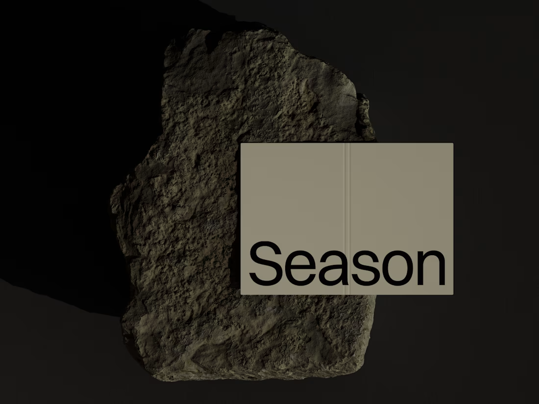
Sometimes, one image says more than an entire brand presentation.
When presenting a logo concept, the way you show it can completely change how a client perceives it.
A logo on a plain background shows the design. But adding the right texture, material, and context can help the...
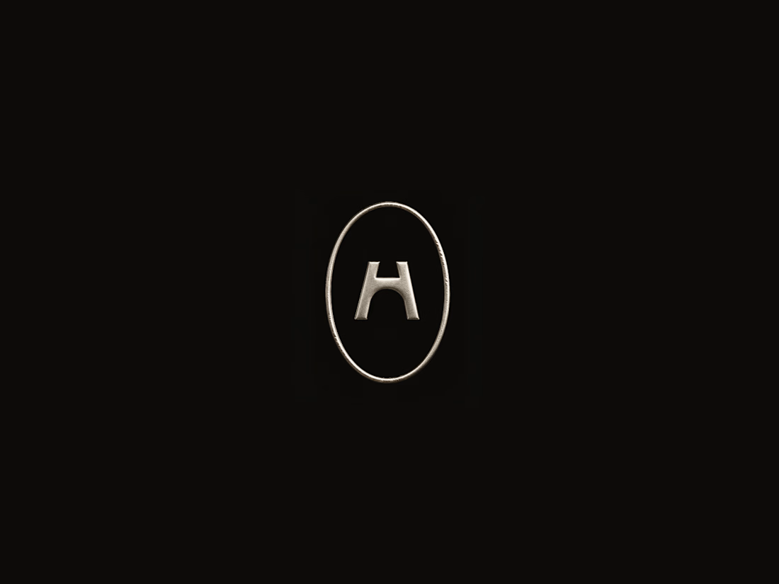
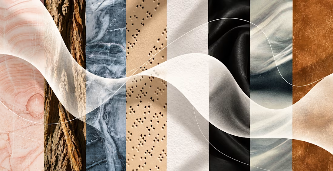
A brand identity shouldn’t only be seen.
One thing I like to discuss with clients toward the end of an identity project is what happens when the brand leaves the screen and becomes something physical.
We experience the world through multiple senses, so why should a brand...
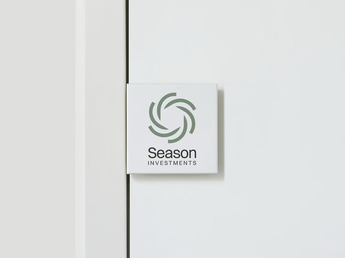
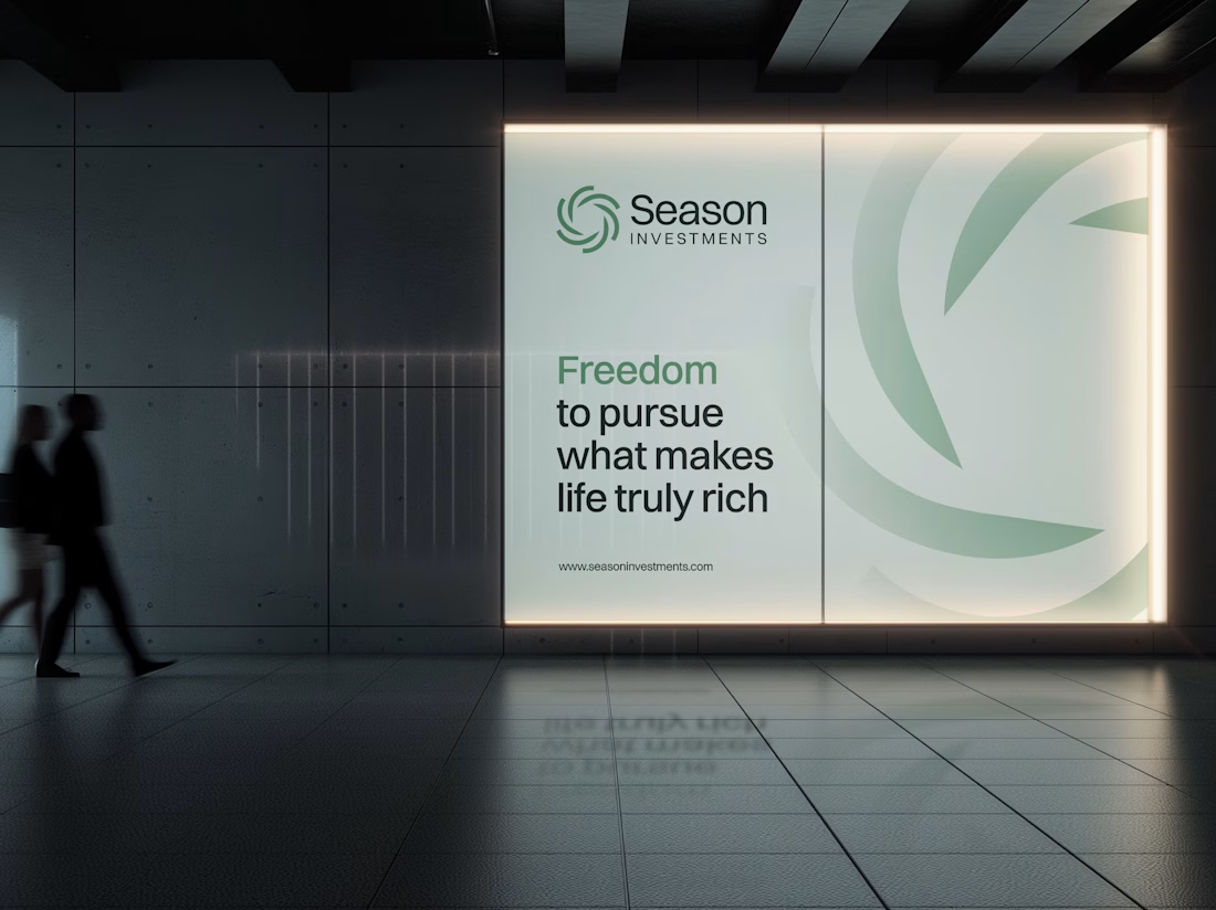
The Rebranding Challenge - Season Investments
One of the key challenges was deciding what to change and what was worth preserving.
Rather than starting from scratch, the new identity retains a visual connection to Season Investments’ heritage, but reframes it for a more...