
Aleksandar Coric
Brand Identity Designer
Ready for work
Aleksandar is ready for their next project!
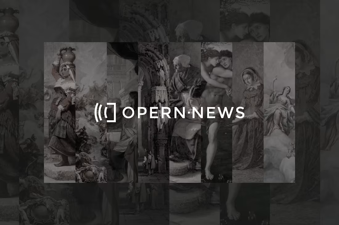
Logo Design for Opern.News (https://Opern.News)
Based in Vienna, Austria, OPERN∙NEWS is a German language non-profit media outlet whose mission is to provide high quality professional journalism while offering support services that brings awareness to the positive image of the opera art form’s impact on the greater global community.
The challenge was to create a brand identity that should enable the transfer of the highest quality stories from the world of opera to an online platform. In addition to the print media, the new era has brought the opportunity to consume local cultural news around the world, regardless of the distance from the scene. opern.news (http://opern.news) is exactly the link between the traditional media and the audience that wants to get quality and meaningful stories via the Internet, without losing quality.
0
11
🚀 This case study is a reason why I enjoy redesign and rebranding projects.
The most interesting challenges are rarely the ones where you can change everything. They’re the ones where clear boundaries already exist, where you need to understand what should be preserved, what can be improved, and most importantly, why a change is necessary in the first place.
I’ve never been a fan of redesigning something simply for the sake of making it look different. Meaningful design should solve problems, strengthen what already works, and create additional value. The goal is not change itself, but improvement.
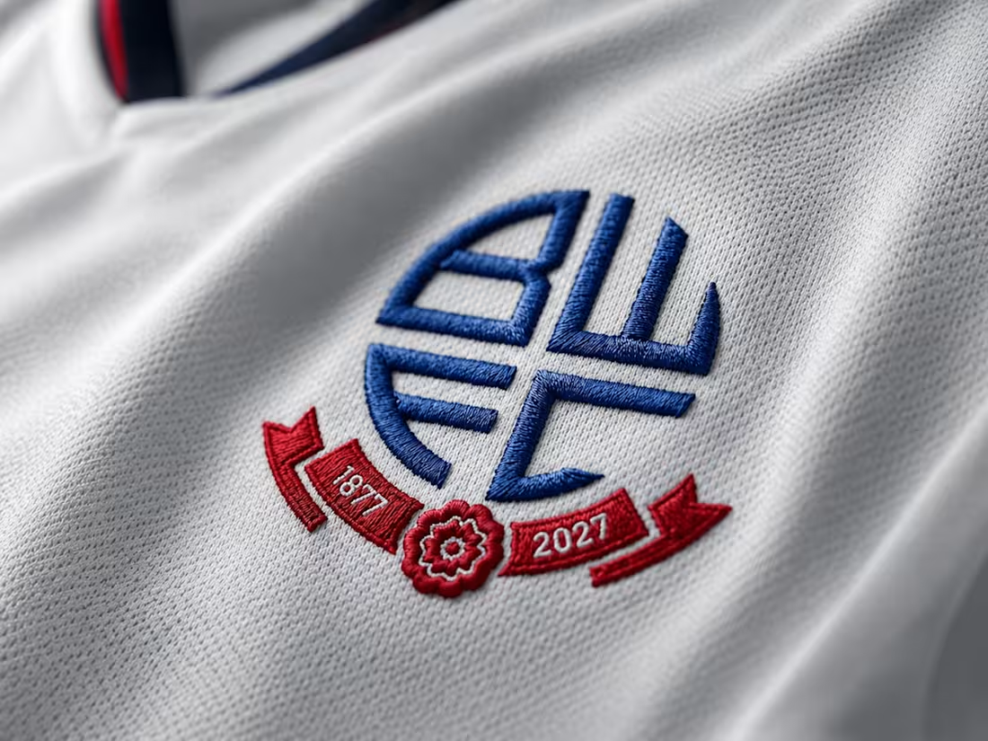
This case study comes from a personal place. As a Bolton Wanderers supporter, the club that introduced me to the magic of English football and the Premier League, I wanted to explore how its visual identity could evolve ahead of its 150th anniversary next year.
Rather than pursuing a dramatic transformation, I focused on thoughtful refinement. Modern rebranding trends often push organizations toward radical change, but when a club has carried a recognizable identity for nearly 150 years, a complete departure from its heritage doesn’t always make sense.
The challenge was to find opportunities for evolution while respecting the history, character, and recognition that generations of supporters associate with the club.
This case study is my proposal for how Bolton Wanderers could build upon its existing identity through a series of purposeful and carefully considered updates.
1
47
Case Study - Bolton Wanderers 150th Anniversary Branding
0
0

Full Branding for NPP Residential
In 2024, NPP Residential, a real estate agency based in Manchester, UK, required a rebrand. The proposed concept centered on creating an abstract monogram from the letters NPP, subtly shaped to resemble buildings.
The elements are arranged to convey progression: the initial “N” sits lower, the middle form rises higher, and the final element reaches the peak, symbolizing growth, ambition, and forward momentum.
0
42
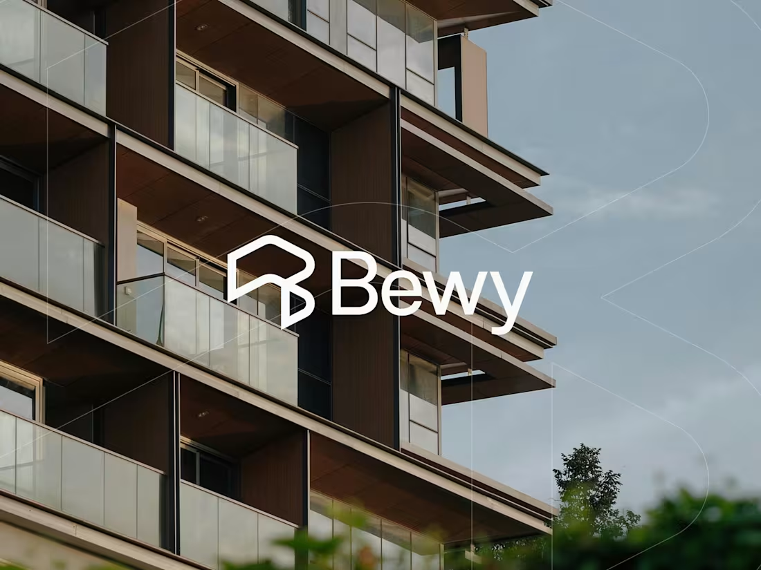
Brand Identity for Bewy – Real Estate Management
The startup initially launched with a distinctive logo and visual identity. However, before product release and early investor discussions, it became clear that the identity did not fully reflect the company’s values, quality, and ambition. A decision was made to move toward a more refined visual direction.
This shift was achieved through the development of a new symbol and updated typography. The previous logo felt overly literal and visually unbalanced. Paired with a rounded typeface, the composition appeared inconsistent.
Additionally, the color palette suggested a low-cost solution rather than a considered, premium brand. These factors highlighted the need for a redesign that would better communicate credibility, quality, and strong positioning aligned with future growth.
2
3
97

BRDO - Streetwear Clothing Brand
Introducing BRDO – a clothing brand inspired by urban culture and the people from the hill (brdo). This brand brings together true local patriots, hip-hop, rap, trap lovers, graffiti artists, best music and art, those who are active in their community. Minimalist designs and iconic phrases connect people across cities, helping them to express their belonging and unique style, without borders. Enjoy high-quality apparel and be a part of the BRDO community. The view is better from the BRDO.
1
115
Tamara Čelar Interior Designer - Branding
The logo embodies the seamless fusion of form and function, where the monogram of T and Č (CH) emerges as a refined mark of identity. Enclosed within a softly contoured rectangle, it suggests both structure and fluidity - an architectural balance between precision and emotion. Rooted in the essence of “Tač” (touch) in Serbian, the design evokes the sensory depth of interior spaces, where textures, materials, and warmth shape the experience beyond sight. The interplay of lines and curves reflects the tactile dialogue between space and its inhabitants, creating a signature that is both distinct and intuitive, bold yet inviting, modern yet timeless.
10
29
343
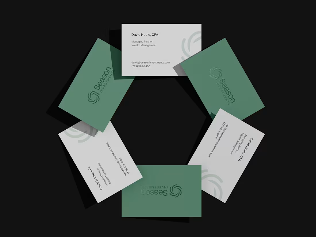
Season Investments - Rebranding
After 14 years in business, Season Investments set out to refresh and modernize their brand identity. The existing mark no longer reflected the values and direction the company wanted to communicate. The goal was to create an identity that conveys trust, credibility, stability, and reliability, while also signaling a forward-looking mindset within a changing financial landscape. The redesigned symbol remains conceptually connected to the original, refined into a clean, timeless form. Gradients and irregular shapes were removed, resulting in six structured elements forming a hexagon, a symbol of knowledge, stability, and security. Two opposing elements subtly shape the letter “S”, reinforcing the connection to the company name.
21
51
457
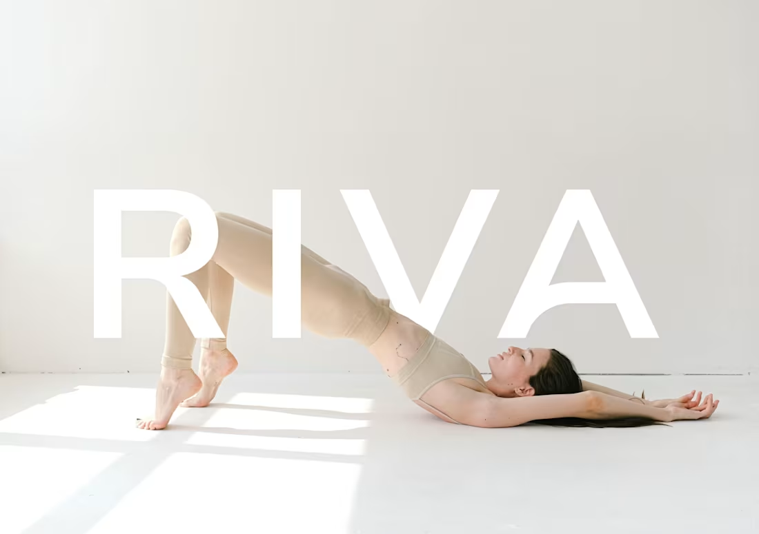
Riva Circle Brand Identity
1
1