
Ahmad I.
UI UX Designer, Web designer, Wireframer
New to Contra
Ahmad is ready for their next project!



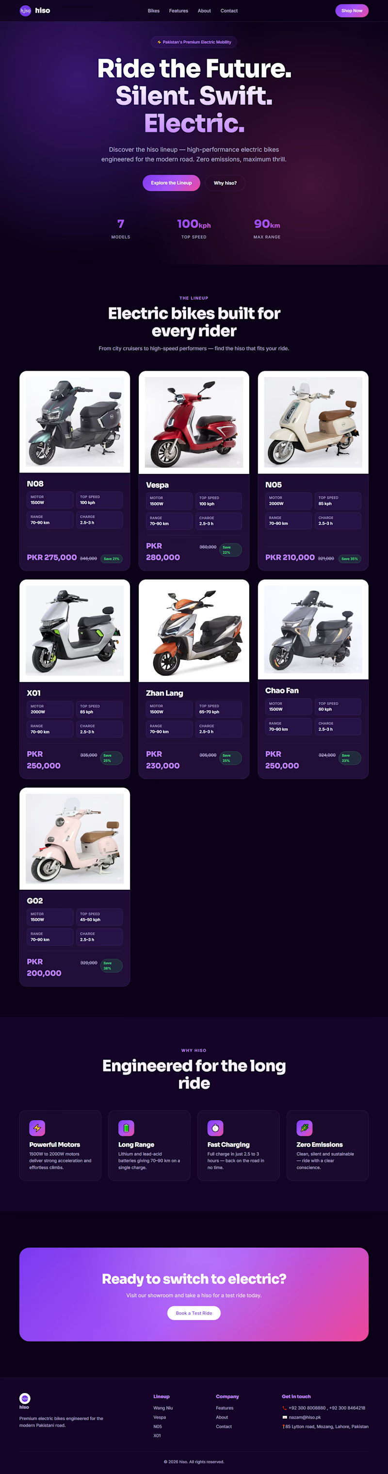
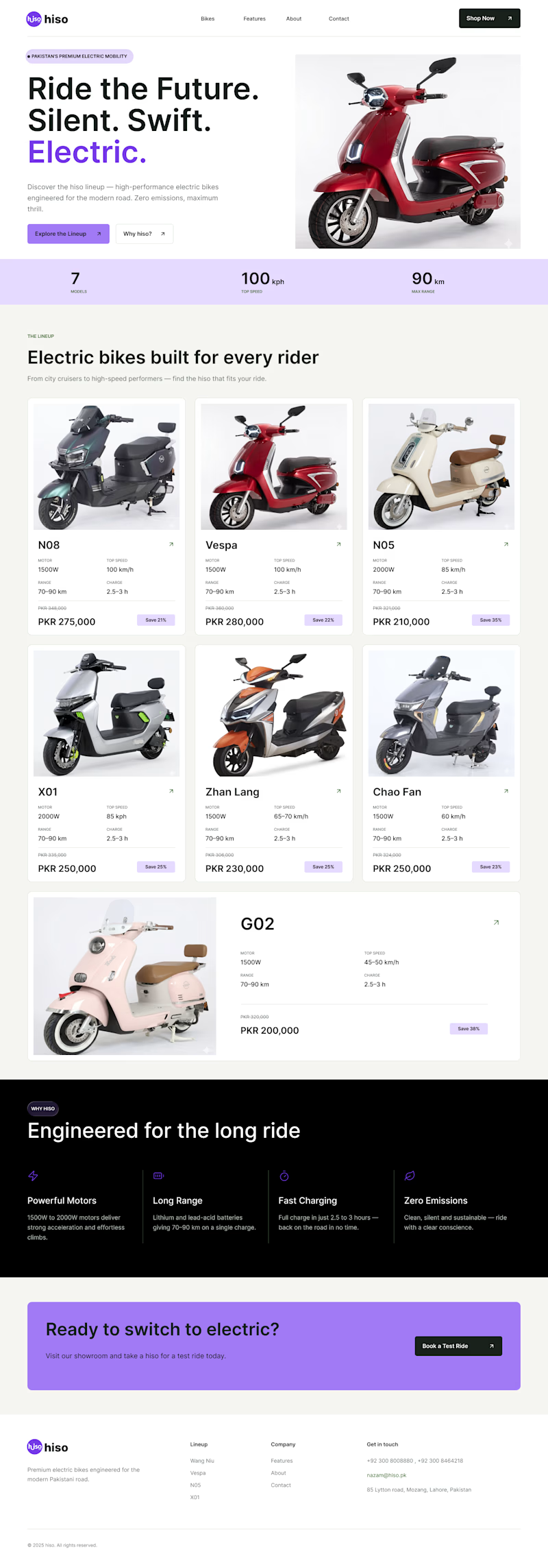
Which one is better ? Old or New
CASE STUDY Time !
I just noticed their website and saw that their color combination is hiding main information and disturbing users to focus on one thing
The theme was too dark with dark text which is making user to focus too much on text and...
0 voted
0%
3 voted
100%
3 votes
Closed
I am happy to share that I have created a whatsapp community for UI UX designing
where we react to junior designers designs and help them improve also will share free designing resources
community Link https://chat.whatsapp.com/C8GkmBV6vnjCImHGbXi5lj

chat.whatsapp.com
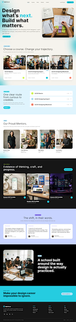
Inertia UI - Designing community
WhatsApp Group Invite

MY CASE STUDY

UI/UX Case Study: How I Redesigned Ozeefy.com
Executive Summary
This case study breaks down how I completely revamped Ozeefy.com , taking it from a basic, generic agency site and turning it into a slick, modern, dark-themed experience built to convert. By overhauling the visual...