The network for creativity
Join 1.25M professional creatives like you
Connect with clients, get discovered, and run your business 100% commission-free
Creatives on Contra have earned over $150M and we are just getting started
Back to feedPost

UI/UX Case Study: How I Redesigned Ozeefy.com
Executive Summary
This case study breaks down how I completely revamped Ozeefy.com, taking it from a basic, generic agency site and turning it into a slick, modern, dark-themed experience built to convert. By overhauling the visual identity, organizing the layouts, leveling up the typography, and introducing a glowing futuristic aesthetic, the new design positions Ozeefy as a top-tier 360-degree digital and e-commerce agency.
1. The Core Problem & What Changed
The Old Site (Ozeefy.com)
Outdated Feel: A traditional light-background layout with basic agency templates that felt flat and generic.
Hard to Skim: Long walls of text made it tough for visitors to quickly read through what the agency actually does.
Basic Visuals: Standard stock icons and static imagery that didn’t feel like a high-end tech or marketing partner.
Weak Contrast: Headlines, details, and call-to-action buttons blended into each other, making it easy for users to drop off without taking action.
The Redesign
Modern Dark Theme: A deep navy/violet background paired with neon purple gradient accents and soft ambient lighting.
Card-Based Layouts: Clean, frosted-glass-style cards that break down complex agency services into simple, easy-to-read sections.
Clear Hierarchy: Crisp white titles alongside muted grey body text so your eyes naturally scroll to the most important details.
Polished Brand Identity: A fresh logo concept, clean icon sets, balanced image grids, and real-world merchandise mockups.
2. Key Design Overhauls
A. Color Palette & Mood
Background: Moved away from plain white and light grey in favor of a sleek, dark-mode canvas.
Glow Accents: Added neon purple glows around key cards, buttons, and section headers to guide the user’s eye directly toward interactive areas.
Legibility: High contrast between bright white titles and deep dark backgrounds makes reading effortless on both mobile and desktop.
B. Content & Typography
Snappy Copy: Swapped out heavy paragraphs for short, impactful headlines tailored to each service line (Web Development, SEO Marketing, Performance Marketing, Fashion Photography, Creative & Design).
Better Readability: Used short subheadings and simple bullet points inside distinct cards so potential clients can scan the page in seconds.
C. Layout & Structure
Dedicated Service Pages: Built a unified layout grid across sub-pages for every core service (UI/UX Design, Warehousing, Community Management, TVC/DVC, Media Planning & Buying).
Hero Sections: Created bold, attention-grabbing hero sections right at the top of pages with clear call-to-action buttons.
Consistent Grid: Unified spacing, margins, and card padding across all screen sizes.
D. Icons & Visual Assets
Matching Icon System: Replaced inconsistent icons with sleek line-art icons housed inside subtle dark rounded badges.
Logo Story: Included a dedicated section breaking down the geometry and thought process behind the new logo.
Real-World Application: Showcase mockups (t-shirts, packaging, mobile previews, and business cards) to build trust and show off brand versatility.
The network for creativity
Join 1.25M professional creatives like you
Connect with clients, get discovered, and run your business 100% commission-free
Creatives on Contra have earned over $150M and we are just getting started





Related posts

Credit card landing page design for a fintech startup — an interactive 3D claw machine that turns the offer into the hero instead of another floating card at 15 degrees.
Every card brand ships the same hero: a card hovering over a gradient. Clawd sells one card, not a marketplace, and the entire pitch is "stop comparing — we already did the comparing". So the landing page had to make a single-product offer read as a win rather than a shortage of options, and pull early-access sign-ups from people who are deliberate about money: the ones who actually track spending and read the APR line.
The metaphor does the positioning work. A claw machine that never misses, plus "we already picked the best one", means the visual is the argument and the headline doesn't have to explain itself.
I built the scene in Blender as an interactive element rather than a still render — the claw follows the cursor, the card tilts in the grip, and the pile underneath reacts, so a visitor plays with the product's core idea for a few seconds instead of scrolling past it.
Hero plus full page structure, desktop and mobile designed separately, the Blender scene with web-ready exports, interaction notes, and a developer-ready Figma file.


nice work

Which hero visual feels right for this brand?
While working on the homepage for Halfspace, a website design and SEO agency, I explored two different hero visuals for the same headline and layout. Same message, same structure, just a different visual metaphor and mood.
Option 1 - Rocket Launch. Bold, literal, and energetic, visually reinforcing the "launch your business" message with motion and fire.
Option 2 - Glass Cube. Abstract, sleek, and premium, giving a more refined, tech-forward feel without relying on a literal metaphor.
Would love your honest UX/UI take, which direction feels more impactful, memorable, and aligned with a web design/SEO brand, and why?
11 voted
41%
16 voted
59%
27 votes
Closed

Both design are great; it's hard to choose one


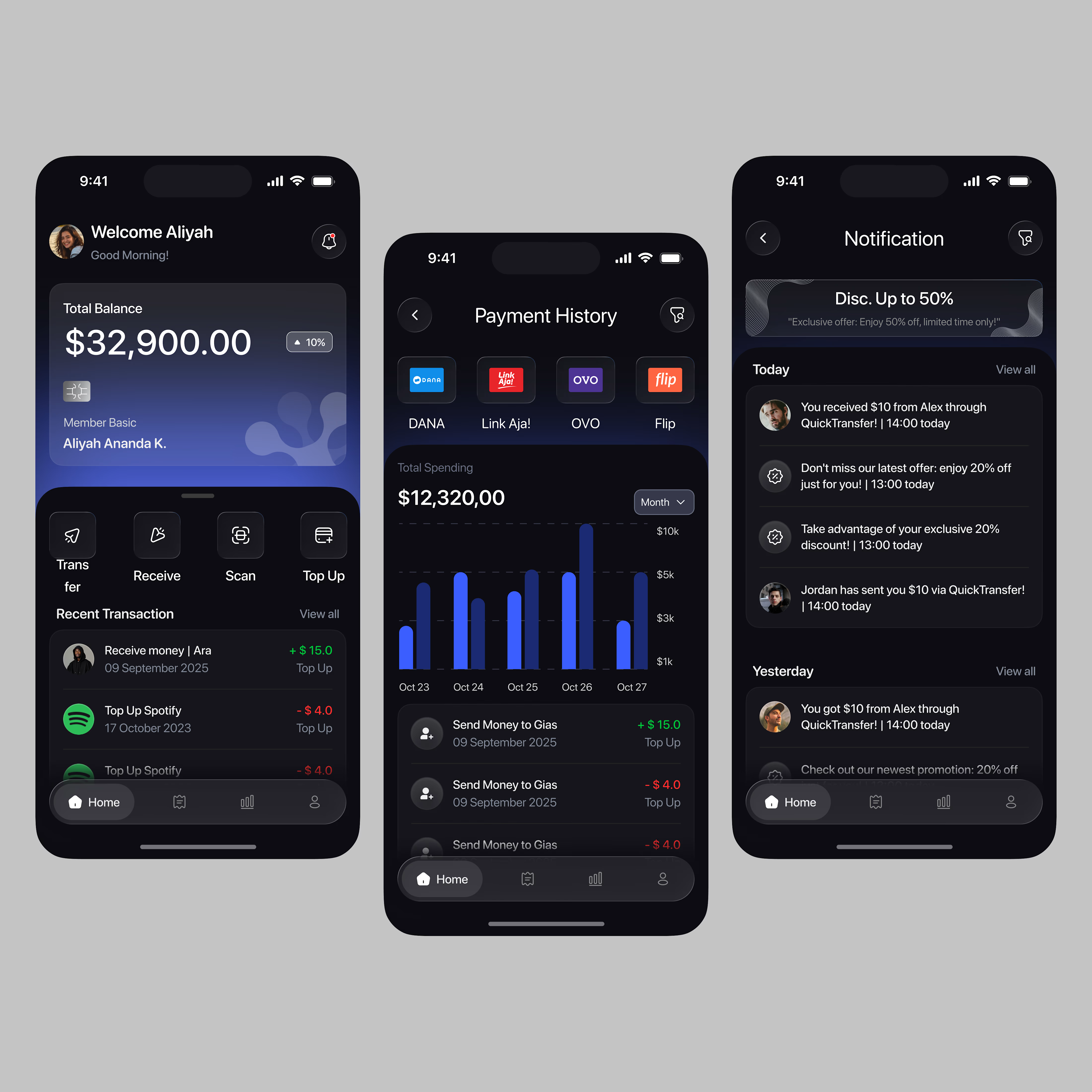
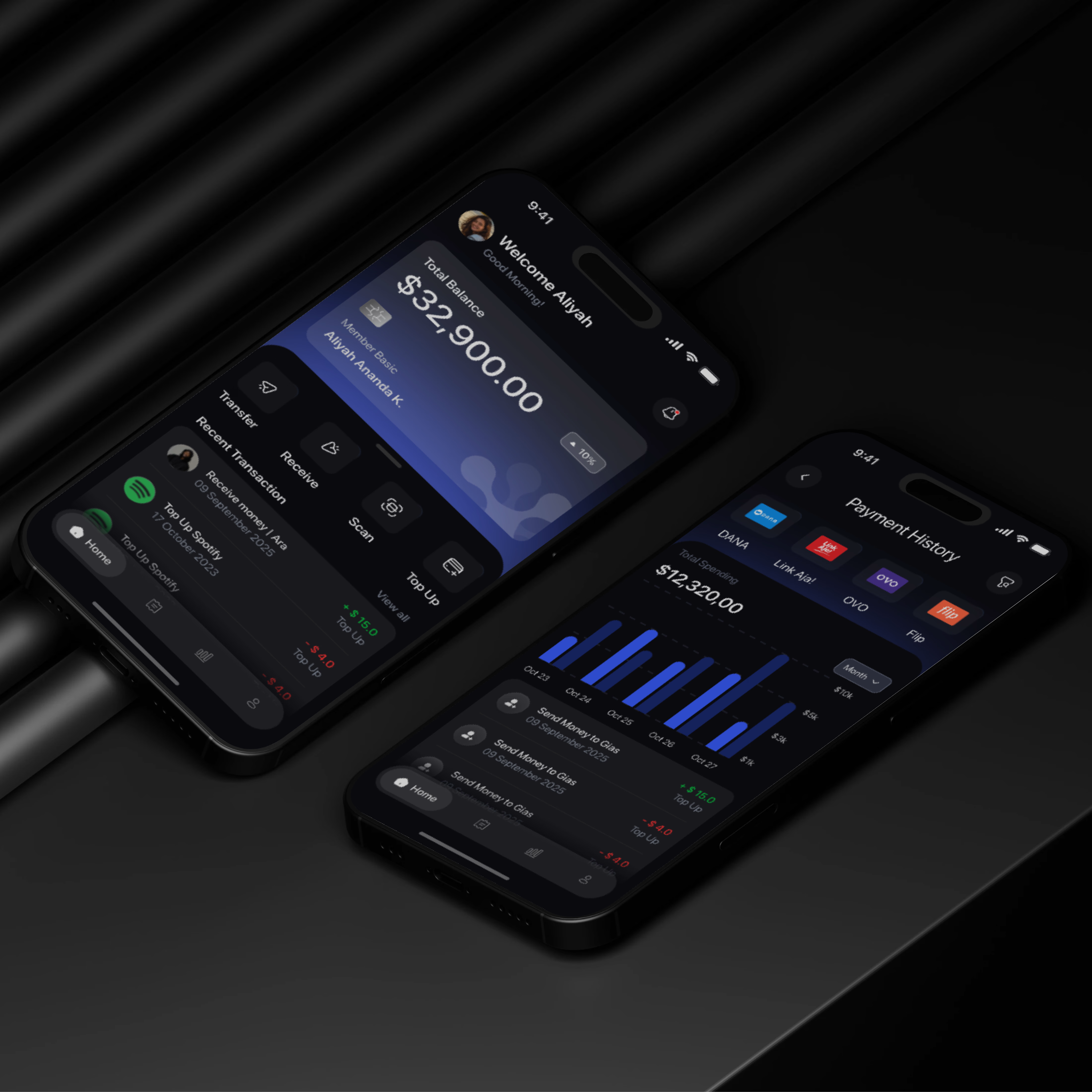
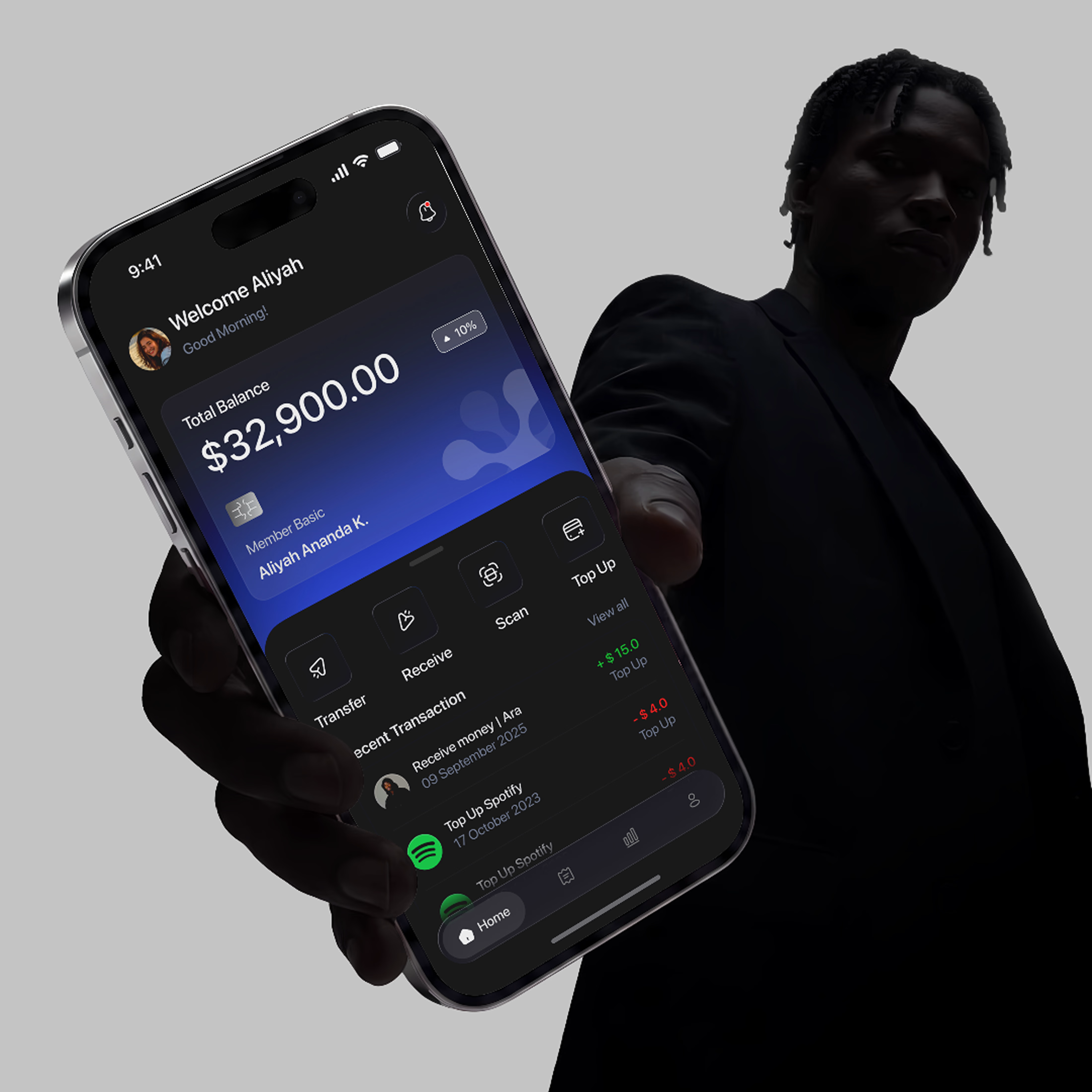
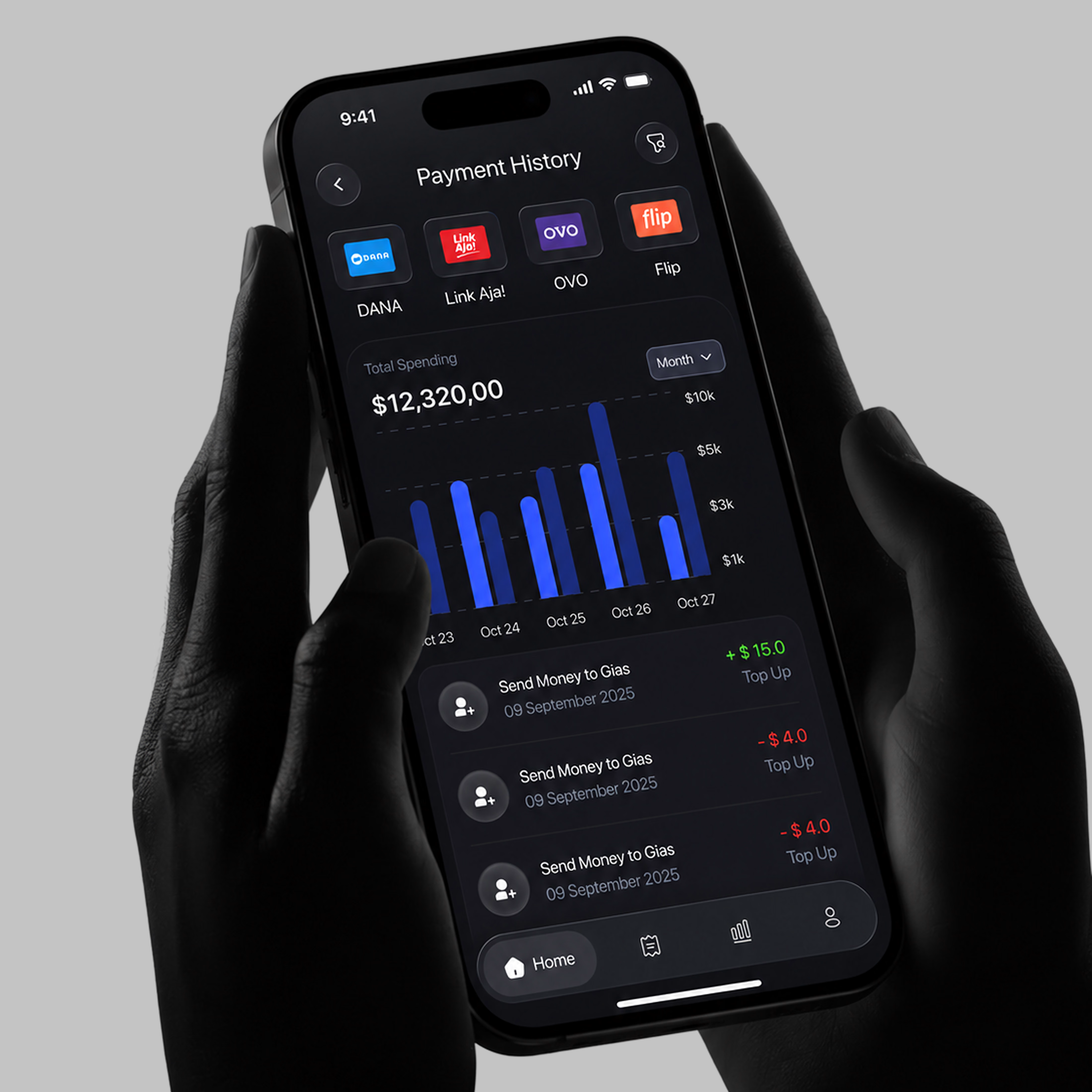

A little sneak peek at what I’ve been working on!