The network for creativity
Join 1.25M professional creatives like you
Connect with clients, get discovered, and run your business 100% commission-free
Creatives on Contra have earned over $150M and we are just getting started
Back to feedPost

I am happy to share that I have created a whatsapp community for UI UX designing
where we react to junior designers designs and help them improve also will share free designing resources
community Link https://chat.whatsapp.com/C8GkmBV6vnjCImHGbXi5lj

chat.whatsapp.com
Inertia UI - Designing community
WhatsApp Group Invite
The network for creativity
Join 1.25M professional creatives like you
Connect with clients, get discovered, and run your business 100% commission-free
Creatives on Contra have earned over $150M and we are just getting started





Related posts

🛒 Flipkart App — UI/UX Mistakes & Solutions
I explored the Flipkart app from a UI/UX perspective and identified several areas where the user experience could be improved.
From information overload and banner clutter to visual hierarchy, notifications, filters, product cards and checkout flow — small design decisions can have a big impact on how easily users browse and shop.
For each mistake, I explored a practical UX solution focused on clarity, simplicity and a smoother user journey.
4 explored — 3 more coming next. 🚀
Good UI gets attention. Great UX makes things easier.
#UIUX #UIDesign #UXDesign #Flipkart #UXCaseStudy #ProductDesign #UXDesigner #UIUXDesign #DesignProcess #ContraDesigner


Mistake and solution side by side is a clean teardown format. Provocative thought though: banner clutter on Flipkart is not a design mistake, it is paid placement. A fair critique should say what the fix costs in revenue, because that is the real reason it stays. That tradeoff would make this a senior-level case study.

Hi Contra people! I'm new here and would love to interact with other designers.
Web, Motion, Logo, Brand, UI/UX... if you are any kind of designer let's connect!
Here's a snippet of a new portfolio template I've been working on:


welcome in. that portfolio template scroll is smooth, framer?

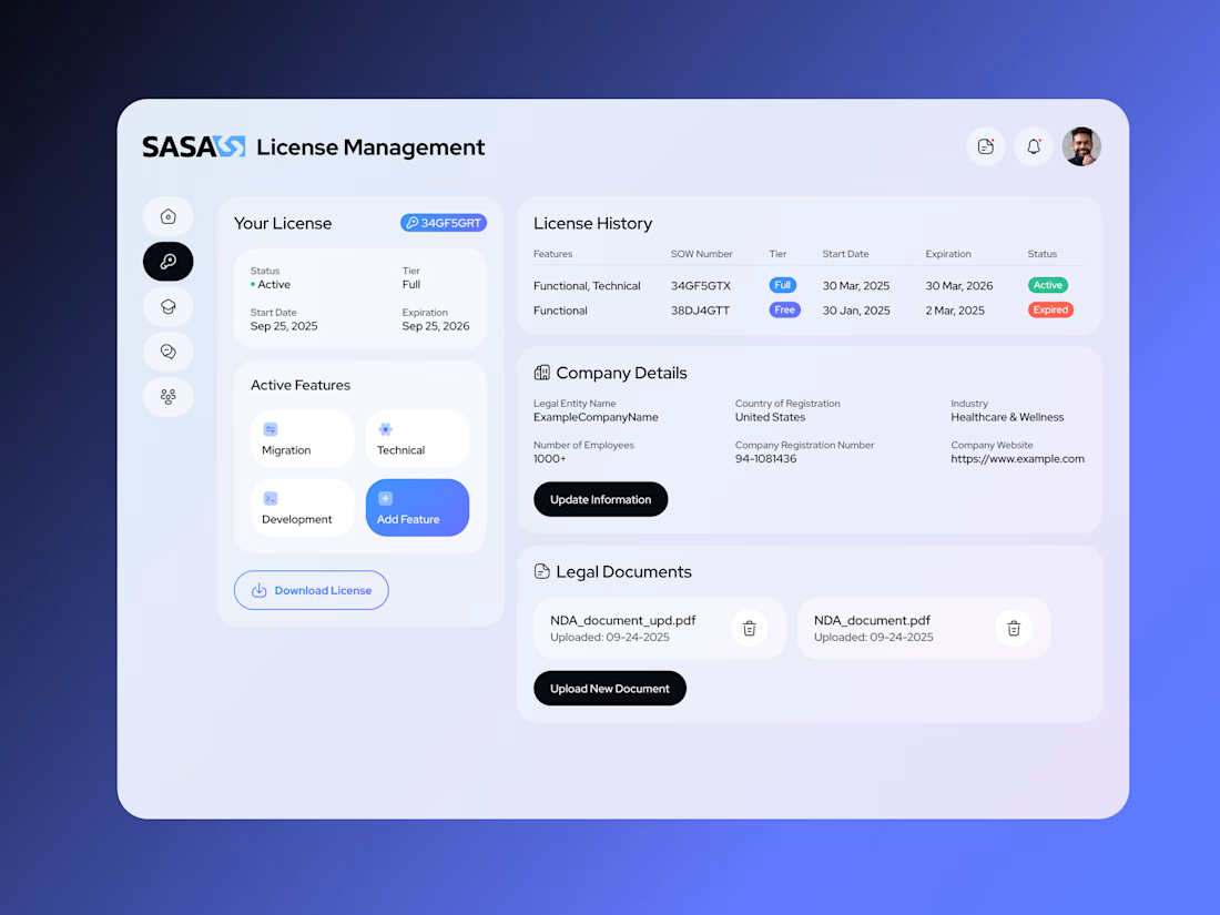
A look at my most recent large-scale UX/UI project: a B2B customer portal for license management, product training, and technical support.
I handled most of the design work, from clarifying requirements and mapping customer journeys to designing the interface and refining it with the client.
A significant part of the work happened before the screens. With limited initial information, I worked closely with the team and developer to piece together requirements and help define workflows that were still taking shape.
The designs shown in the case are the final client-approved screens, developed within strict color palette requirements.
Part of the MVP was built before the project paused. The customer-side design was completed; work on the company and support-side interface had begun.
The full case is now in my portfolio.