The network for creativity
Join 1.25M professional creatives like you
Connect with clients, get discovered, and run your business 100% commission-free
Creatives on Contra have earned over $150M and we are just getting started
Back to feedPost
Taste Test

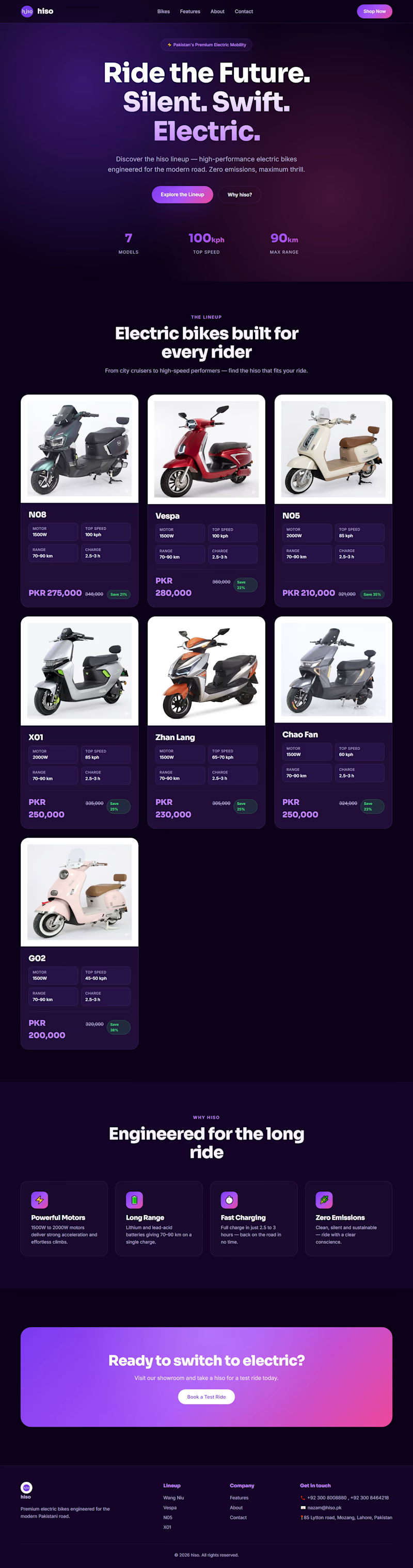
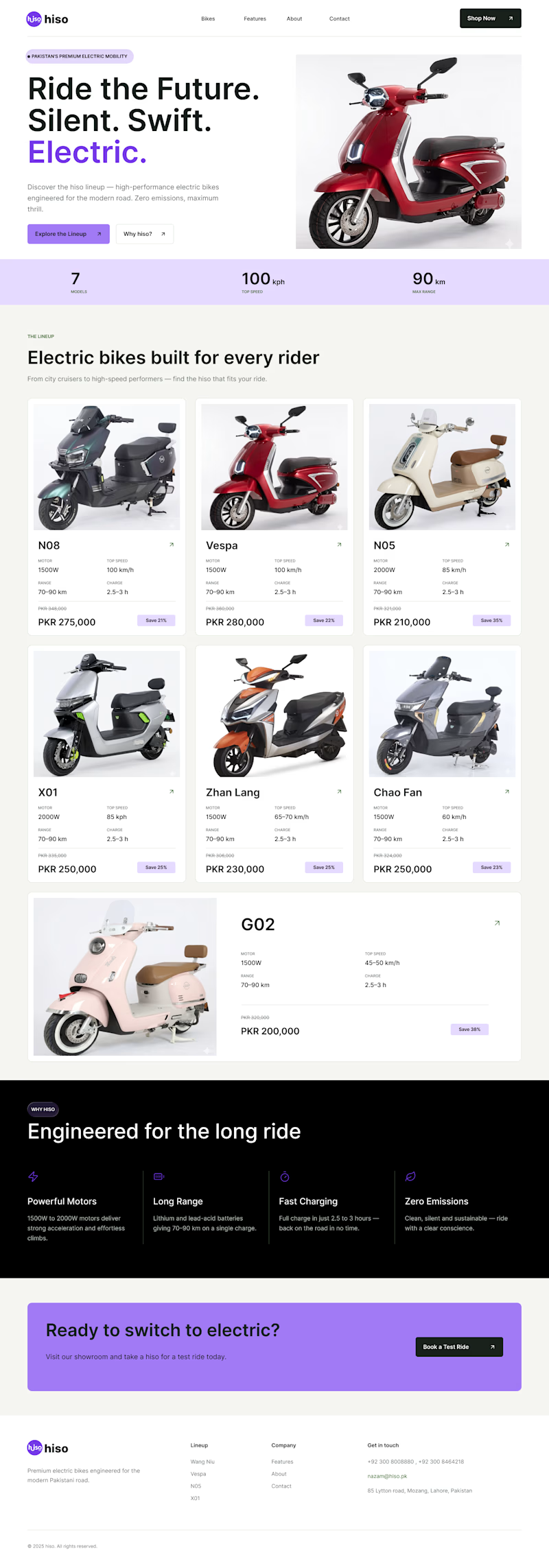
Which one is better ? Old or New
CASE STUDY Time !
I just noticed their website and saw that their color combination is hiding main information and disturbing users to focus on one thing
The theme was too dark with dark text which is making user to focus too much on text and clear price mention makes user things that it's too expensive
MY SOLUTION:
firstly I changed the color scheme
secondly I changed the text color and size
then I change cards style too make it much easier to focus o what user want to see
Then I added a %off tag which makes user to think It's an offer and it could end at any time soo buying right now is a golden oppurtunity.
1 vote
Ends in 1d

The network for creativity
Join 1.25M professional creatives like you
Connect with clients, get discovered, and run your business 100% commission-free
Creatives on Contra have earned over $150M and we are just getting started





Related posts

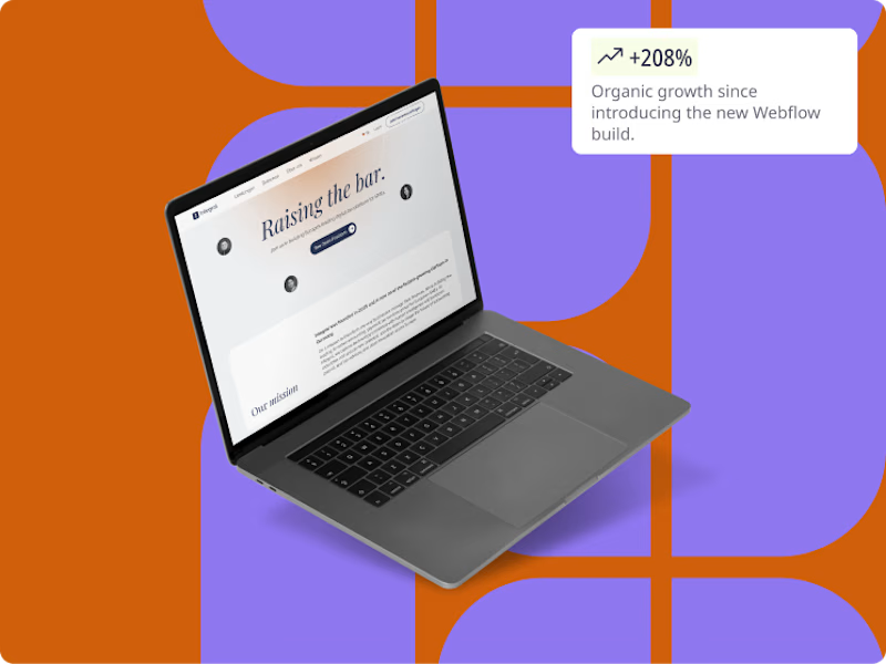
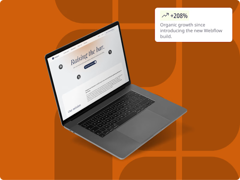
Which thumbnail do you prefer for a portfolio piece on a website?
High or low contrast background?🤔
5 voted
63%
3 voted
37%
8 votes
Closed

I would experiment more on how to make the project the hero of the illustration by keeping the background less dominant and letting the work speak for itself.

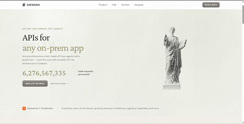
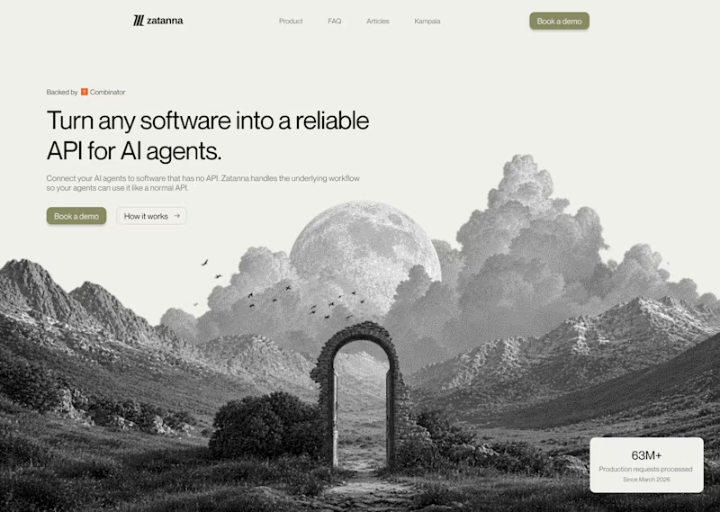


Looks great !


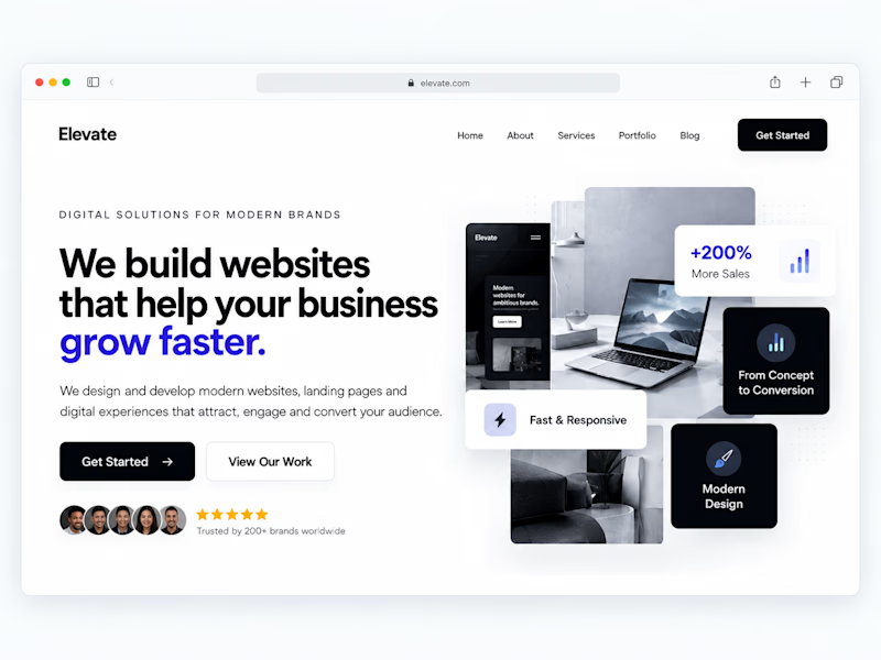
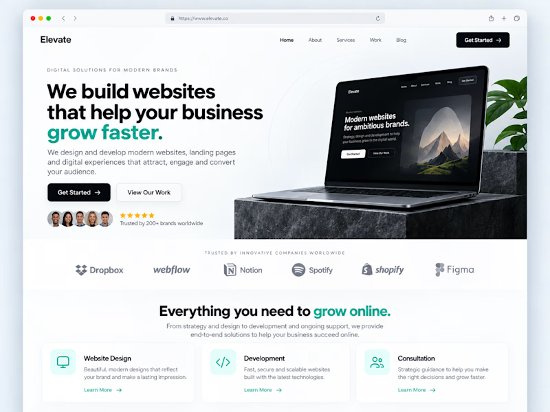
One of the easiest ways to make a website feel more professional:
Give your content more room to breathe.
Not every empty space needs another button, graphic, animation or paragraph.
Good spacing helps create:
• Better visual hierarchy
• Easier readability
• Clearer CTAs
• A more premium feel
Sometimes improving a website isn't about adding more.
It's about knowing what to remove.
Designers: do you prefer spacious layouts or more content-heavy websites?
#WebDesign #Webflow #UIDesign #Figma #WebsiteDesign
1 voted
33%
2 voted
67%
3 votes
Closed
