


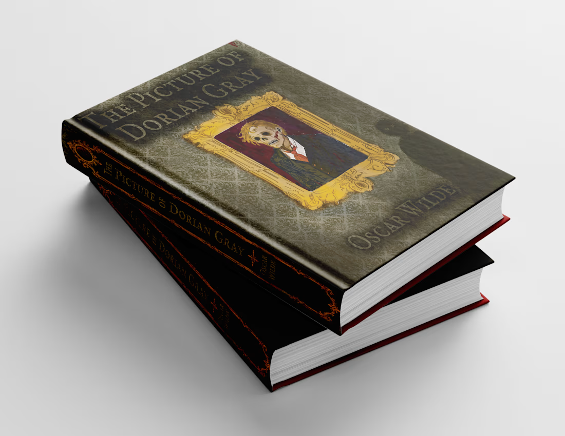
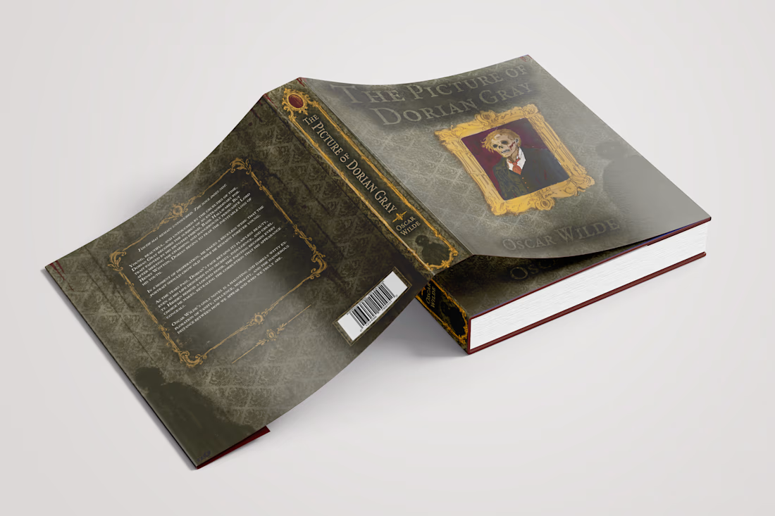
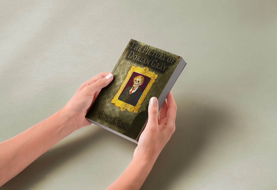
For the mockups, I wanted to see if the cover held onto the feeling I was aiming for: beautiful enough to draw you in, unsettling enough to make you look twice.
Here’s the finished Picture of Dorian Gray hardcover from a few angles. What detail draws your eye first?


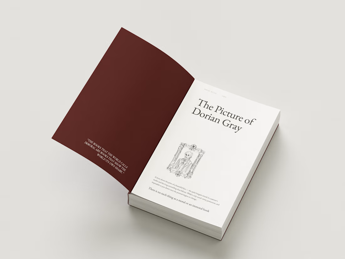
I shared the finished Picture of Dorian Gray cover earlier. This reel shows how I built it, one layer at a time, on the hardcover.
Seeing the wallpaper, frame, figure, and textures appear separately makes me notice what each one adds to the story. Which detail does the most work for you?
AZ Innovations came to me looking for a clean, elevated brand identity that felt different from the typical tech aesthetic. The brief called for a monogram/wordmark that would look strong across everything from invoices to digital platforms.
The interlocking “A” and “Z” represent...

Have you wondered how hacekrs bypass MFA? Nowadays it is getting easier. There is a phishing kit called Mirage2FA that has been working against Microsoft 36...

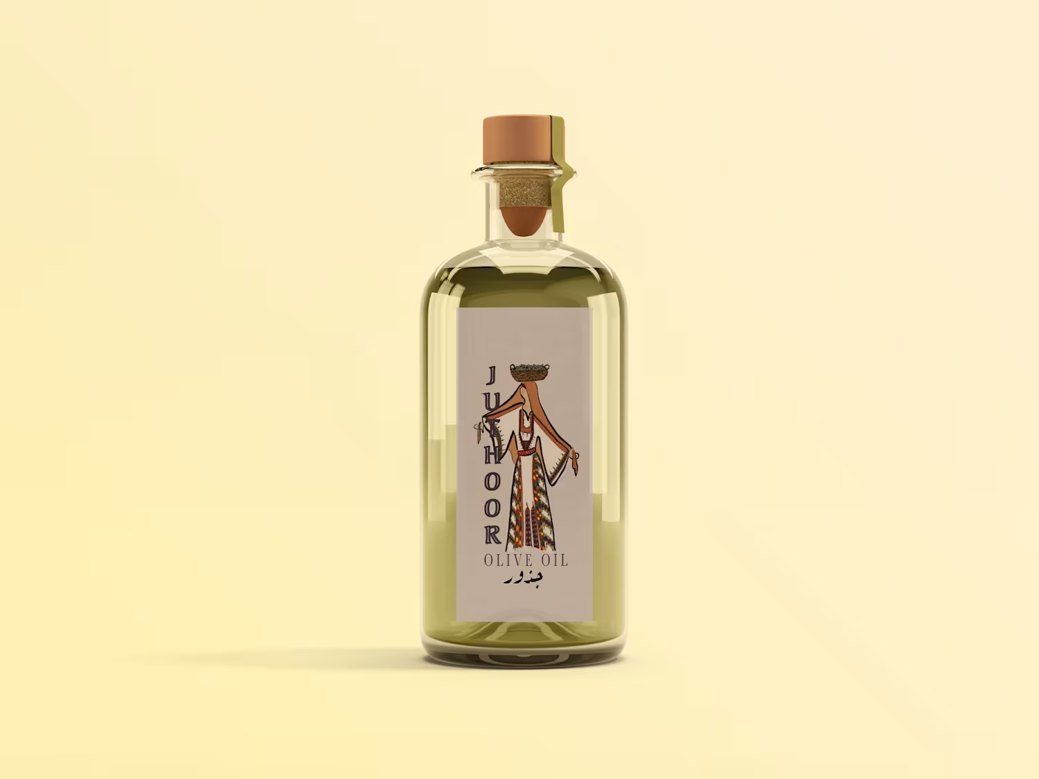
A small behind-the-scenes look at the Juthour Olive Oil identity.
This video shows part of the logo illustration process, from the initial drawing to seeing the mark applied on one of the packaging mockups. Since the full brand identity has already been shared, I wanted this post...


