Abir Odeh's Work | ContraWork by Abir Odeh
Abir Odeh

Abir Odeh

Logos, brand systems, and shelf-worthy book covers

    5.00
    Rating
    4
    Followers
A small behind-the-scenes look at the Juthour Olive Oil identity. This video shows part of the logo illustration process, from the initial drawing to seeing the mark applied on one of the packaging mockups. Since the full brand identity has already been shared, I wanted this post to focus more on the craft behind the mark and how it begins to live on the product. Sometimes the smallest details in a logo are what help the whole brand feel more grounded, intentional, and connected to its story.
2
66
Cover image for Elevate Brand Identity: Expanding Visual Systems Seamlessly
Recently, I expanded one of my brand identity projects into a new product line, and it reminded me how much branding goes beyond just a logo. For Juthoor, I expanded the existing visual identity into a spice product line by carrying the brand system across labels, lids, product photography, and a cohesive family of blends. The original identity already had its own personality, color story, typography, and visual direction. For this expansion, I focused on translating that foundation into a product line that felt cohesive, elevated, and true to the brand’s story. I wanted each product to feel distinct while still belonging to the same brand world. Traditional, warm, elegant, and rooted in cultural storytelling. The goal was for the new line to feel like a natural next chapter. Fresh, but still familiar. This is my favorite part of brand design. Creating a system that has enough personality to be memorable, but enough flexibility to grow with the business.
2
5
302
Cover image for Reimagined cover for The Picture
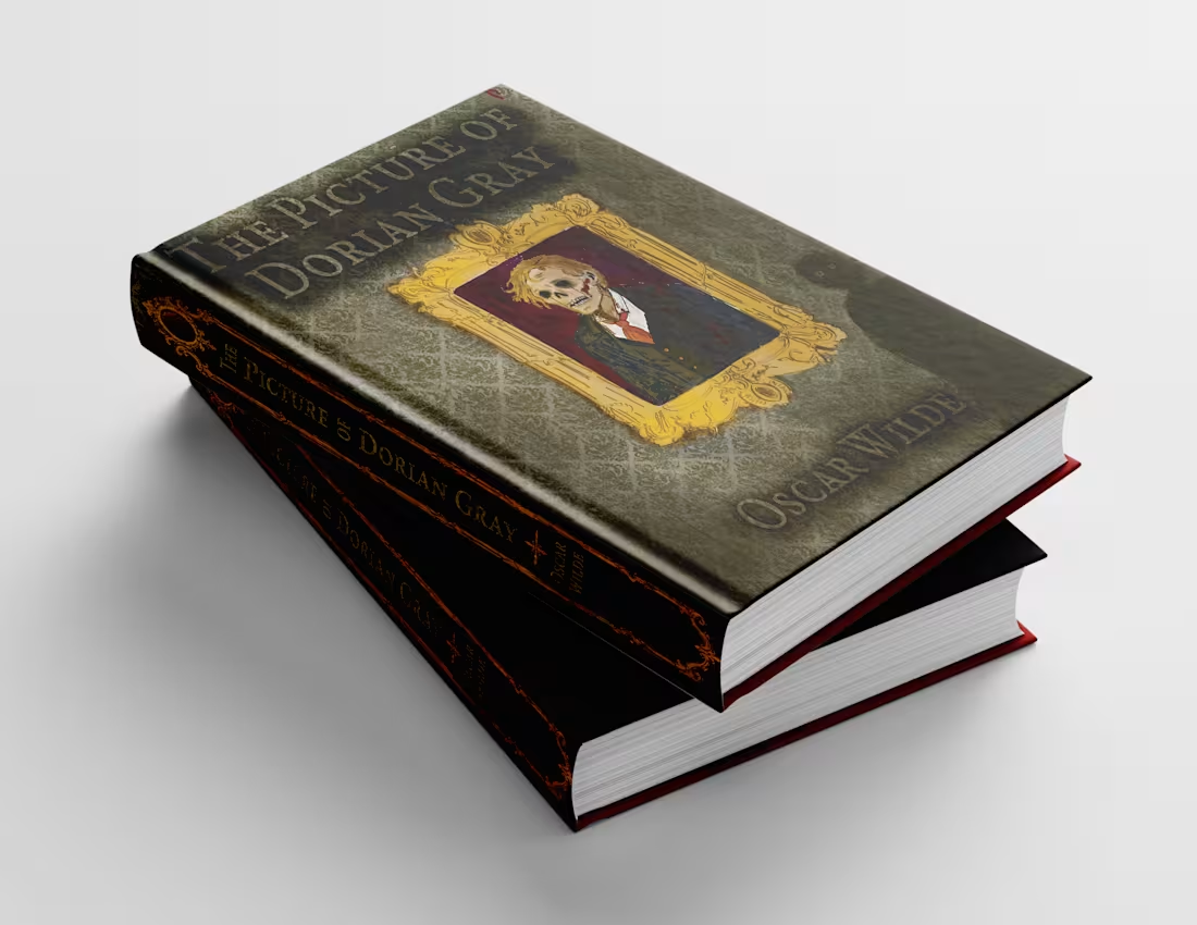
Reimagined cover for The Picture of Dorian Gray by Oscar Wilde. The whole book turns on one idea: Dorian stays young and beautiful while his portrait quietly rots in his place, absorbing every sin. The painting becomes a mirror of who he really is while his outward appearance remains untouched. So I flipped the usual setup. The decaying figure lives inside the gilded frame, while Dorian himself becomes the shadow in the corner—faceless, reduced to two pale eyes watching what he’s become. That’s the part of the story I wanted on the shelf. Everything else builds around that idea: sickly green damask wallpaper for a Victorian drawing room gone to rot, a hand-drawn gold frame to represent beauty and vanity, and a restrained color palette where the only real color comes from the red of his tie and the blood. I then layered in distressed textures to make the cover feel less like a design and more like an object that’s been hanging in that house for far too long. The Picture of Dorian Gray is one of my favorite books of all time, so this was an especially fun project to bring to life.
0
117
Cover image for Baity already had their look
Baity already had their look down. They just needed a way to bring it off the screen and into the real world. So I made them a flyer/poster: something you can actually hand to someone that still nudges them back online. The bread photoshoot (theirs!) did so much of the work, bringing all that warmth and texture you really can't fake. And the QR code handles the rest, turning a quick glance into an easy next step. Honestly, this is my favorite kind of work: brand systems that live beyond the logo. Every little touchpoint, from identity to print, should feel intentional, recognizable, and actually useful.
1
2
217
Cover image for This branding project was created
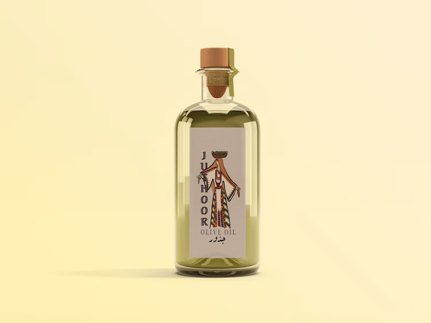
This branding project was created for Juthoor, a Palestinian olive oil brand rooted in heritage, resilience, and cultural identity. The name “Juthoor,” meaning roots, represents connection to land, family, legacy, and belonging. The visual identity was inspired by centuries of Palestinian olive harvest traditions and centered around storytelling through symbolism. The final logo features a respected Palestinian woman (“Haja”) in traditional dress carrying olives — reflecting the generations of women who nurtured the land and preserved these traditions through time. Drawing inspiration from olive trees, handcrafted harvesting, traditional embroidery, and the landscapes of Palestine, the branding was designed to feel timeless, authentic, and deeply human. More than a product, the identity represents heritage, resilience, and a return to the roots.
0
238
Cover image for Design Solutions Construction is a
Design Solutions Construction is a full-service contracting company focused on residential and commercial spaces that blend modern design with lasting craftsmanship. This branding project was built around the idea that strong construction starts with strong design. The geometric logo draws inspiration from architectural structures and rooflines, symbolizing growth, precision, and the progression from concept to completion. Clean lines and minimalist spacing create a modern identity that feels both professional and dependable.
1
253
Cover image for Baity is a home catering brand
Baity is a home catering brand rooted in Palestinian and Middle Eastern cuisine, created to bring the warmth of home-cooked meals to the Southeastern Tennessee community. Inspired by the Arabic word for “my home,” the identity was designed to reflect comfort, hospitality, and cultural connection. For this brand identity, I developed a playful yet rustic visual system paired with a warm, earthy color palette to capture the handmade and welcoming nature of Baity’s food. The goal was to create a brand that feels authentic, inviting, and deeply personal—balancing tradition with a modern, approachable aesthetic.
0
229
Cover image for AZ Innovations is an IT
AZ Innovations is an IT consulting company specializing in cloud infrastructure, cybersecurity, and enterprise technology solutions. Their work centers on helping businesses build secure, scalable, and future-ready digital ecosystems. For this project, the objective was to develop a brand identity that reflects both technical sophistication and strategic leadership. The visual direction focuses on clean geometry, confident typography, and balanced contrast to create a system that feels innovative, trustworthy, and highly professional. The identity was extended into realistic brand applications and 3D mockups to demonstrate versatility across multiple environments. From digital experiences to physical installations, the branding was designed to maintain a strong, recognizable presence while reinforcing AZ Innovations’ position as a modern technology partner.
1
251
Cover image for Knitty Gritty Witty is a
Knitty Gritty Witty is a handmade knitting and fiber arts brand that I designed from concept to execution. I developed the visual identity, logo, color palette, brand direction, and digital presentation to create a cozy, playful, and professional identity. The project showcases my ability to build a creative brand from the ground up, blending storytelling, product design, and e-commerce-focused visuals.
2
1
289
Cover image for Baity Cooking - Palestinian and Middle Eastern catering
Baity Cooking - Palestinian and Middle Eastern catering
0
0
Cover image for Design Solutions Construction Brand
Design Solutions Construction Brand
1
4
Cover image for AZ Innovations | Brand Identity
AZ Innovations | Brand Identity
0
3
Cover image for Juthoor Olive Oil company
Juthoor Olive Oil company
0
4
Cover image for Knitty Gritty Witty Fiber Art design project
Knitty Gritty Witty Fiber Art design project
0
3