The network for creativity
Join 1.25M professional creatives like you
Connect with clients, get discovered, and run your business 100% commission-free
Creatives on Contra have earned over $150M and we are just getting started
Back to feedPost

AZ Innovations came to me looking for a clean, elevated brand identity that felt different from the typical tech aesthetic. The brief called for a monogram/wordmark that would look strong across everything from invoices to digital platforms.
The interlocking “A” and “Z” represent the company’s mission to bridge vision and execution from start to finish. Violet communicates creativity and trust, while chartreuse adds energy and forward momentum.
The result: a bold, adaptable identity built around innovation, precision, and high-end service. ⚡️


Interlocking the first and last letters of the alphabet is a lucky accident of the name - A to Z quietly says end-to-end before anyone reads the tagline. The invoice test you mention is underrated too: a monogram that survives mono black on a PDF usually survives everything. Was...
The network for creativity
Join 1.25M professional creatives like you
Connect with clients, get discovered, and run your business 100% commission-free
Creatives on Contra have earned over $150M and we are just getting started











Related posts

A little peek at the brand work we did for Elio Mortgage.
A warm, approachable identity full of warm vibrant colors paired with soft sun rising inspired gradients, inner glows and custom illustrations & more. Loved this direction!
Full case study coming soon, from process to final identity.
Plenty of logo explorations to share too!


That color palette takes the whole identity to a different level!! I loove it.

Brand Expressions -- Olivir



Thats so crazy!!!!!! Seeing this I feel we humans are still far better than AI

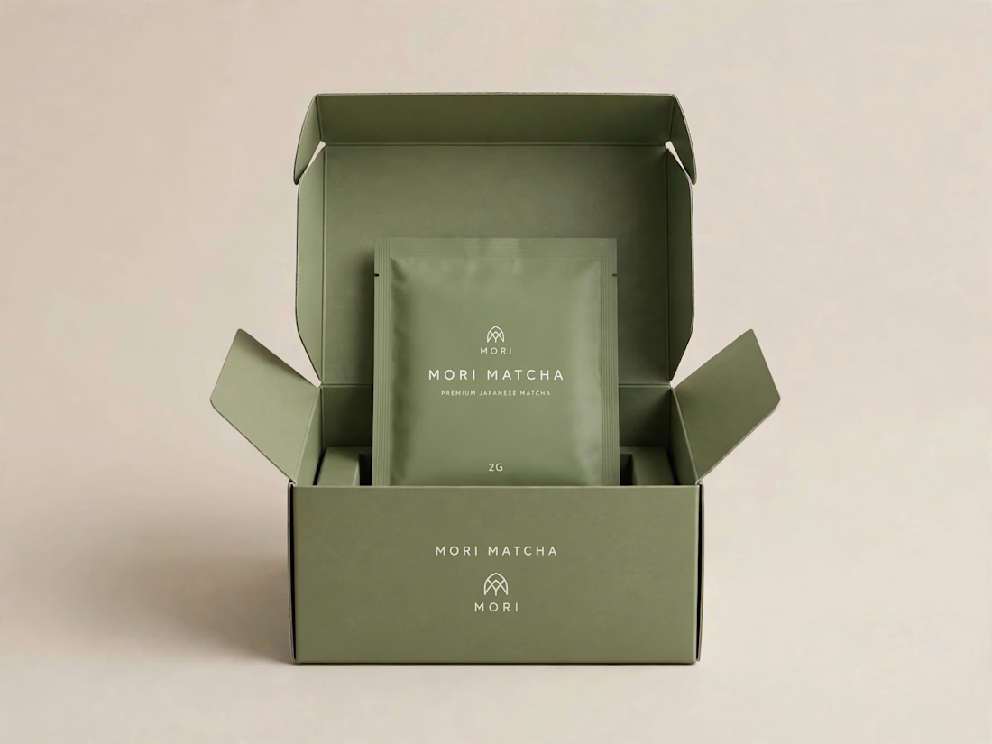
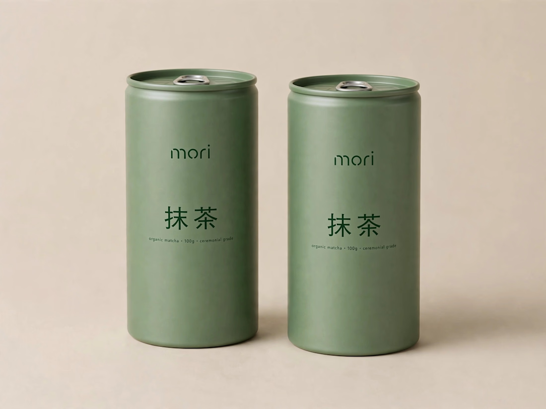
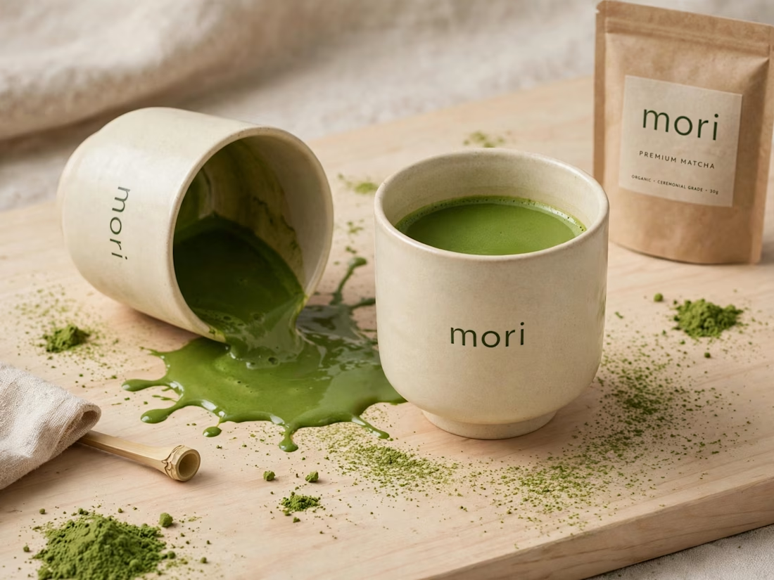
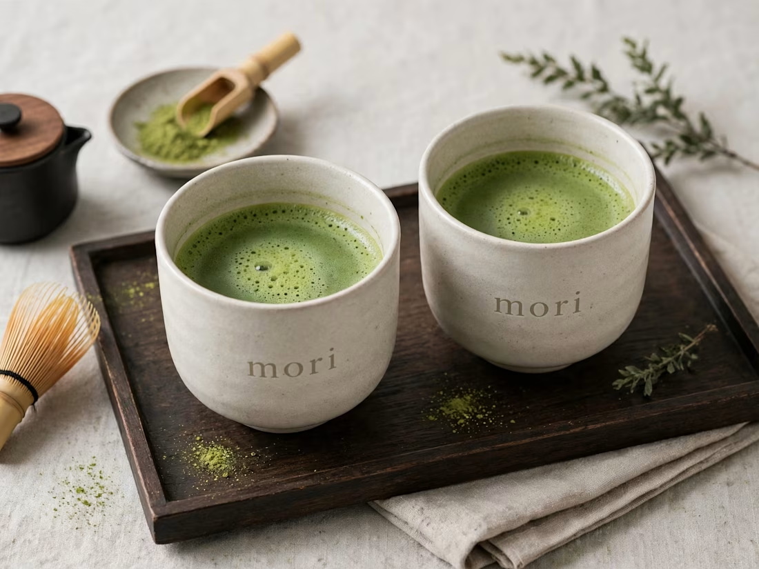
more visuals from my latest project — mori matcha 🍵
explored minimal Japanese packaging with earthy greens and calm typography.
focusing on premium ceramic cups and clean can design.
#branddesign #packagingdesign #visualidentity #brandstrategy #matcha #minimaldesign #japanesedesign #figma #mockup #branding