
pro
Atiya Zehra
UI/UX Designer | Framer & Video Editing
- $1k+
- Earned
- 3x
- Hired
- 5.0
- Rating
- 36
- Followers


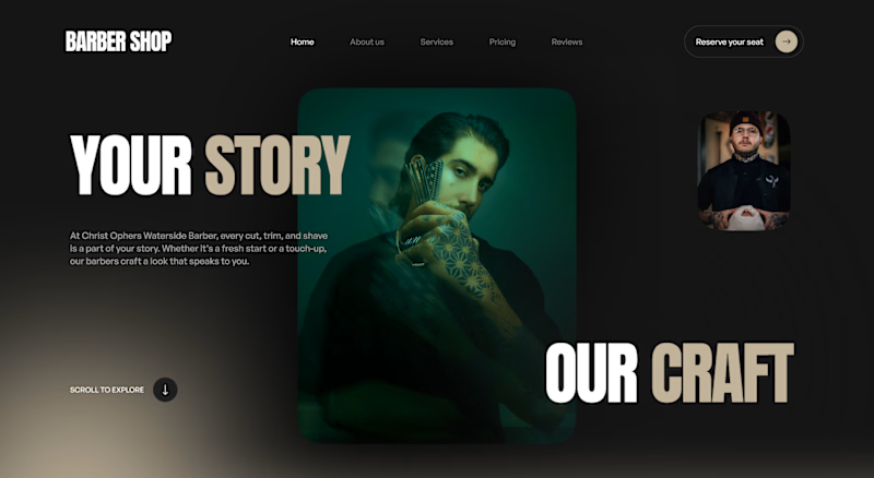
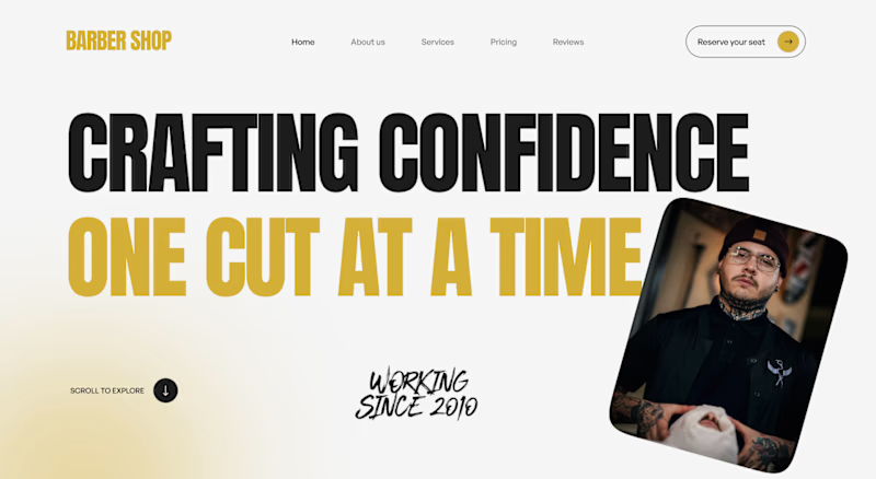
Two directions for a barber shop landing page hero, testing which one lands better.
V1 goes moody, dark green tones with a cinematic full bleed portrait and a quiet "Your Story, Our Craft" line. V2 goes bold, black and gold with a punchy "Crafting Confidence" headline and a...


5 voted
63%
3 voted
37%
8 votes
Closed
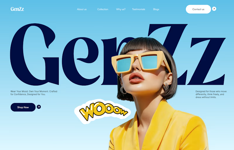
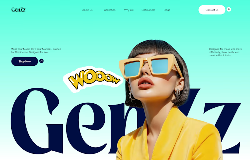
Working on a hero section for GenZz, a bold Gen Z eyewear and fashion brand. Testing two color directions for the landing page and honestly torn between them.
Version 2 has a mint to teal gradient background. Version 1 shifts it to a sky blue gradient. Same layout, same...
10 voted
59%
7 voted
41%
17 votes
Closed
Which version works better for you? 👀
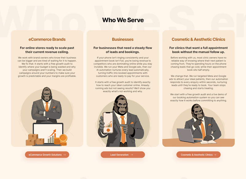
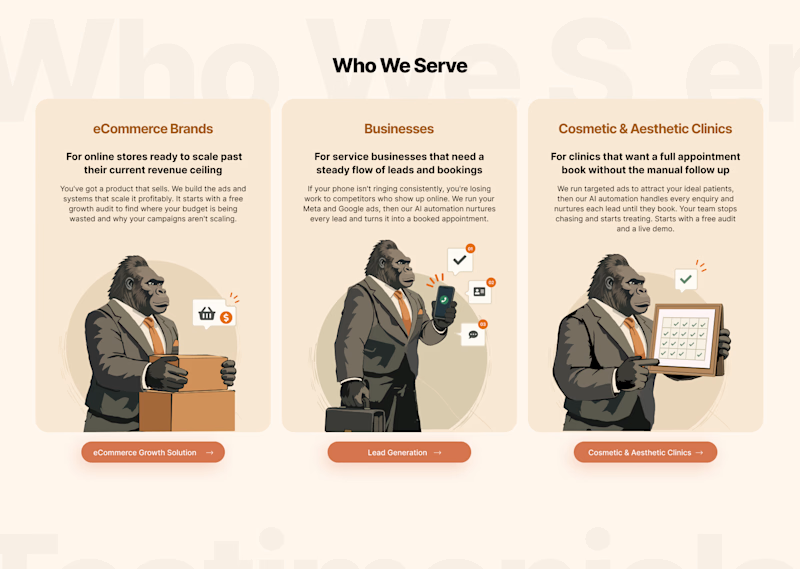
I’ve created two variations of the same design with a slightly different visual approach. I’d love to get the community’s perspective on which one feels more engaging, clear, and effective.
Option 1 or Option 2?
Drop your vote below and, if...

2 voted
100%
0 voted
0%
2 votes
Closed
🙌
RECOMMENDED
“Atiya has a good understanding of brands and delivers great work. I can only recommend it.”


Pietro V.
Captains Essentials