The network for creativity
Join 1.25M professional creatives like you
Connect with clients, get discovered, and run your business 100% commission-free
Creatives on Contra have earned over $150M and we are just getting started
Back to feedPost
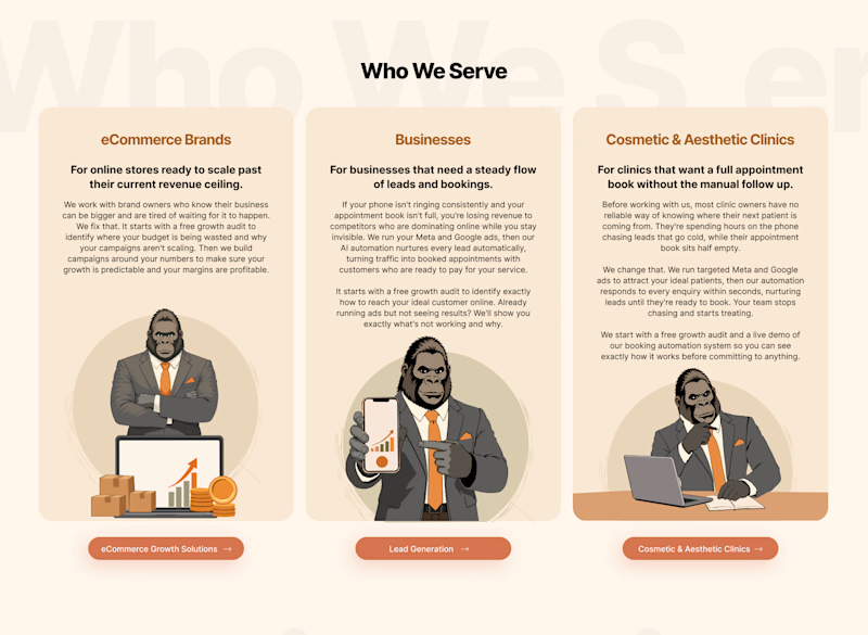
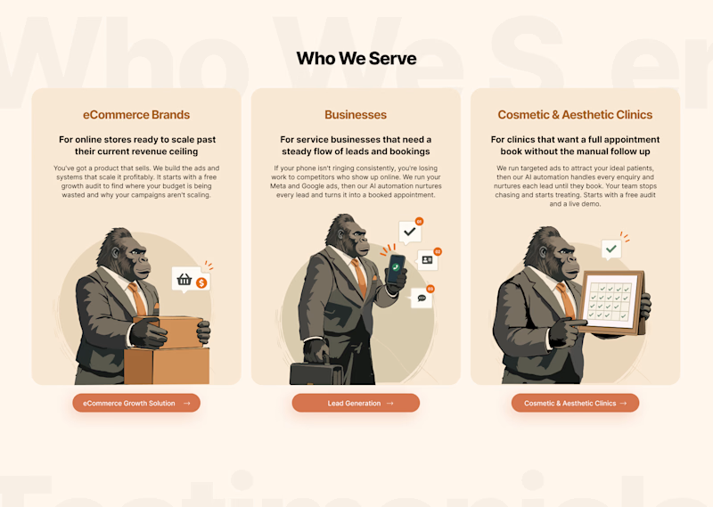
Taste Test

Which version works better for you? 👀
I’ve created two variations of the same design with a slightly different visual approach. I’d love to get the community’s perspective on which one feels more engaging, clear, and effective.
Option 1 or Option 2?
Drop your vote below and, if you can, let me know why you prefer one over the other. Your feedback will help me decide which direction to move forward with! 🙌


2 voted
100%
0 voted
0%
2 votes
Closed

TBH, I needed the headings to tell the three apart in both versions. The eCommerce card is actually the strongest of the lot — boxes and coins say "online store" instantly. The problem is the other two: Businesses is a suit holding the same growth chart, so it blurs into card...


the warm orange option is my pick

I would like to go with V1
The network for creativity
Join 1.25M professional creatives like you
Connect with clients, get discovered, and run your business 100% commission-free
Creatives on Contra have earned over $150M and we are just getting started









Related posts

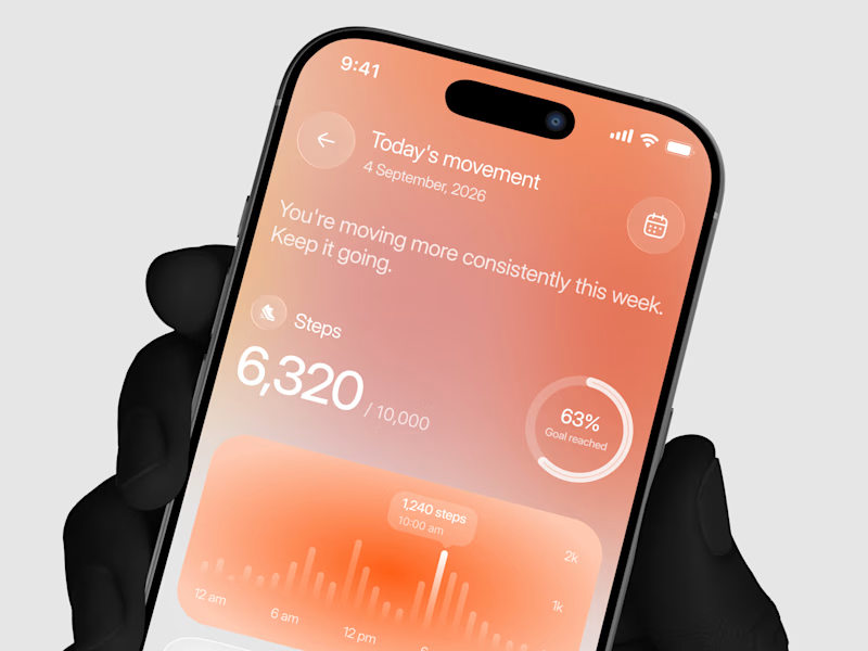
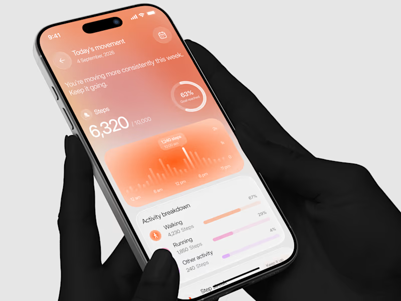
Designed a step tracking screen where you can see your daily progress and weekly trend in one glance.
Same screen, two shots. Which one would stop your scroll? 👀

11 voted
73%
4 voted
27%
15 votes
Closed


Two page transitions, one site. Which one feels better to you?

5 voted
83%
1 voted
17%
6 votes
Closed

Kinetic Reveal feels more natural ❤️❤️
great job Dayyan🎉🎉

Same Design.com promo, two crops. Square keeps the desk tight, wide gives the room its light. 1 or 2.
11 voted
73%
4 voted
27%
15 votes
Closed