The network for creativity
Join 1.25M professional creatives like you
Connect with clients, get discovered, and run your business 100% commission-free
Creatives on Contra have earned over $150M and we are just getting started
Back to feedPost
Taste Test

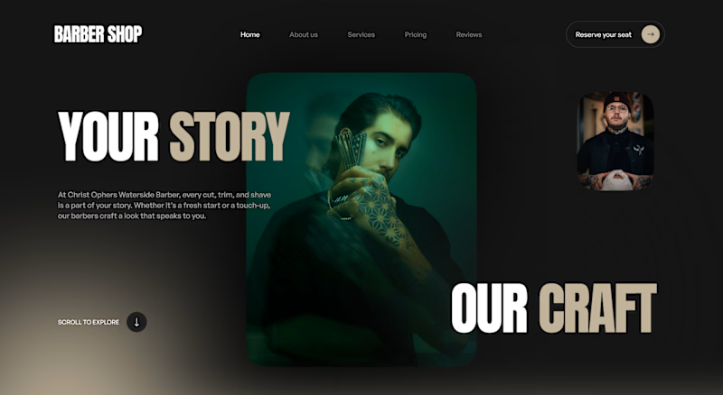
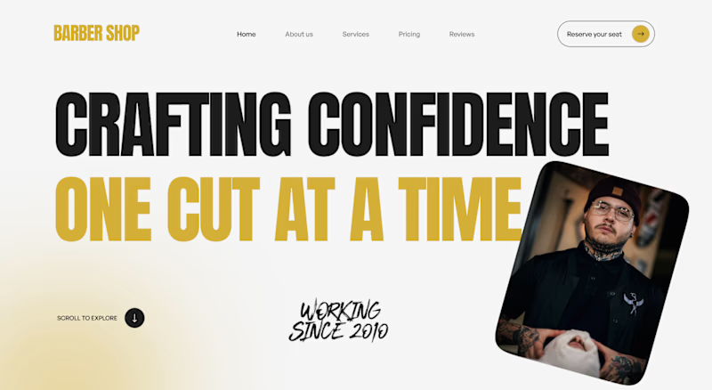
Two directions for a barber shop landing page hero, testing which one lands better.
V1 goes moody, dark green tones with a cinematic full bleed portrait and a quiet "Your Story, Our Craft" line. V2 goes bold, black and gold with a punchy "Crafting Confidence" headline and a tilted portrait card breaking the grid. Same shop, two completely different first impressions.
Trying to figure out which direction actually serves the brand better long term versus which one just wins on first impressions.


5 voted
63%
3 voted
37%
8 votes
Closed

Light and bold feels more modern and attractive I like it ❤️❤️

V1 Dark and Moody. It makes the shop feel like a high-end experience instead of just a quick haircut. That cool stylish vibe will stick in people's minds much longer.
The network for creativity
Join 1.25M professional creatives like you
Connect with clients, get discovered, and run your business 100% commission-free
Creatives on Contra have earned over $150M and we are just getting started











Related posts

Hey everyone! 👋
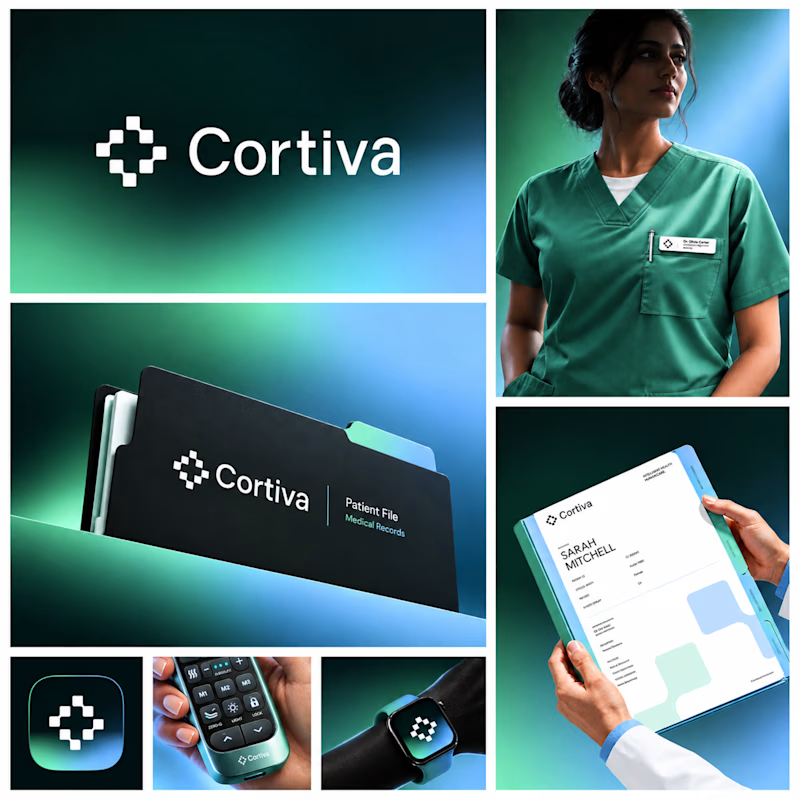
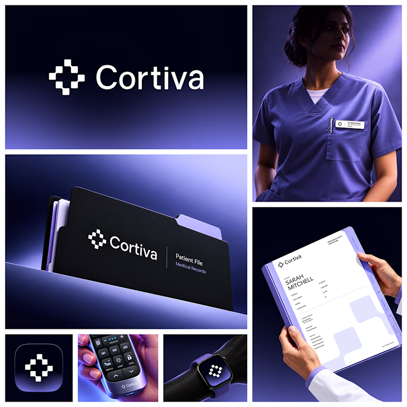
Working on Cortiva, an AI-first hospital branding project.
I've already finalized the color direction, but I thought it would be fun to explore two different moods.
Option 01💚 or Option 02? 💜
Both have their own personality, and I'm curious to see which one you prefer!
Let's see which one wins! 👀
5 voted
33%
10 voted
67%
15 votes
Closed

Option 01 for me. Green gets to "care" faster in a hospital setting, while the violet pulls the whole system toward a tech product. Since the identity is AI-first, I'd be curious whether you want patients to read it as clinical or as friendly first.

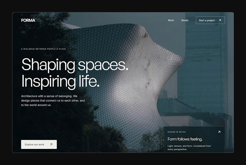
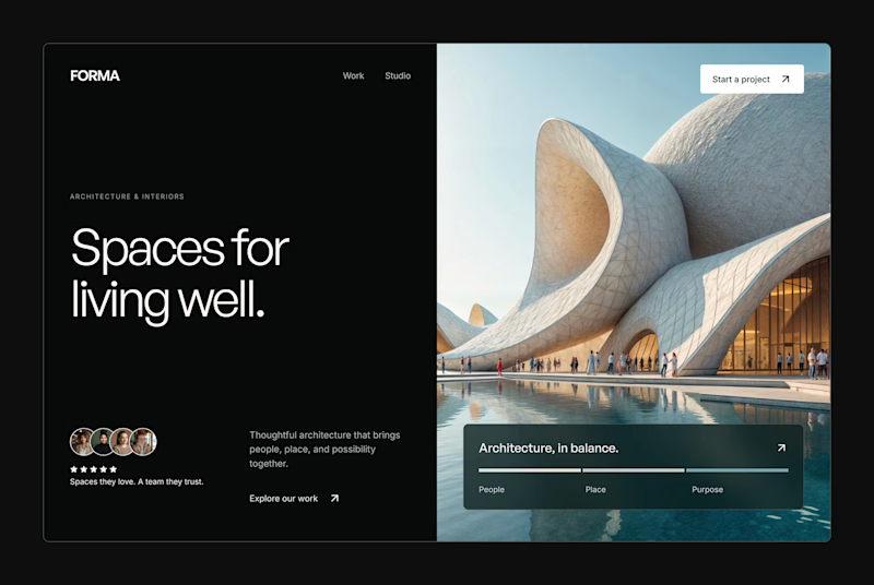
Design Exploration: Hero Section of Architecture Website. Which one do you think much better?


12 voted
43%
16 voted
57%
28 votes
Closed


FOCUS — Creative Portfolio & Digital Art Website 🌸✨
A visually expressive website concept for a creative portfolio, built around digital art, bold imagery, and visual storytelling
The design combines vibrant pink tones, soft gradients, experimental typography, and immersive photography to create a distinctive editorial experience
Special attention was given to:
• Bold editorial hero composition
• Vibrant pink and dark color palette
• Experimental typography and visual details
• Immersive photography and digital artwork
• Creative project gallery and navigation
• Responsive mobile experience
• Clean layouts with a strong visual identity
The result is an expressive digital experience that puts creativity, emotion, and visual storytelling at the center of every screen 💗
Looking to create a standout portfolio or website for a creative brand? Let’s connect 🚀





The vibrant pink against the dark palette gives this such a bold editorial feel. The experimental typography is the star here.