The network for creativity
Join 1.25M professional creatives like you
Connect with clients, get discovered, and run your business 100% commission-free
Creatives on Contra have earned over $150M and we are just getting started
Back to feedPost
Taste Test

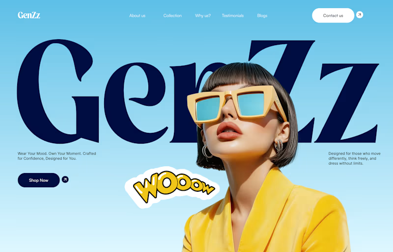
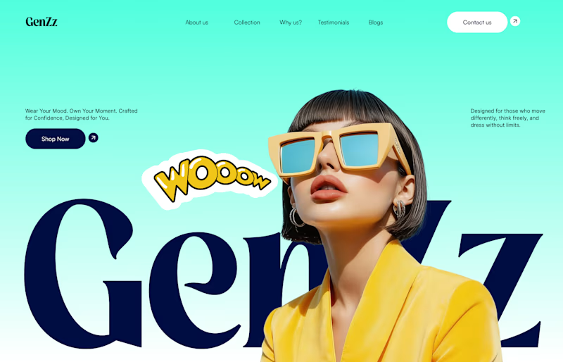
Working on a hero section for GenZz, a bold Gen Z eyewear and fashion brand. Testing two color directions for the landing page and honestly torn between them.
Version 2 has a mint to teal gradient background. Version 1 shifts it to a sky blue gradient. Same layout, same typography, same energy, just a different mood in the backdrop.
Which one pulls you in more and why. Curious if the mint feels more playful and on brand for Gen Z, or if the blue reads cleaner and more premium.
Would love your honest take before I lock this in with the client.


10 voted
59%
7 voted
41%
17 votes
Closed

The mint-to-teal direction feels especially ownable for a Gen Z eyewear brand—the contrast gives the product room to lead. I’d test the sky blue as a calmer secondary state so the system keeps a clear visual hierarchy.
Really appreciate the detailed take. That's exactly the direction I'm leaning too, using mint as the lead and blue as a calmer secondary state so the system has range without losing hierarchy. Good call.

Blue
Noted, thanks for weighing in.

Appreciate the vote, thank you

V1 for me. The sky blue feels fresher and makes the yellow pop really well.
Glad the blue tone is landing for you, and yeah the yellow really does pop against it. Good feedback, thank you.

Professional and impressive design work ! Good job
Thank you, really appreciate that.


the yellow sunglasses look so good
Thank you, that piece was fun to art direct.
cool, dmytro stands out. how long did this take?
Thanks. Took about 3 hours, concept to these two polished directions.
also, not sure I follow the dmytro reference, could you clarify?
cool, mohammad stands out. how long did this take?

I personally prefer green, it’s kind of trend color now and the menu is clear the only comment that I have Id you going to use green, try ti make the e bold text be dark green instead of dark blue to help both of them matching together

I love the choice of color


I'd go for V2
The network for creativity
Join 1.25M professional creatives like you
Connect with clients, get discovered, and run your business 100% commission-free
Creatives on Contra have earned over $150M and we are just getting started











Related posts

A little peek at the brand work we did for Elio Mortgage.
A warm, approachable identity full of warm vibrant colors paired with soft sun rising inspired gradients, inner glows and custom illustrations & more. Loved this direction!
Full case study coming soon, from process to final identity.
Plenty of logo explorations to share too!


That color palette takes the whole identity to a different level!! I loove it.

Brand Expressions -- Olivir



Thats so crazy!!!!!! Seeing this I feel we humans are still far better than AI

FOCUS — Creative Portfolio & Digital Art Website 🌸✨
A visually expressive website concept for a creative portfolio, built around digital art, bold imagery, and visual storytelling
The design combines vibrant pink tones, soft gradients, experimental typography, and immersive photography to create a distinctive editorial experience
Special attention was given to:
• Bold editorial hero composition
• Vibrant pink and dark color palette
• Experimental typography and visual details
• Immersive photography and digital artwork
• Creative project gallery and navigation
• Responsive mobile experience
• Clean layouts with a strong visual identity
The result is an expressive digital experience that puts creativity, emotion, and visual storytelling at the center of every screen 💗
Looking to create a standout portfolio or website for a creative brand? Let’s connect 🚀





The vibrant pink against the dark palette gives this such a bold editorial feel. The experimental typography is the star here.