Waju UI/UX
Award Winning Saas I B2B I Fintech Product and Web Designer
Profile in progress
Waju is building their profile!

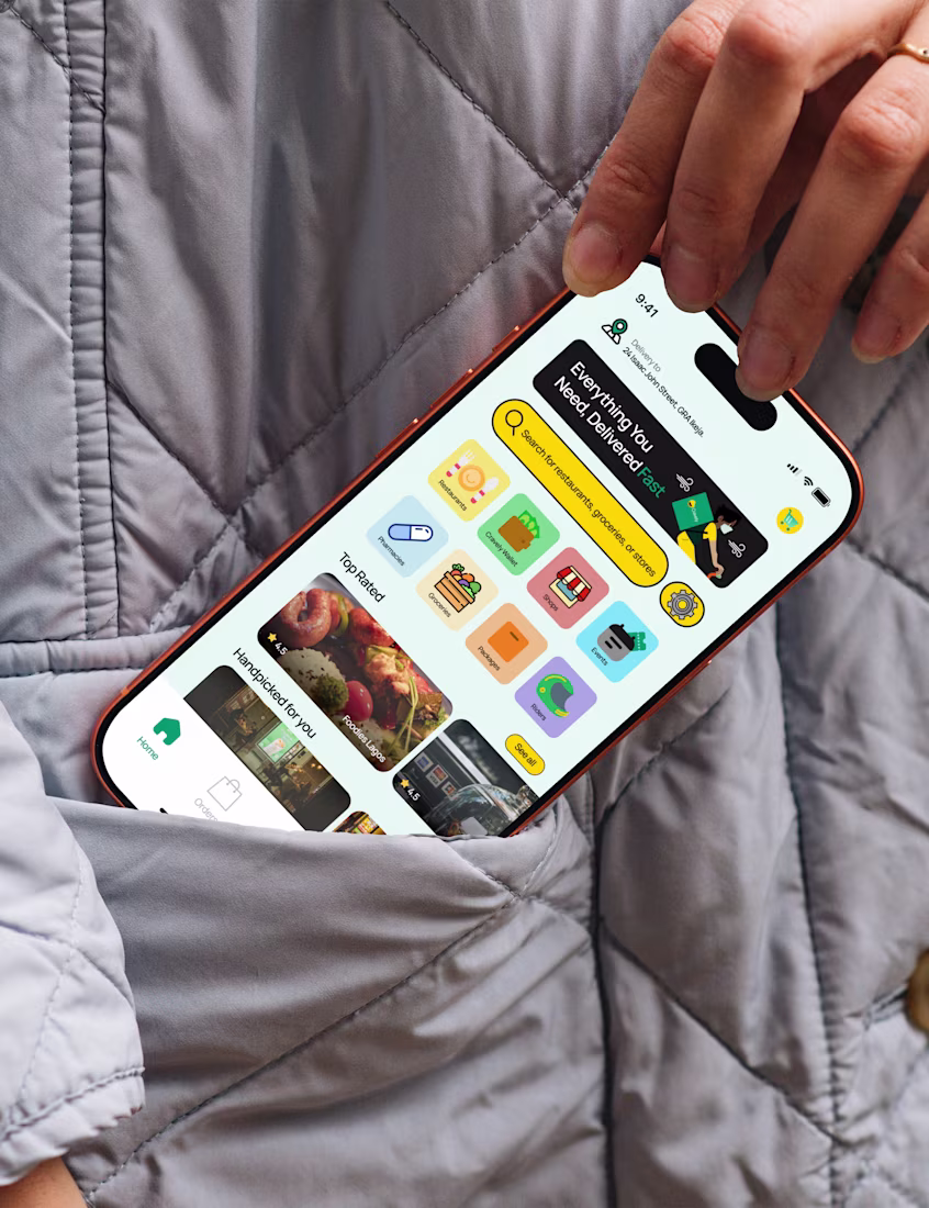
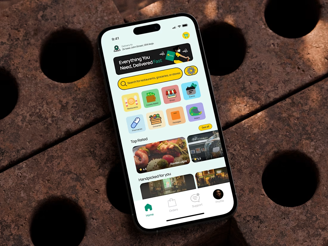
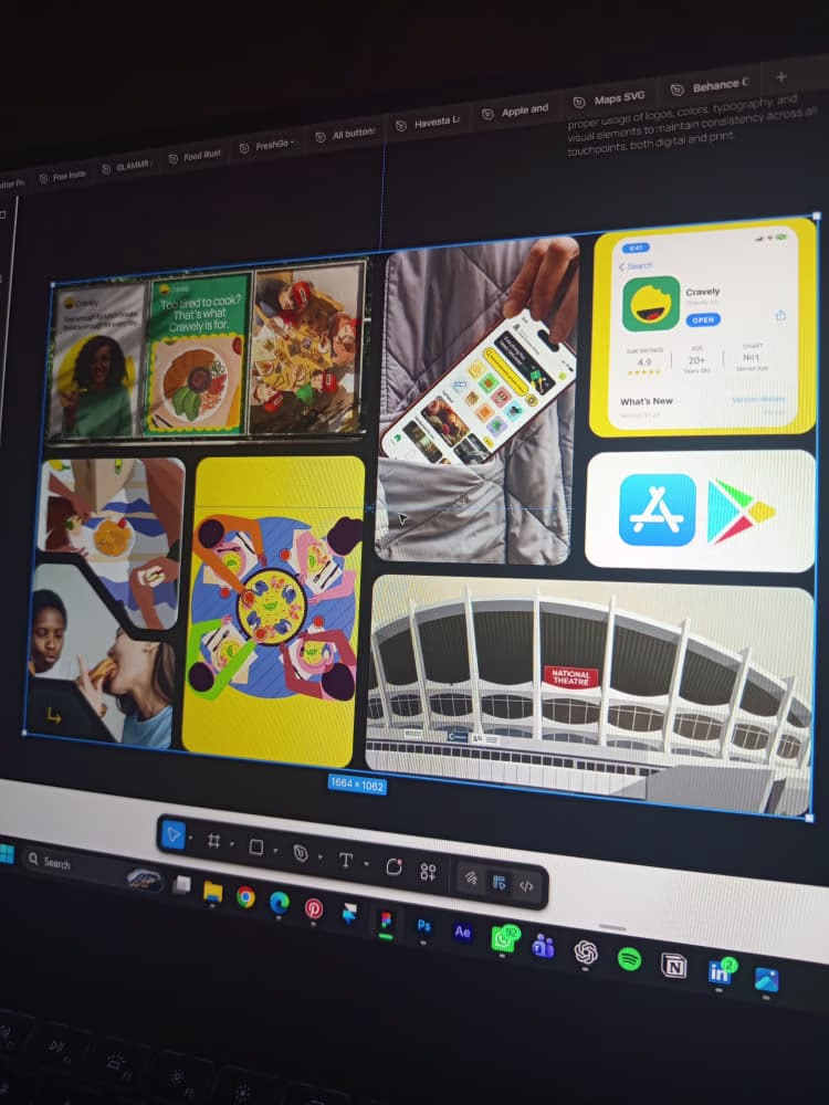
Here is the main dashboard UI for Cravely. The idea was inspired by chowdeck's app interface although I aimed to be different in the color selection, illustrations and placeholder. On the third slide is a bento grid that contains all thought process and brand elements that...
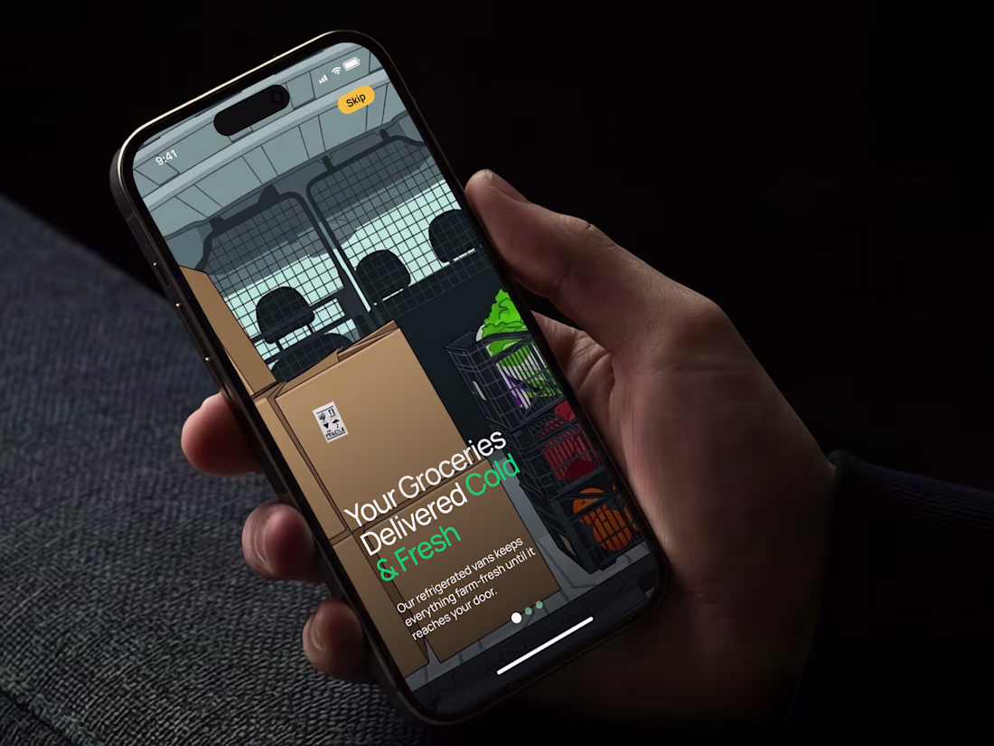
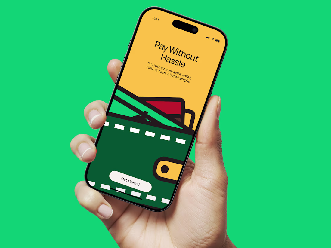
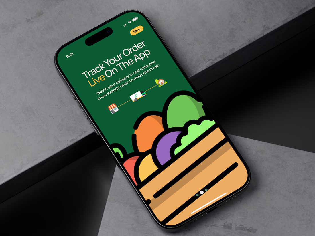
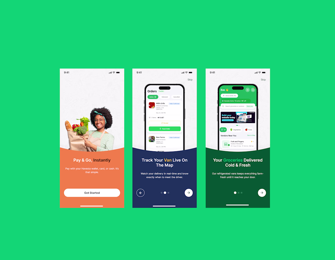
Few days ago, the founder and CEO of havesta.com reached out to me to create new onboarding screens for the company's mobile app. We hopped on a google meet, had a 50-minute discussion on how he wants the new screen to look like and eventually, he gave me freedom to create....
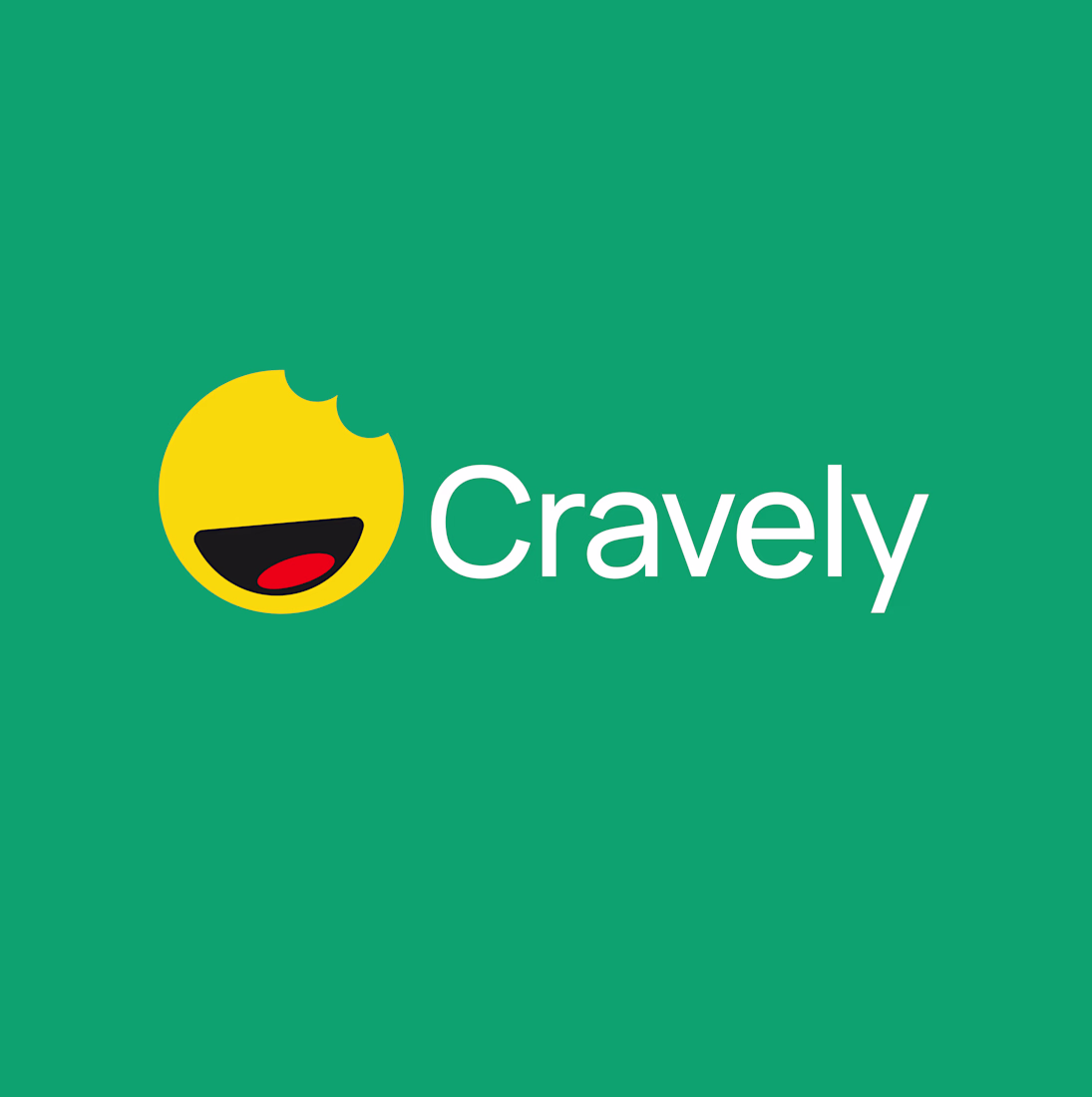
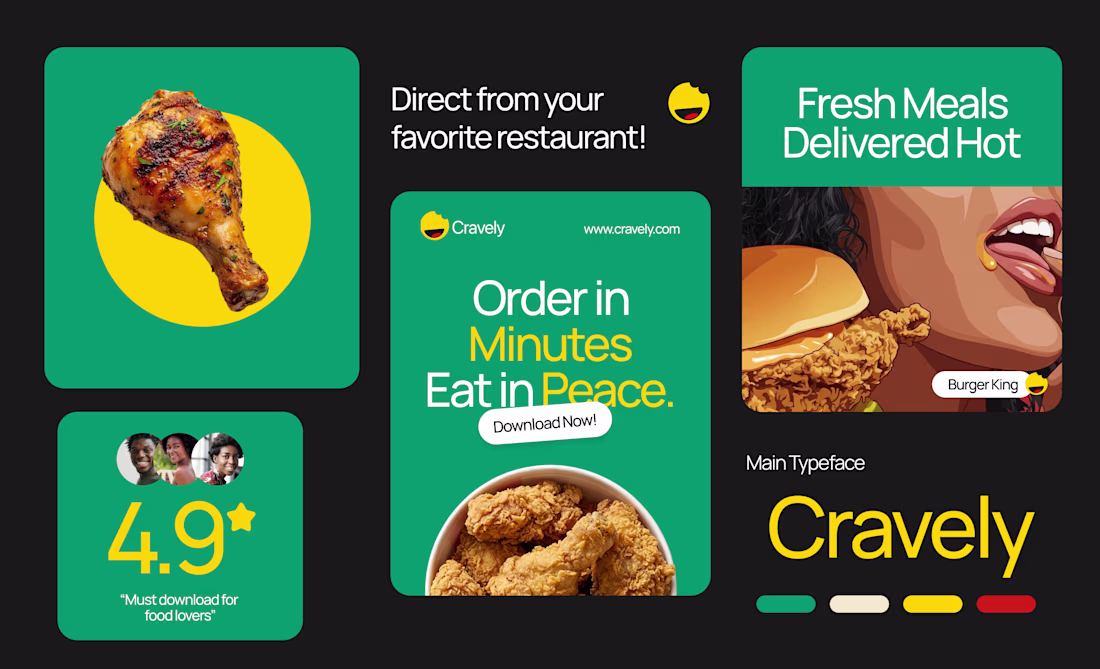
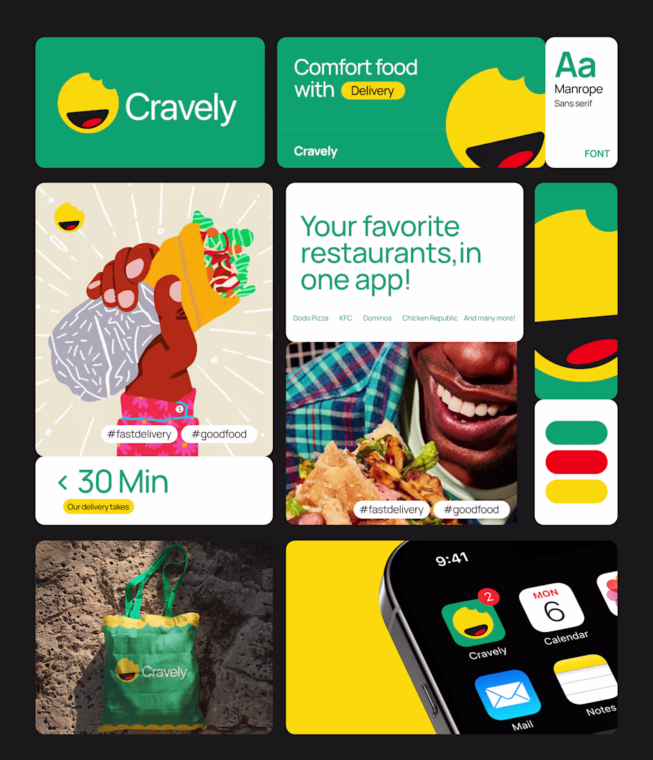
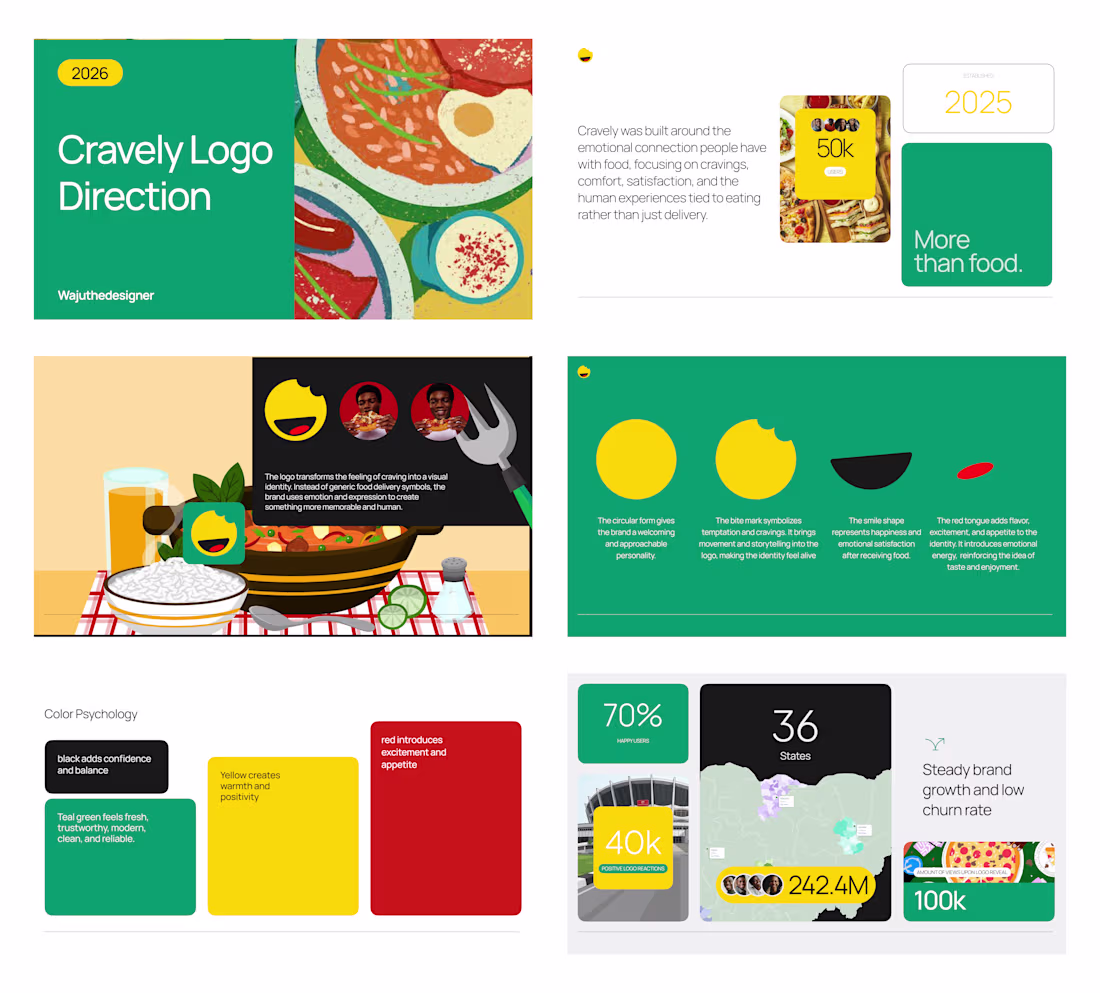
Brand identity design and logo direction for Cravely.
Cravely is a food logistics product that brings together local restaurants, home kitchens, and everyday food lovers in one seamless experience. Whether you’re craving comfort meals, discovering new flavors, or ordering...
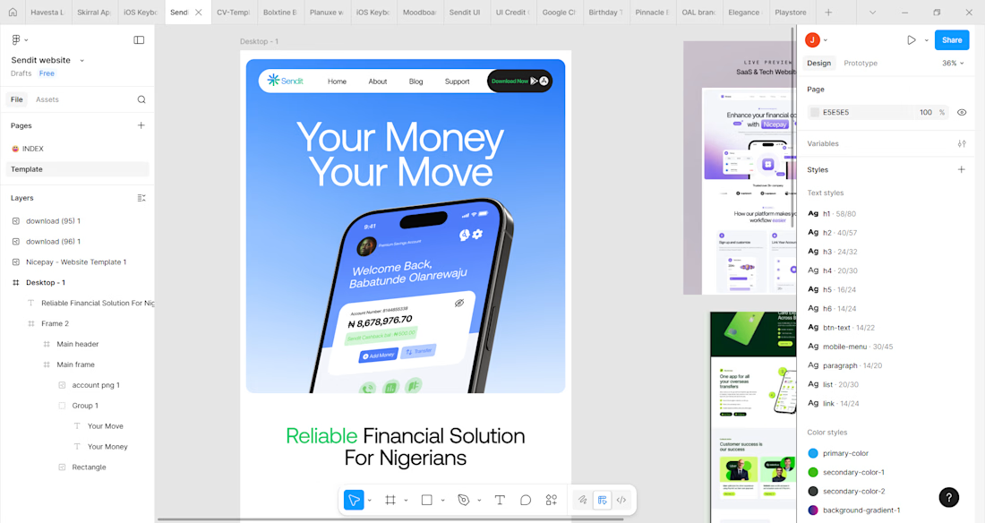
I designed and animated these screens on Figma and jitter respectively. This was a showcase of the screens I have designed so far for a Nigerian based fintech startup. From the main dashboard to the transaction screen, every design was made specifically to tailor the user's...
The website is a work in process now that the main screens have been designed.
The website is the official digital front of the microfinance bank, built to communicate trust, credibility, and value. It explains how the bank helps Nigerians manage their money and positions the...