The network for creativity
Join 1.25M professional creatives like you
Connect with clients, get discovered, and run your business 100% commission-free
Creatives on Contra have earned over $150M and we are just getting started
Back to feedPost

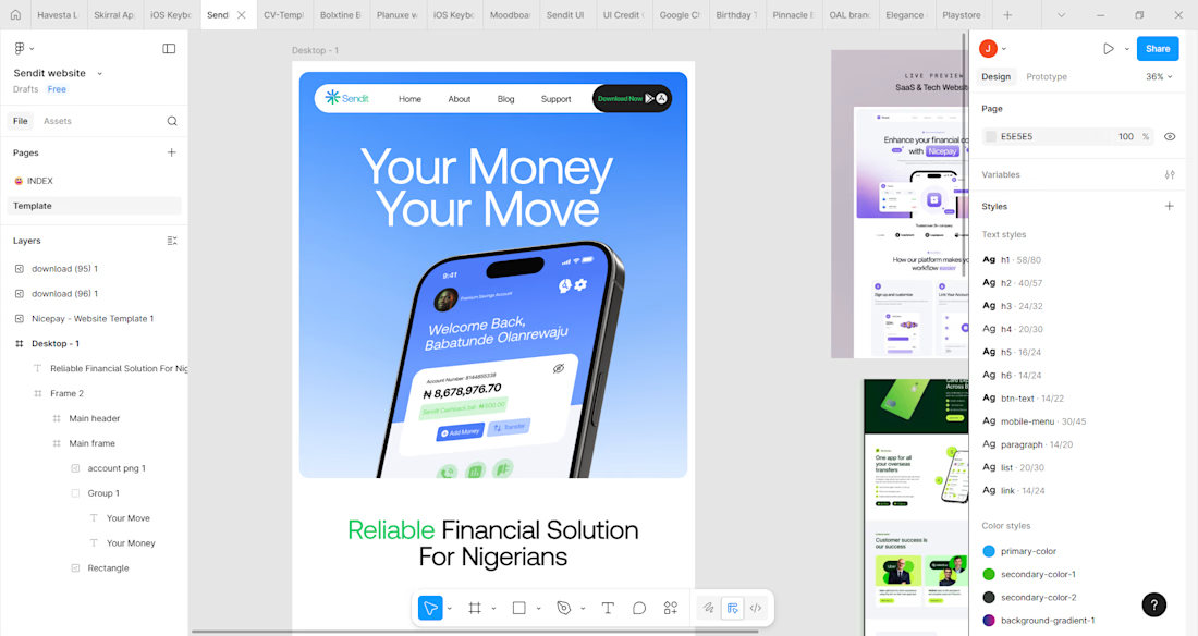
The website is a work in process now that the main screens have been designed.
The website is the official digital front of the microfinance bank, built to communicate trust, credibility, and value. It explains how the bank helps Nigerians manage their money and positions the mobile app as the primary solution for everyday financial needs.
It is designed for everyday Nigerians, including individuals, small business owners, freelancers, and users seeking a secure, modern, and easy-to-use banking experience.
The website guides users to quickly understand the product, explore key features, build confidence in the brand, and take action by downloading the app or seeking further support.
Overall, it drives app adoption, strengthens brand credibility, reduces onboarding friction, and converts visitors into active, long-term users.

The network for creativity
Join 1.25M professional creatives like you
Connect with clients, get discovered, and run your business 100% commission-free
Creatives on Contra have earned over $150M and we are just getting started





Related posts

Just wrapped up a new redesign, and I’m really happy with how it turned out. 💻
Can’t wait to share more details and the live site soon...


Sitting on this before the reveal instead of rushing to post it says you're already happy with how it landed, so now I'm curious what part of the redesign you're most excited for people to see once the site goes live.

New case study: the landing page for REVAI, a concept AI sales platform.
The brief I gave myself was structural, not decorative: design a page where every section earns the next one. Hero makes one claim and gets out of the way. The value proposition comes before any feature gets named — because a feature nobody understands yet is just noise. Proof (testimonial, logos) sits right before the final ask, not scattered earlier where it does nothing.
Art direction followed the same logic — high contrast where the page needs to make a claim, quieter and more editorial where it needs to build trust. The layout isn't there to look good in isolation. It's there to move someone from "what is this" to "I trust this" in one scroll.

Love the colors dude! Hell of a work🔥


Have you ever gone this bold on a 404? ⚡
Back to our latest poll: y'all voted Black (60%). We shipped Pink anyway.
Our client's call, not ours - and once you see her brand, you'll get why. Feminine-led, bold, unapologetic - Pink was never really up for debate on her end. 💗👠
See it live: https://productionportugal.com/404
404pagecreativewebsitewebdesignCreative Design Motion DesignWeb DesignAdobe After EffectsFigmaWebflow


You nailed the overall mood here. The details just reinforce it nicely.