


Bland is a choice.
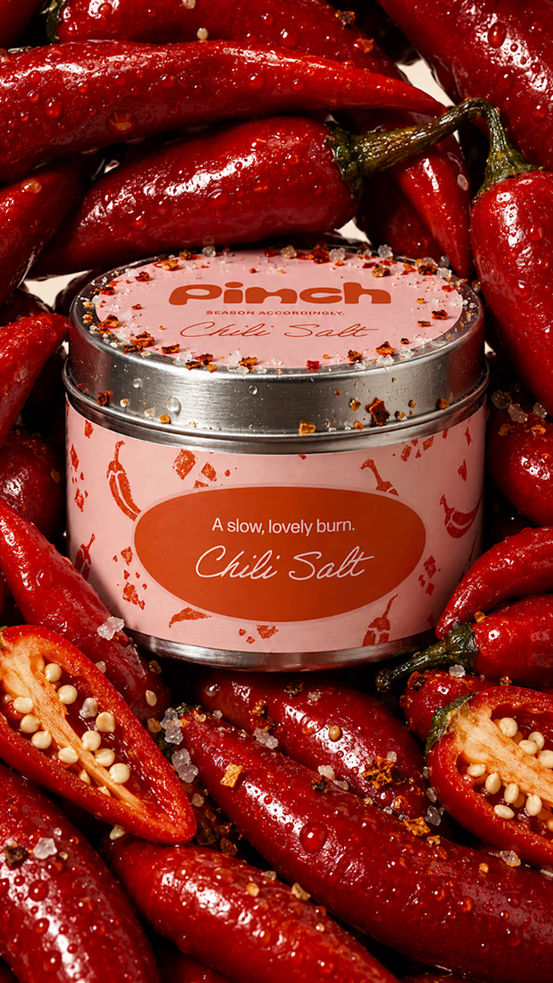
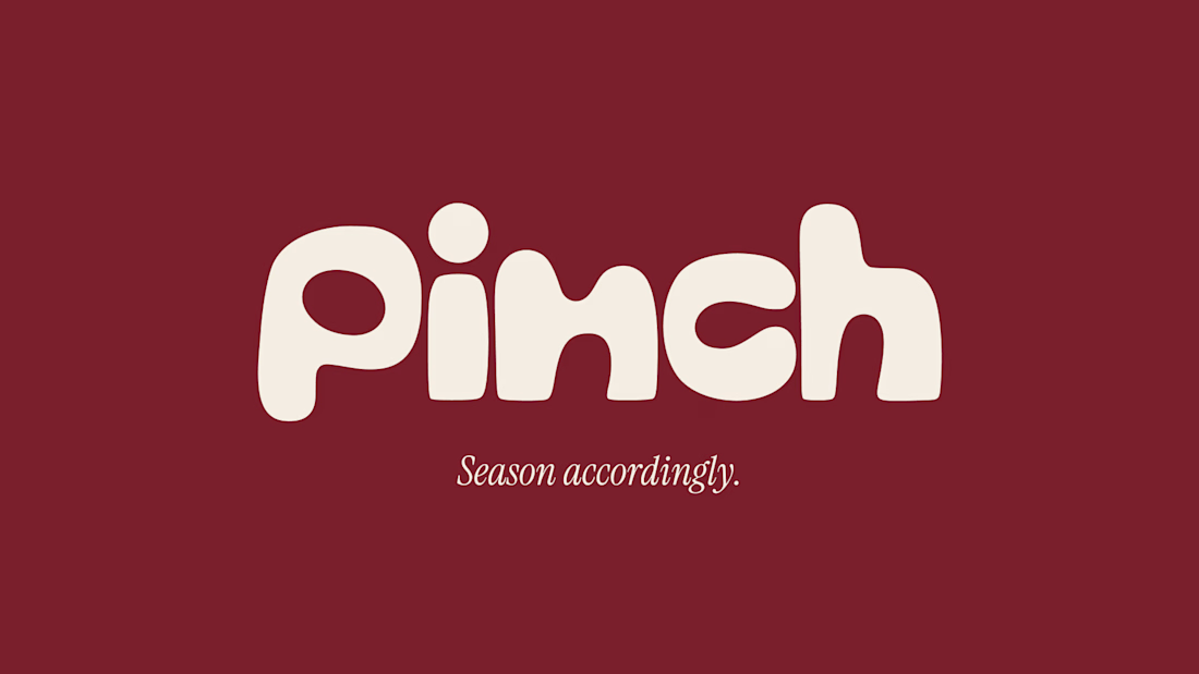
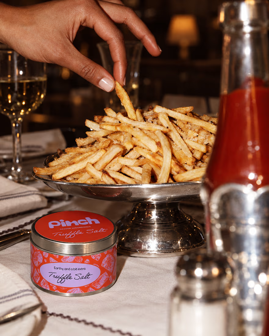
Pinch is a concept brand for a mid-high salt line made to live on the counter, not in the cupboard. Five flavors, five two-color tins, one refillable keepsake people leave next to the bar cart.
I built the full identity: wordmark, lid lockups, hand-stamped...


Pinch is featured on Contra! 🎉
It started as a free afternoon and a brief to myself: a salt brand you'd actually leave out on the counter. Five flavors, five tins, one very sassy voice.
Thank you Contra !!
Designers, do you make concept projects in between client work? How do you pick what to make?

Top 1% of creatives on Contra with a 195 score 🎉 What I'm most excited about is who's showing up because of it: new clients, designers, new conversations, projects I wouldn't have found on my own. Grateful, and ready for more.
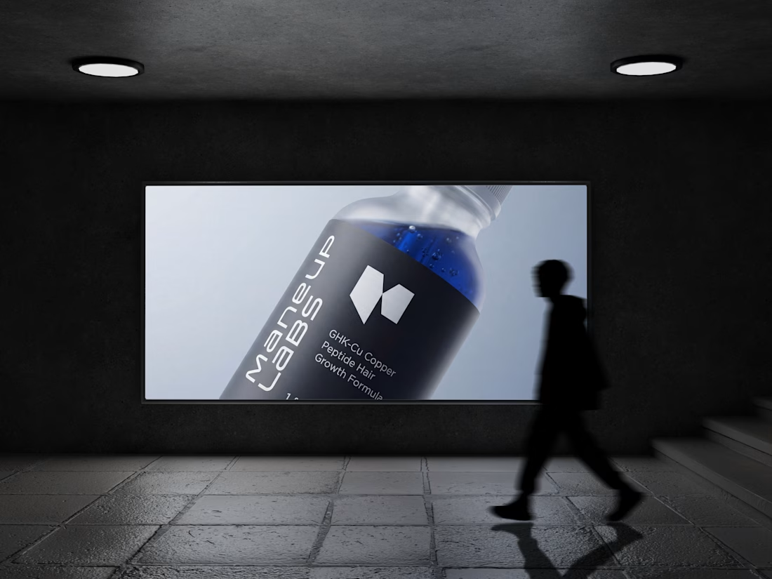
Hot take: hair growth products don't have to look like medicine to work like it.
Most brands in this category go clinical white and blue, it reads safe, but it also reads like something you'd hide in a drawer, not something you'd want visible on your sink. For Maneup Labs, I went...
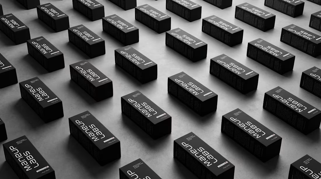
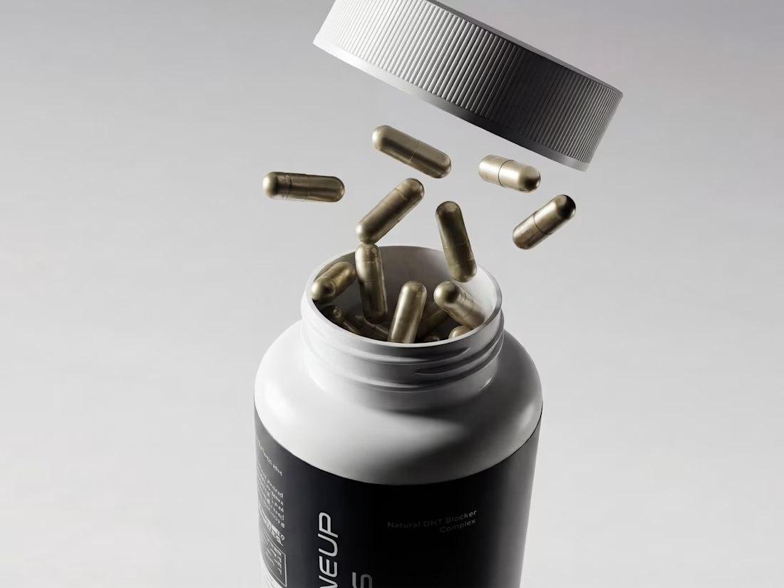
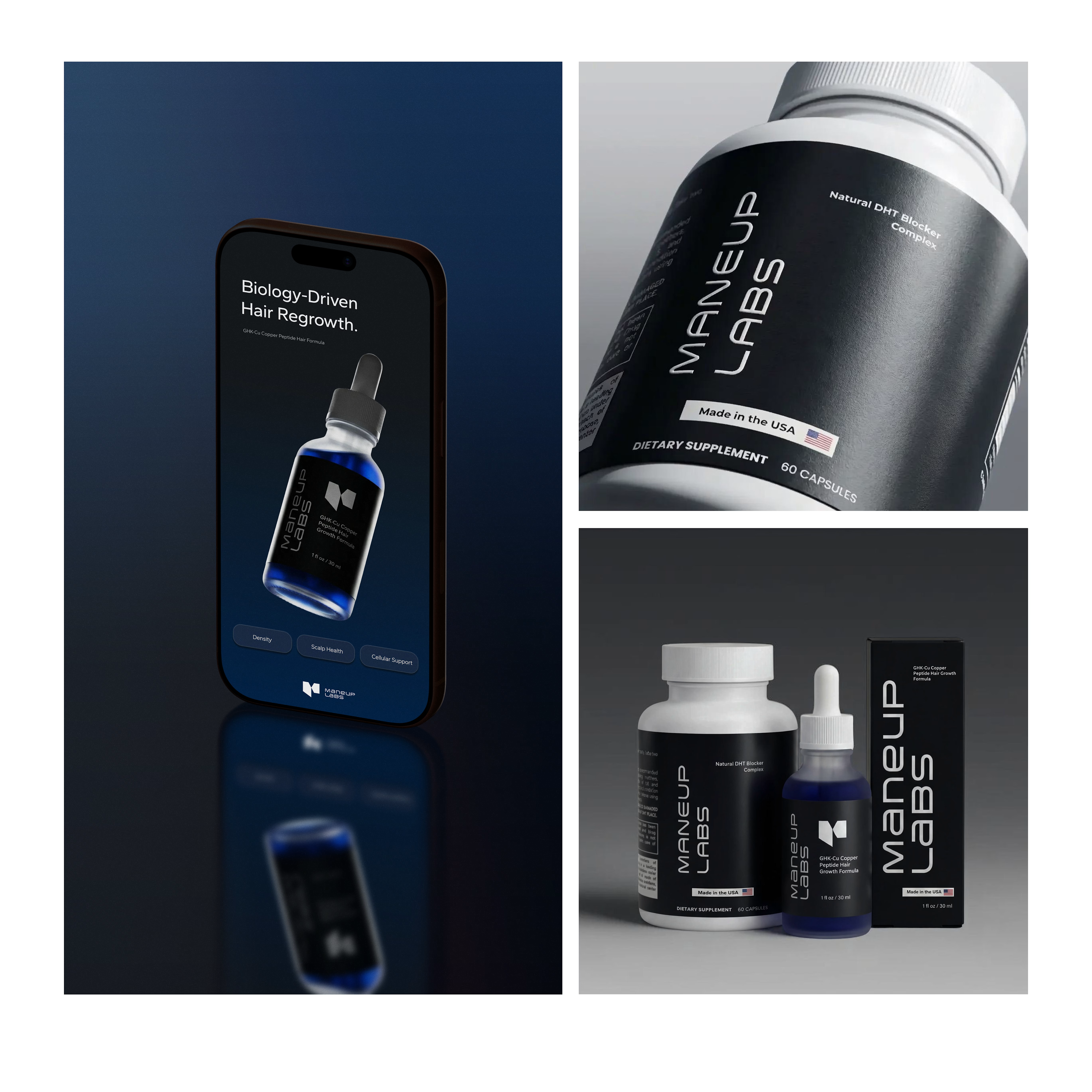
Woke up excited! 🎉 Contra just featured two of my projects, one in Standout Projects, one in Brand Design.
Wasn't expecting to open the app to that. Grateful, and it's a good reminder to keep showing up for your own work even when you don't know who's watching it.