Vera Ibanga
UI/UX Designer & No-Code Web Developer (Wordpress Expert)




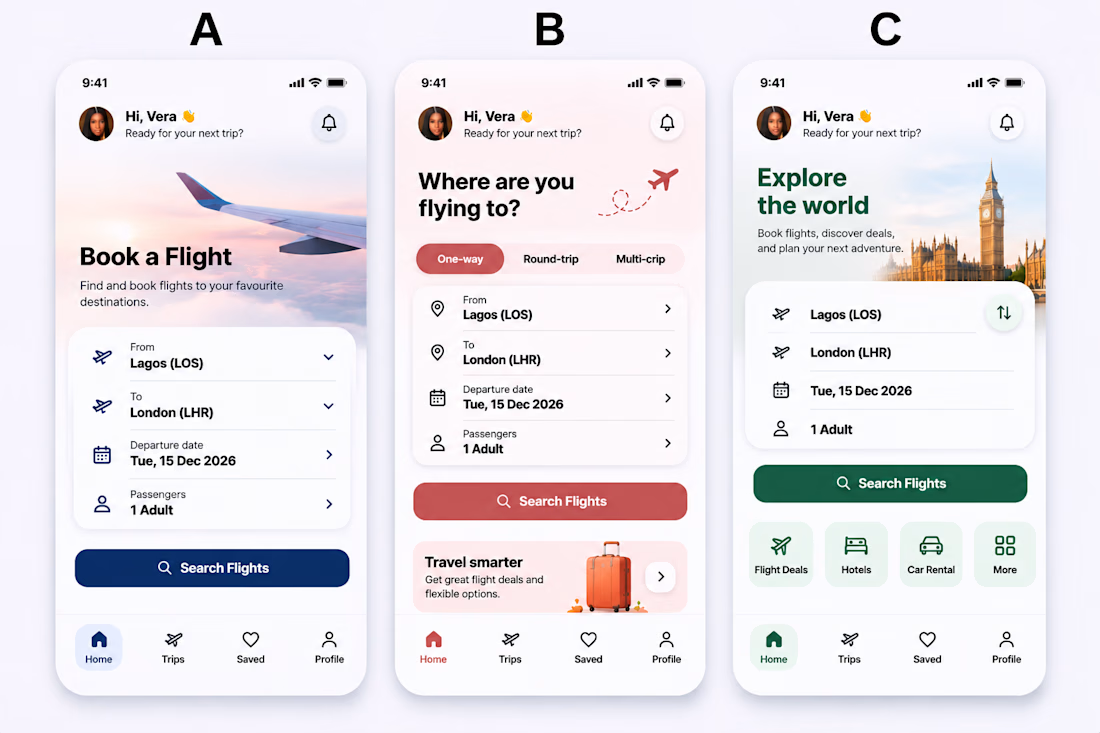
Same flight booking app, three different UI approaches.
Explored three clean and minimal designs, each focused on making flight booking simple, intuitive, and stress-free.
Now I'm curious
A, B, or C — which design would you prefer to use when booking your next flight?
Let's hear...

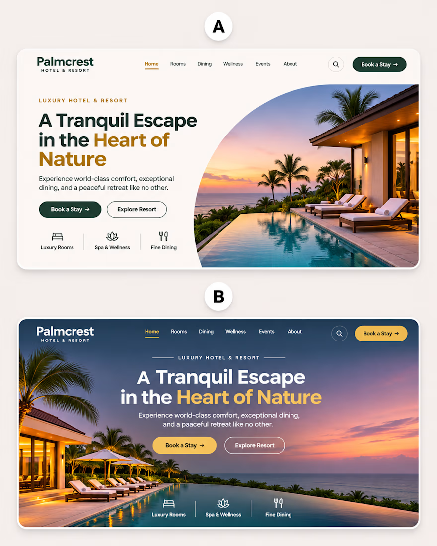
Same website. Two different design approaches.
Explored two hero section concepts for a luxury hotel and resort website, focusing on visual hierarchy, typography, simplicity, and creating a memorable first impression.
A or B — which design gives you that luxury experience at...
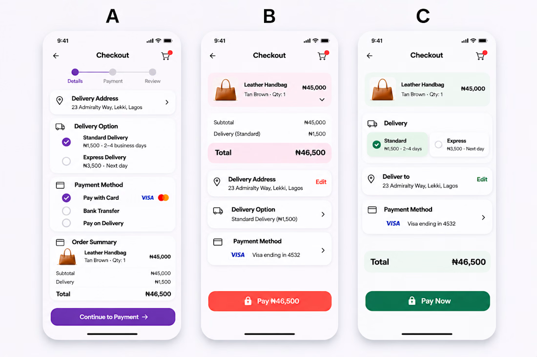
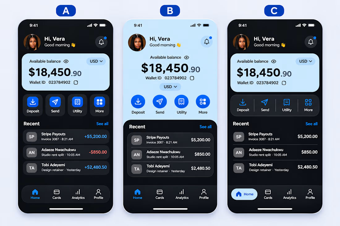
Three designs. One wallet. Which would you choose?
I explored three different UI directions for a fintech wallet dashboard, keeping the same content and functionality but experimenting with layout, visual hierarchy, and user experience.
A, B, or C, which design feels more...
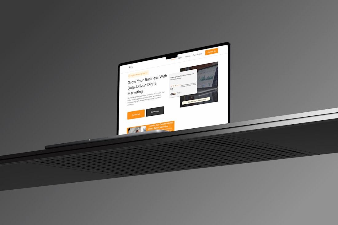
A recent website project for a digital marketing agency, designed with the UK audience in mind
Kept it clean, modern, and professional while making the user experience simple and engaging.
Always love turning a client’s vision into something that feels just right.
I’m Vera, a...