The network for creativity
Join 1.25M professional creatives like you
Connect with clients, get discovered, and run your business 100% commission-free
Creatives on Contra have earned over $150M and we are just getting started
Back to feedPost

Same flight booking app, three different UI approaches.
Explored three clean and minimal designs, each focused on making flight booking simple, intuitive, and stress-free.
Now I'm curious
A, B, or C — which design would you prefer to use when booking your next flight?
Let's hear your thoughts!
I'm Vera, a Product Designer and Web Developer.

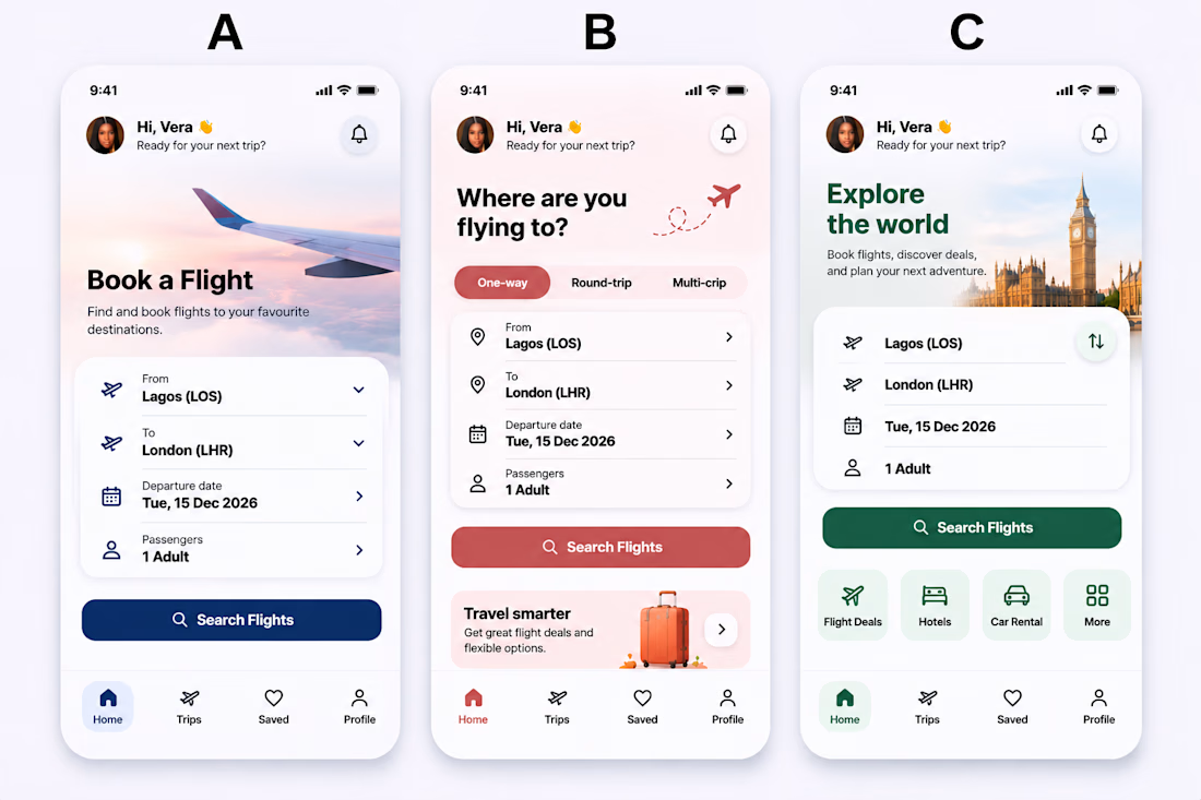

I'm going with C — the 'Explore the world' header over the London photo makes it feel like a trip before you've even searched, and the quick actions for Flight Deals, Hotels and Car Rental make it the most useful home screen of the three. B's One-way / Round-trip / Multi-city switch is a close second for pure clarity.
The network for creativity
Join 1.25M professional creatives like you
Connect with clients, get discovered, and run your business 100% commission-free
Creatives on Contra have earned over $150M and we are just getting started






Related posts

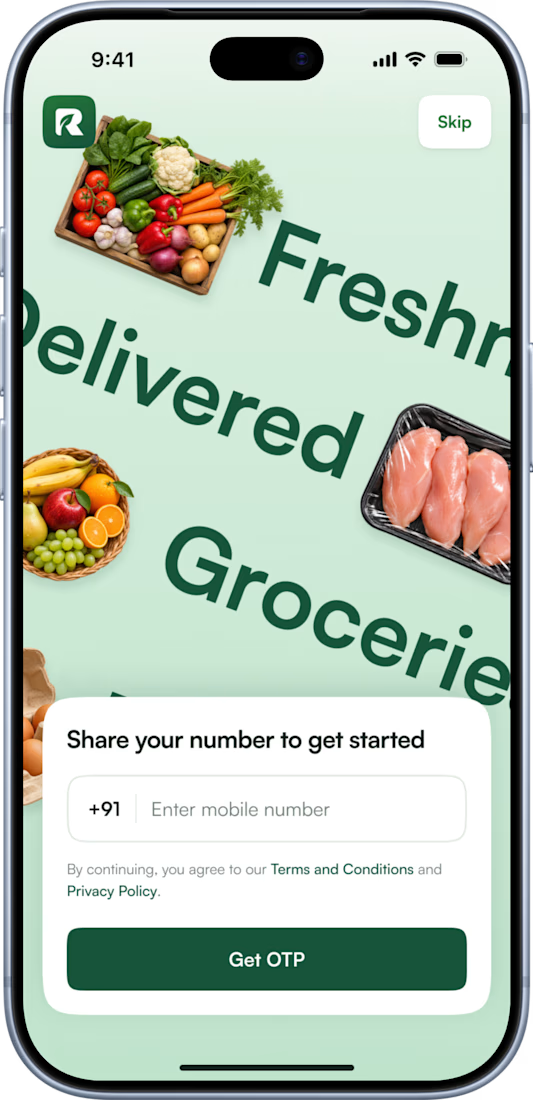
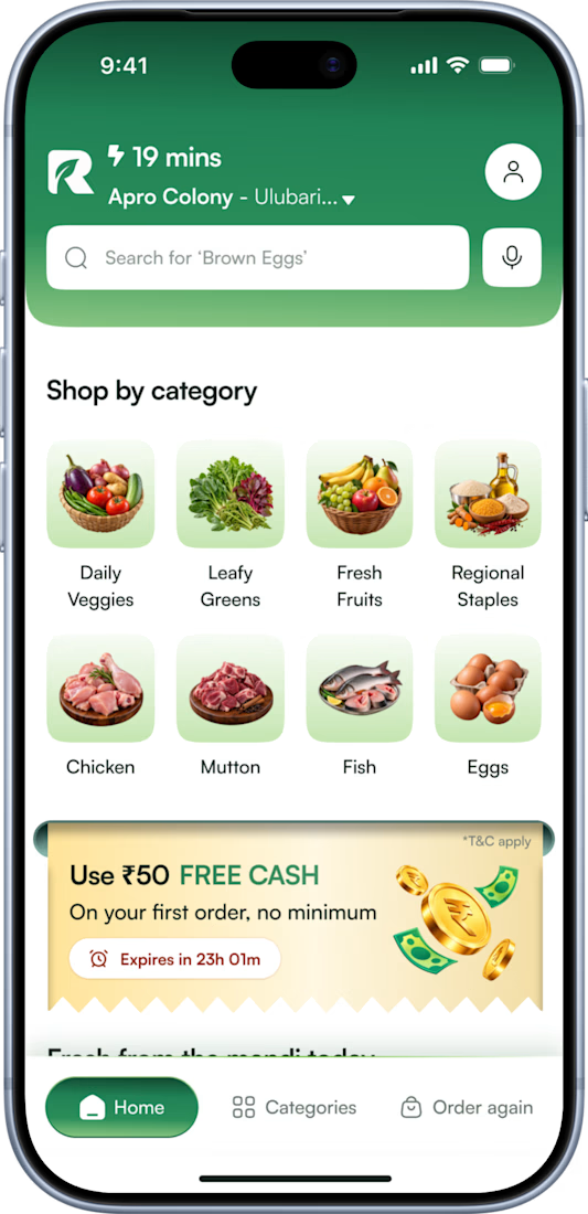
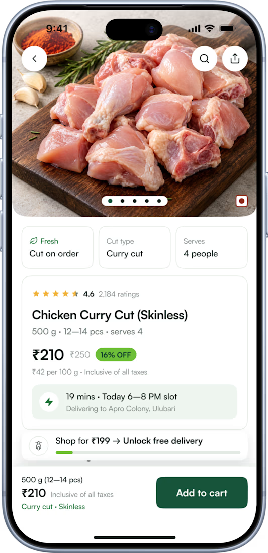
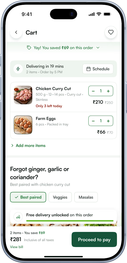

Pinterest bringing in a real local client is such an underrated channel! For the delivery partner app, are you keeping it on the same design system as the customer app, or going more utilitarian with big tap targets for riders on the move?

Had some fun with this one.
Exploring how typography, colour, and a few unexpected details can give a brand its own personality.
Meet Flankman. Full case study is live! ↓



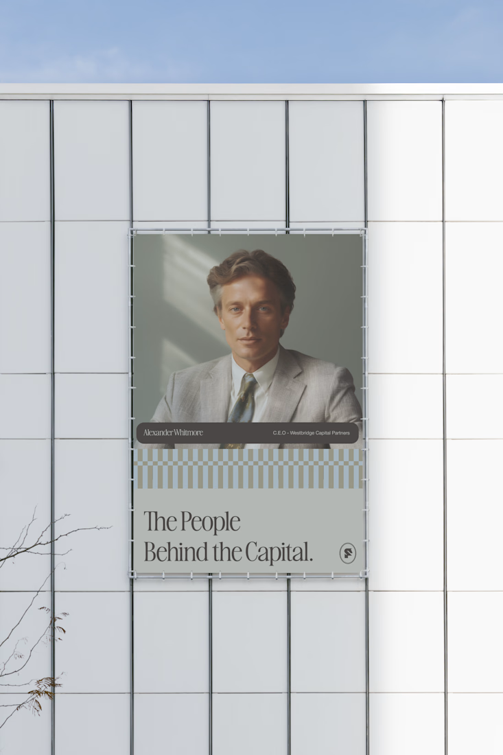


clean

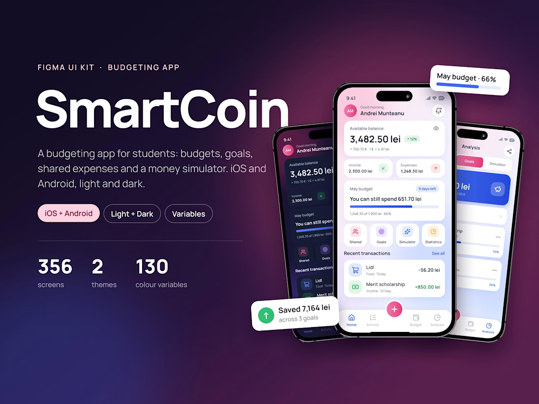
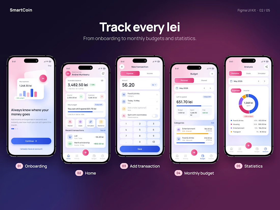
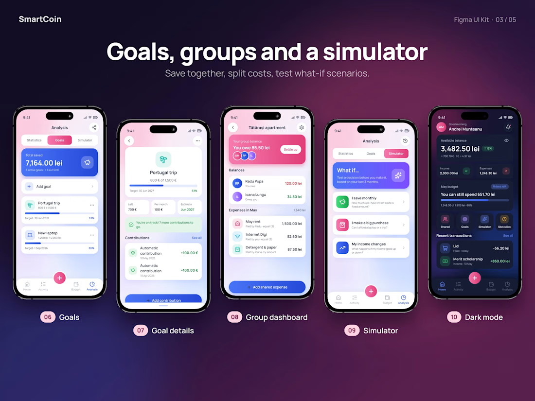
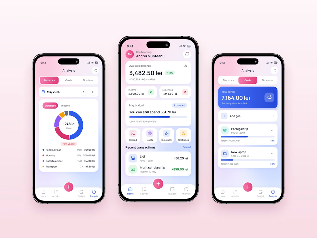
SmartCoin is now a full Figma UI kit 💸
A budgeting app for students: budgets, savings goals, shared expenses and a what-if simulator. 356 screens, iOS + Android, light + dark, 130 colour variables.
Case study: grecu.framer.website/smartcoin

The what-if simulator is a clever touch.