The network for creativity
Join 1.25M professional creatives like you
Connect with clients, get discovered, and run your business 100% commission-free
Creatives on Contra have earned over $150M and we are just getting started
Back to feedPost

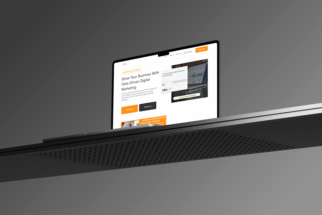
A recent website project for a digital marketing agency, designed with the UK audience in mind
Kept it clean, modern, and professional while making the user experience simple and engaging.
Always love turning a client’s vision into something that feels just right.
I’m Vera, a Product Designer and Web Developer.



Designing for a specific audience gives the project a useful starting point. Which part of the agency website did you adapt most for the UK audience?

Giving each service card its own CTA instead of one page-level button matches how agency buyers arrive. Most land on SEO or PPC already decided, not browsing the menu.
The network for creativity
Join 1.25M professional creatives like you
Connect with clients, get discovered, and run your business 100% commission-free
Creatives on Contra have earned over $150M and we are just getting started

Challenges
View all


Related posts


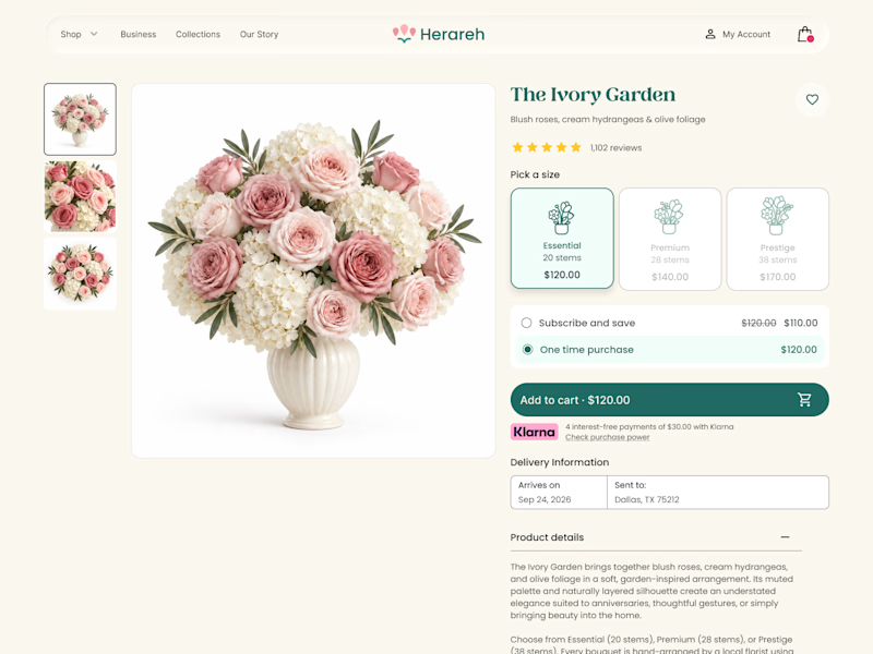
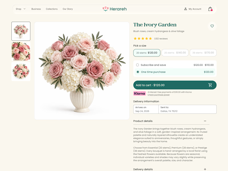

Icon cards for me, bouquets are such a visual purchase that a scannable icon beats reading "small/medium/large" every time. Did the compact chips version convert worse in testing, or are you still gathering data on that?

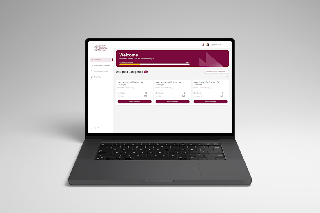
The Ghana Digital Product Awards platform is a digital experience designed to streamline how judges review, shortlist and vote for outstanding digital products and professionals.
I designed the judge-facing experience, focusing on making the evaluation process clear, structured and easy to navigate across multiple award categories.


Nice work

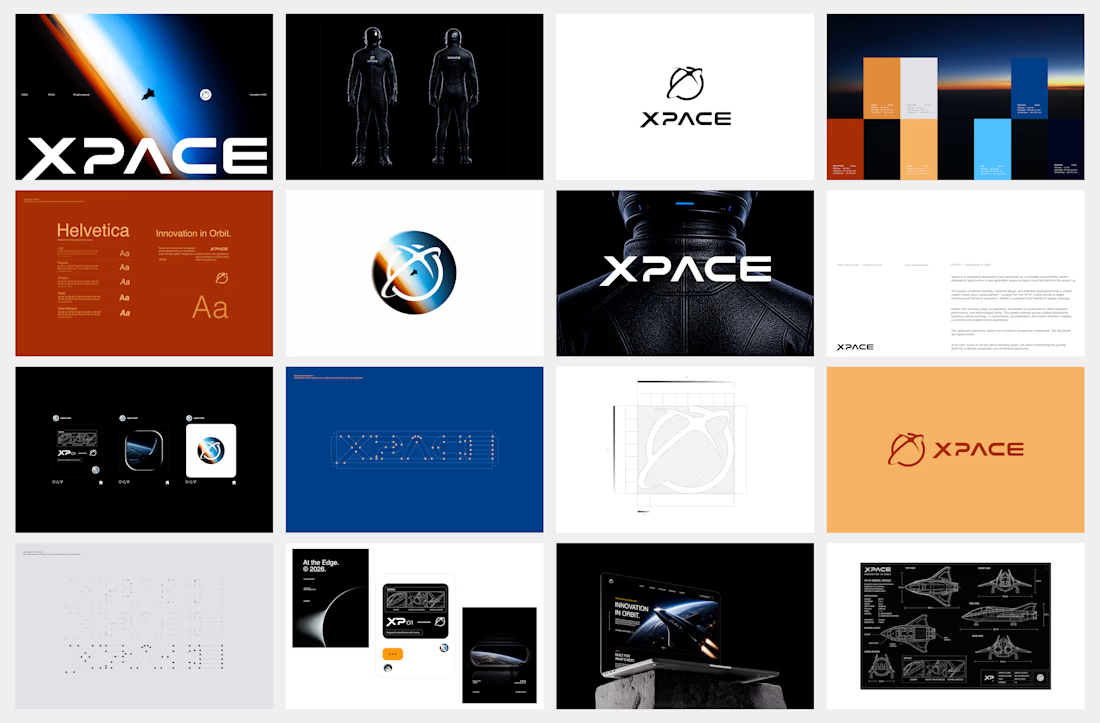
What if a space brand didn’t just look futuristic — but felt like it was already living in the future?
For XPACE, the goal was to build a visual identity that could turn the idea of space exploration into a complete and immersive brand experience.
The identity combines a bold typographic system, a high-contrast visual language, and electric blue accents against deep black to create a futuristic presence that feels precise, technological, and unmistakably XPACE.
But the identity didn’t stop at the logo.
The system was extended across digital interfaces, web design, favicon and UI icons, access cards, board passes, and branded applications — creating a consistent experience across every touchpoint.
Every detail was designed to make XPACE feel less like a brand inspired by the future, and more like a brand built for it.
XPACE — Visual Identity System.
Looking to build a visual identity that goes beyond a logo?
Let’s create something with a world of its own.



The identity system feels cohesive because the typography, electric blue accents, and image language all push in the same direction. Extending that logic into interfaces and packaging is what makes XPACE feel like a real world, not just a futuristic logo.