The network for creativity
Join 1.25M professional creatives like you
Connect with clients, get discovered, and run your business 100% commission-free
Creatives on Contra have earned over $150M and we are just getting started
Back to feedPost
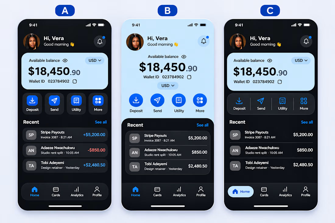
Three designs. One wallet. Which would you choose?
I explored three different UI directions for a fintech wallet dashboard, keeping the same content and functionality but experimenting with layout, visual hierarchy, and user experience.
A, B, or C, which design feels more intuitive, clean, and user-friendly?
I'd love to hear your thoughts, especially from fellow designers and developers.
Let's talk design!
I'm Vera, a Product Designer and Web Developer.

Love seeing these wallet explorations.

Thank you Vensita
The network for creativity
Join 1.25M professional creatives like you
Connect with clients, get discovered, and run your business 100% commission-free
Creatives on Contra have earned over $150M and we are just getting started






Related posts


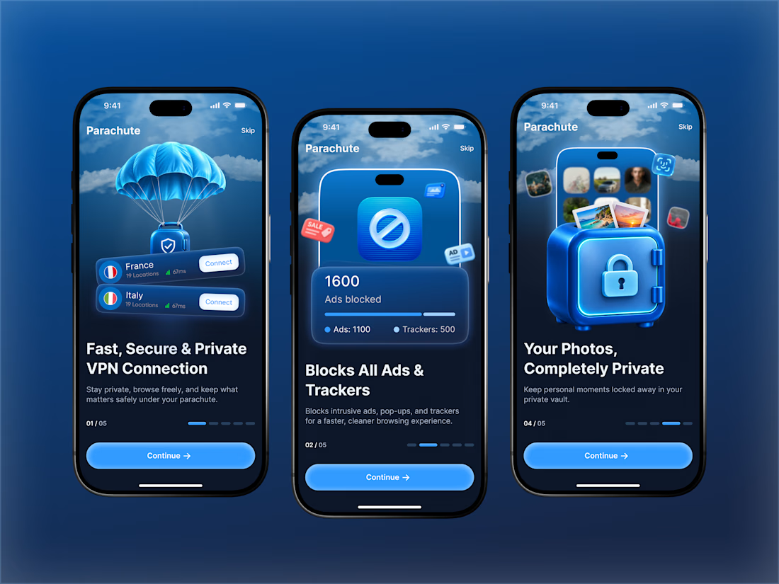
Those onboarding screens look polished.


Love the attention to detail! The smooth scrolling, subtle animations, and interactive elements make the mobile experience feel clean, modern, and engaging. Great work! 👏

Blog card design.
Which one of these looks better?
1 voted
7%
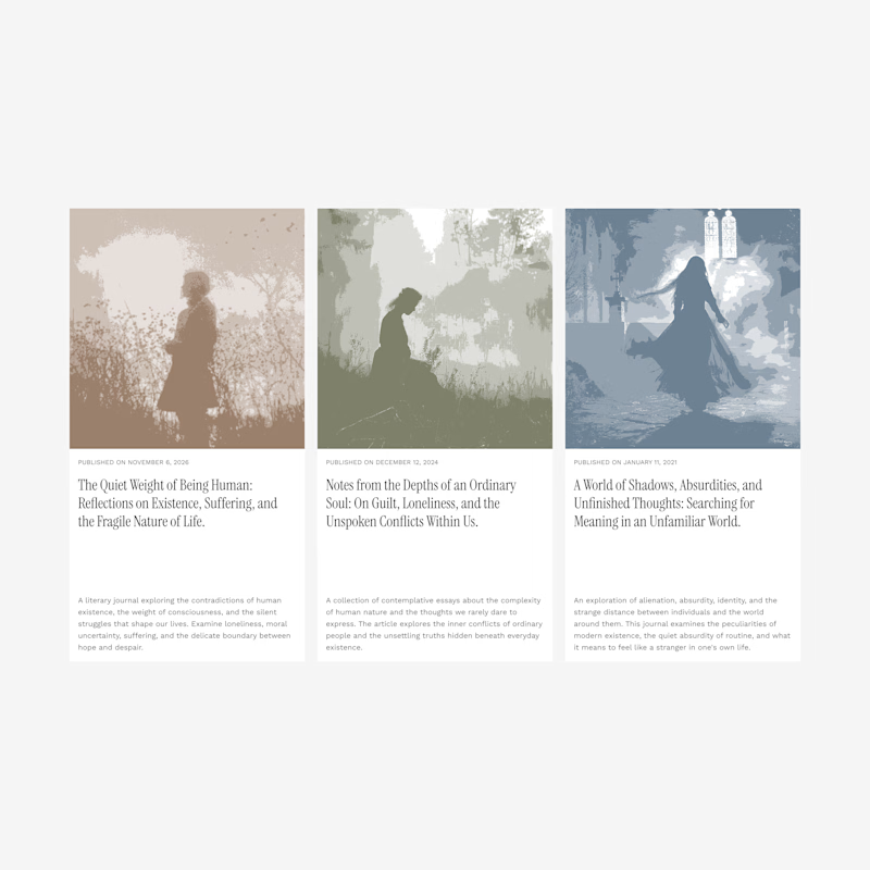
13 voted
93%
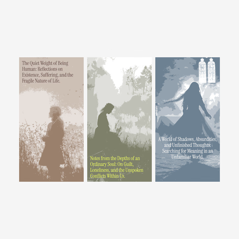
14 votes
Closed