Lala P.
Brand & Packaging Designer, Consumer Product Brands
- $1k+
- Earned
- 2x
- Hired
- 5.00
- Rating
- 45
- Followers




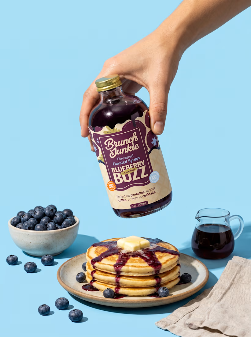
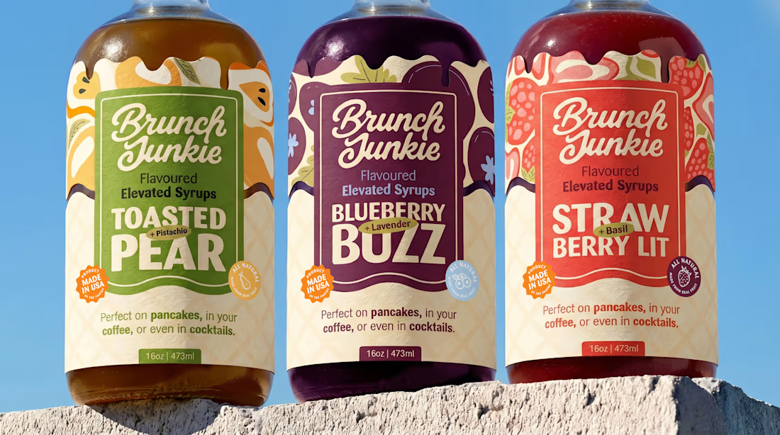
Brunch Junkie, Brand Strategy, Identity & Packaging Design
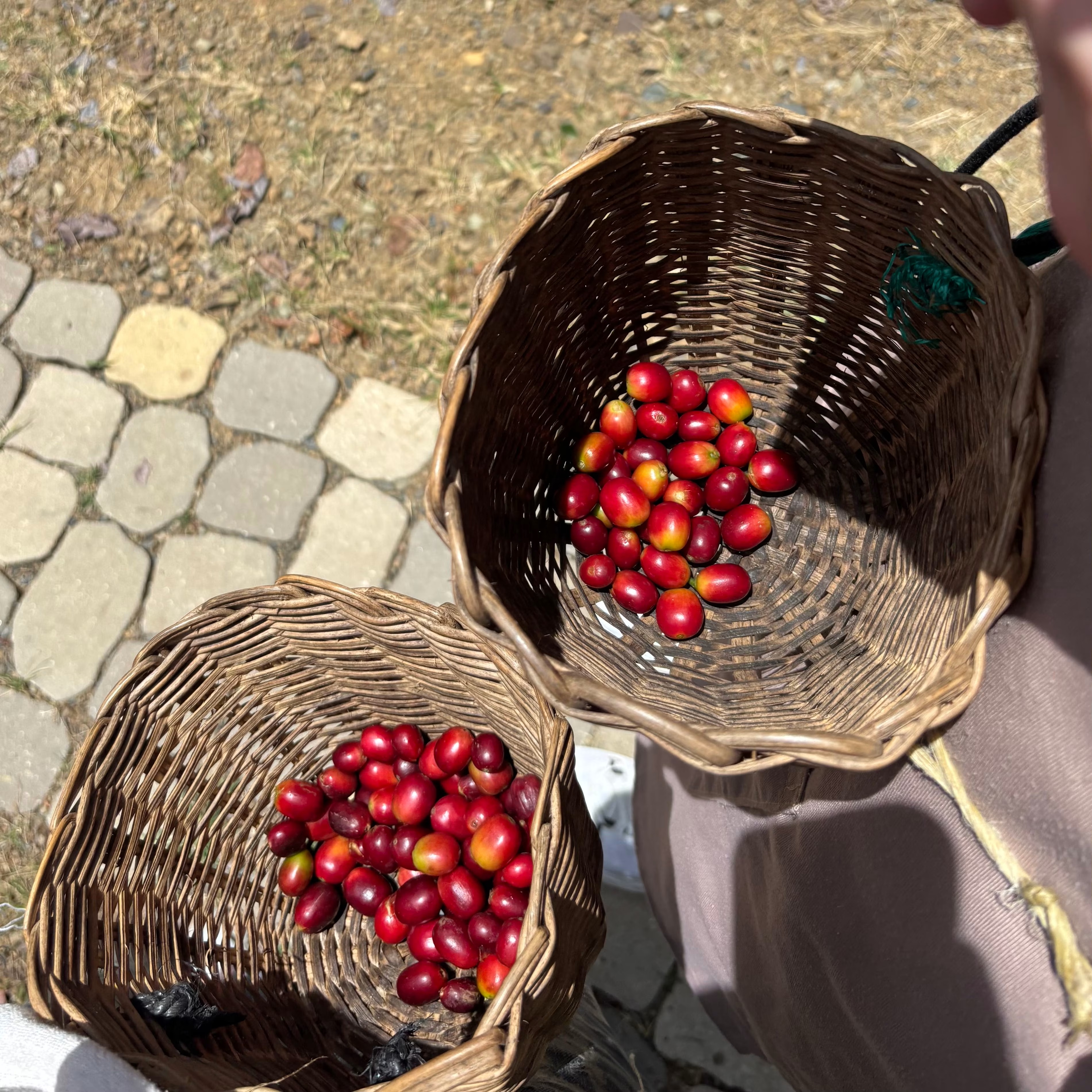
Every syrup on the shelf looked the same. Maple. Again. The client saw a gap nobody was filling and built Brunch Junkie to fill it, a small-batch artisan syrup brand from Denver, Colorado, made with real fruits and herbs.
...
Red flag alert 🚩 That’s when I knew this wasn’t going to work 🙃
📄 20-page brochure
📦 6-panel flyer
📐 Apartment layouts
💸 Payment plan visuals
🧾 Booking forms
🎁 Gift box design
All due in 1.5 weeks. For ~1K EUR
It was a lot, but I thought I could handle it.
Had a great first...


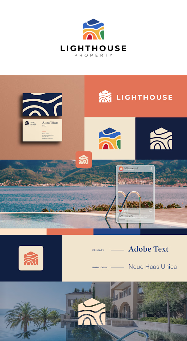
The client wanted a rainbow in their logo. 🌈
Premium apartments and green land around Budva, Montenegro. And the brief said the logo had to have rainbow colours in it.
I tried to talk them out of it. Rainbow palettes in property branding usually end up looking like a budget...