The network for creativity
Join 1.25M professional creatives like you
Connect with clients, get discovered, and run your business 100% commission-free
Creatives on Contra have earned over $150M and we are just getting started
Back to feedPost

"It was exactly what we imagined, but at the same time not what we imagined at all and somehow even better."
That's what one of the founders said when they opened the logo. They approved it with no changes, which has happened to me maybe twice over the last 6 years 😄
So here's what they were looking at.
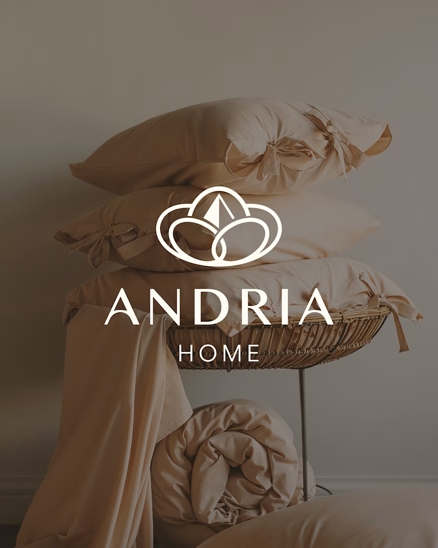
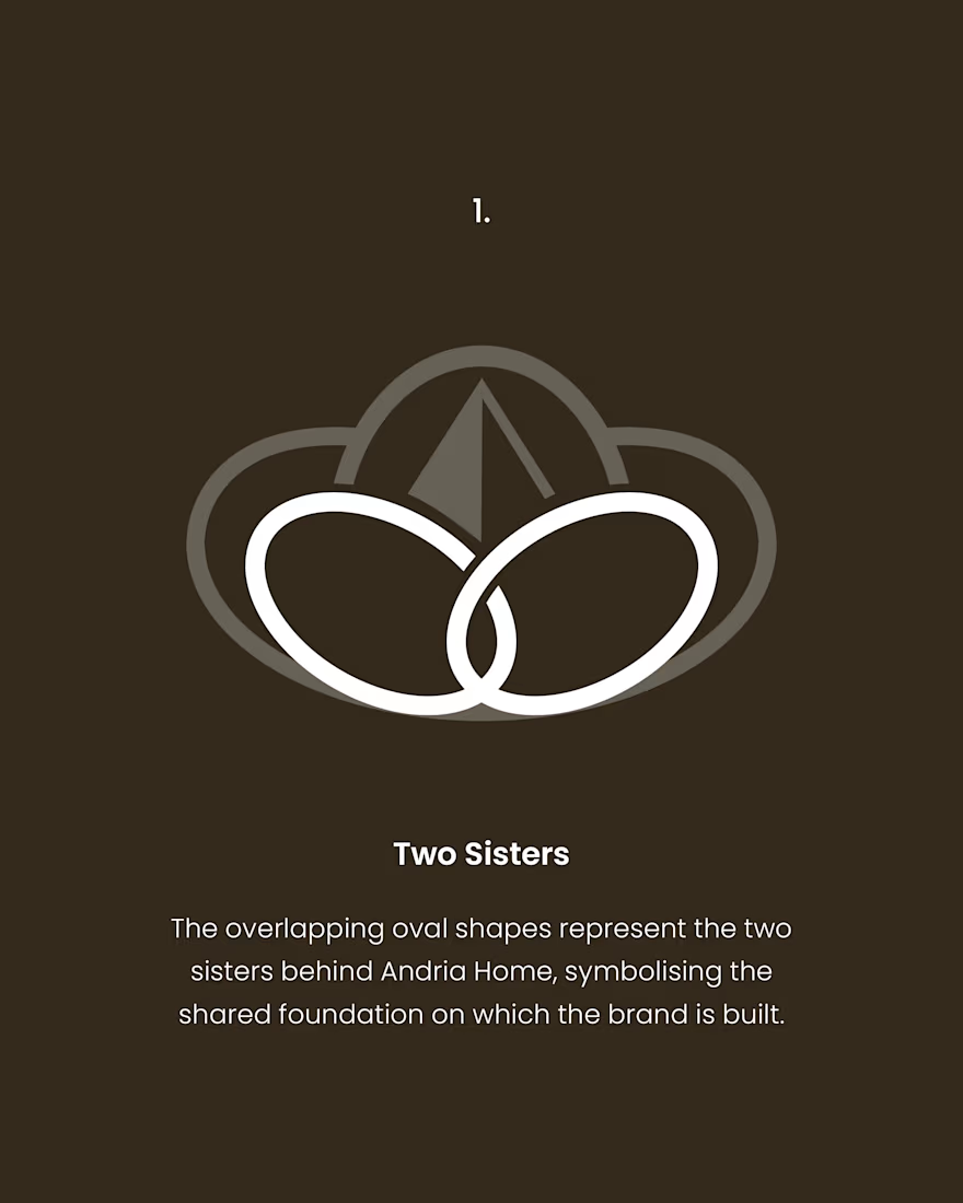
Andria Home is premium Egyptian cotton bedding, run by two sisters. The mark starts with them. Two overlapping ovals, because that's the actual business.
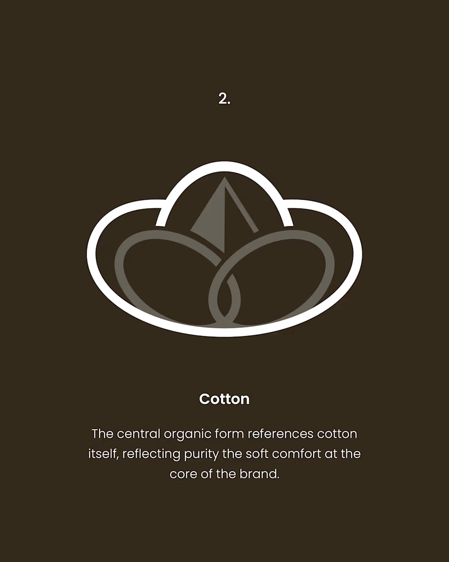
Cotton goes in the middle, wraps the whole thing around like a soft cotton ball.
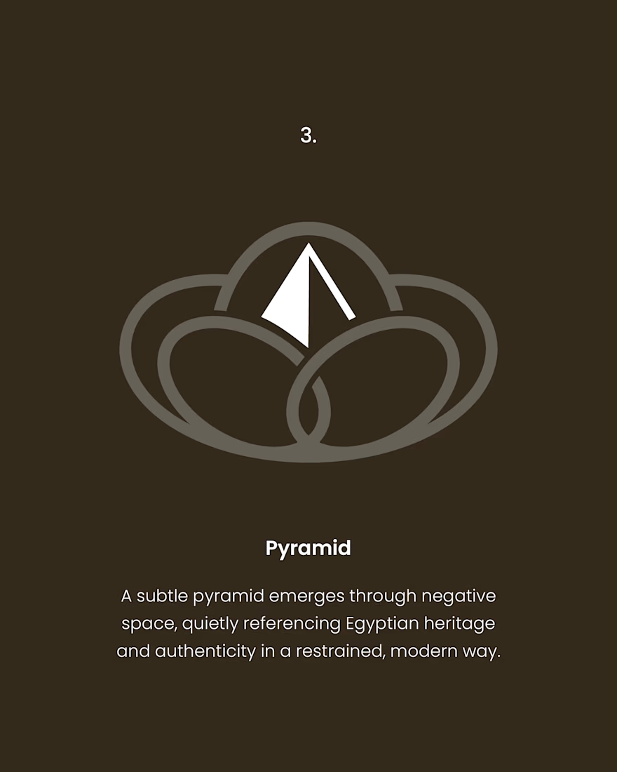
And the pyramid just appeared exactly where it should have. It showed up in the gap the moment the first two shapes landed right.
Which is maybe why they said it was what they imagined and also nothing like it. Every piece of the mark was already in the conversation. They just hadn't seen it stacked up.
The network for creativity
Join 1.25M professional creatives like you
Connect with clients, get discovered, and run your business 100% commission-free
Creatives on Contra have earned over $150M and we are just getting started





Related posts


The thing I keep relearning: a design is never finished because someone ran out of ideas. It's finished because someone decided to stop. Knowing when to stop is the hardest part.


Damn.... Crazy colors 👏😍

Ceya Logo & Visual Identity, 2025.
Two offset circles, one idea: a partner that’s always alongside you. 🟢🔵
Full case study in my portfolio.
Got a project ? Let's talk about it.

Great visual identity it was so attractive and unique 🎉🎉🔥🔥

Jordan Reid - Sportswear Brand Identity


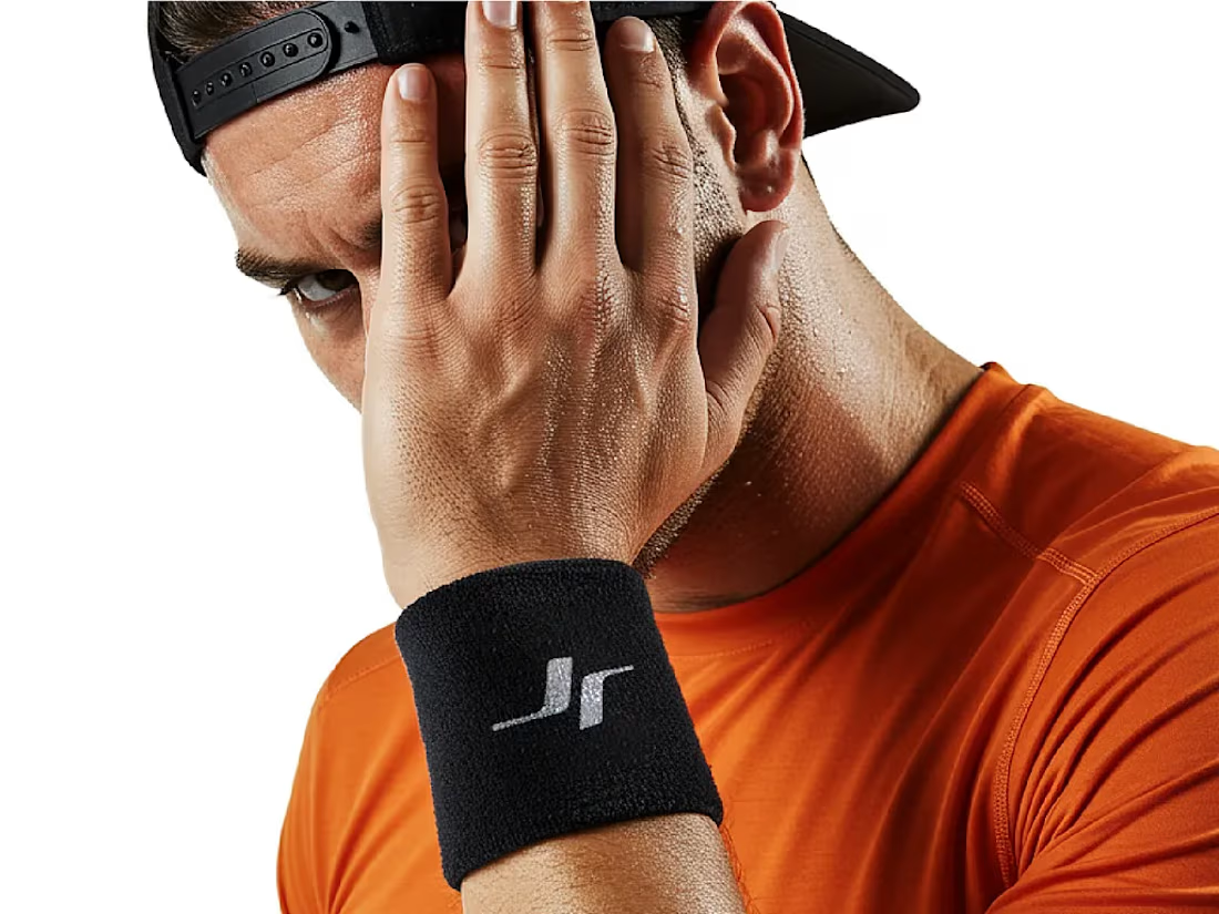



Like the logo direction