


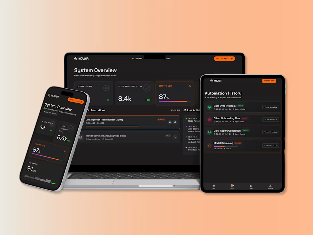
Project: Novair — AI Agent Orchestration Dashboard
0
34
LookBook — Book & Product Collection Page
Web Design · E-commerce
Overview
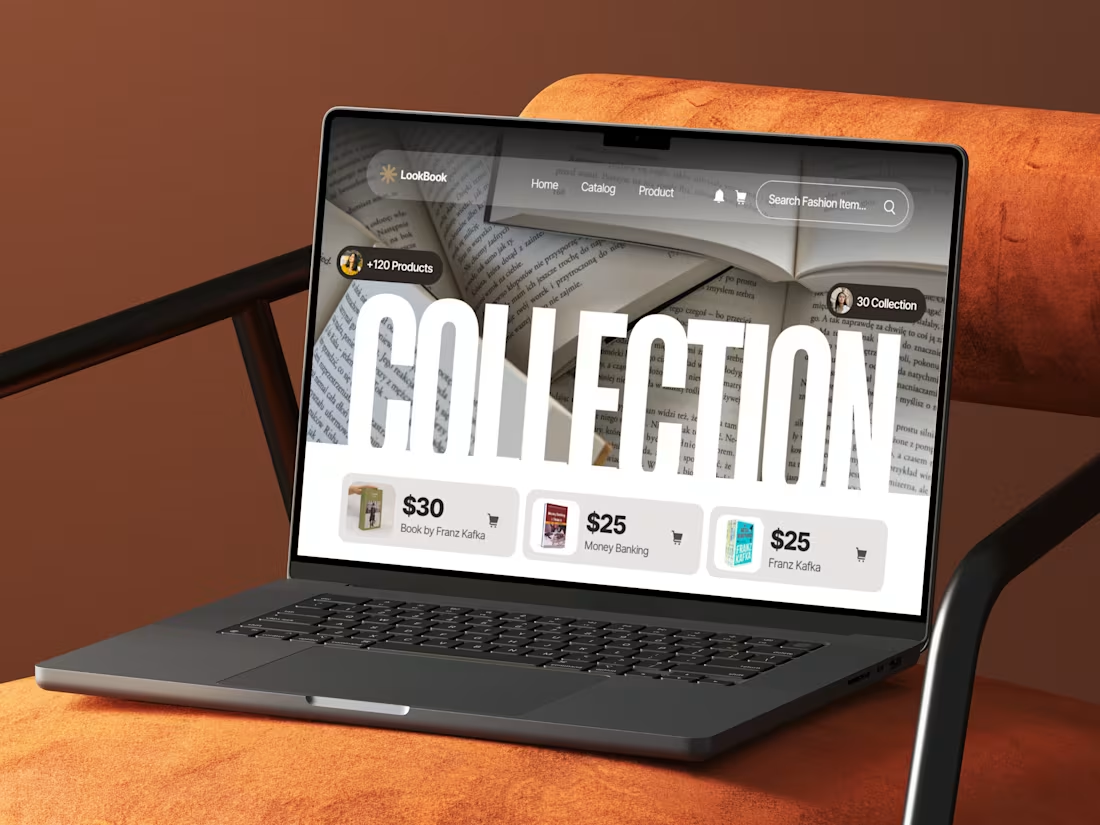
LookBook is a curated storefront concept for browsing and shopping product collections — designed here around a book/literature catalog.
Design Approach
Hero moment: An oversized "COLLECTION" wordmark cuts across a photographic book-page background, using clipped/masked typography to feel editorial rather than templated.
Social proof, minimal: Small avatar-tagged pills ("+120 Products," "30 Collection") add credibility without cluttering the hero.
Product cards: Clean, uniform cards with thumbnail, price, and one-tap cart icon keep the shop-from-hero flow fast and scannable.
Presentation: Shown on a laptop against a warm terracotta setting, giving the concept a cozy, lifestyle-brand feel rather than a sterile SaaS look.
Outcome
A collection landing page that leads with visual storytelling first, commerce second — browsing feels editorial, buying stays effortless.
0
65
Finora — Personal Finance Landing Page
Web Design · Landing Page
Overview
Finora is a premium personal finance platform positioning itself around control and clarity — helping users track spending, set saving goals, and manage investments from a single dashboard. This project covers the marketing site's hero landing page.
The Challenge
Fintech landing pages tend to fall into two traps: either sterile corporate-blue templates, or gradient-heavy noise that undercuts trust. The goal here was to make a finance product feel premium and modern without borrowing the usual "startup fintech" visual clichés.
Design Approach
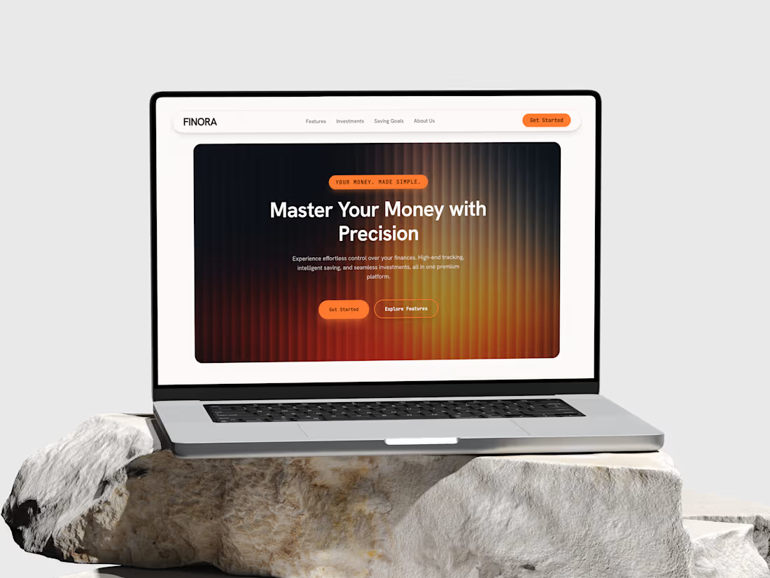
Hero treatment: A radial amber-to-charcoal gradient with fine vertical striping gives the hero section warmth and depth — closer to a luxury product launch than a typical SaaS banner — while staying dark enough to keep white headline text sharp.
Typography contrast: A bold, rounded sans-serif for the headline paired with a monospaced font for labels, badges, and CTAs — the mono touch signals "precision" and "data," reinforcing the product's positioning (Master Your Money with Precision) without needing icons or charts to prove it.
Navigation: A pill-shaped floating nav bar keeps the top of the page light and breathable against the darker hero, so the eye moves naturally from brand to nav to CTA.
CTA hierarchy: A solid orange "Get Started" paired with an outlined "Explore Features" — a clear primary/secondary action pattern that avoids decision fatigue on first visit.
Presentation: Displayed on a MacBook mockup set against natural stone — a deliberate choice to lend the brand a grounded, tactile, high-end feel rather than the usual sterile device-on-gradient portfolio shot.
Key Elements
Hero section, pill navigation, dual CTA pattern, badge/eyebrow tag styling.
Outcome
A landing page that signals trust and precision through restraint — one bold gradient, one accent color, and typography doing most of the heavy lifting.
0
54
Amara — HR & Workforce Dashboard
UI/UX Design · Web App Design
Overview
Amara is a people-operations dashboard designed to give HR leads a single, calm view of everything that needs their attention — headcount, hiring pipeline, payroll, attendance, and team composition — without the clutter typical of enterprise HR software.
The Challenge
Most HR platforms bury critical daily actions under dense tables and multi-step navigation. The brief called for a dashboard that surfaces what actually needs a decision today — pending approvals, open roles, comp reviews — while still giving leadership the bird's-eye metrics they check weekly.
Design Approach
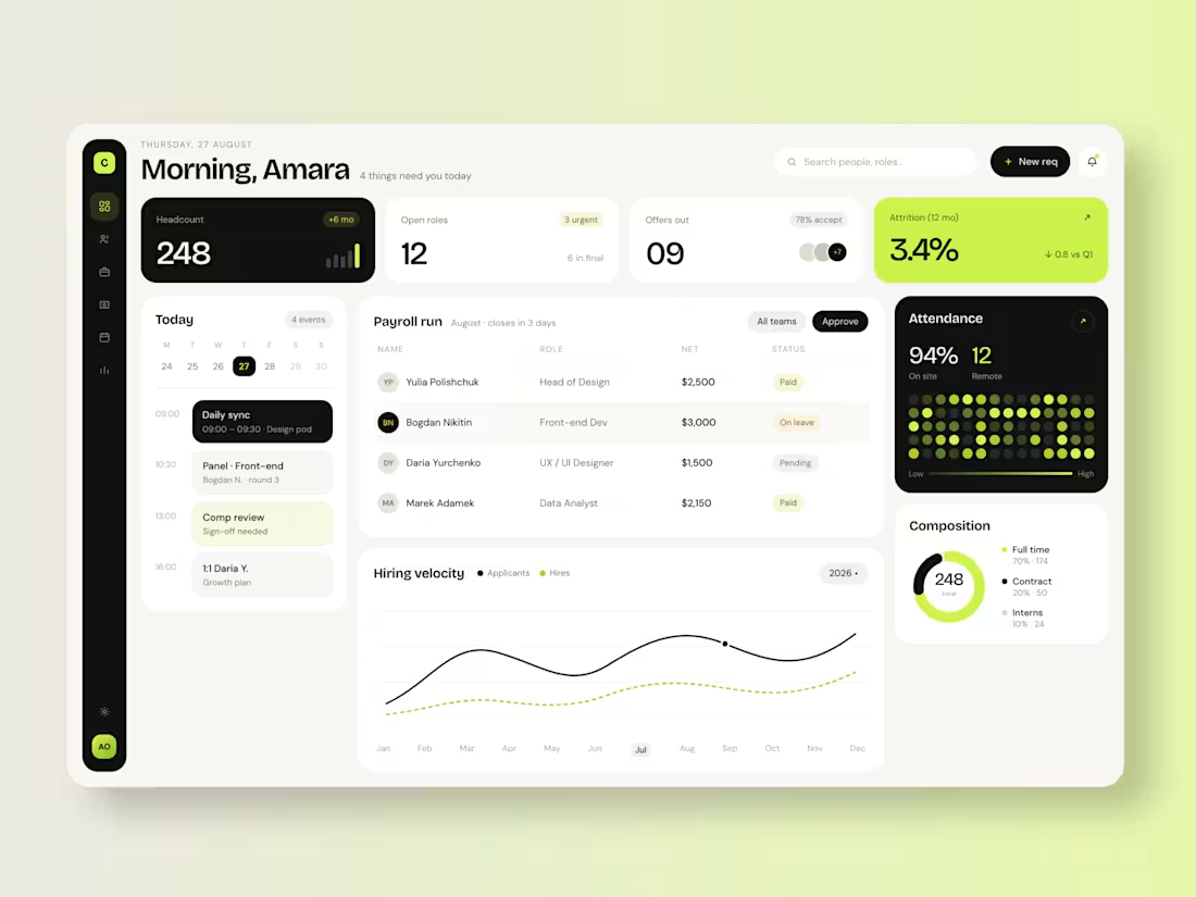
Visual language: A high-contrast black-and-cream palette accented with a single acid-lime highlight color, used deliberately to draw the eye to what's urgent (attrition alerts, active dates, key CTAs) rather than decorating the whole interface.
Information hierarchy: Top-row KPI cards (headcount, open roles, offers, attrition) act as a daily pulse check, sized and colored by urgency — the attrition card is the only fully-lime block on the page, making it impossible to miss.
Task-first layout: A "Today" agenda panel sits beside payroll and hiring data so scheduling and operational tasks live in the same glance as the metrics that inform them.
Data storytelling: The hiring velocity chart pairs applicant volume against actual hires using solid vs. dashed lines — a small detail that makes conversion rate readable at a glance, no legend math required.
Human touches: Attendance is shown as a dot-matrix heatmap rather than a bar chart, giving it a more organic, "who's actually in the building" feel.
Key Screens
Dashboard home, payroll run tracker, hiring velocity analytics, team composition breakdown, attendance heatmap.
Outcome
A dashboard that reads more like a personal morning briefing than a data table — designed to reduce the time an HR lead spends hunting for what matters and get them into action mode faster.
0
43