The network for creativity
Join 1.25M professional creatives like you
Connect with clients, get discovered, and run your business 100% commission-free
Creatives on Contra have earned over $150M and we are just getting started
Back to feedPost

Amara — HR & Workforce Dashboard
UI/UX Design · Web App Design
Overview
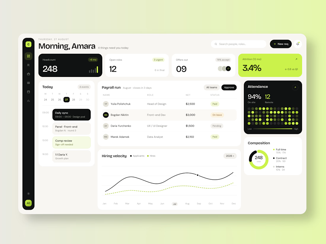
Amara is a people-operations dashboard designed to give HR leads a single, calm view of everything that needs their attention — headcount, hiring pipeline, payroll, attendance, and team composition — without the clutter typical of enterprise HR software.
The Challenge
Most HR platforms bury critical daily actions under dense tables and multi-step navigation. The brief called for a dashboard that surfaces what actually needs a decision today — pending approvals, open roles, comp reviews — while still giving leadership the bird's-eye metrics they check weekly.
Design Approach
Visual language: A high-contrast black-and-cream palette accented with a single acid-lime highlight color, used deliberately to draw the eye to what's urgent (attrition alerts, active dates, key CTAs) rather than decorating the whole interface.
Information hierarchy: Top-row KPI cards (headcount, open roles, offers, attrition) act as a daily pulse check, sized and colored by urgency — the attrition card is the only fully-lime block on the page, making it impossible to miss.
Task-first layout: A "Today" agenda panel sits beside payroll and hiring data so scheduling and operational tasks live in the same glance as the metrics that inform them.
Data storytelling: The hiring velocity chart pairs applicant volume against actual hires using solid vs. dashed lines — a small detail that makes conversion rate readable at a glance, no legend math required.
Human touches: Attendance is shown as a dot-matrix heatmap rather than a bar chart, giving it a more organic, "who's actually in the building" feel.
Key Screens
Dashboard home, payroll run tracker, hiring velocity analytics, team composition breakdown, attendance heatmap.
Outcome
A dashboard that reads more like a personal morning briefing than a data table — designed to reduce the time an HR lead spends hunting for what matters and get them into action mode faster.


The network for creativity
Join 1.25M professional creatives like you
Connect with clients, get discovered, and run your business 100% commission-free
Creatives on Contra have earned over $150M and we are just getting started



Related posts

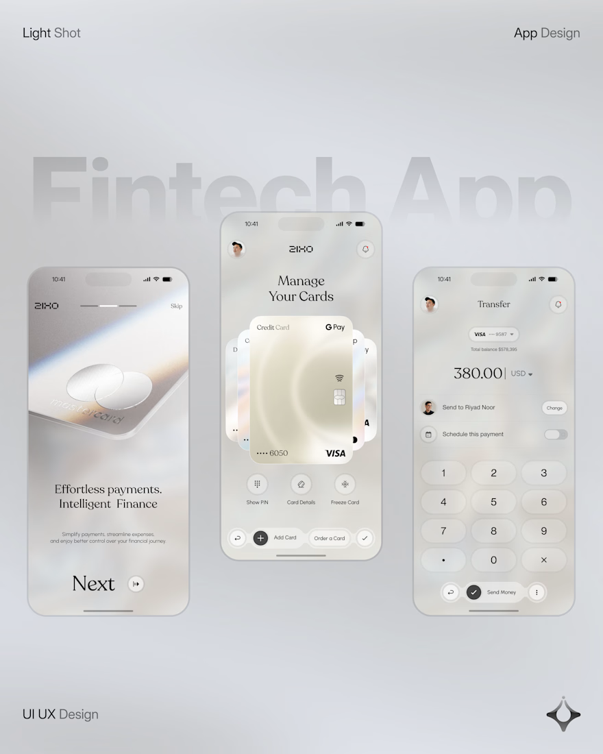
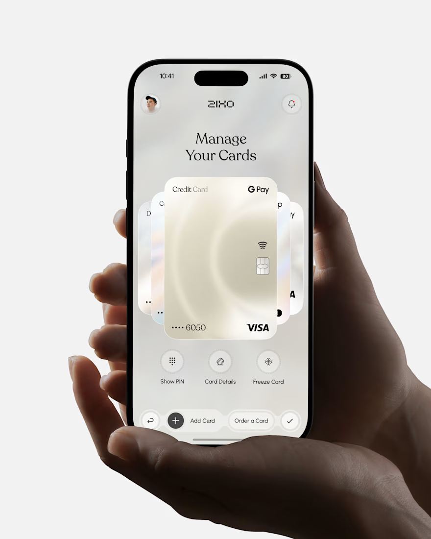
People don’t just want a banking app. They want to feel in control of their money.
Great fintech design doesn’t just look premium. It makes money feel simpler, safer, and easier to control.
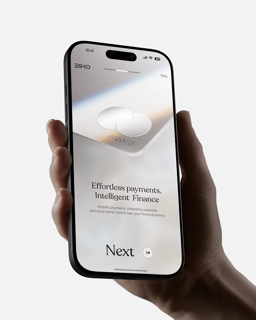
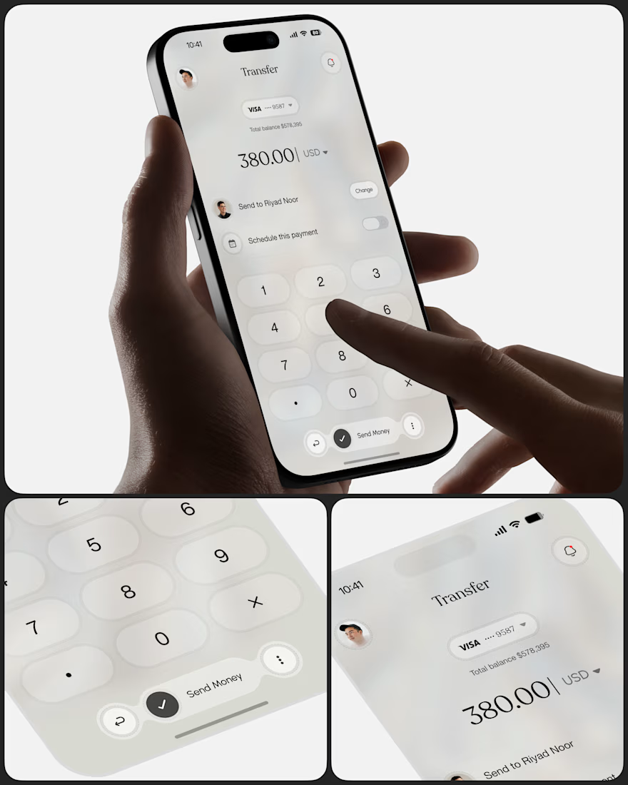
Meet Ziko, a mobile banking concept where every interaction is designed to reduce friction and build trust.
What wins your trust first: 🔒 Security, ✨ Simplicity, or ⚡ Speed?



Stunning

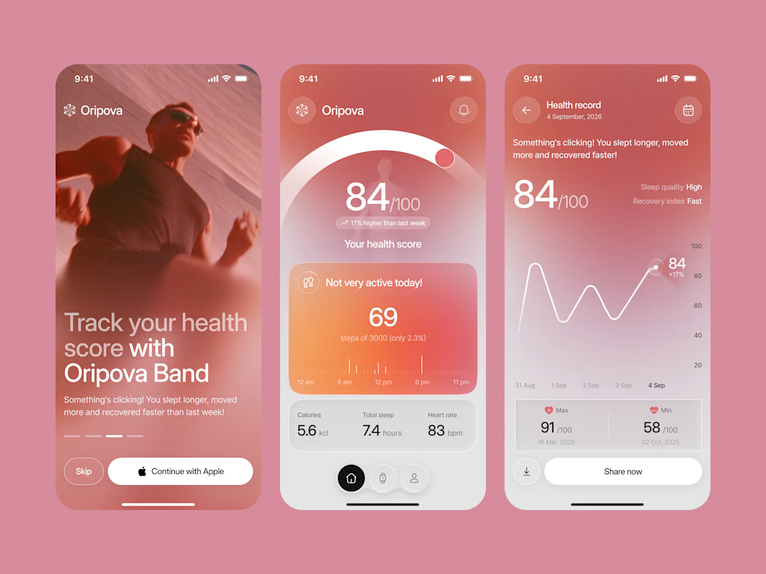
Designed a modern Smart Band Health Tracking App.
A warm rose and coral gradient with soft blur effects, a cinematic onboarding photo, and large, clean numbers for a bold and inspiring first impression.
A glowing health score, a daily steps card with a clear timeline, quick stats for calories, sleep, and heart rate, plus a health record chart with simple daily insights make wellness data feel easy to understand. Soft glass cards and a floating tab bar keep the whole app smooth and easy to use.

Impressive work

Kajabi Website Design for Online Coaches & Courses
Designed a Kajabi website concept for online coaches and course creators who need a clear, professional way to present their programs and learning offers.
The website focuses on presenting course information, highlighting program benefits, and guiding visitors toward enrollment or the next step. The layout combines clear content structure, engaging sections, responsive design, and strategically placed calls to action to create a smooth experience across desktop and mobile.
The goal is to help coaches communicate the value of their programs and give prospective students a clear path from discovering the offer to taking action.
#Kajabi #KajabiWebsiteDesign #WebsiteDesign #OnlineCourse #CourseCreator #OnlineCoaching #CoachingWebsite #CourseWebsite #LandingPageDesign #SalesPageDesign #WebDevelopment #Elearning

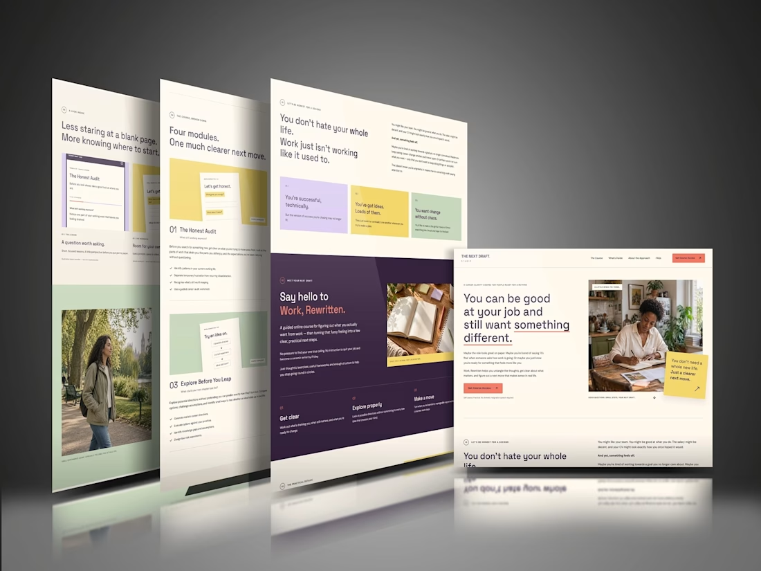

The “Four modules. One much clearer next move.” line makes the course feel manageable before someone gets into the details. That’s a useful choice for coaches whose offers can otherwise feel overwhelming. For this concept, would the main CTA go straight to enrollment, or let visitors preview a lesson first?