The network for creativity
Join 1.25M professional creatives like you
Connect with clients, get discovered, and run your business 100% commission-free
Creatives on Contra have earned over $150M and we are just getting started
Back to feedPost

Finora — Personal Finance Landing Page
Web Design · Landing Page
Overview
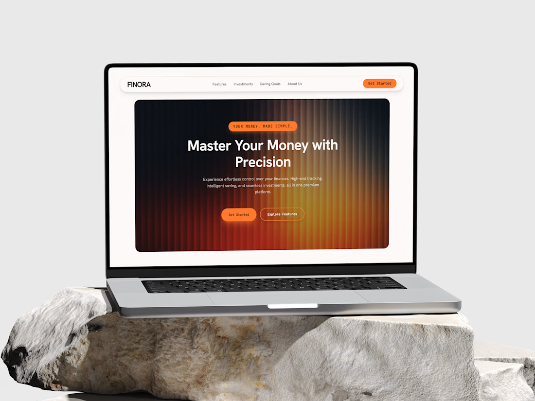
Finora is a premium personal finance platform positioning itself around control and clarity — helping users track spending, set saving goals, and manage investments from a single dashboard. This project covers the marketing site's hero landing page.
The Challenge
Fintech landing pages tend to fall into two traps: either sterile corporate-blue templates, or gradient-heavy noise that undercuts trust. The goal here was to make a finance product feel premium and modern without borrowing the usual "startup fintech" visual clichés.
Design Approach
Hero treatment: A radial amber-to-charcoal gradient with fine vertical striping gives the hero section warmth and depth — closer to a luxury product launch than a typical SaaS banner — while staying dark enough to keep white headline text sharp.
Typography contrast: A bold, rounded sans-serif for the headline paired with a monospaced font for labels, badges, and CTAs — the mono touch signals "precision" and "data," reinforcing the product's positioning (Master Your Money with Precision) without needing icons or charts to prove it.
Navigation: A pill-shaped floating nav bar keeps the top of the page light and breathable against the darker hero, so the eye moves naturally from brand to nav to CTA.
CTA hierarchy: A solid orange "Get Started" paired with an outlined "Explore Features" — a clear primary/secondary action pattern that avoids decision fatigue on first visit.
Presentation: Displayed on a MacBook mockup set against natural stone — a deliberate choice to lend the brand a grounded, tactile, high-end feel rather than the usual sterile device-on-gradient portfolio shot.
Key Elements
Hero section, pill navigation, dual CTA pattern, badge/eyebrow tag styling.
Outcome
A landing page that signals trust and precision through restraint — one bold gradient, one accent color, and typography doing most of the heavy lifting.


The network for creativity
Join 1.25M professional creatives like you
Connect with clients, get discovered, and run your business 100% commission-free
Creatives on Contra have earned over $150M and we are just getting started



Related posts

Webiste redesign for Saas company


2 voted
4%
44 voted
96%
46 votes
Closed


cool