
pro
SUBHAN DESIGNS • Identity & Packaging
Identity & Packaging Systems Beyond Category Conventions
- $1k+
- Earned
- 5.0
- Rating
- 49
- Followers


1
3
42
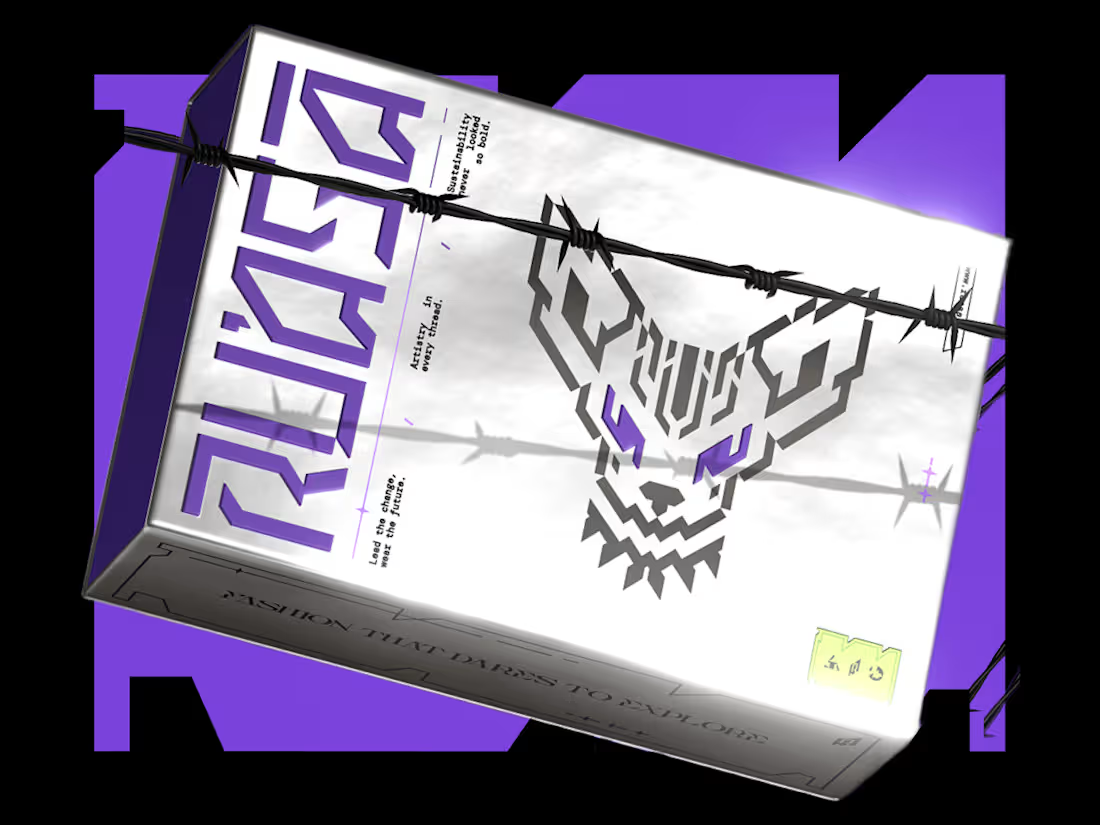
"We weren’t sure what our brand should look like. They gave us a clear path forward.”
That’s how our client described their experience working with us on Ru’asā.
They came to us with a clear ambition: build a premium fashion brand that goes beyond category conventions.
Derived from the Arabic ra’is, meaning chief or leader, Ru’asā celebrates individuality and rebellion against conformity.
We built the complete brand experience across Strategy, Creative Direction, Visual Identity, Packaging Experience and Collaterals.
The full project is live. Take a look at how we brought the brand to life here (https://www.behance.net/gallery/241790871/Techno-Gothic-Branding-Packaging-for-Fashion-Brand)
Building a brand that aims to set the standard rather than follow one? I’d love to hear from you
4
14
696
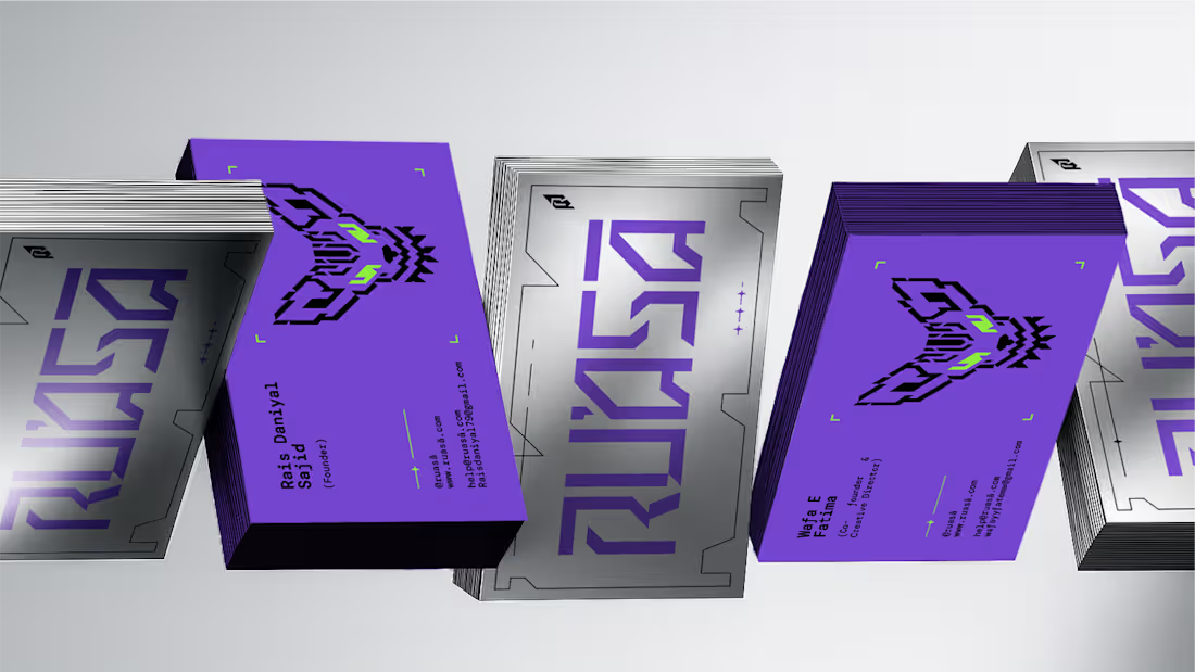
Scalability should never come at the cost of personality when building an Identity.
A strong identity carries one big idea consistently, from the biggest brand moments to the smallest touchpoints, without losing what makes it distinctive. To me, that’s one of the clearest signs of a system built to last.
For Ru’asā, this was especially important. The identity is intentionally maximalist, which meant every application had to carry the same energy without becoming inconsistent or overwhelming.
The challenge was building something expressive, yet systematic enough to scale. And that’s exactly what we built.
Here are some of the touchpoints we created for Ru’asā. Do they feel like they belong to the same world?
2
5
638
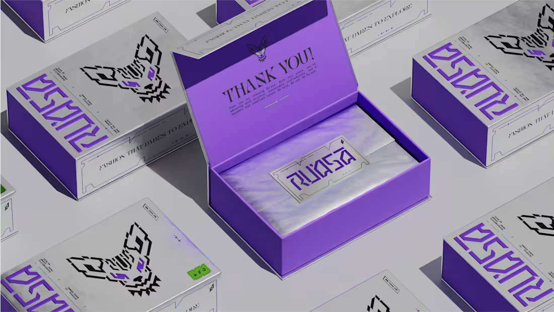
Packaging visuals from our recent Identity & Packaging project for Ru’asā.
We built the packaging around silver foil, a raised wordmark and a cyber-gothic visual language, sharpened by Ru’asā’s signature purple accents.
Every detail was designed to do two things: elevate the unboxing experience and reinforce the brand’s unconventional character. Premium in execution, rebellious in expression.
The complete project is now live, covering Creative Direction, Mascot Logo, Visual Identity, Packaging Experience and Collaterals.
Explore the full case study here (https://www.behance.net/gallery/241790871/Techno-Gothic-Branding-Packaging-for-Fashion-Brand)
P.S. Is this a box you’d keep long after the unboxing?
1
5
534