
pro
May | Brand designer & strategist
Creating strategic brands with brains & personality
- $1k+
- Earned
- 3x
- Hired
- 5.00
- Rating
- 160
- Followers
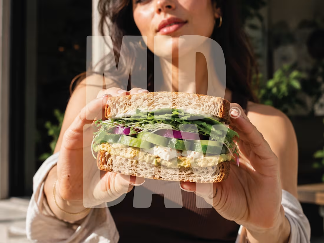
MIDDAY | Sandwich Bar Brand Identity
A self-initiated brand identity for MIDDAY, a contemporary sandwich bar built around one simple idea: everyday lunch should still feel worth looking forward to.
The identity combines bold editorial typography, warm lifestyle photography and familiar deli-inspired details to create something considered, approachable and easy to return to.
Your 12:30 deserves better.
more posts on this one in the upcoming days!
3
21
254
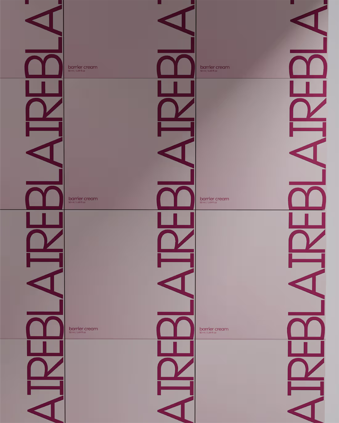
BLAIRE Part 3.
A closer look at the packaging system behind the concept.
The collection was developed around sculptural forms, coated aluminium finishes, and a restrained visual language that allows the materials to do most of the work. Rather than relying on loud branding, the focus was placed on silhouette, proportion, and subtle typography to create products that feel considered both on shelf and in hand.
The result is a skincare and beauty collection that balances softness with structure through a cohesive family of vessels, cartons, and material finishes.
The full case study will be shared soon.
4
22
839
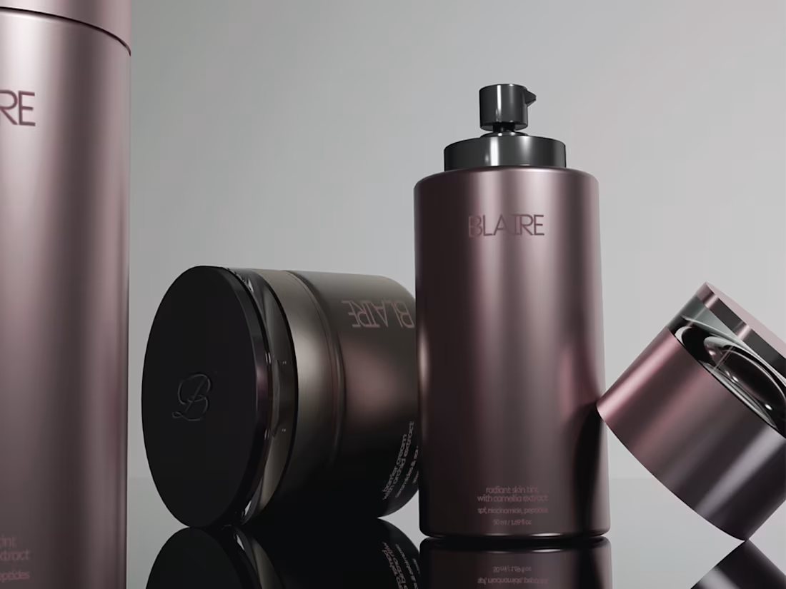
Part 2 of BLAIRE focuses on the structure behind the visual direction; exploring typography, layout systems, printed elements, and the details that create consistency across the brand.
This phase shifts away from atmosphere and moves deeper into the mechanics of the identity system; balancing softness with precision through restrained compositions and controlled spacing.
More renders + Full case study coming soon ✦
3
25
661
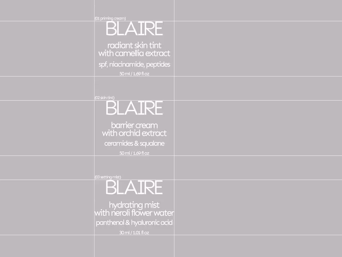
BLAIRE is a skincare and beauty concept centered around softness, restraint, and sculptural cosmetic forms.
The direction explores skin-first products through coated aluminium packaging, muted floral tones, and editorial-inspired layouts. Designed as beauty objects first, the collection balances subtle branding with softened silhouettes, reflective finishes, and atmospheric color palettes.
The first release includes a radiant skin tint, hydrating setting mist, and barrier priming cream developed as a cohesive luxury beauty line.
Part 2 and 3 of the project, iuncluding more of the packaging and brand system will be shared this weekend, alongside the full case study.
25
43
1.3K
Part 2 of REFORMR expands the concept further into physical and digital applications; exploring how the identity moves across space, interaction, and membership experiences.
This phase focuses on building a more connected brand system through:
• app and booking flow concepts
• membership and access design
• environmental and spatial visuals
• campaign-style compositions
• tactile print explorations
The direction continues to balance structure and softness through a restrained palette, bold typography, and calm interface design; creating a system that feels both functional and atmospheric.
Full case study coming soon ✦
7
29
785
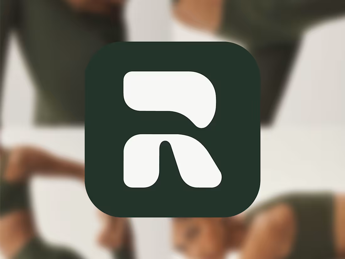
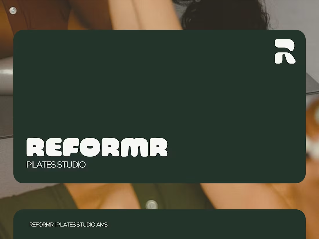
REFORMR is a reformer pilates studio concept built around structure, control, and intentional movement.
The direction combines softened athletic energy with a more refined and atmospheric visual identity system; balancing performance with restraint across both physical and digital touchpoints.
For this first presentation, I explored:
• identity direction
• visual language
• tactile brand elements
• digital applications
• spatial and editorial-inspired compositions
Built to feel calm, recognizable, and structured without losing warmth.
Part 2 + full case study coming soon ✦
4
10
359
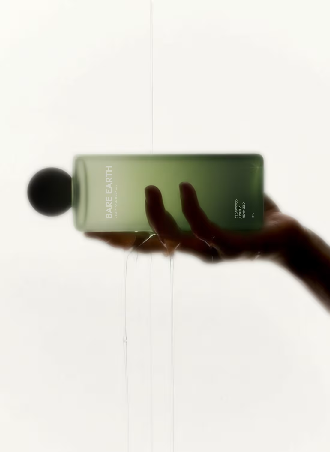
Not every body care brand needs to glow.
Bare Earth explores strength as a brand decision, not just a formula claim. Forest extracts, mineral clays, pine resins; translated into a restrained visual system.
Mockups by me, available soon
4
35
660
Karmae — Fragrance Brand Identity & Packaging
1
18
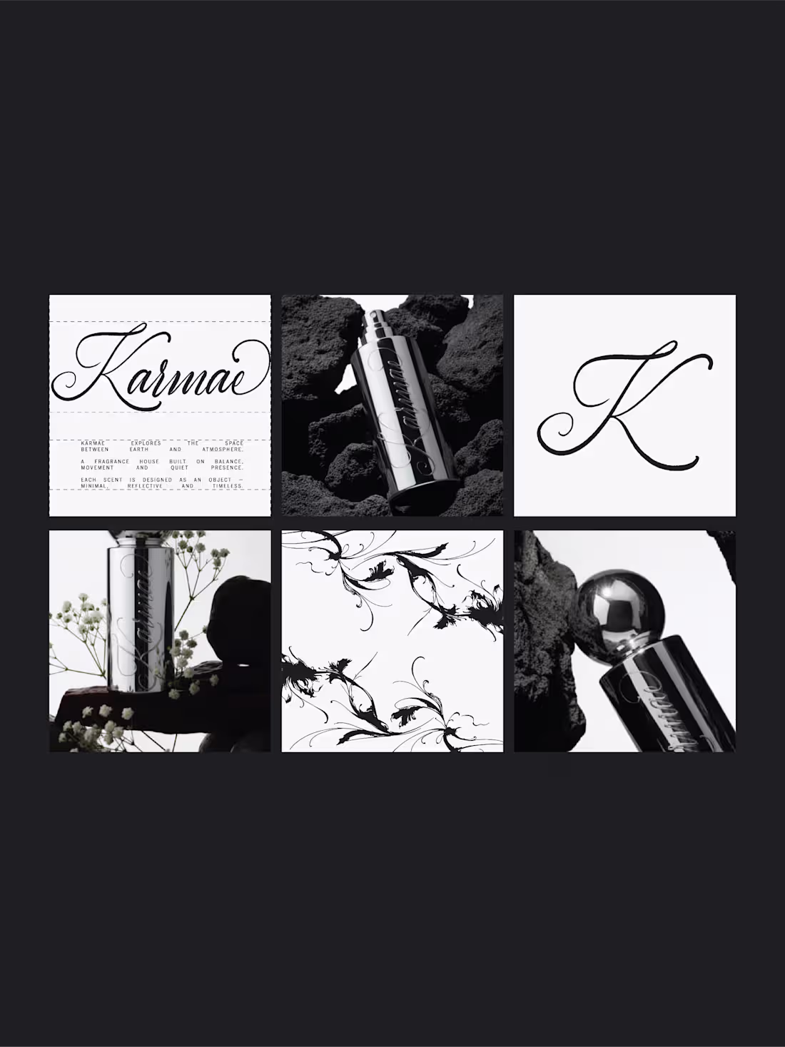
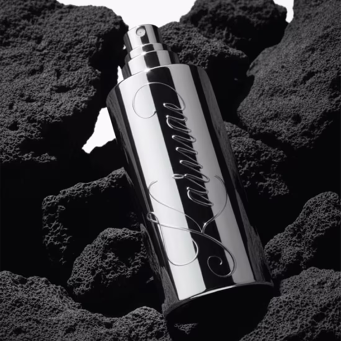
A closer look at Karmae.
An exploration of balance, contrast, and presence...
translated into a refined wordmark and visual system.
Sublte details, controlled spacing,
and a focus on restraint over excess.
More coming soon.
Full case study after the weekend.
3
28
849
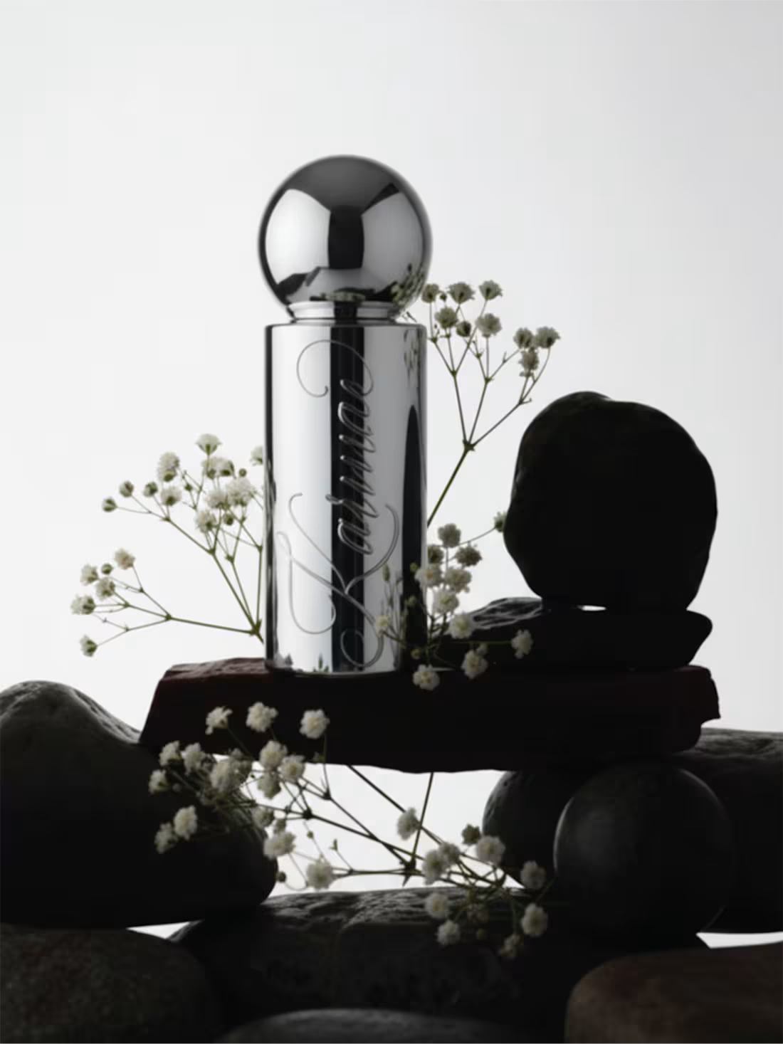
Karmae, a fragrance concept exploring the space between earth and atmosphere.
This project started with the idea of balance: reflective chrome, mineral textures, and delicate botanical linework forming a system that feels both grounded and weightless.
The bottle acts almost like a celestial object; minimal, reflective, and constantly shifting with light.
Genderless, atmospheric, and quietly powerful.
Really enjoyed building this world and translating the idea of orbit and movement into something tactile.
More from this project coming soon, including a deeper case study.
8
27
691
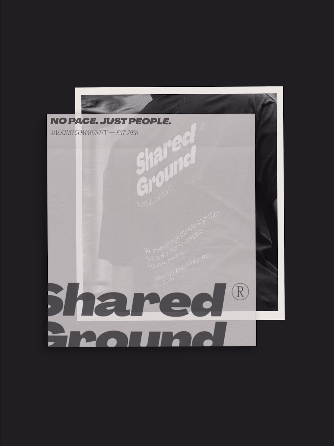
Shared Ground, a small branding study concept for a walking community made for those who want to slow down in cities that never do.
1
13
542
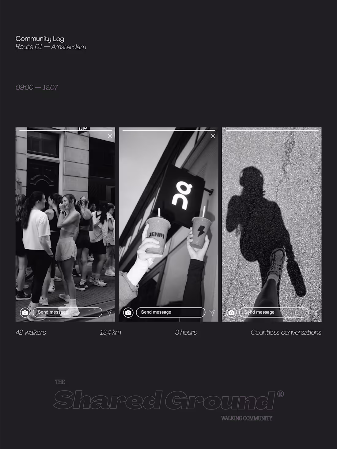
First look at shared ground, a walking community made for those who want to slow down in cities that never do.
1
17
769
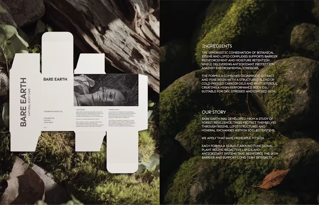
Bare Earth — Elemental Body Care Identity
0
19
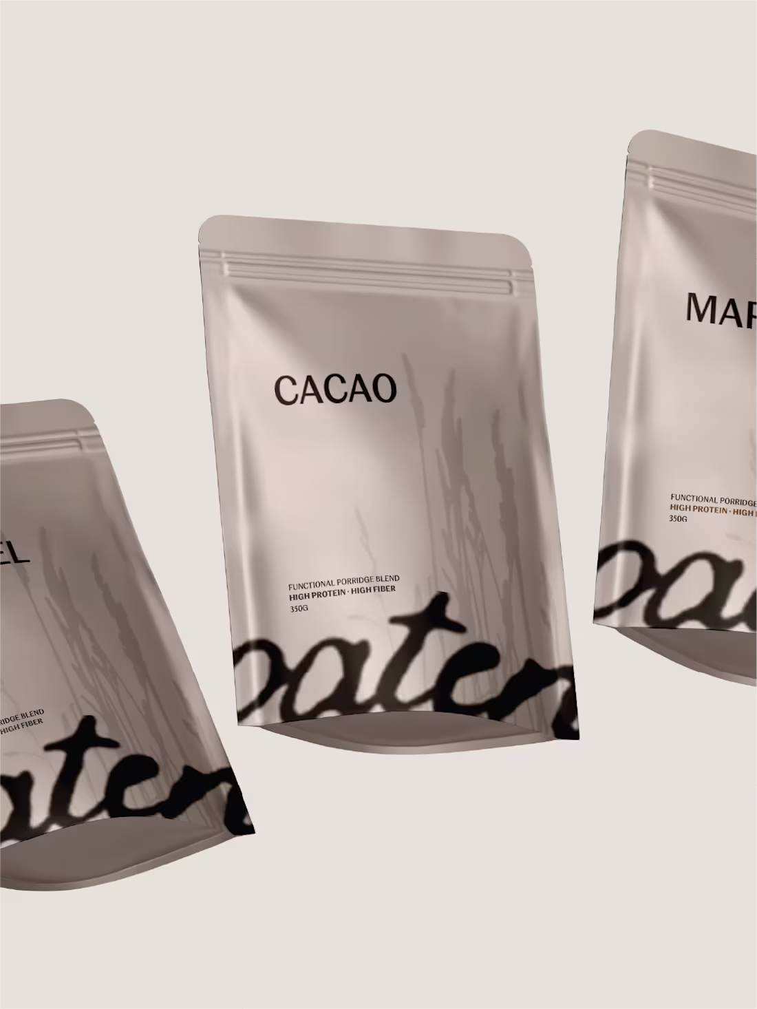
Oaten was created for modern routine.
Nourishment positioned as structure, not spectacle.
High protein, high fiber; translated into a restrained visual system.
Muted neutrals, grounded typography, and layered materials create clarity without noise.
Three blends. One daily rhythm.
Designed to move seamlessly across packaging and print; tactile, precise, and intentional.
9
42
634
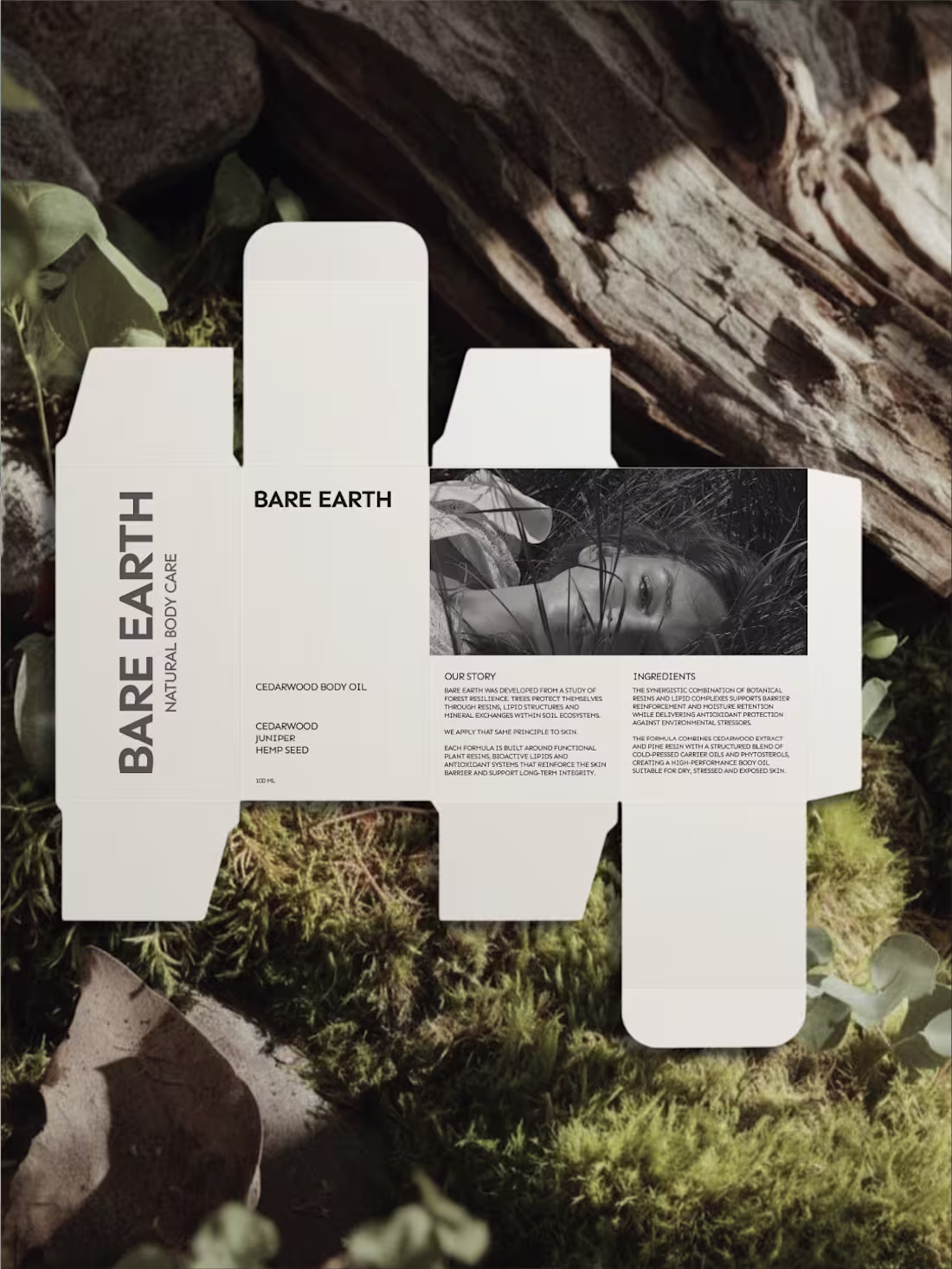
Not every body care brand needs to glow.
Bare Earth explores strength as a brand decision, not just a formula claim. Forest extracts, mineral clays, pine resins; translated into a restrained visual system.
Mockups by me, available soon
9
35
816
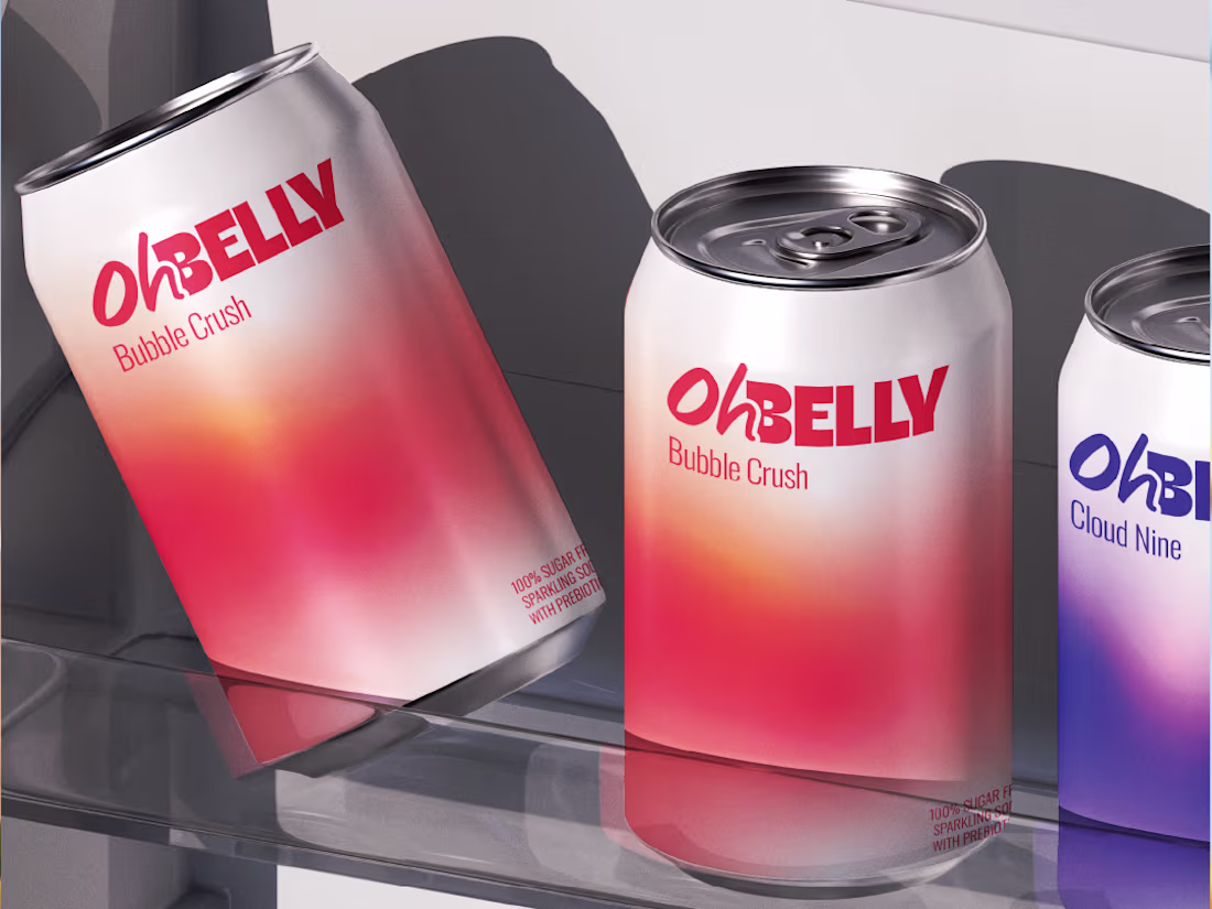
Oh Belly reimagines soda with lightness as the guiding principle.
Soft gradients, subtle pixel details, and playful visuals create a system that floats across packaging and digital.
29
632
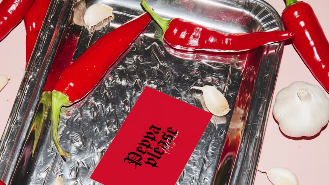
Peppa Please — Building a Bold, Scalable Hot Sauce Brand
5
32
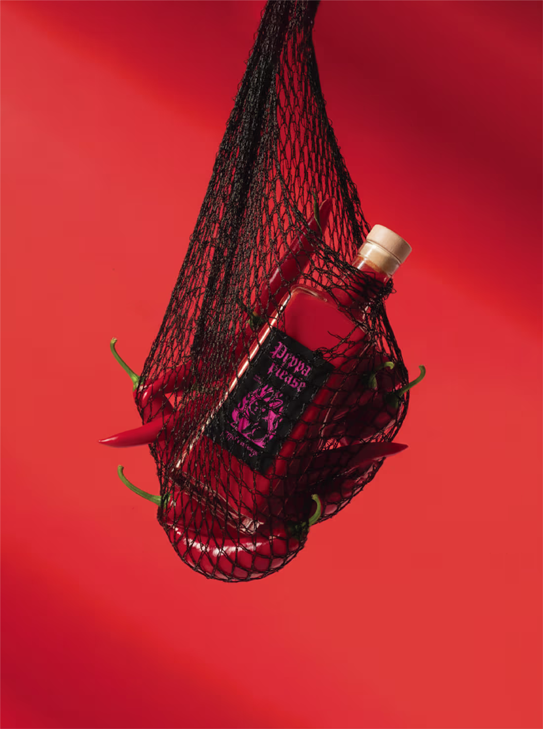
Did it just get hot in here?
Concept Branding & Packaging for Peppa Please!🌶️
Let me know your thoughts on this one!
1
17
605
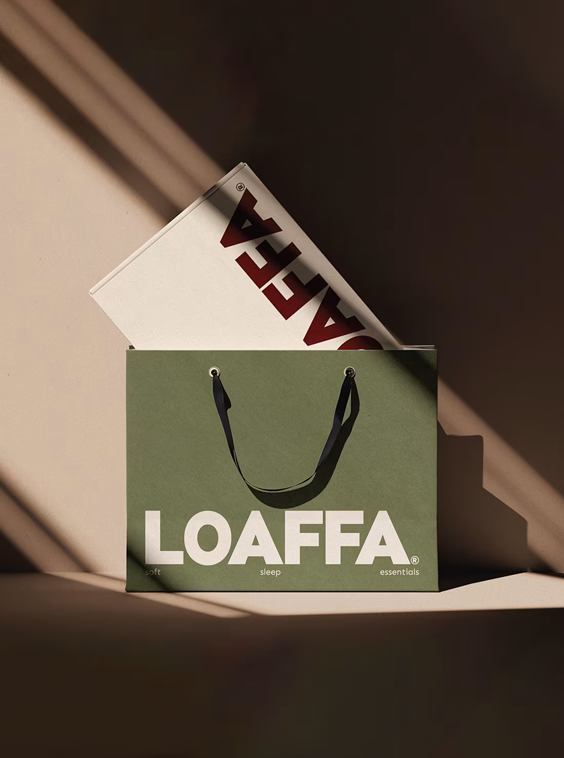
First passion project of 2026, meet LOAFFA;
Your newest obsession when it comes to sleepwear and bedding.
Worth coming home to, and hard to leave in the morning...
4
24
720
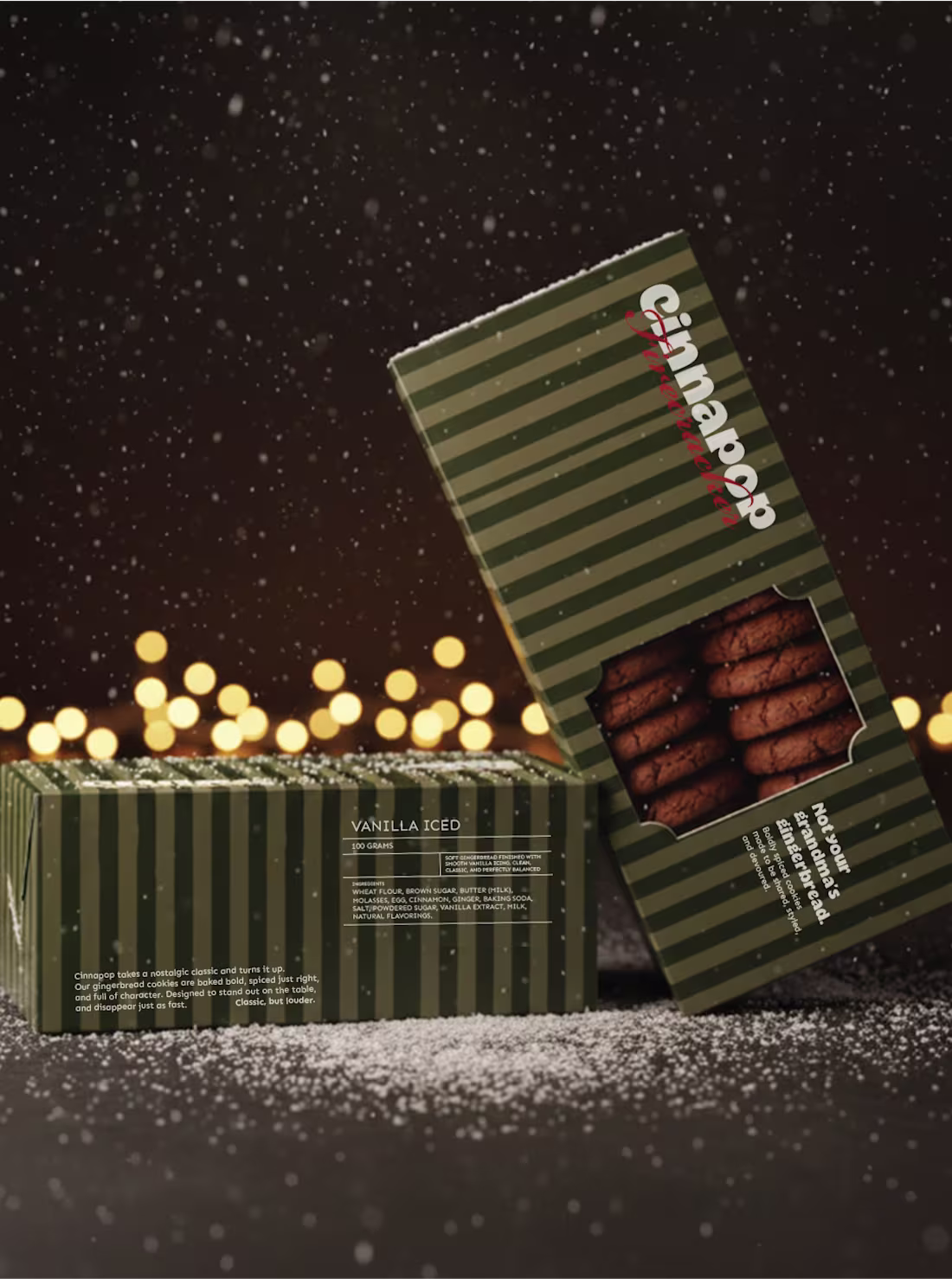
Small look at Cinnapop, a gingerbread cookie brand I made for fun... Just in time for the holidays!
5
34
666
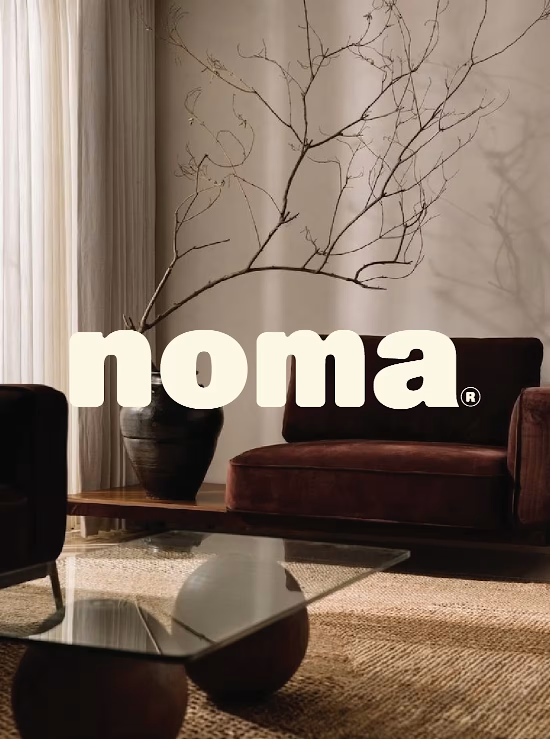
(Case study is coming soon!)
A small view into my latest personal project:
NOMA, furniture shaped by warmth and balance.
9
36
785
A warm little passion project I have been shaping between late-night coffee and early baked bread in the last 24 hours.🍞
Inherited by her uncle, the first spark of Uncle Dough. Taken in hand by the next generation of sourdough bakers✨
2
26
670
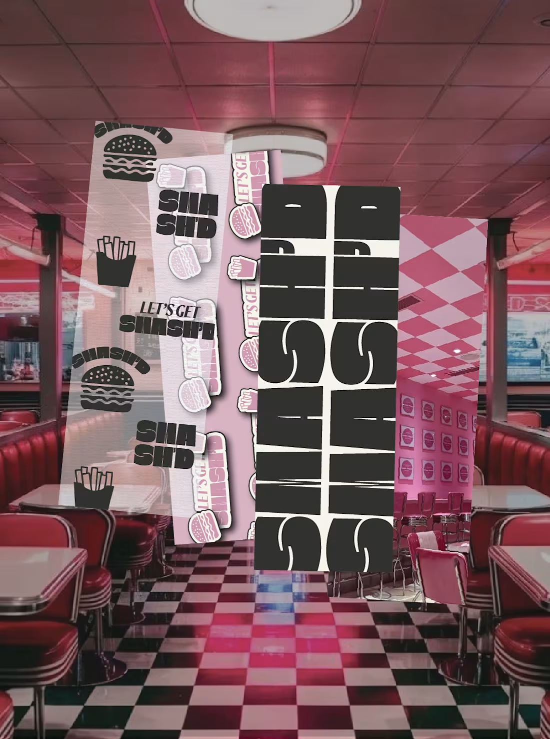
A quick preview of my latest brand passion project, meet SMASH'D;
A fast & bold street burger brand with grit, flavor &unapologetic energy.
12
42
803
A small view on the branding, visuals, and merch for the concept, Off Court.
A modern padel & lifestyle brand rooted in French ease.
A study in movement, stillness, and light, built around the rhythm of play and the calm that follows.
8
56
731
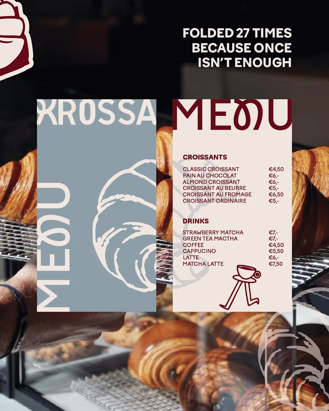
Branding & visuals for KROSSA.
A bold, unapologetic boulangerie redefining the art of pastry.
Crafted for those who crave more, luxury layered with attitude.
Where Parisian elegance meets fearless expression, and butter meets rebellion.
9
32
675
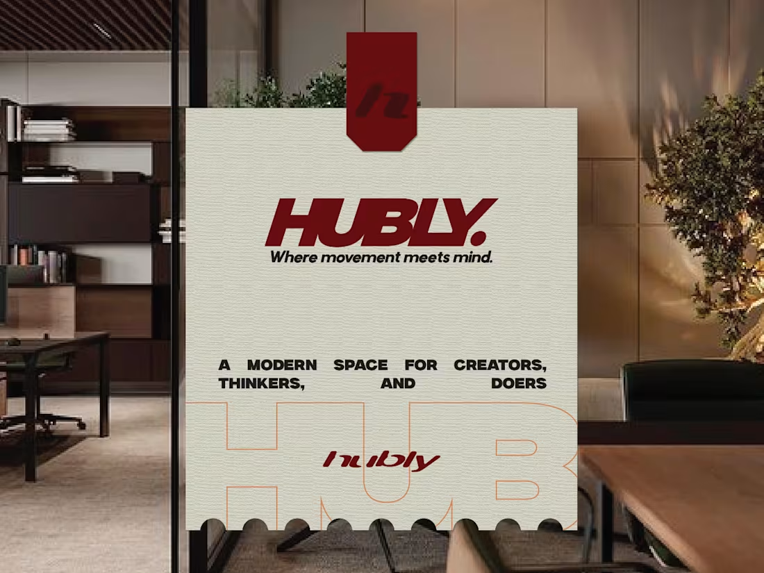
Branding & visuals for HUBLY. A modern, innovative coworking space.
A concept designed for the doers, where movement meets minds. Built around creativity, focus, and connection, HUBLY redefines what a workspace can feel like.
15
57
792
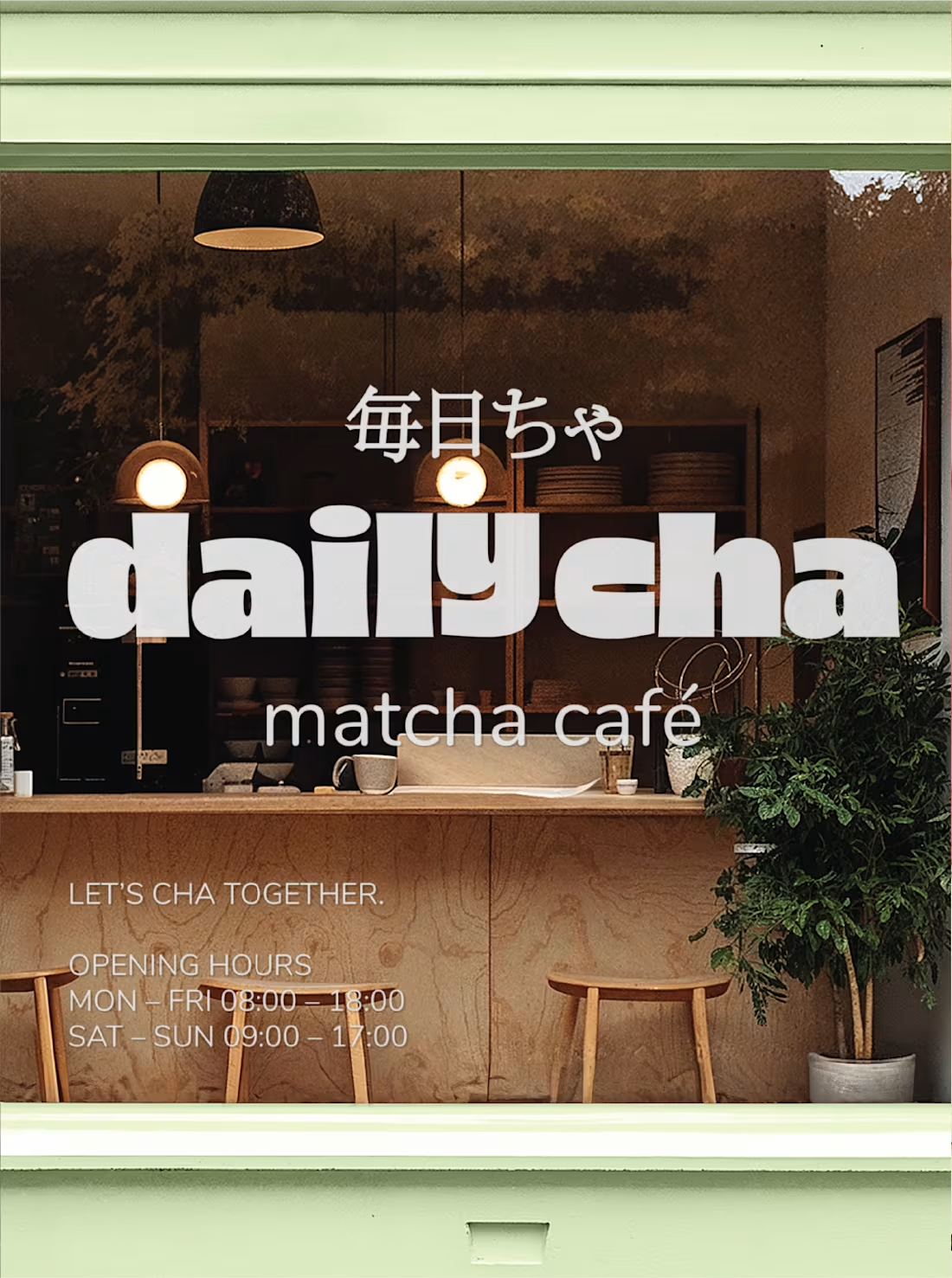
Branding & packaging for Daily Cha, let’s cha together.
fresh, and anything but boring. We’re here to turn matcha into a vibe: playful colors, good energy, and a menu full of choices that hit just right. It’s not just tea, it’s a ritual you’ll actually look forward to.
48
132
1.1K