pro
Stephenie Amadhe
Product Designer | Product Manager | SMM & Brand Strategist
- 5.00
- Rating
- 58
- Followers
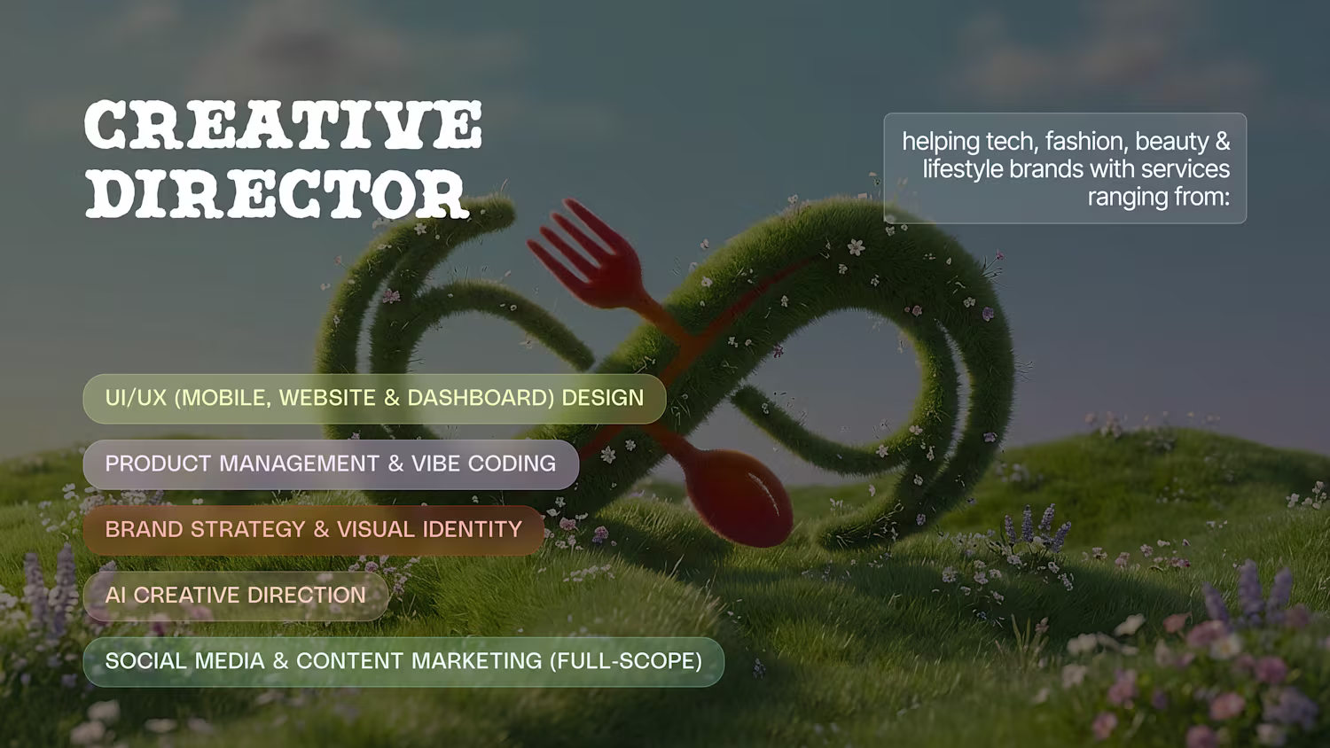
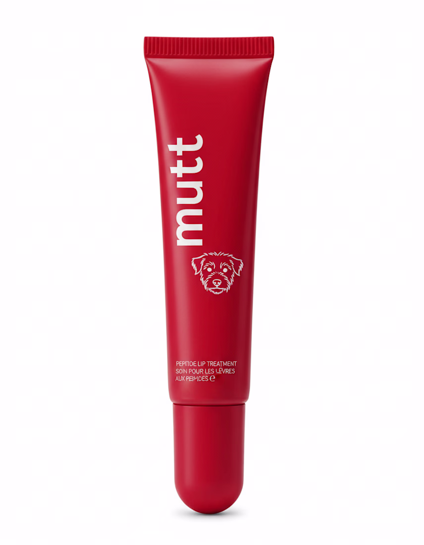
Logo explorations using Flora, one of my fav tool for AI creative direction
I generated this logo concept in minutes; here’s how.
One thing about me; I always have visuals in my head.
But since I started in Product Design (not Photoshop/Illustrator), turning those ideas into finished concepts used to slow me down.
That’s why AI Creative Direction has...
Testing Weavy in my AI workflow today and wow, it’s powerful but VERY technical.
A few quick lessons:
• Weavy needs very structured prompts. Unlike Flora or Lovart, you have to break requests into clean micro-steps or the output falls apart.
• Each element needs its own refinement...
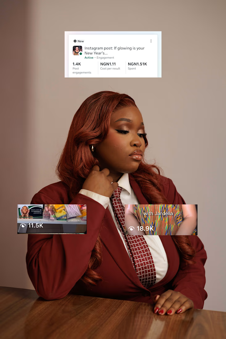
This tiny editing tweak increased ad interest in 24 hours.
I’ve realised people barely have attention spans anymore — even I 2× videos daily.
So instead of editing like a creator, I started editing like a viewer. Game changer.
A client’s visibility ad was dragging, so I tried...
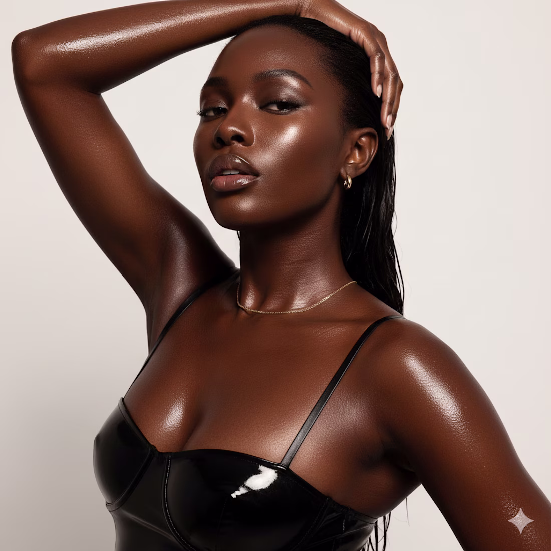
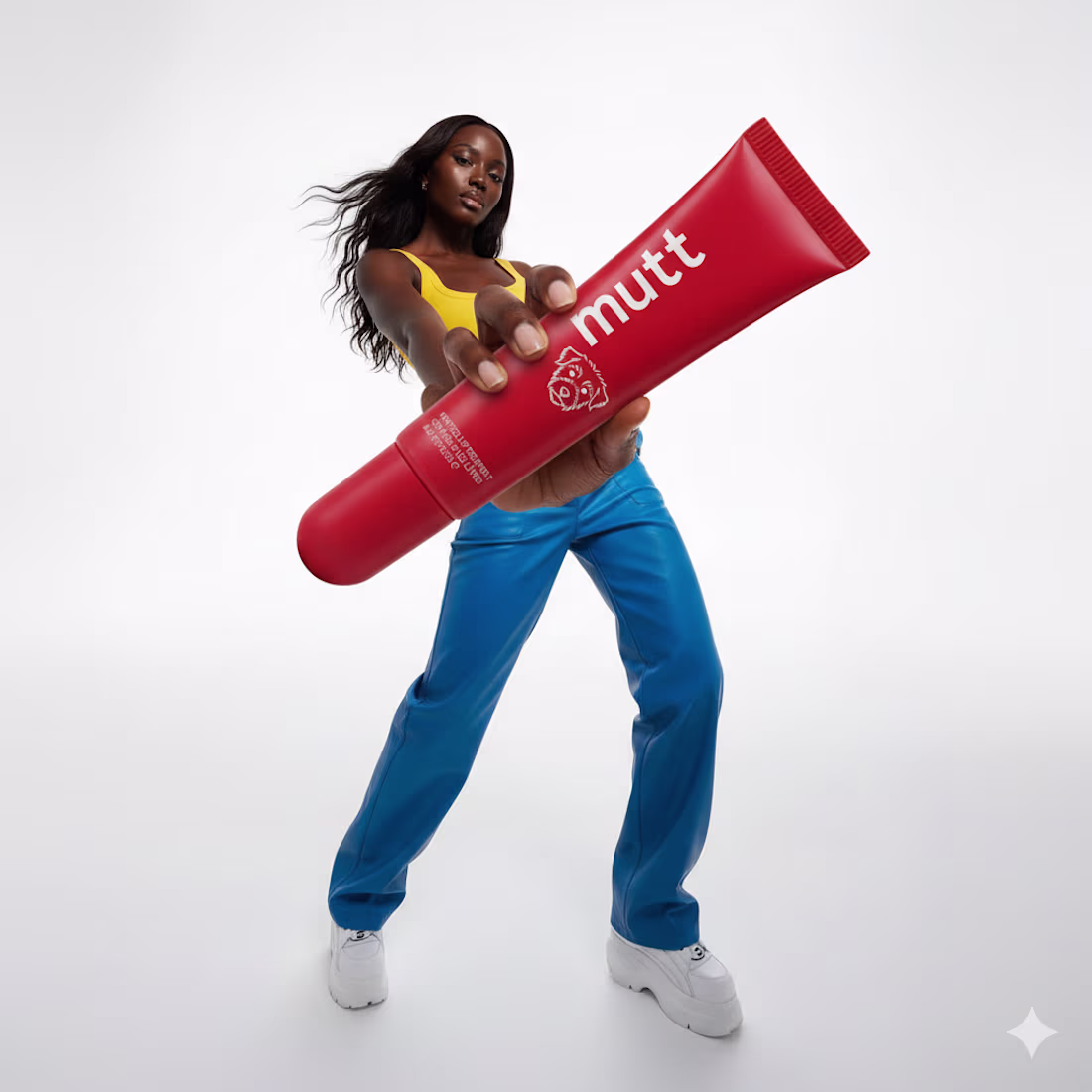
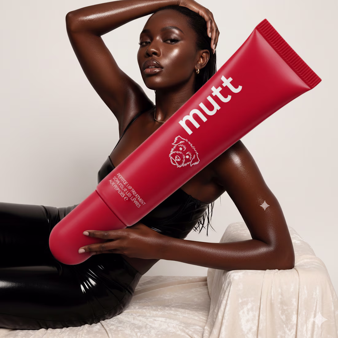
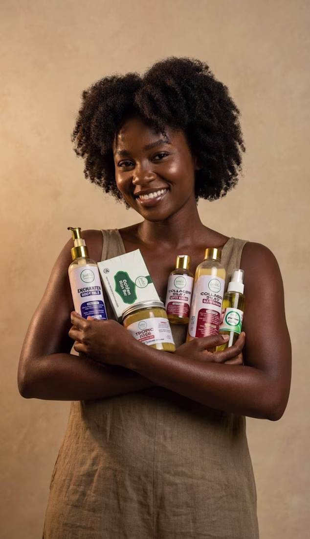
The product and model
The art direction and product shots all using nano banana pro.
I love what AI can help me accomplish