pro
Stephenie Amadhe
Product Designer | Product Manager | SMM & Brand Strategist
- 5.00
- Rating
- 58
- Followers
I generated this logo concept in minutes; here’s how.
One thing about me; I always have visuals in my head.
But since I started in Product Design (not Photoshop/Illustrator), turning those ideas into finished concepts used to slow me down.
That’s why AI Creative Direction has...
Testing Weavy in my AI workflow today and wow, it’s powerful but VERY technical.
A few quick lessons:
• Weavy needs very structured prompts. Unlike Flora or Lovart, you have to break requests into clean micro-steps or the output falls apart.
• Each element needs its own refinement...
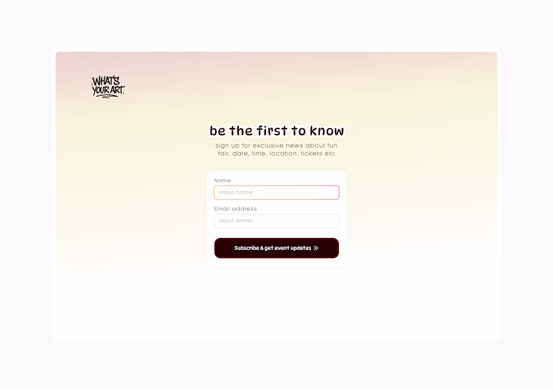
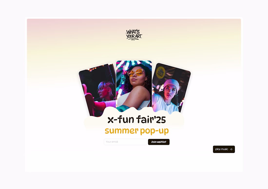
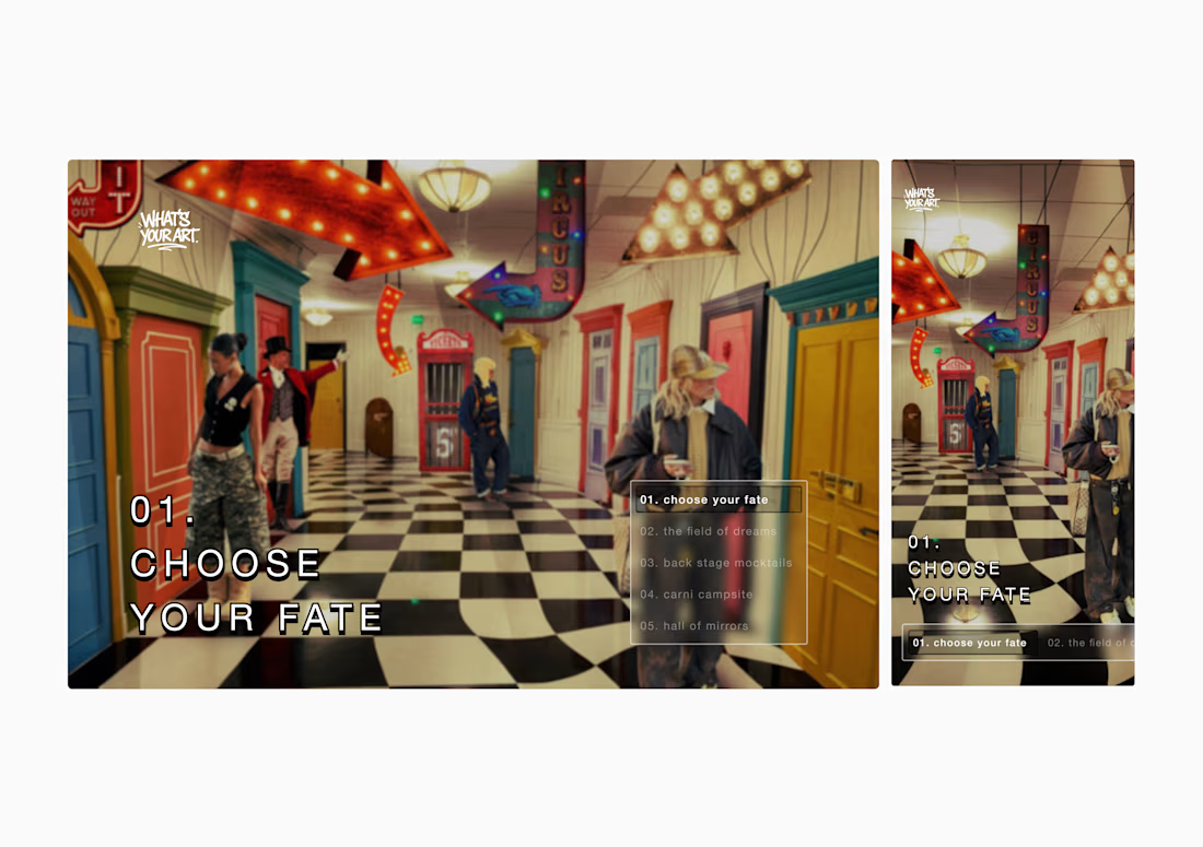
I recently built a website campaign for a brand’s creative event, and every screen had one job: communicate clearly.
A good campaign website must answer:
• Who it’s for
• Why it matters
• The pain points
• The benefits
• The offer
• And where to sign up
Social media brings...
Hi! I'm Stephenie 👋
I've worked as a product designer and manager for 4+ years, but late last year I rebranded not leaving those skills behind, but expanding into brand marketing, campaign design, UGC, and content creation.
Think creative director meets editorial strategist, but...

Design has multiple angles it isn’t just iteration, it’s alignment with the product’s real market vision.
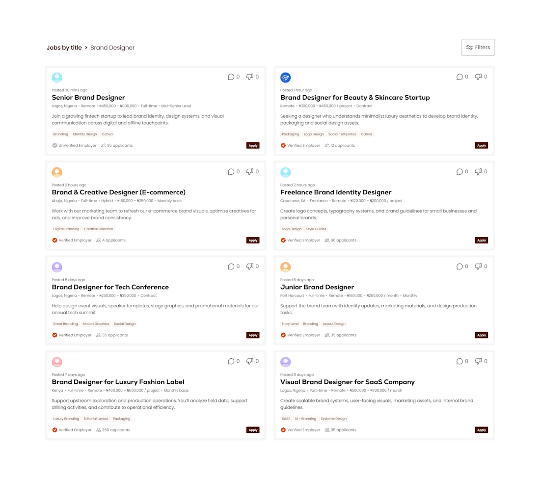
I designed a full job screen for a client… then we revisited the platform vision. The goal shifted → a more social-media-driven job marketplace.
So back to the drawing...