
pro
Sonjoy C. Barman
Full Stack Dev building scalable SaaS apps with Next.js
New to Contra
Sonjoy is ready for their next project!
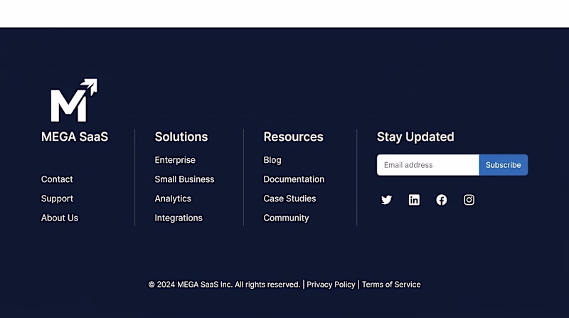
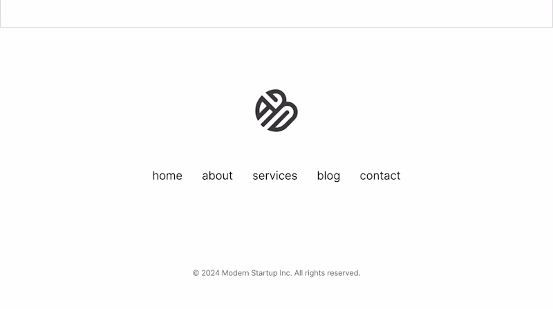
Mega footer or keep it simple? 🗂️
Design 2: 4-column mega footer, full link sitemap, newsletter, social icons.
Design 1: Minimal footer, logo + 5 links + copyright. That's it.
Does a bigger footer help or just add noise?
2️⃣ = Mega footer | 1️⃣ = Minimal footer
#FooterDesign #WebDesign #LandingPage #UIDesign #Contra
3 voted
60%
2 voted
40%
5 votes
Closed
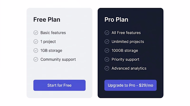
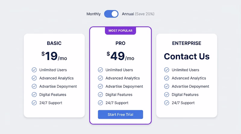
2-column or 3-column pricing? The debate never ends. 🏷️
Here's what the data says:
— 3 columns create a "middle option" anchor effect
— 2 columns feel cleaner and faster to decide
But which LOOKS better to you?
2️⃣ = Two plans | 1️⃣ = Three plans
5 voted
63%
3 voted
37%
8 votes
Closed
Motion vs stillness on landing pages — which wins? ⚡
Some say animation grabs attention. Others say it kills load time and focus.
Design 2: Subtle Lottie animation, floating elements, dynamic feel.
Design 1: Pixel-perfect static layout, no distractions, pure focus on copy.
As...
2 voted
40%
3 voted
60%

5 votes
Closed
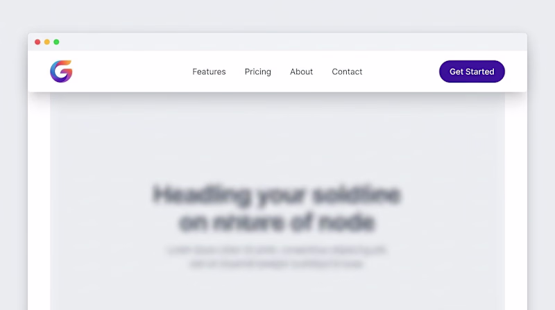
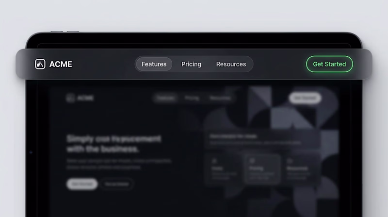
Sticky navigation — dark or light? 🤔
One rule of landing pages: your nav sets the entire brand tone.
Design A: Frosted dark navbar, white logo, and ghost buttons.
Design B: Pure white navbar, colourful logo, solid CTA.
Which converts better in your experience?
2️⃣ = Dark...
0 voted
0%
7 voted
100%
7 votes
Closed
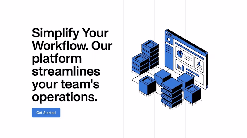
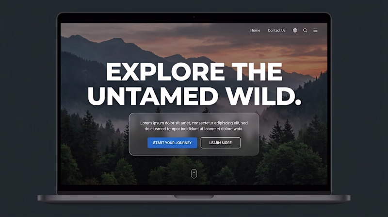
Which hero section makes you stop scrolling? 👀
Left: Clean white space, single powerful headline, one CTA.
Right: Full-bleed image, overlay text, dual CTAs.
Both are conversion-tested. But which one fits YOUR brand?
Drop your vote below. 👇
2️⃣ = Minimalist | 1️⃣ =...
0 voted
0%
2 voted
100%
2 votes
Closed