The network for creativity
Join 1.25M professional creatives like you
Connect with clients, get discovered, and run your business 100% commission-free
Creatives on Contra have earned over $150M and we are just getting started
Back to feedPost
Taste Test
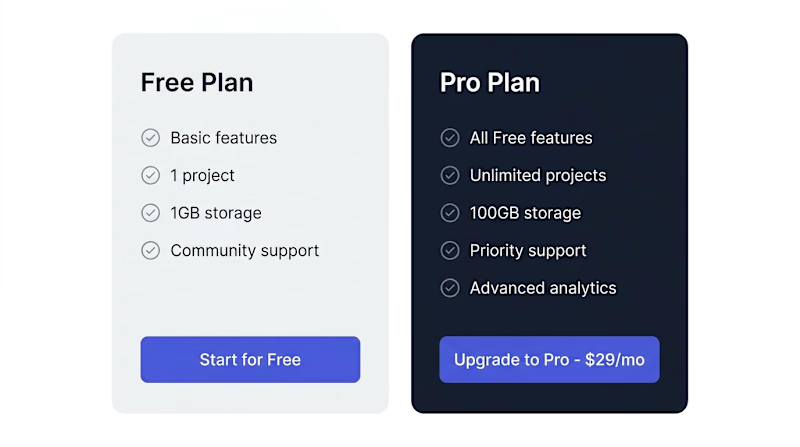
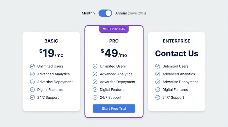
2-column or 3-column pricing? The debate never ends. 🏷️
Here's what the data says:
— 3 columns create a "middle option" anchor effect
— 2 columns feel cleaner and faster to decide
But which LOOKS better to you?
2️⃣ = Two plans | 1️⃣ = Three plans

5 voted
63%
3 voted
37%
8 votes
Closed

Going with 2. The cleaner layout forces you to sharpen your value prop rather than hiding behind a middle tier. When someone lands on a pricing page they already know what they need, so the fewer decisions the better.

Right

3-column for me. The highlighted middle plan immediately draws attention and creates a clearer comparison flow. 👌


i prefer the 3 column

The column count is really a packaging decision wearing a layout costume. Three columns earn their anchor effect only when the middle tier is a real decoy you priced on purpose; bolt on a third plan just to trigger the bias and people sense the padding. So I'd start from...
The network for creativity
Join 1.25M professional creatives like you
Connect with clients, get discovered, and run your business 100% commission-free
Creatives on Contra have earned over $150M and we are just getting started











Related posts


You did a great Job! 🔥


Same brand. Same palette. Two completely different proposals for a real estate developer.
A: An isotype built from blocks. Geometric, precise, the language of construction. It says we build.
B: Custom lettering with movement. Warmer, more editorial. It says we build places you’d want to live in.
36 voted
51%

35 voted
49%

71 votes
Closed

My vote is B, Milagros. Custom lettering with movement has real editorial warmth, which suits a developer selling places people actually want to live in.

Same SAE-REN project. A new way to explore it.
I’ve reworked the case study to make the connections between the identity, packaging, and physical applications clearer.
I think this version finally strikes the balance I was looking for: explaining the design decisions and logic behind the system while making the full page a pleasure to explore.
Old or new, which version would make you keep exploring?
2 voted
15%
11 voted
85%
13 votes
Closed

New♥️