Shayan Preceptor
I help businesses grow with personal branding & logos.
Ready for work
Shayan is ready for their next project!


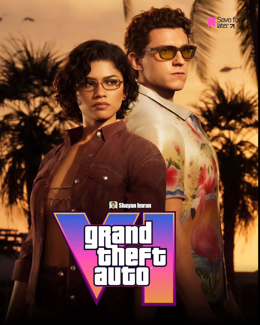
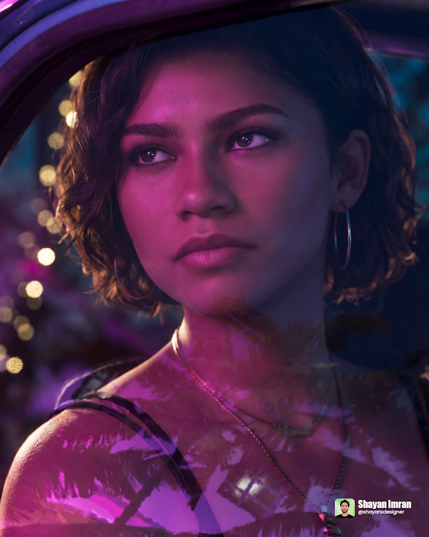
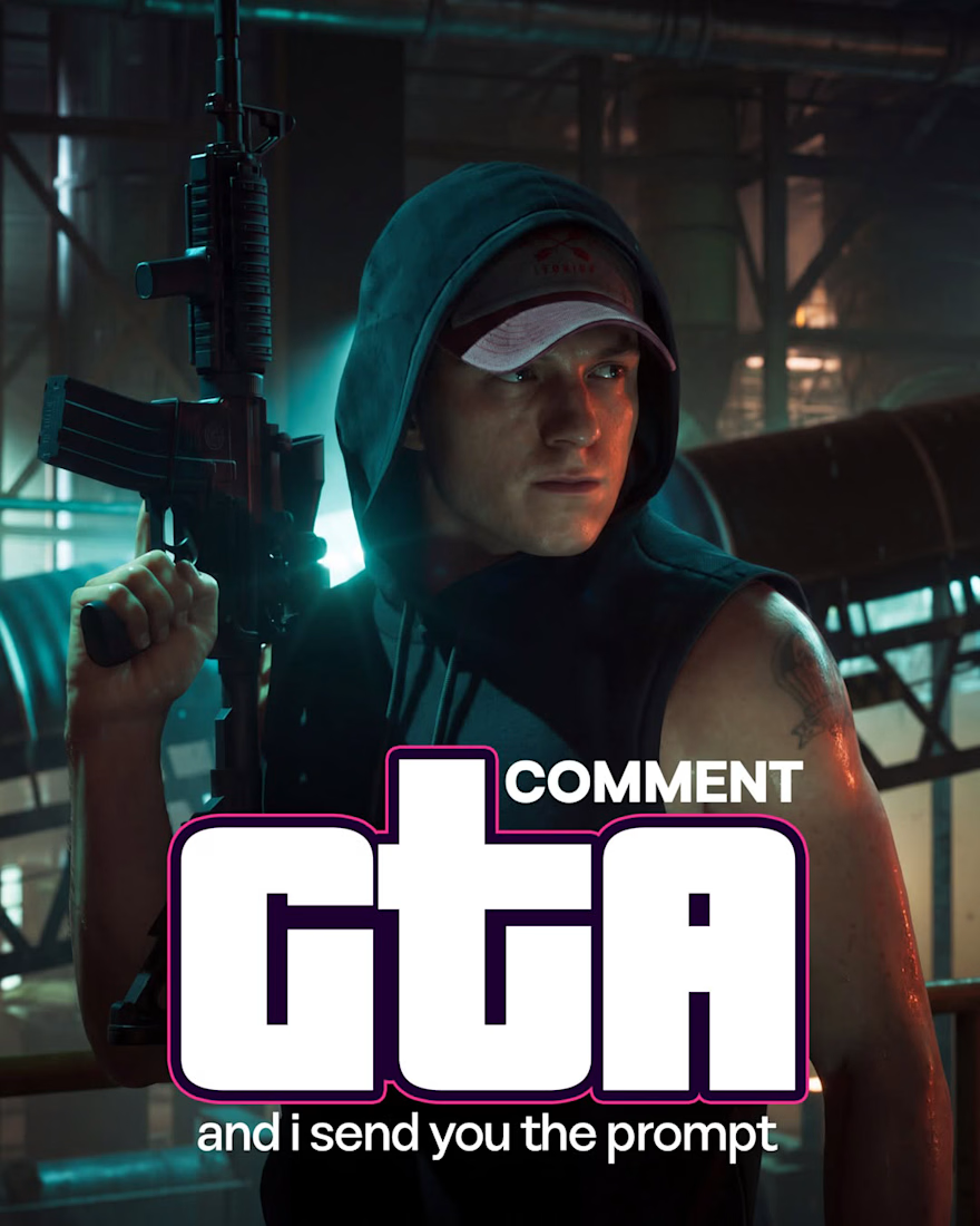
3 𝒑𝒆𝒐𝒑𝒍𝒆 𝑫𝑴'𝒅 𝒎𝒆 𝒂𝒔𝒌𝒊𝒏𝒈 𝒘𝒉𝒆𝒓𝒆 𝑰 𝒍𝒆𝒂𝒌𝒆𝒅 𝒕𝒉𝒆𝒔𝒆 𝑮𝑻𝑨 𝑽𝑰 𝒔𝒄𝒓𝒆𝒆𝒏𝒔𝒉𝒐𝒕𝒔 𝒇𝒓𝒐𝒎. 𝑰 𝒅𝒊𝒅𝒏'𝒕 𝒍𝒆𝒂𝒌 𝒂𝒏𝒚𝒕𝒉𝒊𝒏𝒈.
I didn't leak anything.
I made them.
Every frame here is 100% AI. No early access, no insider source, no leak. Just...



A client rejected 3 of my poster concepts.
Same layout. Same photo. Same colors.
I couldn't figure out what was wrong.
Until I changed one thing.
The font.
Nothing else. Just the font.
Suddenly the exact same design looked "expensive" to him.
That's when it hit me —
Nobody ever says "I...
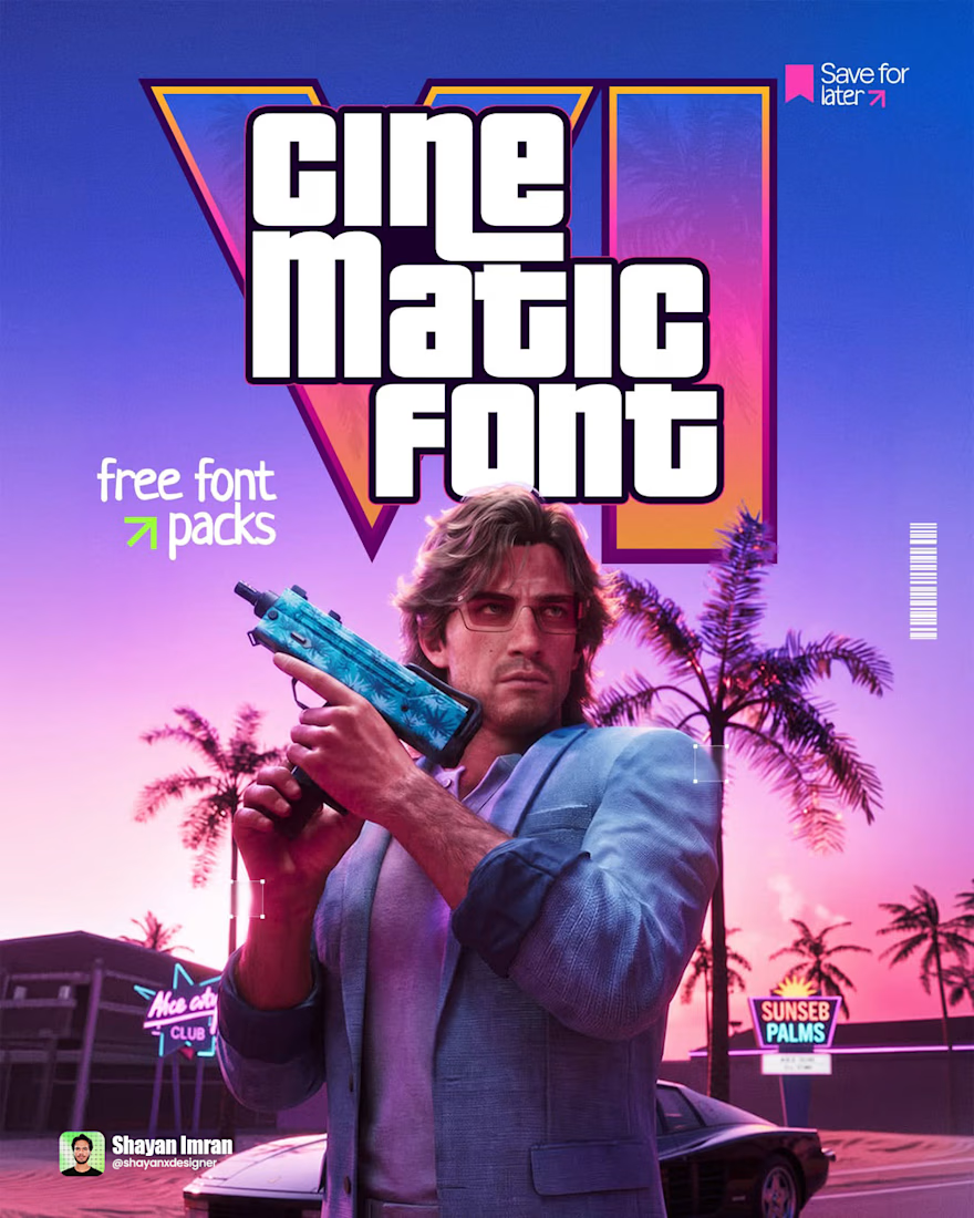
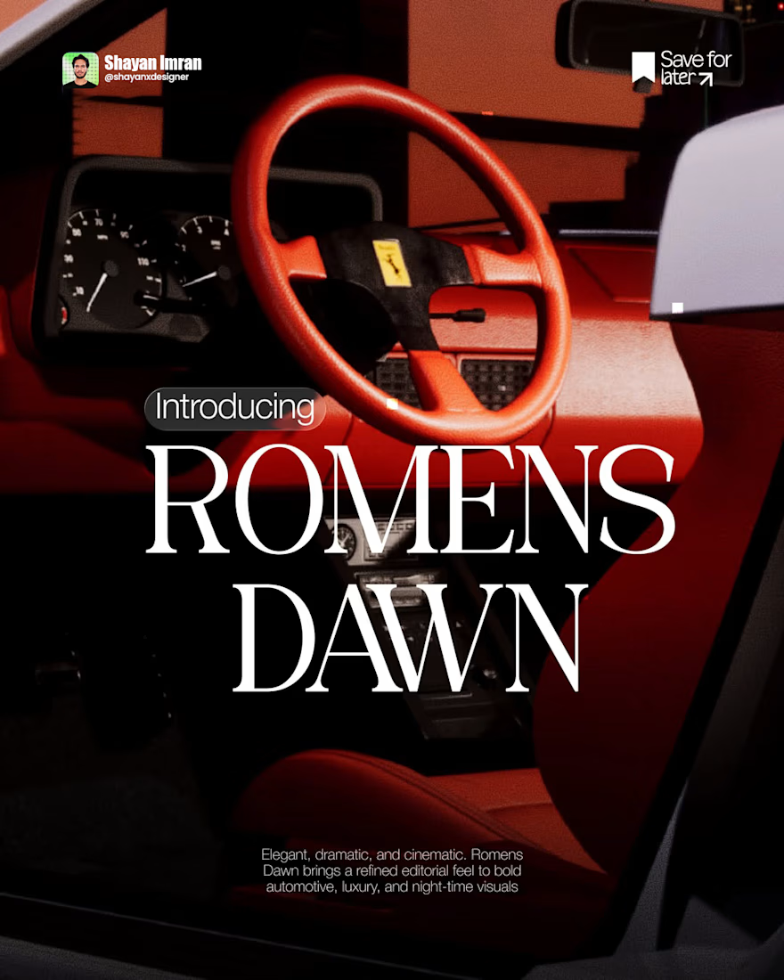
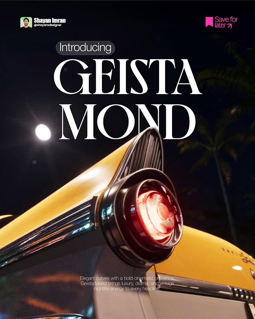
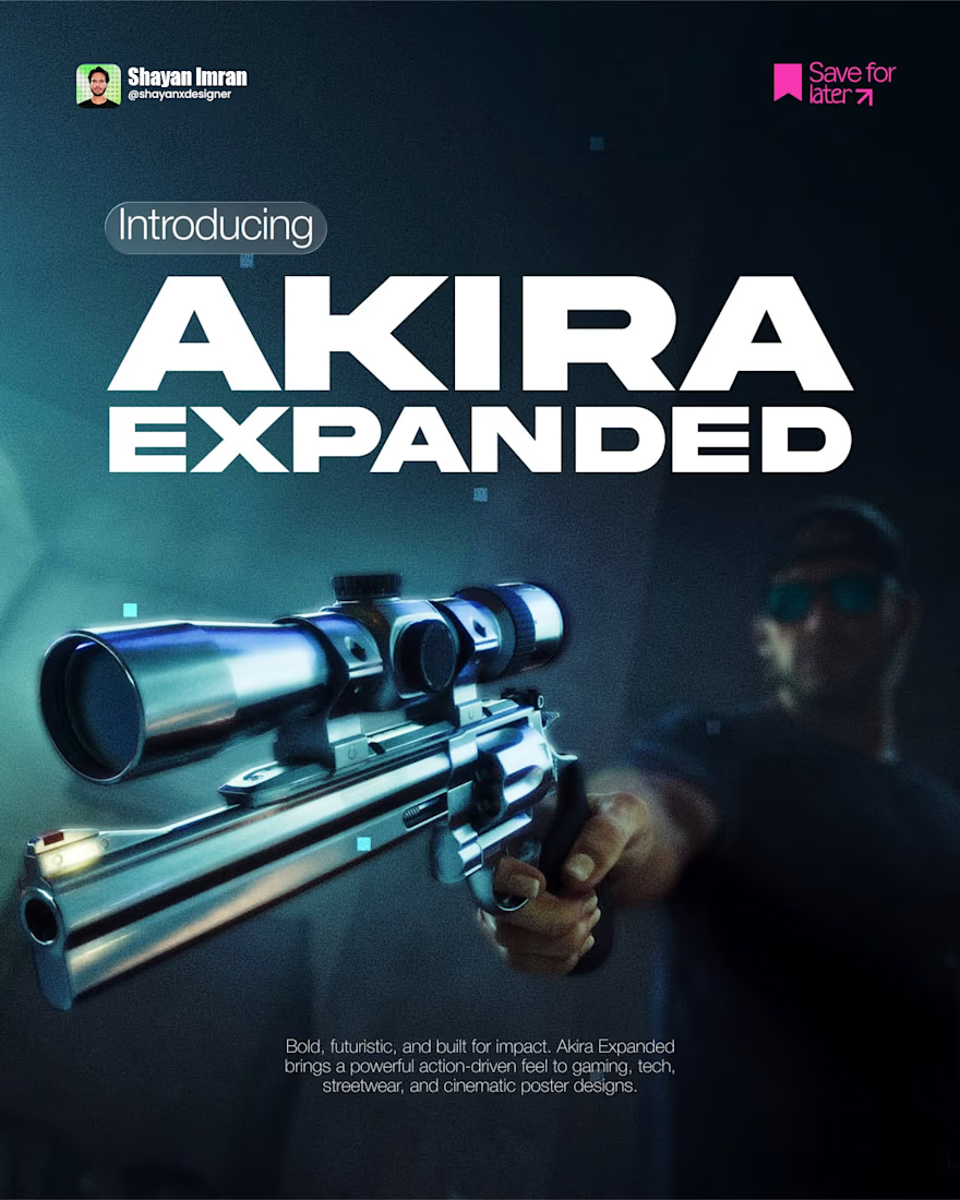
I’ve been saving fonts a lot lately.
Not because I need another 100 fonts sitting in my folder 😂
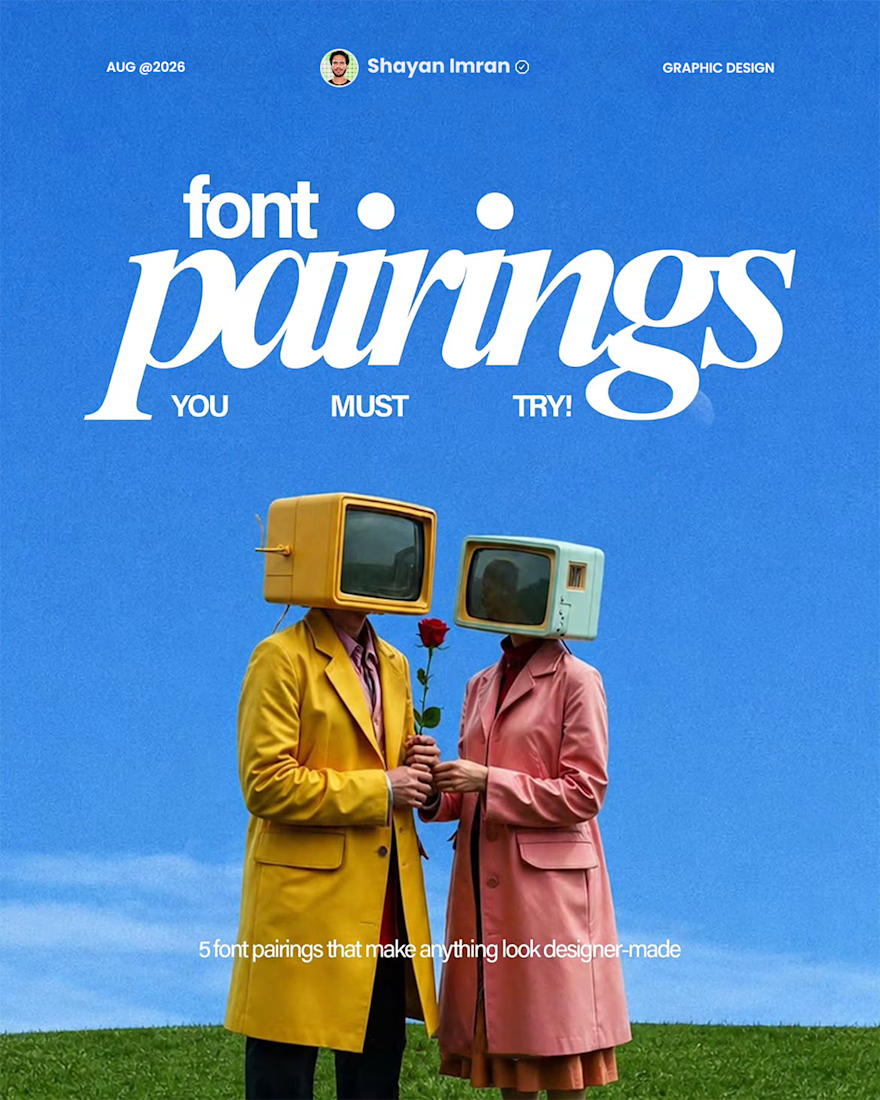
Some styles just keep showing up in designs, branding, posters, and social content — and I wanted to see which ones are actually worth paying attention to.
So I put together 5 font...
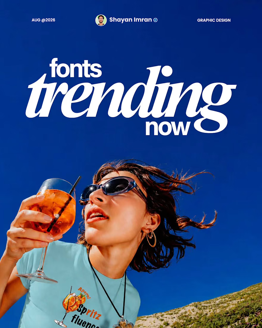
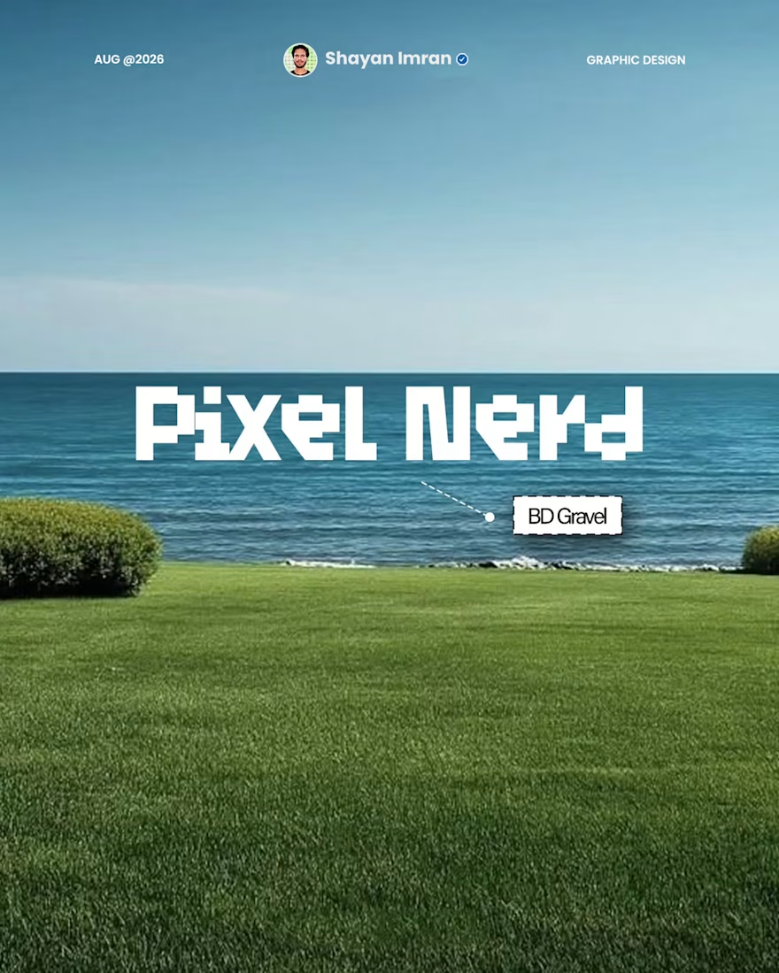
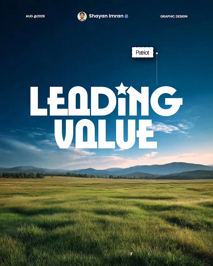
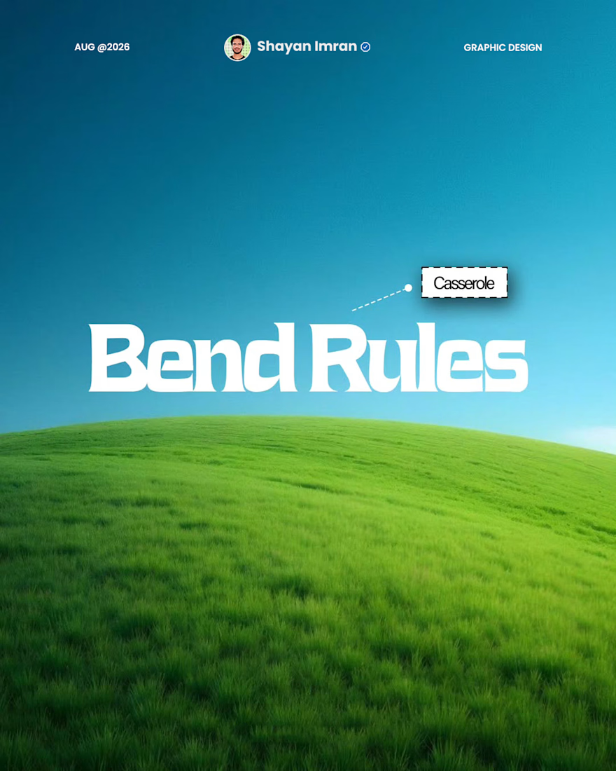
I used to just throw two fonts together and hope they matched.
They rarely did.
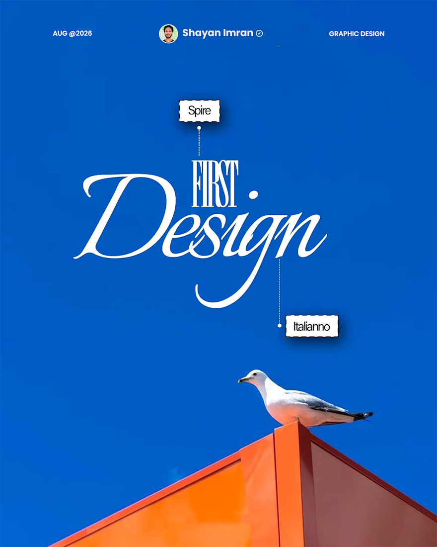
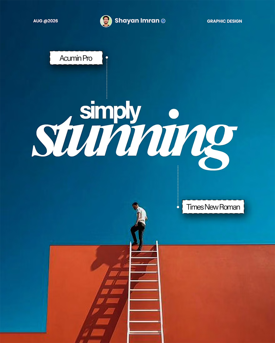
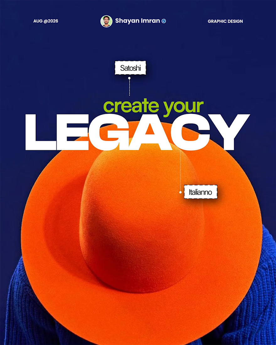
Font pairing isn't random — it's contrast. One font does the talking (bold, expressive), the other stays quiet and just supports it. Get that balance right and even a simple design looks expensive.
...