

A little warmth, a little calm, and a moment to yourself. 🧡
Meet Murmur a brand identity designed around making everyday moments feel a little quieter.
From the bold orange palette to the simple visual language, every element brings together energy and calm without feeling...

Which Yap feels right? 🗣️
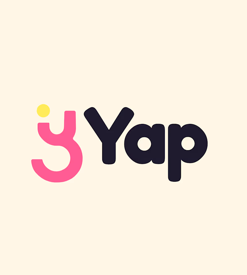
I’m working on the branding for Yap, a chit-chat app. The logo is the same in both versions. Only the colors change, and the colors change how the app feels.
Version A: Soft and calm
Lavender mark, a muted charcoal-purple wordmark, a small peach dot, and...

10 voted
37%

17 voted
63%
27 votes
Closed
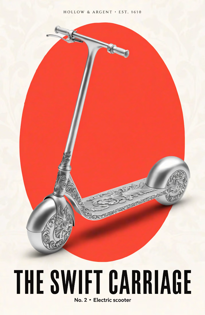
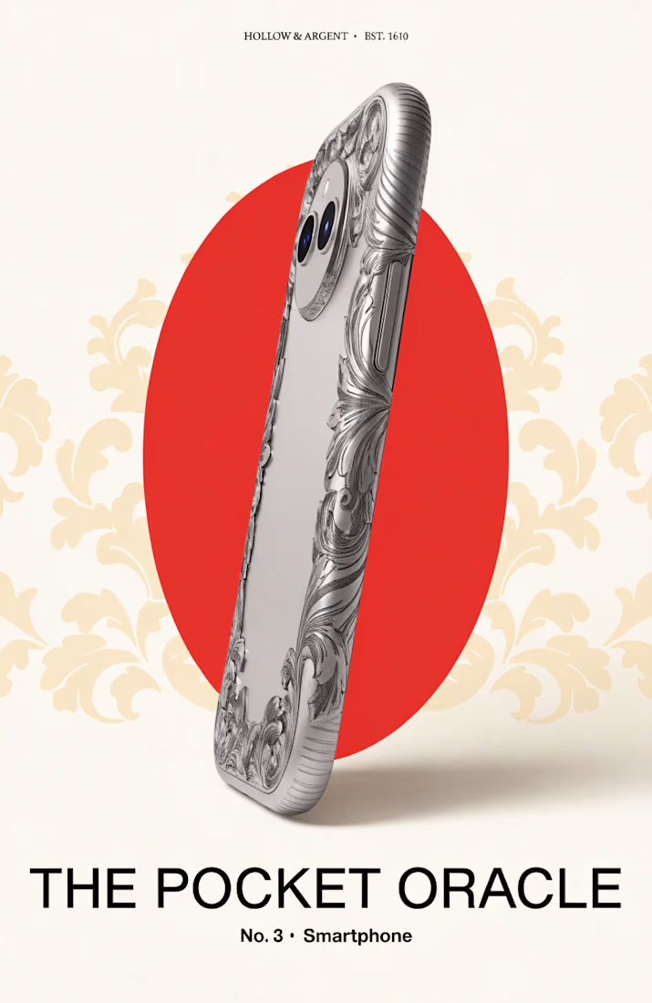
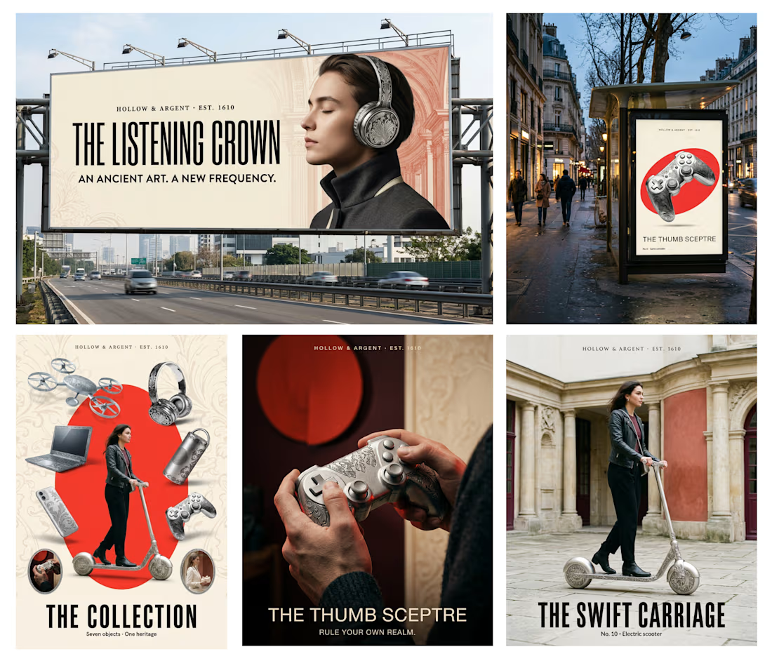
Every few years a new gadget arrives and someone calls it the future. I kept wondering what a silversmith from 1610 would call it.
So for the Contra × Recraft Archive Style Challenge,
I found a silver dish made by Adam van Vianen in 1610. It’s in the Rijksmuseum’s public domain...
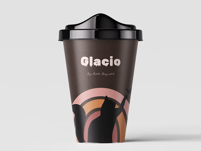
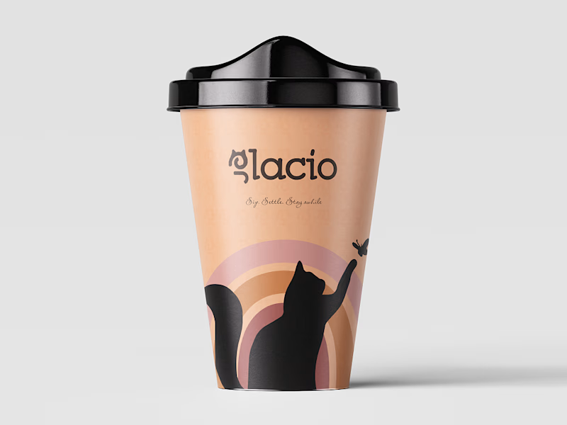
Glacio: a coffee shop for cat people
Glacio is a coffee place with a cat in it. I wanted the brand to feel like the shop itself: warm, a little playful, and somewhere you’d stay longer than you planned.
What I made:
A wordmark with a small cat touch
A color palette of emerald green,...
1 voted
17%
5 voted
83%
6 votes
Closed
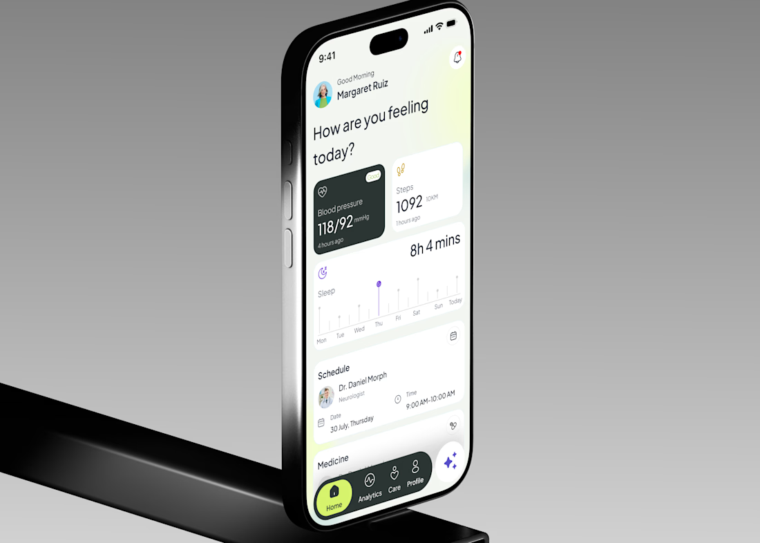
Currently working on a medical care app, focusing on simplifying the way users navigate healthcare services through clear layouts, intuitive flows, and accessible interface design.
From structuring user journeys to refining the UI, the goal is to make essential healthcare tasks...