The network for creativity
Join 1.25M professional creatives like you
Connect with clients, get discovered, and run your business 100% commission-free
Creatives on Contra have earned over $150M and we are just getting started
Back to feedPost
Taste Test
Which Yap feels right? 🗣️
I’m working on the branding for Yap, a chit-chat app. The logo is the same in both versions. Only the colors change, and the colors change how the app feels.
Version A: Soft and calm
Lavender mark, a muted charcoal-purple wordmark, a small peach dot, and a near-white background. It’s quiet and gentle. It feels like a cozy late-night chat with a close friend.
Version B: Young and bold
Hot pink mark, near-black wordmark, a yellow dot, and a warm cream background. It’s loud and playful. It feels like a group chat that never goes quiet.
Drop an A or a B in the comments, and tell me why if you have a minute. I’m still deciding, so your pick will help.




6 votes
Ends in 1d

In my perspective this app will be used by current generation so it'll be good to have more pop out colours to attract them. Good work!🔥

Exactly that what the idea is . Thanks

Stunning
Thanks
My pleasure

soft and calm
nice perspective
The network for creativity
Join 1.25M professional creatives like you
Connect with clients, get discovered, and run your business 100% commission-free
Creatives on Contra have earned over $150M and we are just getting started
Related posts

Proper Form — Social Media Branding System
A flexible social media system created for Proper Form as part of the wider brand identity.
The template system was designed to adapt across different post formats, banners and platforms while maintaining a consistent visual language.
Rather than repeating one rigid layout, the system gives the brand room to vary composition, imagery and content while remaining clearly recognizable.
Created by Lepisov Branding in collaboration with Creative Mints.
Logo design: Ilya Gorchanyuk
Creative direction: Dmitry Lepisov
Brand identity + social system: Lepisov Branding × Creative Mints


This is how a social system should work: strong enough rules that the brand reads at thumbnail size, loose enough that the feed never looks copy-pasted. Do you hand clients a Figma kit for this, or build it in something their team edits themselves?

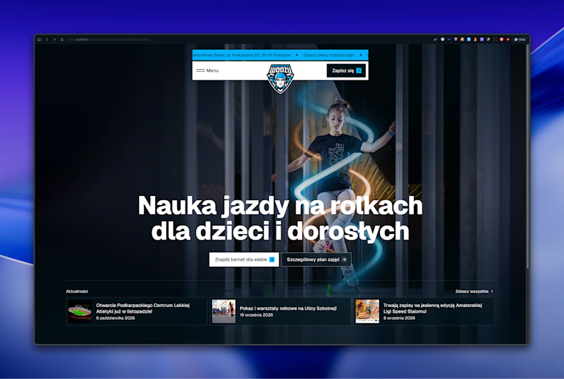
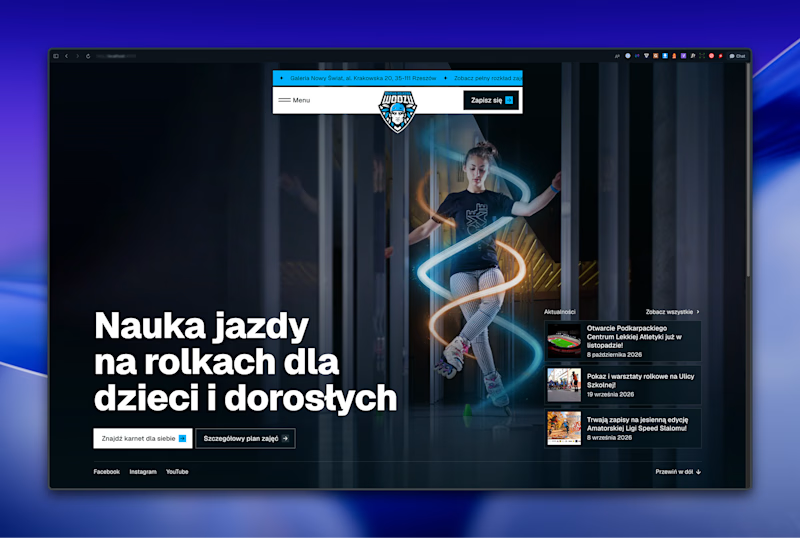

Left aligned for me. With that much body copy next to the headline it reads cleaner.

Most assistants talk. I wanted one that answers.
Muted Winter: a voice assistant that replies in three words, shows what it is doing with six petals, and dims itself after midnight.
Case study live
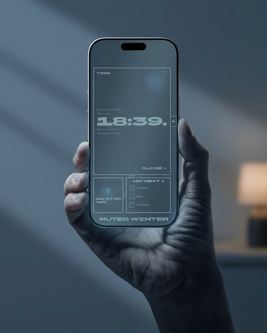

Three word replies is a smart constraint. The petals showing what it's doing is a nice touch.