

Trying something new: type that sits on a cube instead of a flat page.
Neon green on near-black, three faces, a slow turn. I wanted to see how far I could push plain text before it stops being readable.
Still a test, so tell me what works and what doesn’t.
Does the 3D look convincing, or does it feel flat?

A little warmth, a little calm, and a moment to yourself. 🧡
Meet Murmur a brand identity designed around making everyday moments feel a little quieter.
From the bold orange palette to the simple visual language, every element brings together energy and calm without feeling...
Which Yap feels right? 🗣️
I’m working on the branding for Yap, a chit-chat app. The logo is the same in both versions. Only the colors change, and the colors change how the app feels.
Version A: Soft and calm
Lavender mark, a muted charcoal-purple wordmark, a small peach dot, and...

10 voted
37%

17 voted
63%
27 votes
Closed
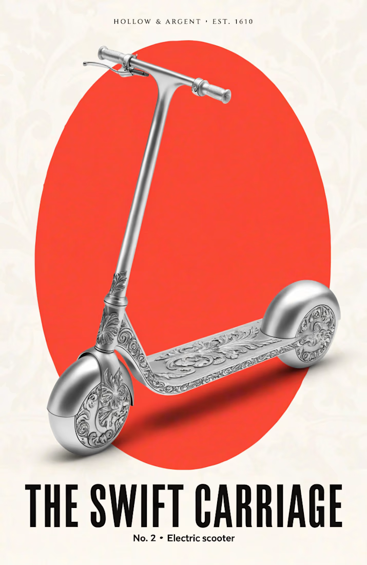
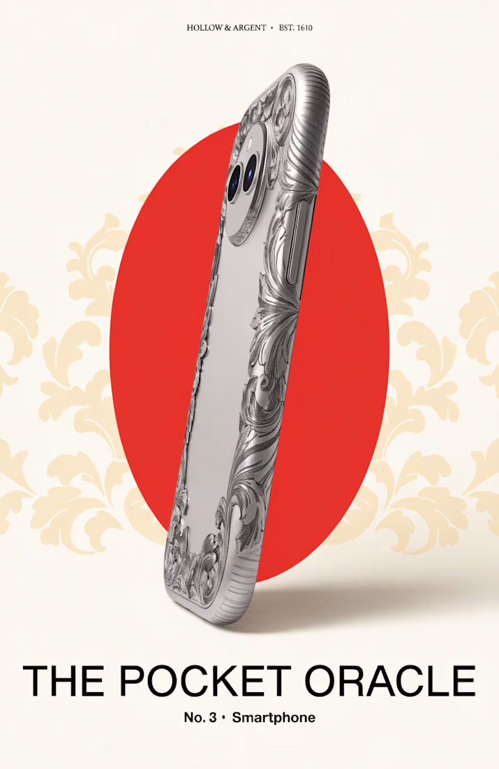
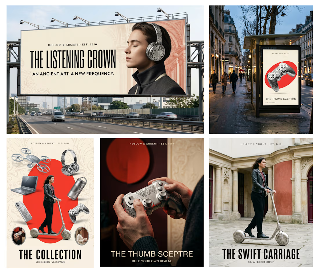
Every few years a new gadget arrives and someone calls it the future. I kept wondering what a silversmith from 1610 would call it.
So for the Contra × Recraft Archive Style Challenge,
I found a silver dish made by Adam van Vianen in 1610. It’s in the Rijksmuseum’s public domain...
3 months on Contra. A lot of learning. And now, 98 on my Discovery Score. 🥹🤍
When I started this journey, I was still figuring things out. And honestly, I still am.
But over the past 3 months, I've been showing up, improving my profile, learning how Contra works, and finding...