pro
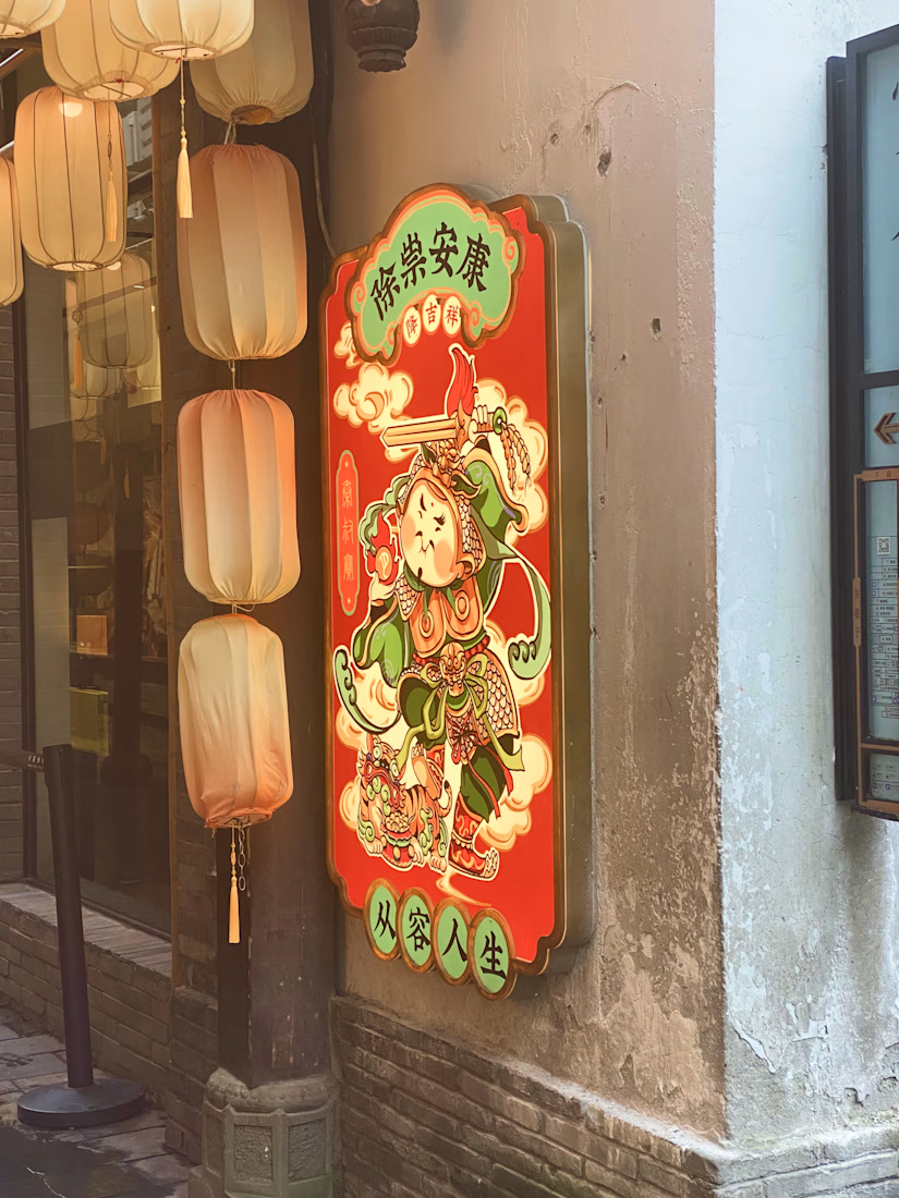
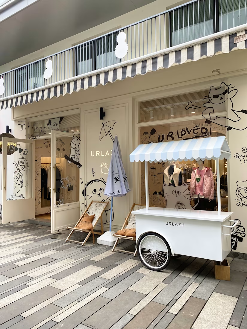
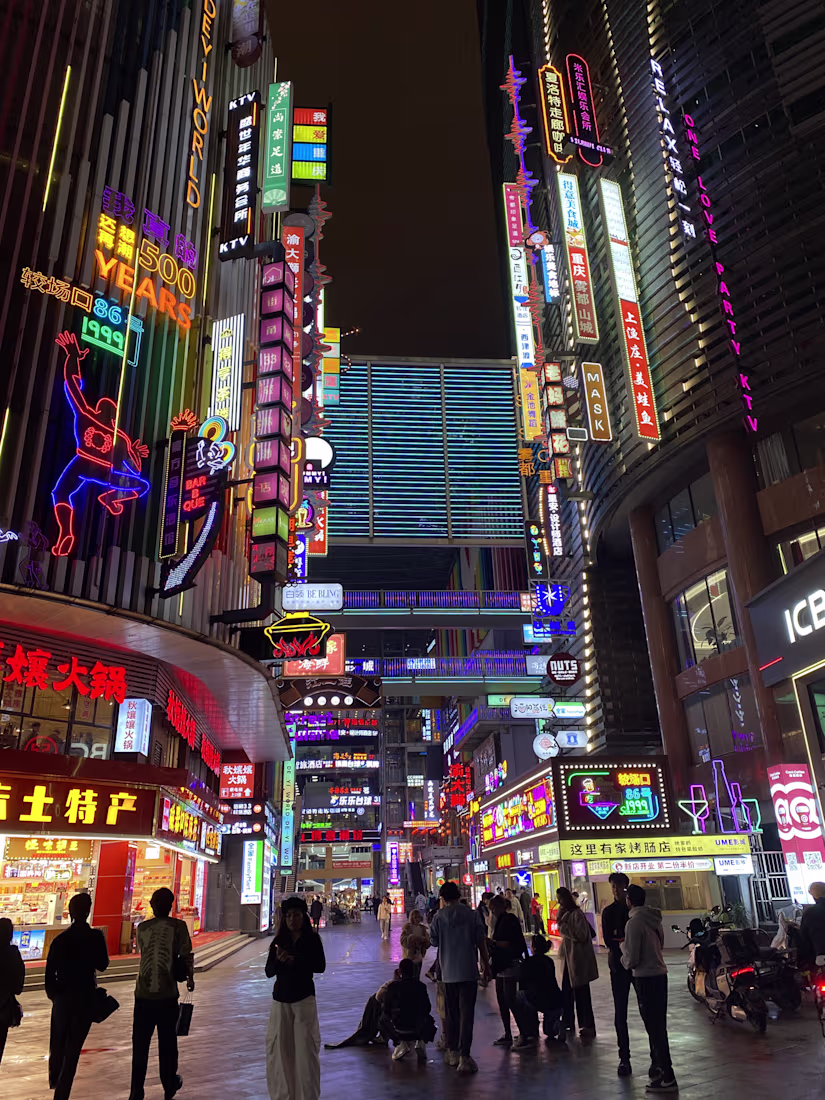
Getting design inspiration by walking around in Chengdu, Chongqing and Shanghai.
Every corner is a mix between tradition and innovation.
Not all donuts come out with a hole 🍩
It's an Italian saying: "Non tutte le ciambelle escono con il buco."
It means not everything turns out as planned.
And sometimes that's exactly what needs to happen.
I presented this new identity.
Every detail intentional.
I so was proud.
...
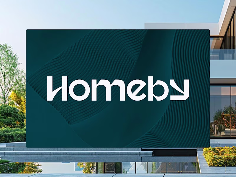
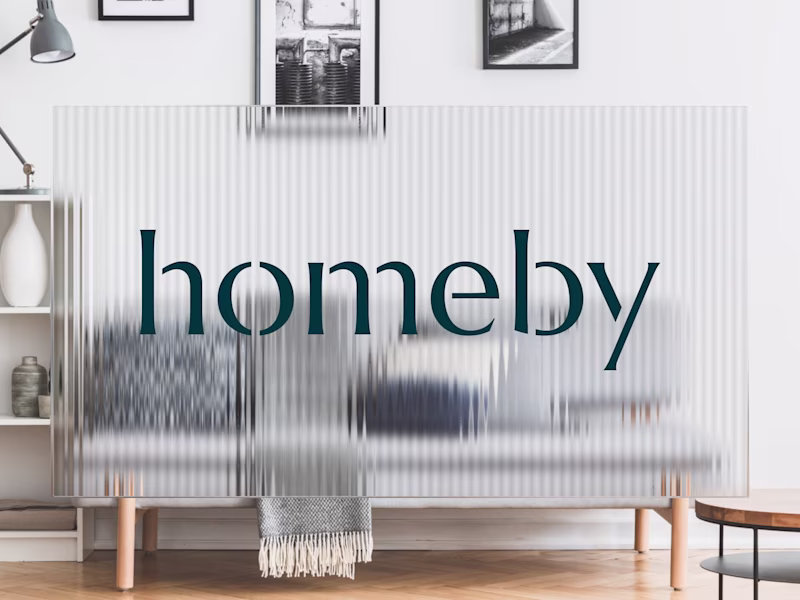
Rejected vs final brand identity direction ↓
Which one would you have picked?
Option 1: Bold geometry. Modern and confident.
But it felt too 'European startup'. Not enough warmth.
Option 2: Conveys care without predictable real estate symbols.
Different execution. Better fit.
2 voted
22%
7 voted
78%
9 votes
Closed
I've audited 200+ websites in the past 2 years.
Almost all make the same 3 mistakes that cost them leads daily.
1/ No mention of the customer's struggle
If you don't name the problem, visitors won't know you solve it.
✓ The fix:
Lead with the problem. Name the frustration or cost...
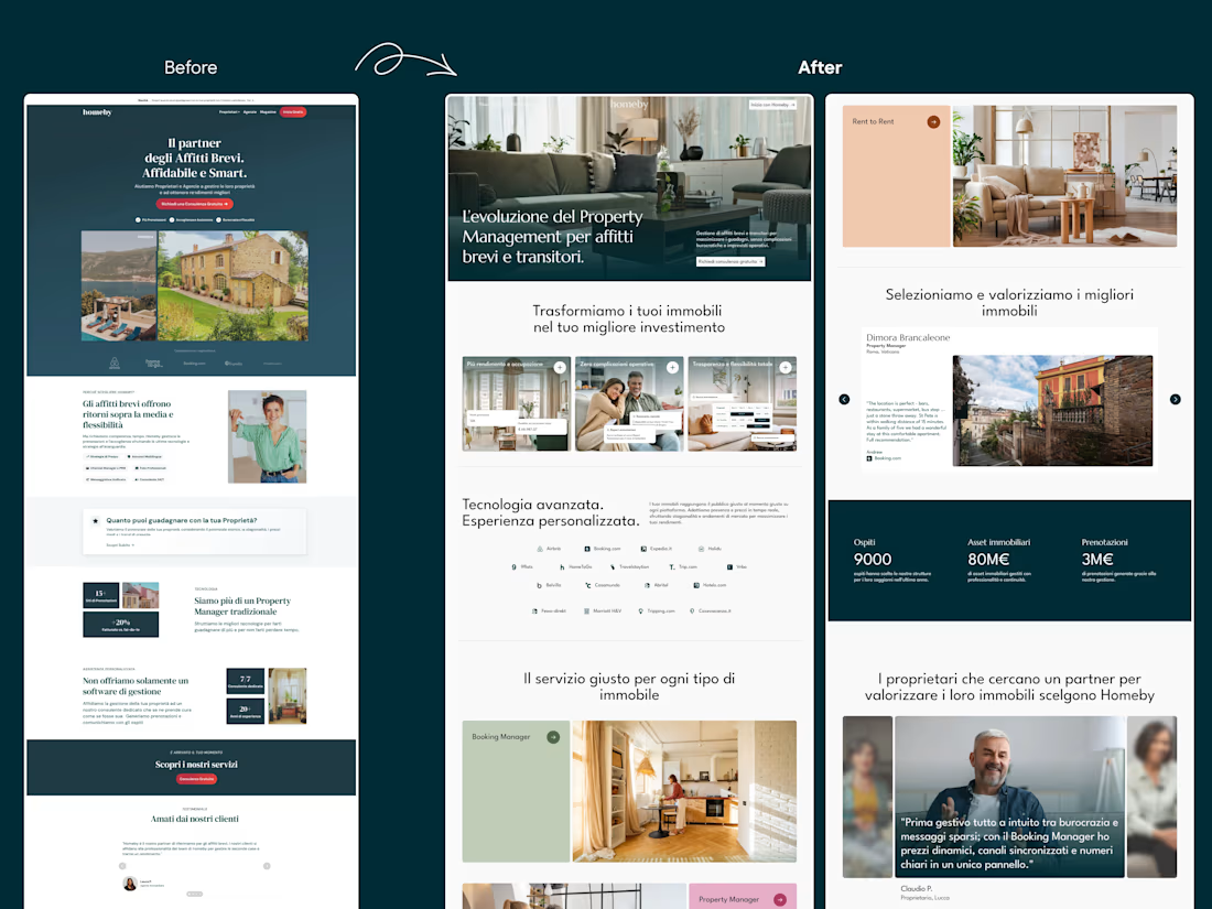
Before vs After ↓
I always love doing these comparisons after project completion.
Two screenshots. Weeks of work, feedback, and iterations behind them.
The impact?
→ 10% conversion rate
→ 4+ qualified leads per day (from barely 1/day)
→ 2x time spent on site
→ Completely booked out
...