The network for creativity
Join 1.25M professional creatives like you
Connect with clients, get discovered, and run your business 100% commission-free
Creatives on Contra have earned over $150M and we are just getting started
Back to feedPost

I've audited 200+ websites in the past 2 years.
Almost all make the same 3 mistakes that cost them leads daily.
1/ No mention of the customer's struggle
If you don't name the problem, visitors won't know you solve it.
✓ The fix:
Lead with the problem. Name the frustration or cost of inaction.
2/ You assume people understand how you'll change their life
Show real outcomes: time saved, anxiety reduced, workload gone.
✓ The fix:
Focus on outcomes, not capabilities.
3/ You hide behind jargon
I checked out a cybersecurity website full of technical terms.
I left not knowing if I needed it or how they could help.
✓ The fix:
Keep it focused on real-life impact.
Audit your site:
• Does it show what problem you solve?
• How you solve it?
• What life looks like after?
If not, you're losing leads.

The network for creativity
Join 1.25M professional creatives like you
Connect with clients, get discovered, and run your business 100% commission-free
Creatives on Contra have earned over $150M and we are just getting started





Related posts

This project was slightly out of my comfort zone.
Most of my work tends to be warmer, more elegant and feminine. So when this client asked for something very rigid, minimal and clean, I knew I was going to have to approach the project differently.
They are architects, and they wanted their structural, precise and highly organised way of thinking to come through in the website.
I have to admit, I was a little scared at the beginning.
It’s always interesting when a project doesn’t immediately feel like “you”. There’s a temptation to bring your own aesthetic into everything you create — but sometimes the real challenge is knowing when not to.
Looking at the final website now, I actually love how consistent it feels with their identity.
And perhaps that’s the real goal of design: not to make everything look like your work, but to create something that feels unmistakably like your client.
Have you ever worked on a project that was completely outside your usual aesthetic? Did you embrace it, or did you find yourself trying to bring it back into your own visual language?

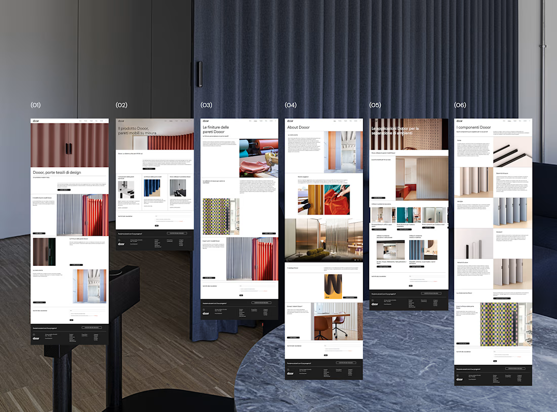


Swiss-inspired web design exploration. Which one would you go with?
11 voted
37%
19 voted
63%
30 votes
Closed

expanded for user convinience

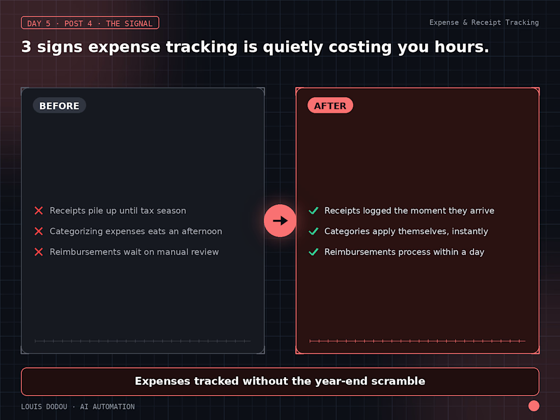
3 signs expense tracking is quietly costing you hours:
1. Receipts pile up until tax season
2. Categorizing is a once-a-month chore, not a habit
3. Reimbursements wait on someone finding time to review
→ If this sounds familiar, the backlog is the real cost, not the receipts.