The network for creativity
Join 1.25M professional creatives like you
Connect with clients, get discovered, and run your business 100% commission-free
Creatives on Contra have earned over $150M and we are just getting started
Back to feedPost
Taste Test
Rejected vs final brand identity direction ↓
Which one would you have picked?
Option 1: Bold geometry. Modern and confident.
But it felt too 'European startup'. Not enough warmth.
Option 2: Conveys care without predictable real estate symbols.
Different execution. Better fit.
2 voted
22%
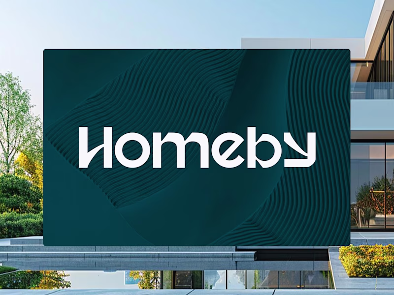
7 voted
78%
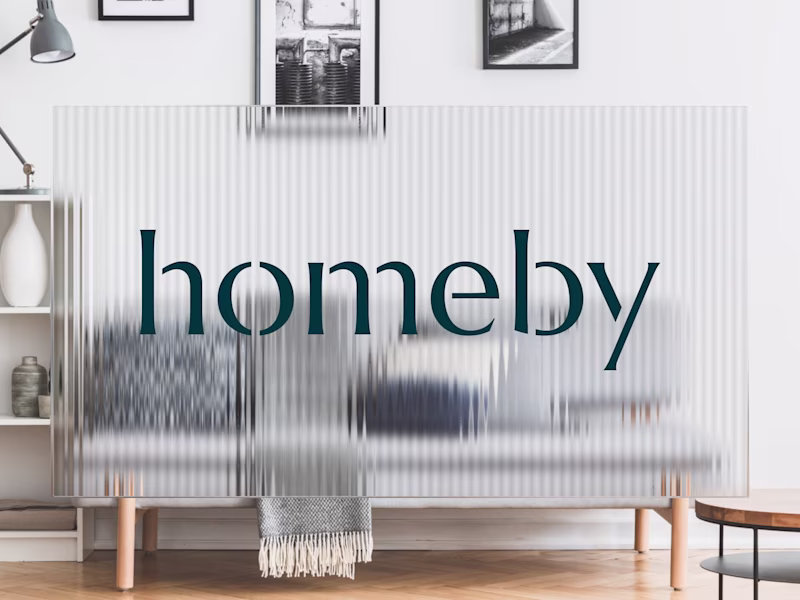
9 votes
Closed
second one clears..
Option 2 feels right. It has a certain warmth that fits a home brand much better than the tech heavy feel of Option 1.
That's exactly the feeling the client was looking for 🙌
I’d go with Option 1. The logo stands out more, and the background helps reinforce the brand presence.
Thank you 😊 I loved option 1 as well, but the client felt it was too "European startup" and not warm enough. In the end, it's about the target audience, but also how you want to be perceived.
The network for creativity
Join 1.25M professional creatives like you
Connect with clients, get discovered, and run your business 100% commission-free
Creatives on Contra have earned over $150M and we are just getting started
Related posts
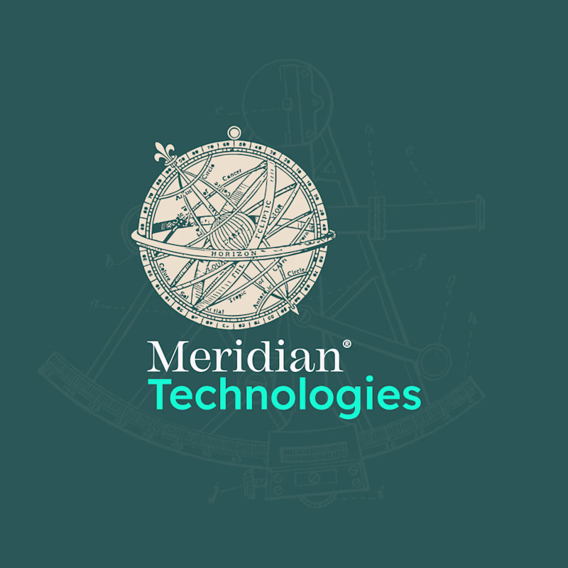
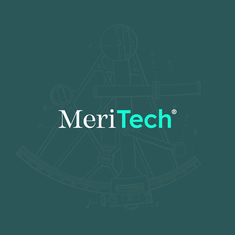
Option A — Full Logo vs. Option B — Compact Version
Two sides of the same brand. 🪙
I've been working on a concept brand identity for MeriTech, and here's a sneak peek at the logo system: the full version and the compact mark, side by side.
The full logo carries the complete brand presence, while the compact version is built to work in tighter spaces without losing the identity.
This is part of a bigger case study I'm putting together — covering the full brand direction, visual system, and the thinking behind every decision.
Stay tuned, the full project drops soon. 👀
#Contra #ContraCreator #FreelanceDesigner
1 voted
17%
5 voted
83%
6 votes
Closed
Compact looks cleaner. More memorable. Love it
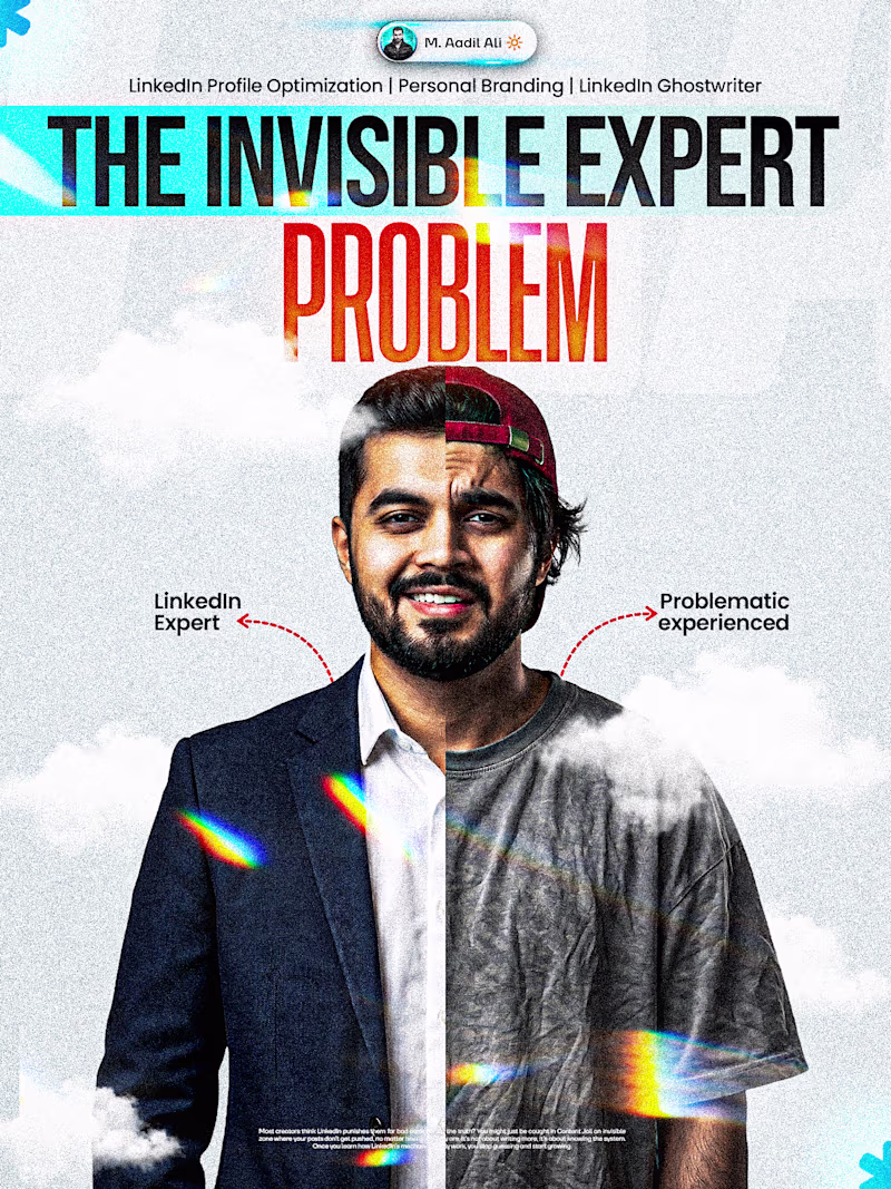
Brilliant work. Invisible profile.
That's not a talent problem. It's positioning and it's 100% fixable.
Which one gets your attention first, A or B ... ?
6 voted
67%
3 voted
33%
9 votes
Closed
Went with A. The split face with the two labels tells the whole story before you even read the headline, B needs the caption to land the point.
Purple road making art exploration like art galleries, museums, and auction houses accessible from any location.
They needed a logo & brand identity that prioritized having fun and sharing the art exploration journey with their audience and artists alike. Their choice was clear amongst the below 2 logos.
Wanted to know the popular choice of the people.
Logo 1: Used negative space to convey a journey towards infinity, with the P and R symbols creating a visual metaphor for a road leading forward.
Logo 2: Used the vanishing perspective to symbolize journey and the road ahead.
Let me know what sits right?
4 voted
50%
4 voted
50%
8 votes
Closed
Great execution overall.
Trending
Claude
Claude has entered the design space. How are you using Claude Design?
Contra University
Learn from expert creatives how to earn more using next-gen AI tools.
fifaworldcup2026
The World Cup is here and the whole world's watching. How are you designing for the world stage?
creativeaiflow
Creative AI workflows are evolving. What tools do you use, and what are their strengths and weaknesses?
freelancerlife
Freelancer life is wins, pivots, and everything in between. What’s yours right now?