



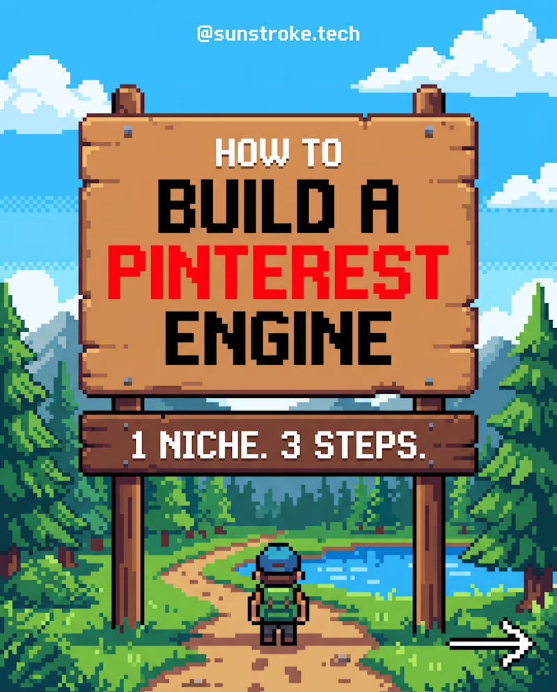
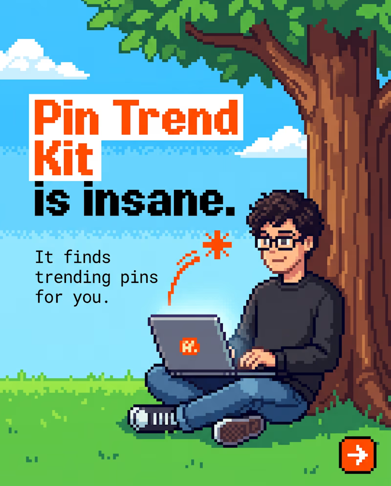
which thumbnail looks perfect for my Pintrest Pin Trend product?
A or B?
follow sunstroke.tech for more!
1 voted
50%
1 voted
50%
2 votes
Closed
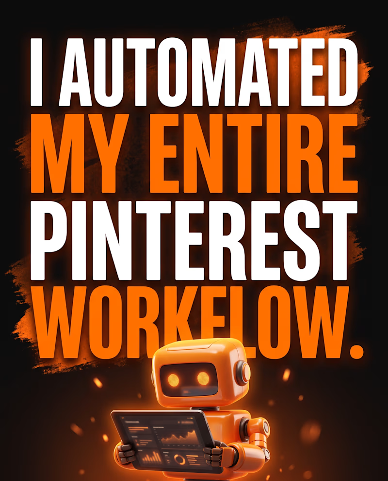
Which One thumbnail looks Perfect for my Pintrest Pin Trend AI Tool?
A or B?
2 voted
50%

2 voted
50%
4 votes
Closed
ORBIT — Interactive Hero Concept
What happens when a landing page feels more like a visual experience than a website?
I designed and built this Orbit hero experience with a focus on:
→ Editorial-inspired typography
→ Minimal monochrome + soft pink visual system
→ Pixel-art /...


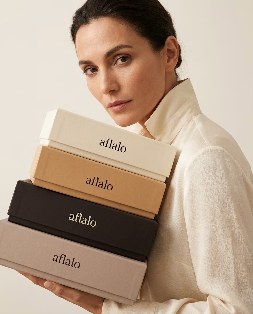
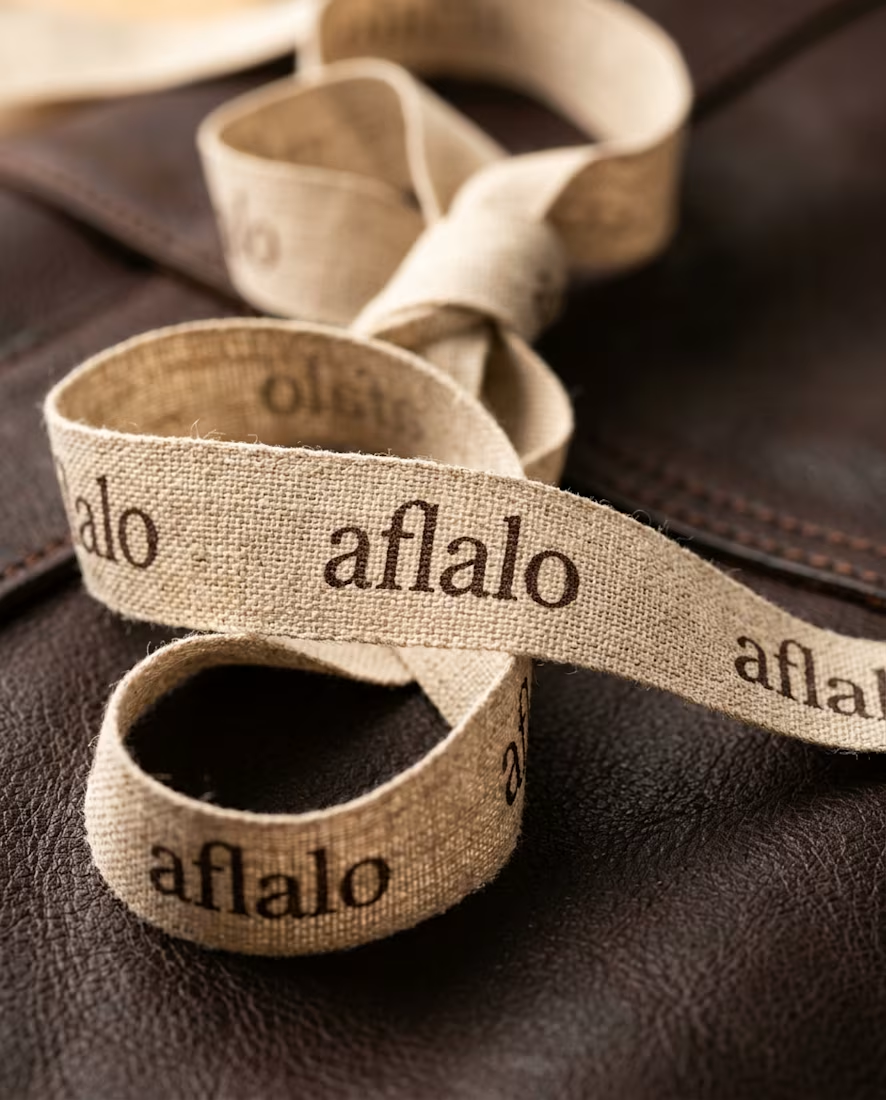
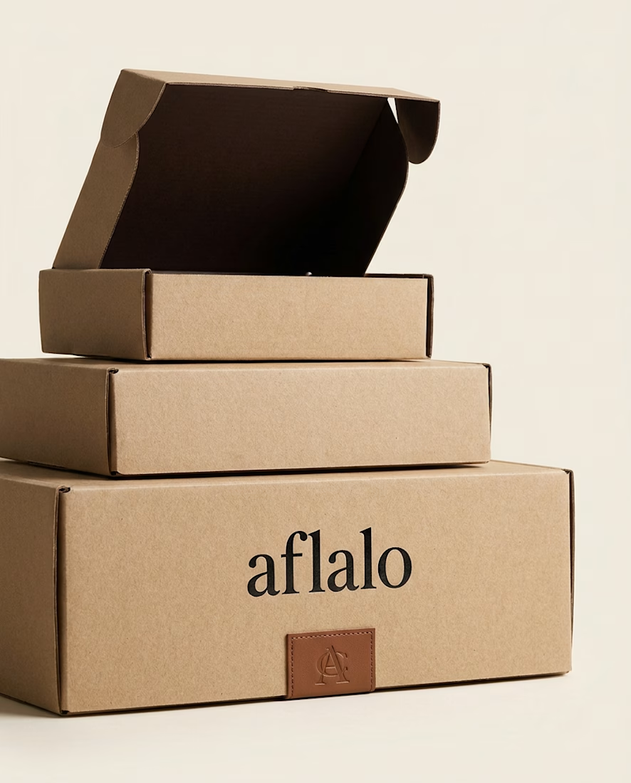
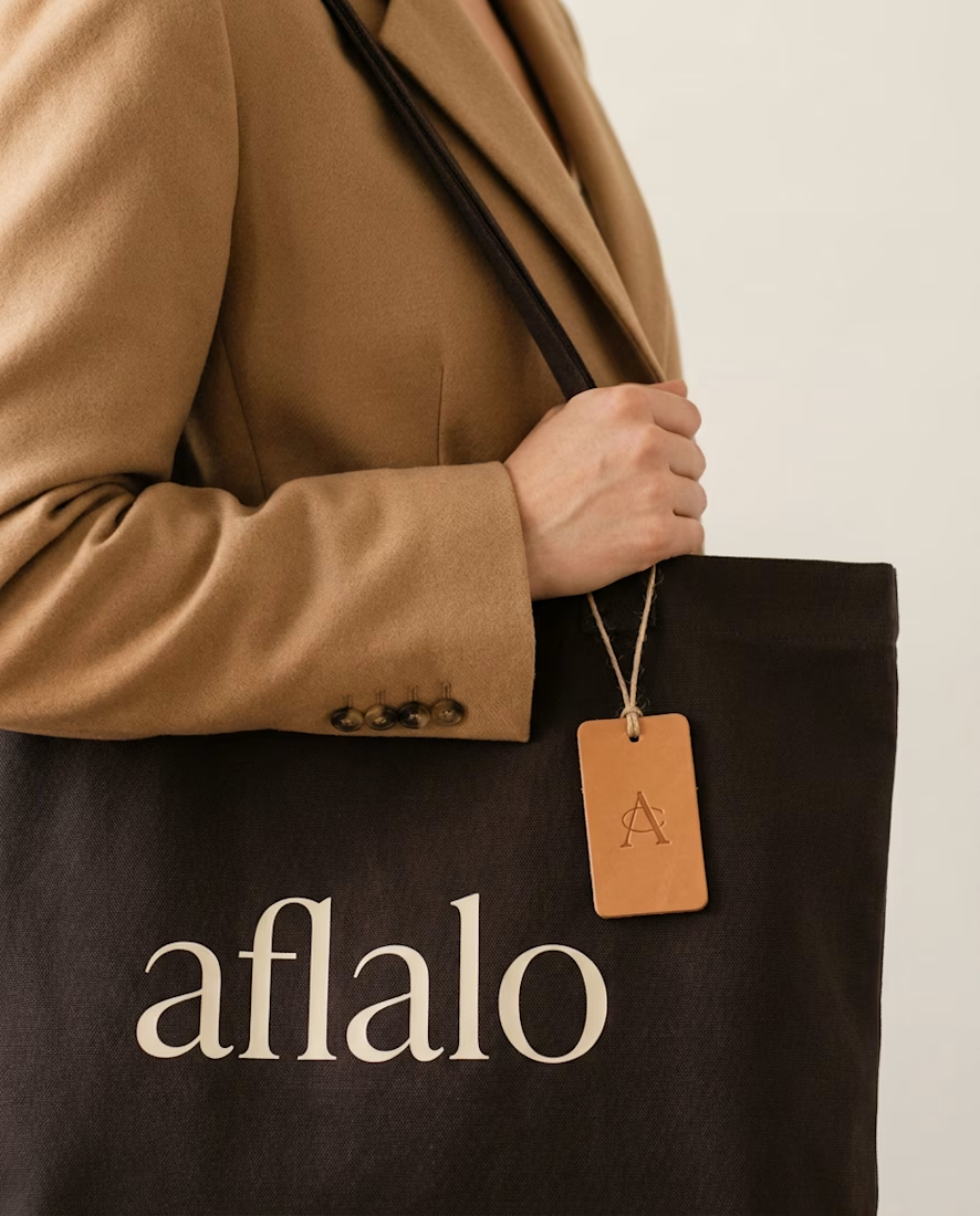
Brand concept: AFLALO 🥃🤍
Yael Aflalo (the founder behind Reformation) just self-financed a new label out of a SoHo cast-iron building — so I sketched what its packaging language could look like.
Direction: quiet luxury over embellishment. Lowercase serif wordmark with one subtle...


Found this scrolling Lapa Ninja today and had to stop — the "Marble" landing page (withmarble.com) is one of the most intentional pieces of design I've seen in a while 🌊
What makes it work:
🎬 A full-bleed looping hero video (a kid kayaking toward the island) instead of a...