The network for creativity
Join 1.25M professional creatives like you
Connect with clients, get discovered, and run your business 100% commission-free
Creatives on Contra have earned over $150M and we are just getting started
Back to feedPost
Taste Test

Which One Is Best A or B?
0 voted
0%
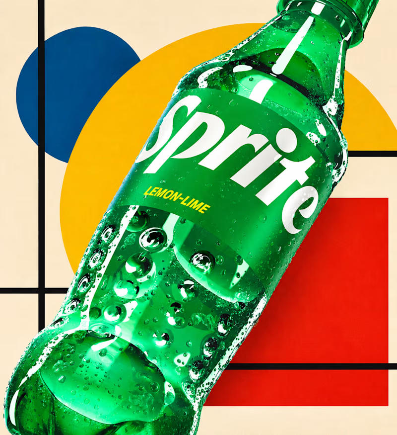
3 voted
100%
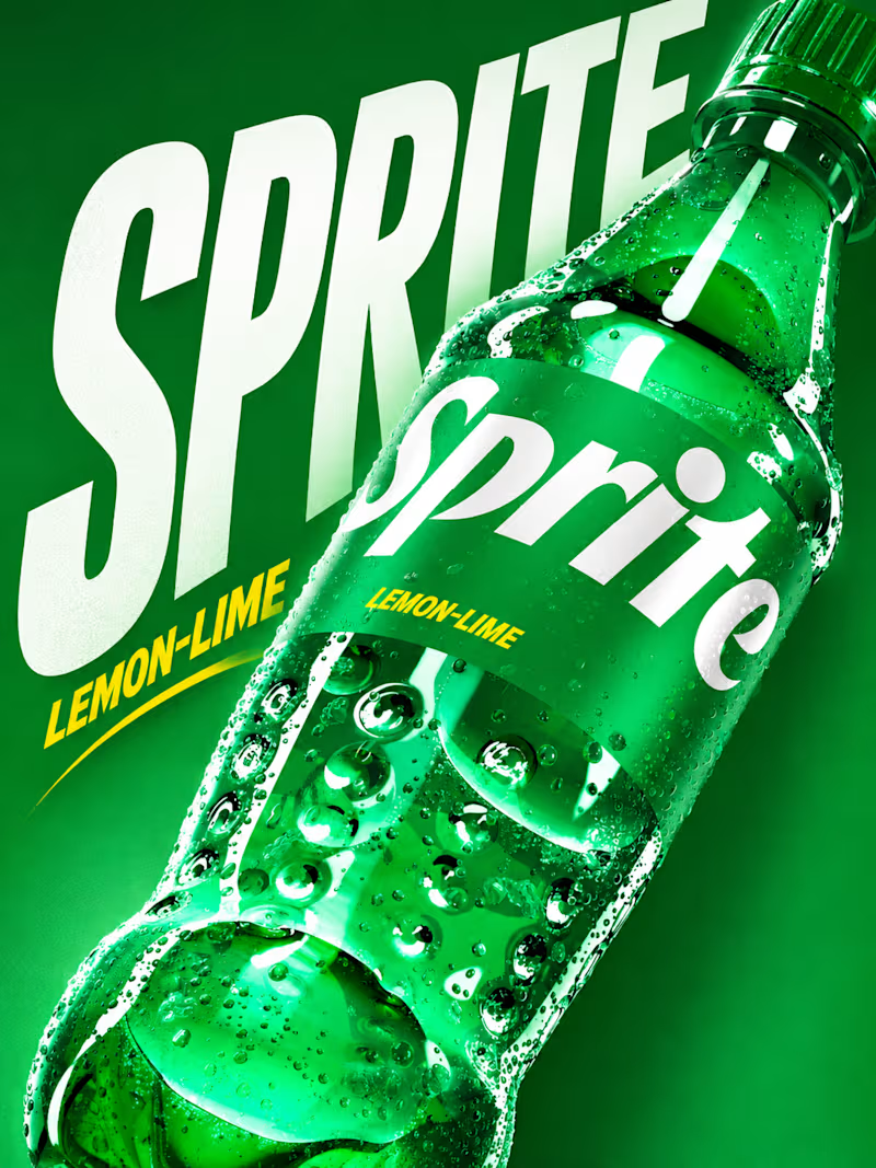
3 votes
Closed

Both are strong Sahil! For me A is the winner - that big bold SPRITE typography with LEMON-LIME pop and the all-green background feels more iconic and thirst-quenching, the condensation detail really hits. B is more artistic with those Bauhaus shapes, great for a campaign variant, but A sells the chill factor instantly!
The network for creativity
Join 1.25M professional creatives like you
Connect with clients, get discovered, and run your business 100% commission-free
Creatives on Contra have earned over $150M and we are just getting started



Related posts

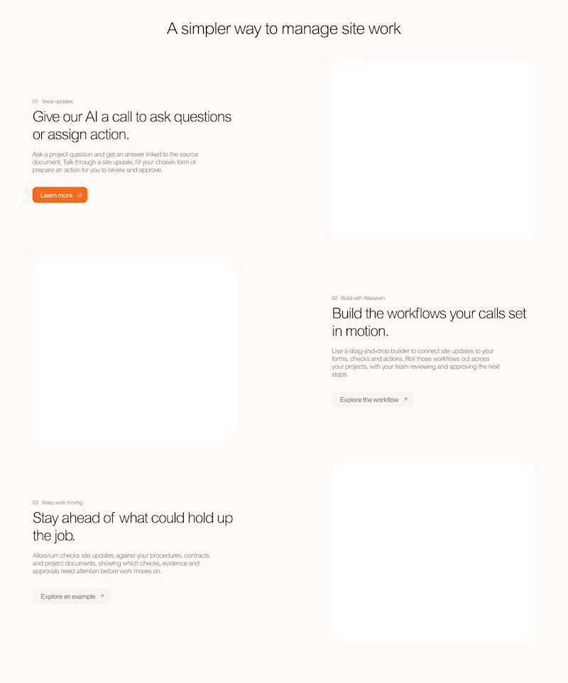
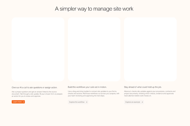

Voted B. Seeing the whole flow at once makes the section easier to scan for someone new to the product.

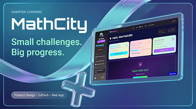
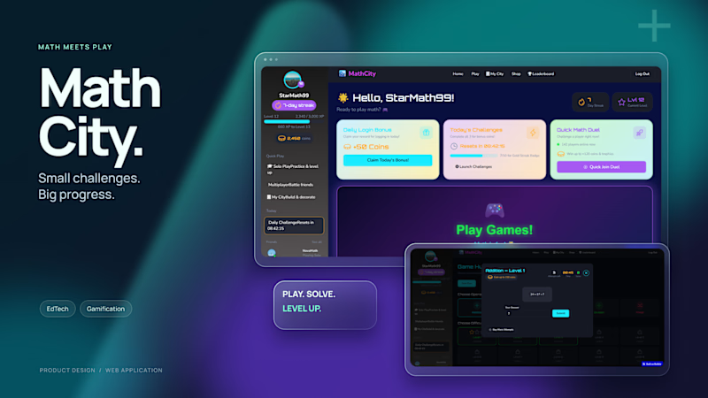
Experimenting with glass elements in banners for MathCity my app for learning math through play.
Which version do you prefer? I’d also love to hear your thoughts in the comments
4 voted
50%
4 voted
50%
8 votes
Closed
Went with B. The bold MathCity wordmark reads fast, and A's glass effect pulls attention from the name.

