The network for creativity
Join 1.25M professional creatives like you
Connect with clients, get discovered, and run your business 100% commission-free
Creatives on Contra have earned over $150M and we are just getting started
Back to feedPost
Taste Test


Which one would you put in the gift box?
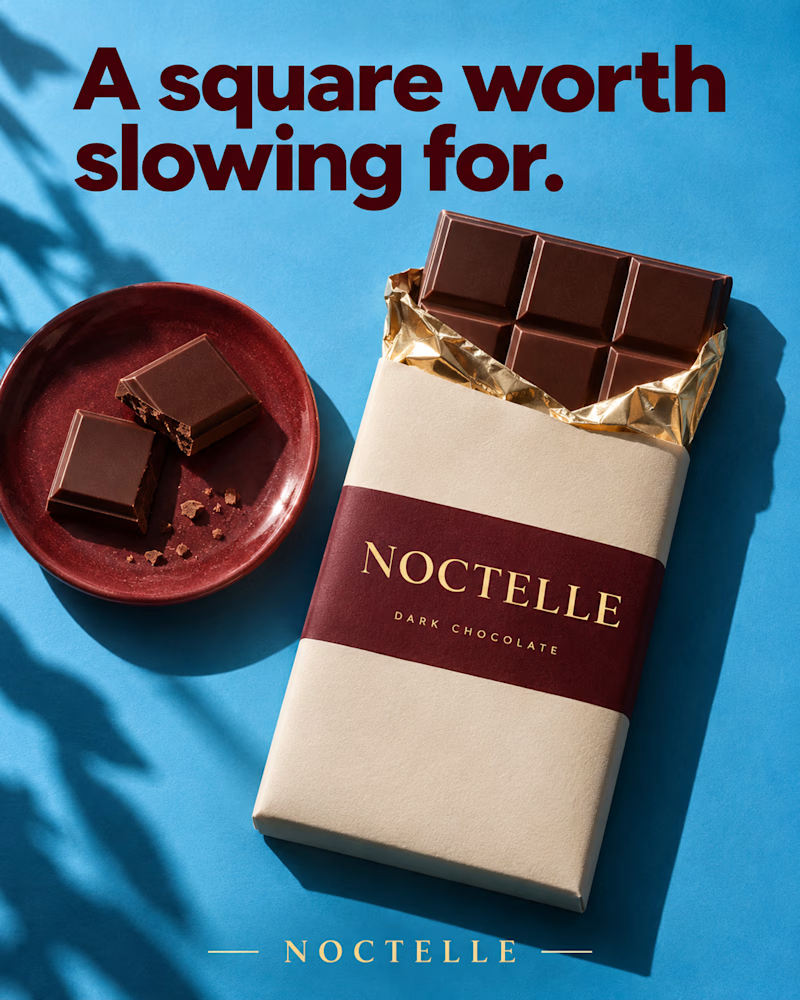
The first is shot from above on sky blue, a cream wrapper with a wine band and gold type, gold foil peeled back from the bar, two broken squares on a glazed red plate beside it, leaf shadow along the left edge, heavy maroon sans headline.
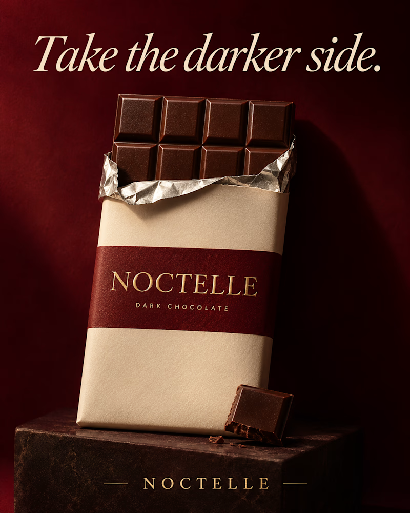
The second is the same bar standing on a dark stone block against deep wine red, silver foil open at the top, one broken square leaning at its base, low warm light, the headline in cream italic serif.
One sells the afternoon. The other sells the indulgence.
👇 #packagingdesign #brandconcept #foodphotography
2 voted
29%
5 voted
71%
7 votes
Closed

Slow Square 🔥
The network for creativity
Join 1.25M professional creatives like you
Connect with clients, get discovered, and run your business 100% commission-free
Creatives on Contra have earned over $150M and we are just getting started


Related posts

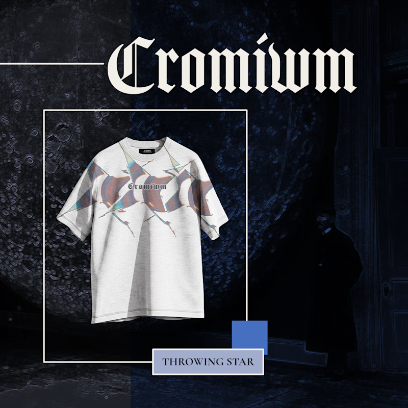
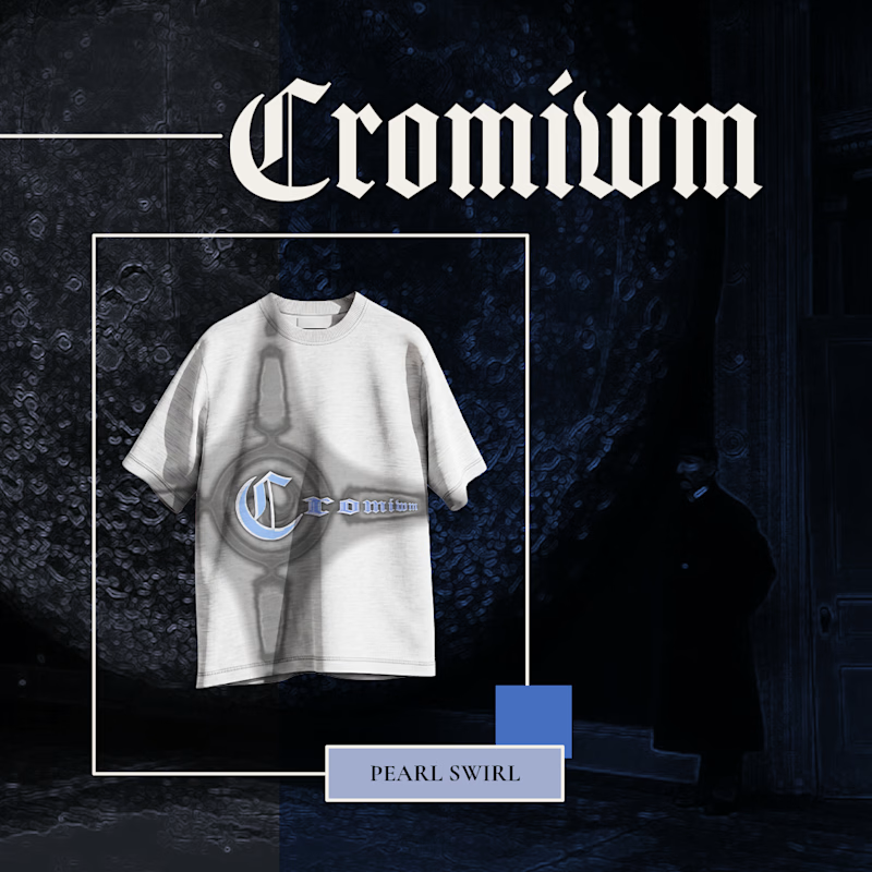

Pearl Swirl for me 🌀 That chrome emblem pairs really well with the gothic logo.

Same content, two different settings.
One designed to be seen on a big conference screen, the other experienced through a compact device. It's interesting how the same visuals can feel different depending on where they show up.
Which setting do you think brings the content to life better?
4 voted
57%

3 voted
43%

7 votes
Closed
Big screen 🔥

Which one is better?
1 voted
50%
1 voted
50%
2 votes
Closed