
pro
Rahul Upadhyay

Design Head & Product Designer at Pencil & Screen
- 5.0
- Rating
- 32
- Followers


Another quick exploration for a wellness brand.
This time, we wanted the product itself to take centre stage. We brought it closer, made it the hero, and kept the supporting information focused on its key benefits.
The idea was to make the product feel tangible while keeping the...
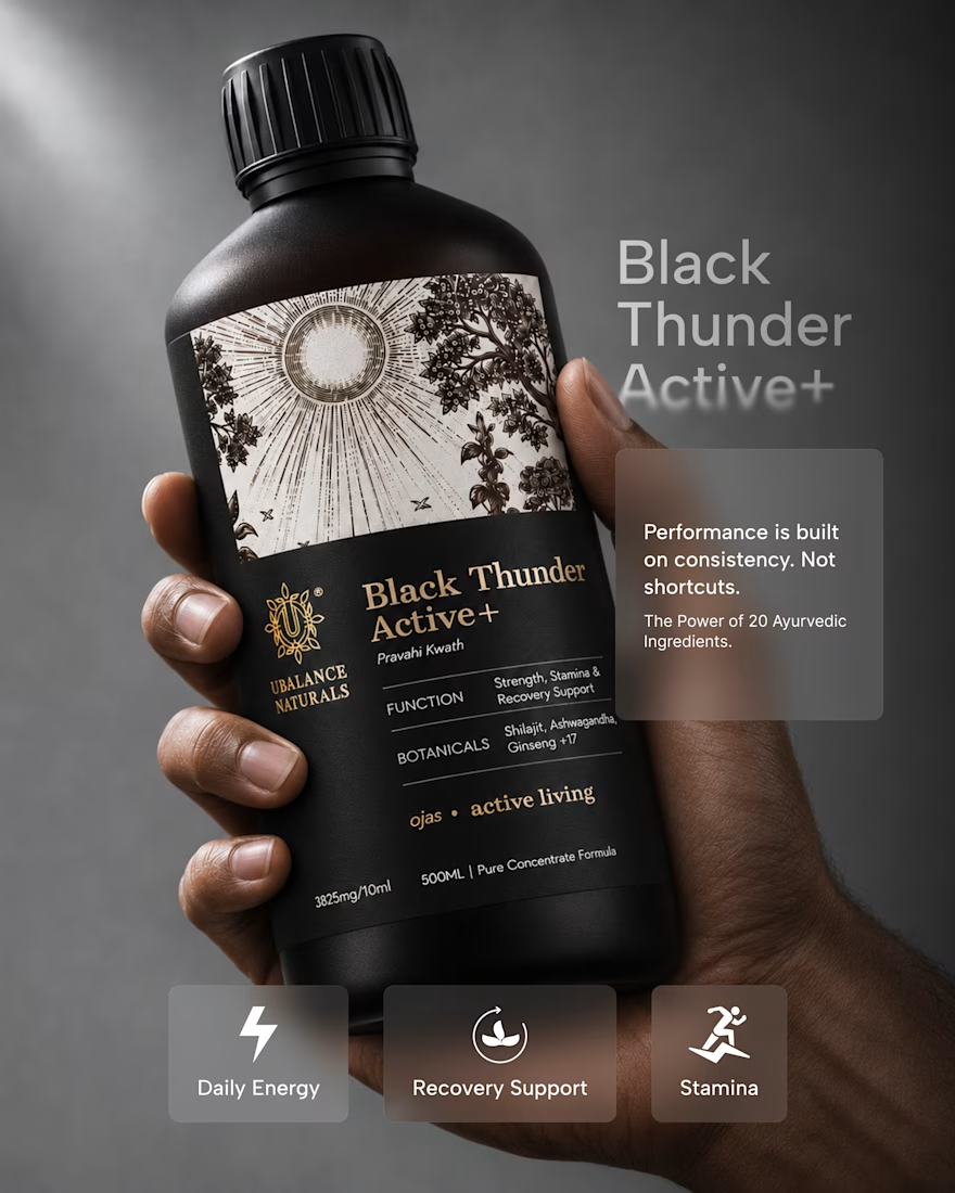
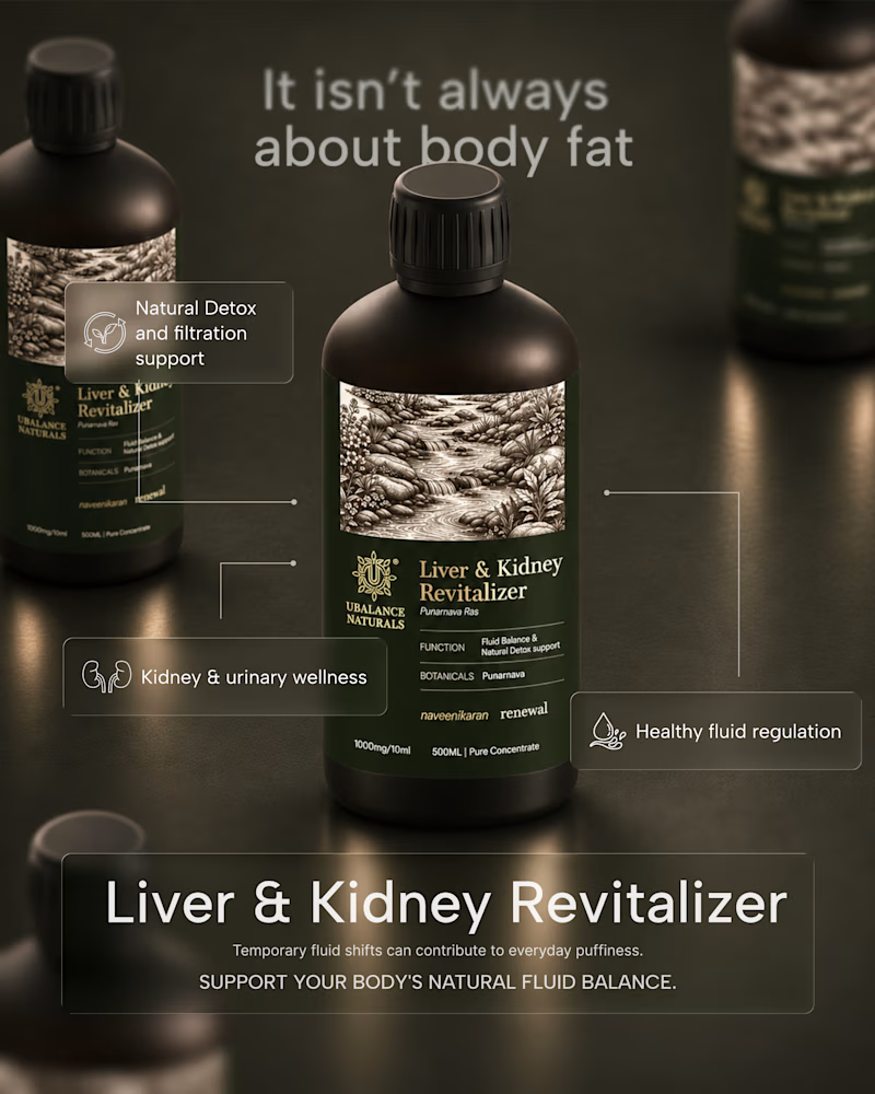
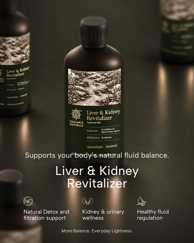
A quick exploration of two different directions for a wellness product ad.
One focuses on the product, while the other brings more attention to the product information.
These are early explorations, just to get a feel for the brand and its visual direction.
I’d love to hear your...
1 voted
50%
1 voted
50%
2 votes
Closed
A website should do more than look good. It should communicate clearly.
A website concept for Anant Growth, bringing web design, content strategy, and visual communication together in a playful, approachable digital experience.

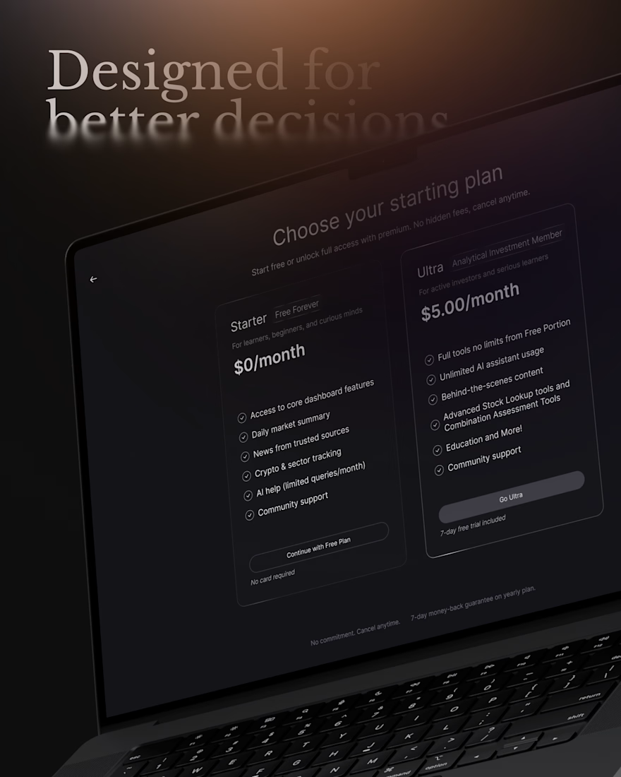
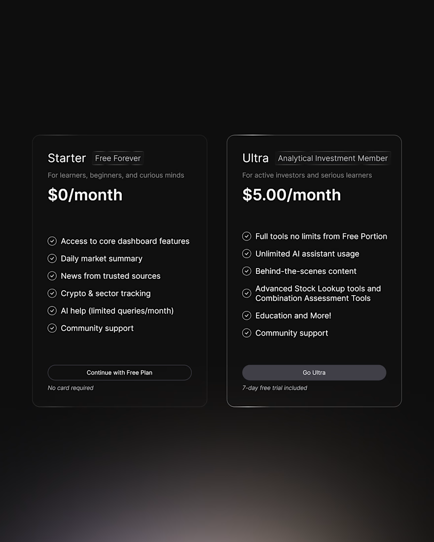
Payment Screen - Not every design decision needs to be loud.
Sometimes, a subtle shift in visual hierarchy is enough to guide people toward the right choice without forcing it.
For Analytical Investments, I designed the pricing experience so the journey from the $0 plan to the...
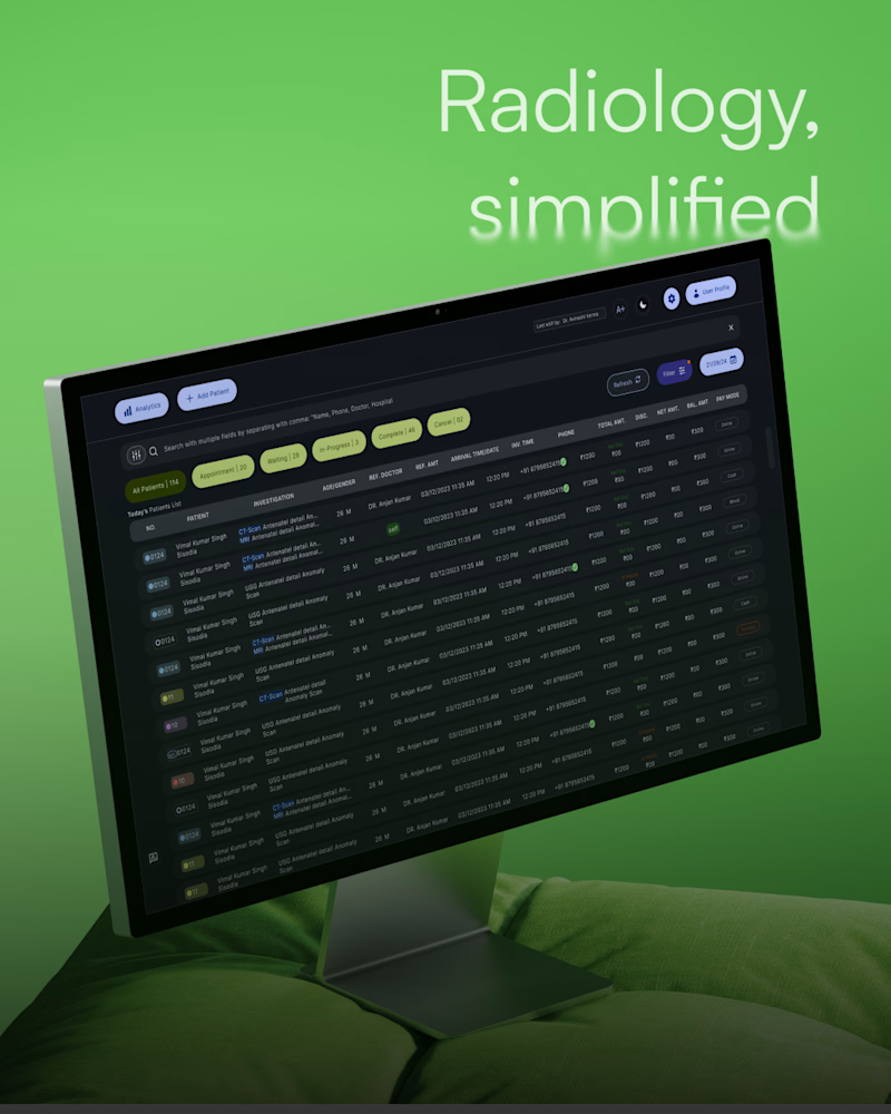
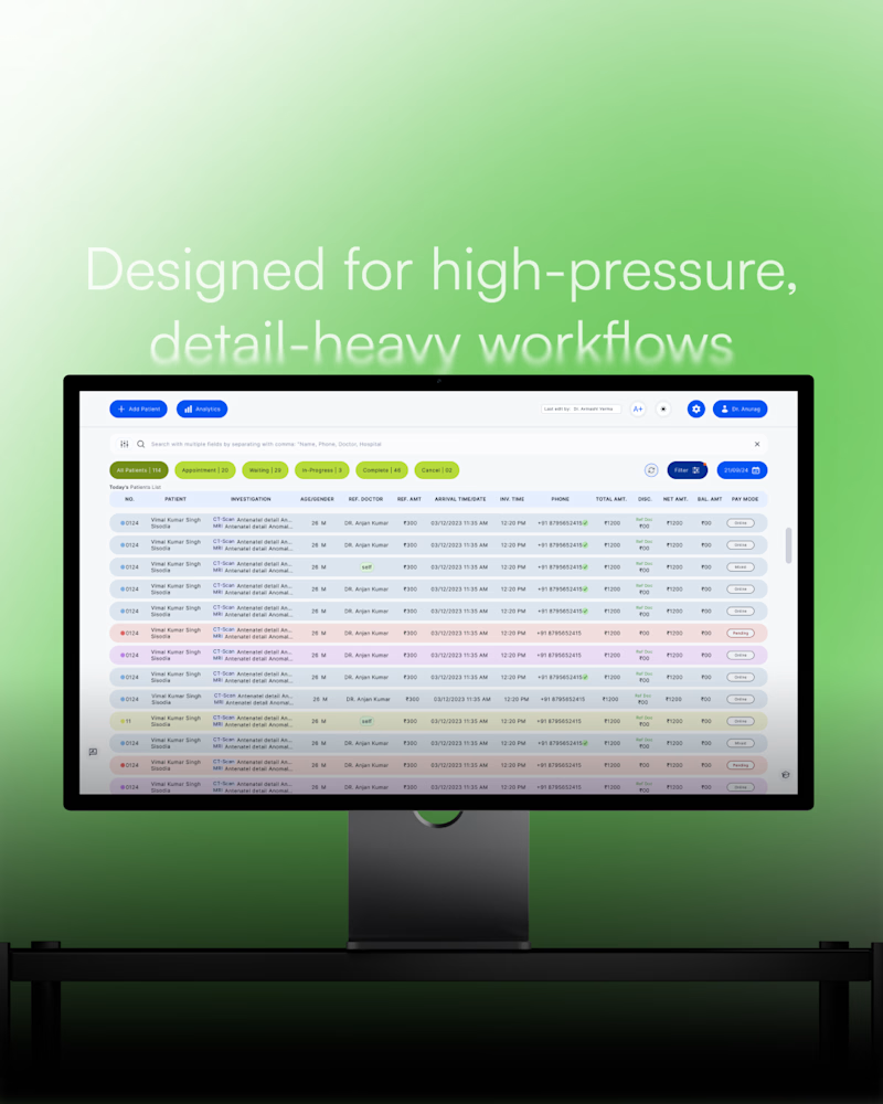
Light or dark? 👀
For Anant Radio, both had a purpose.
Noir Dark for focused, detail-heavy workflows.
Pearl Light for clarity and everyday use.
Which one would you pick?👀
4 voted
57%
3 voted
43%
7 votes
Closed