pro
Nesar U. Rahid
Logo and Brand Designer rooted in minimal thinking
Profile in progress
Nesar is building their profile!
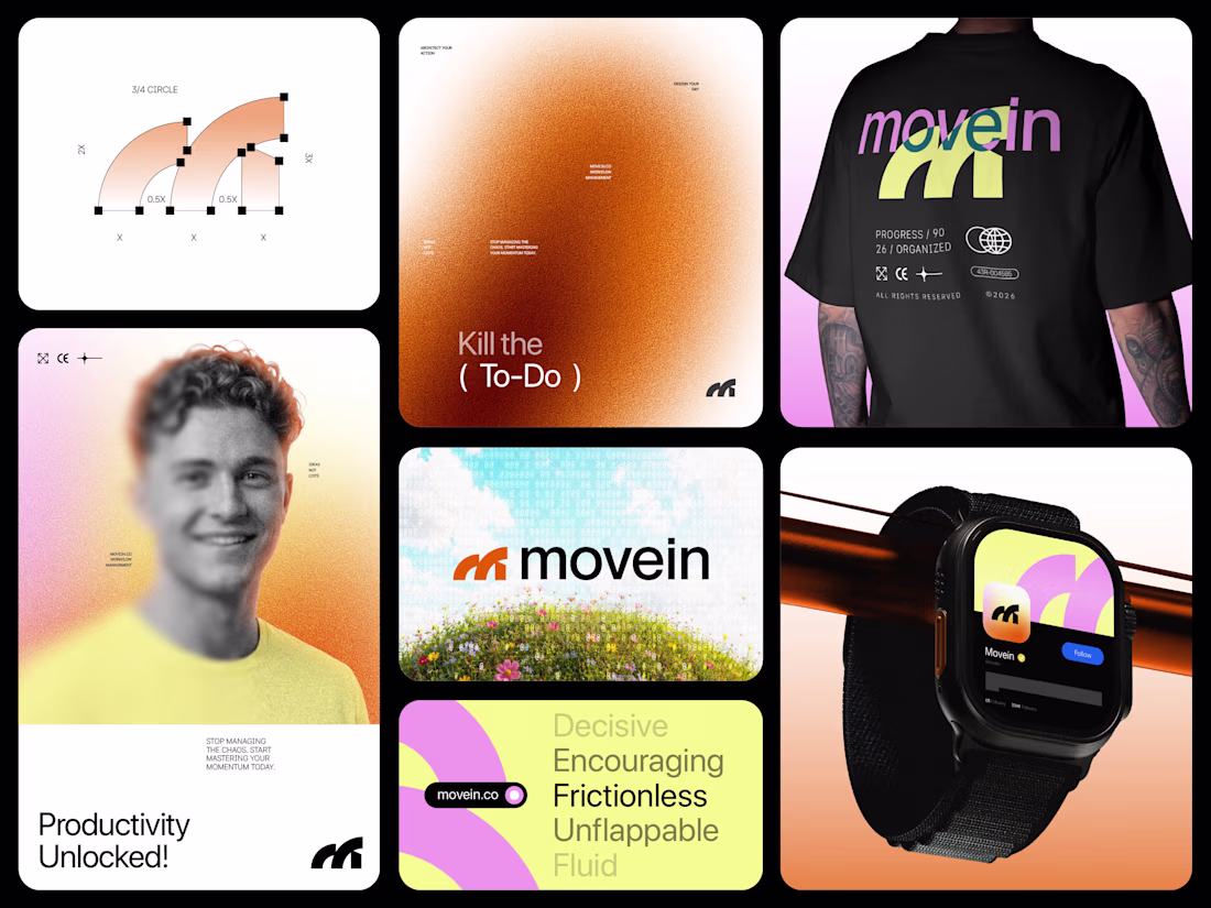
Movein™, a productivity brand identity built around momentum, clarity, and flow.
The kinetic “M” symbol represents progress in motion, powered by energetic orange, sunrise yellow, and digital pink to make productivity feel alive instead of overwhelming.
Feedback on the concept & color psychology?
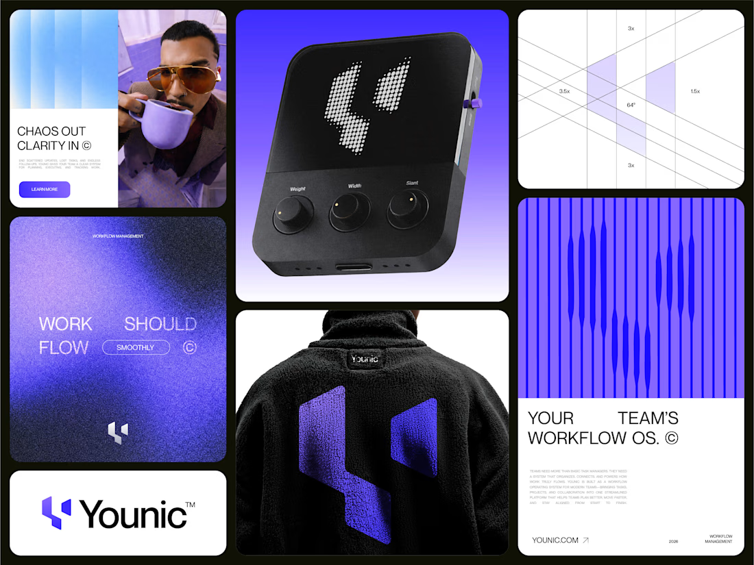
Just finished this branding exploration for Younic a Workflow Management Software.
The identity is built around the letterform Y, symbolizing connection, guided paths, and growth.
Purple drives the core system with light blue supporting flow and clarity.
Would love to hear honest...
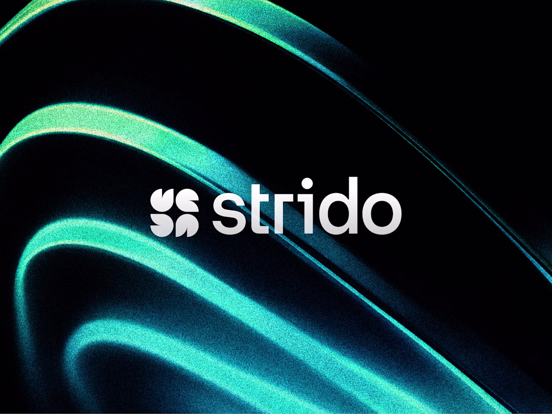
Just wrapped up this branding exploration for Strido a collaboration software brand built around sync, flow, and connection.
The core idea combines Letterform S + flames + sparkles + connection to create a mark that feels energetic, modern, and digital first.
Color direction:...
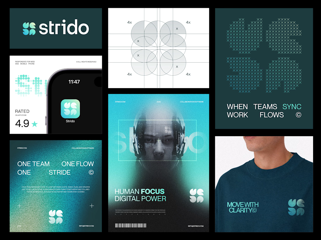
Logo Design for a Workflow management Collaboration SaaS.
The concept blends:
Letterform S
Flames
Sparkle
Feedbacks are welcome!
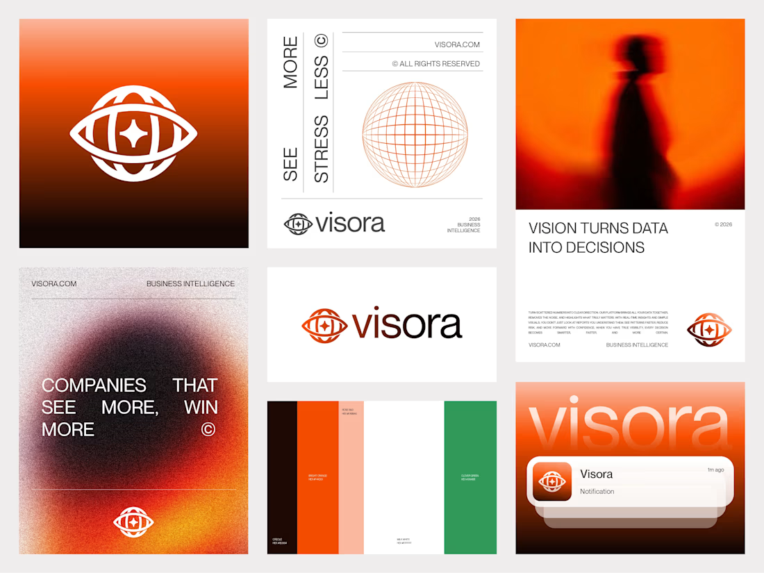
Just finished this branding for Visora™ a BI SaaS built on the idea of vision turning data into decisions.
We used bold orange instead of the usual tech blue, with green for growth and black/white for contrast.
Would love your feedback:
Does the concept feel clear?
Would you change anything?