
pro
Nesar U. Rahid
Logo and Brand Designer rooted in minimal thinking
Profile in progress
Nesar is building their profile!
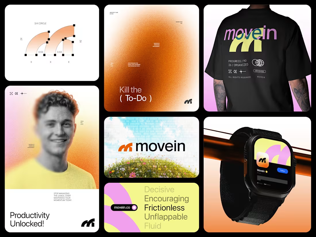
Movein™, a productivity brand identity built around momentum, clarity, and flow.
The kinetic “M” symbol represents progress in motion, powered by energetic orange, sunrise yellow, and digital pink to make productivity feel alive instead of overwhelming.
Feedback on the concept & color psychology?
1
4
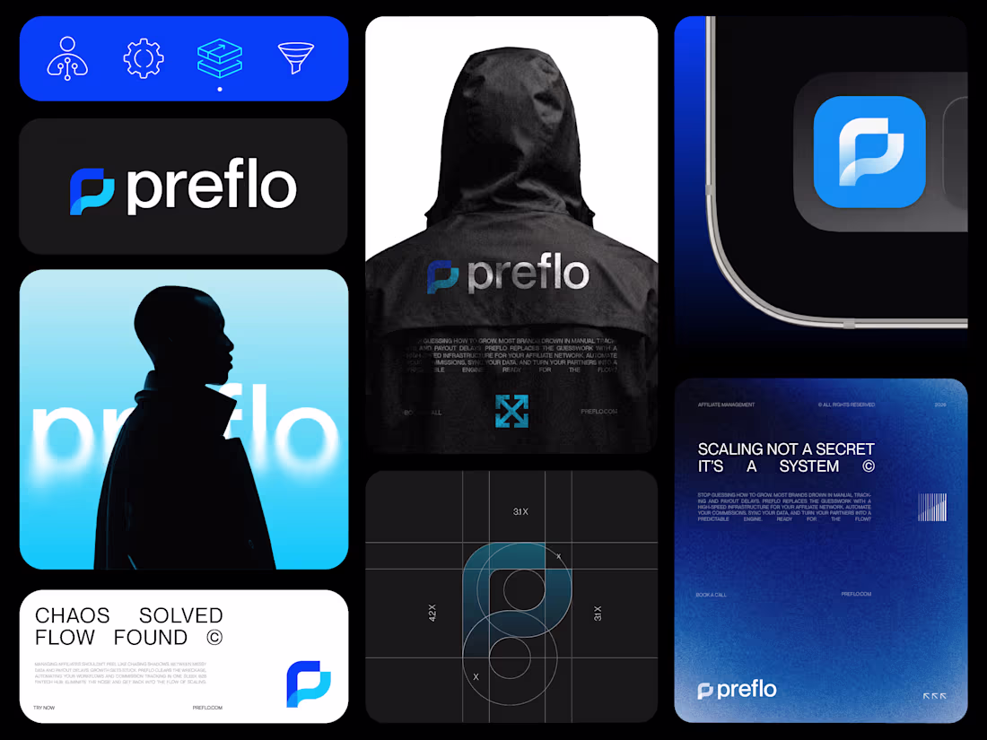
Branding for a B2B Fintech Affiliate Management SaaS.
preflo balances a structured "P" with a fluid "Flow Line" to represent automated fintech infrastructure.
The Royal and Light Blue palette merges financial authority with high tech digital energy for a premium finish.
This identity transforms chaotic affiliate data into a systematic, "stroke style" visual experience.
Designers, does this blend of geometry and movement hit the mark?
0
9
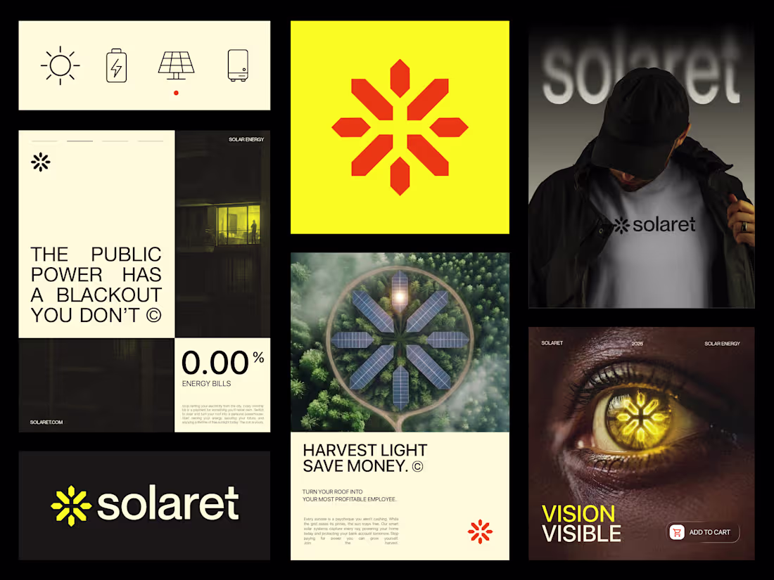
Harvesting Light. Saving Pixels.
Changing the "green leaf" clichés to reinvent solar as high performance technology.
Concept: Symmetrical Power Burst. Precision geometry meeting the raw energy of the sun.
Color: Sun blind Yellow and Burnt Orange for heat, grounded by deep Black for "Blackout" reliability.
Designers, does this sharp geometry scream "Reliable Power" to you?
0
43
Solmed
0
0
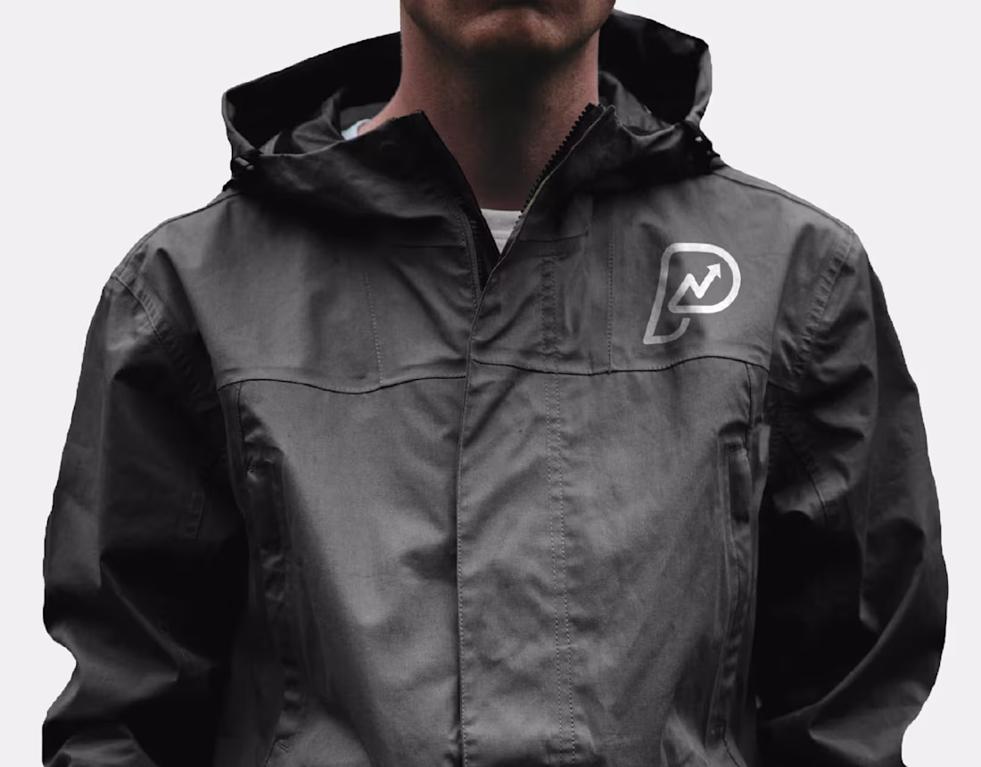
PatPay ® Brand identity design
0
0
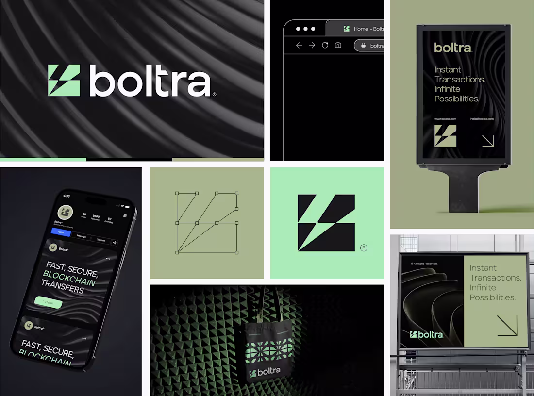
Boltra ®
0
7
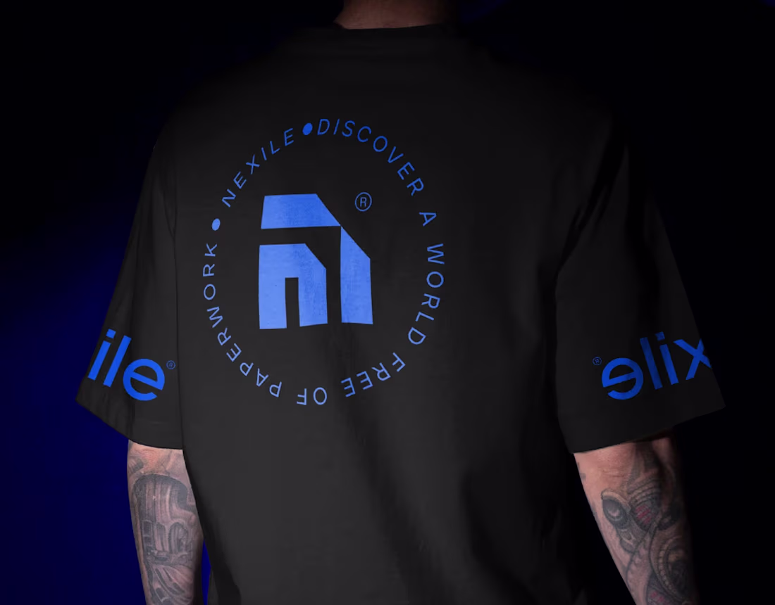
Nexile ® Brand identity design
0
0
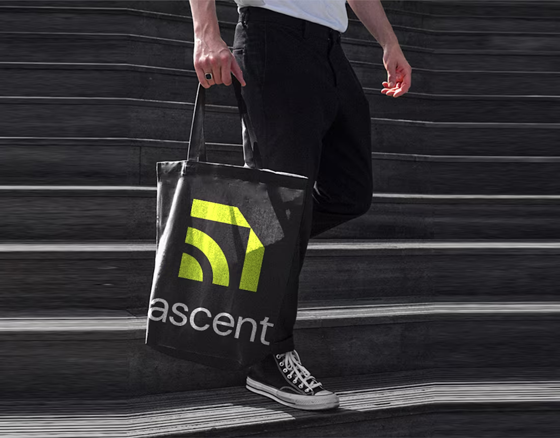
Ascent™
0
0
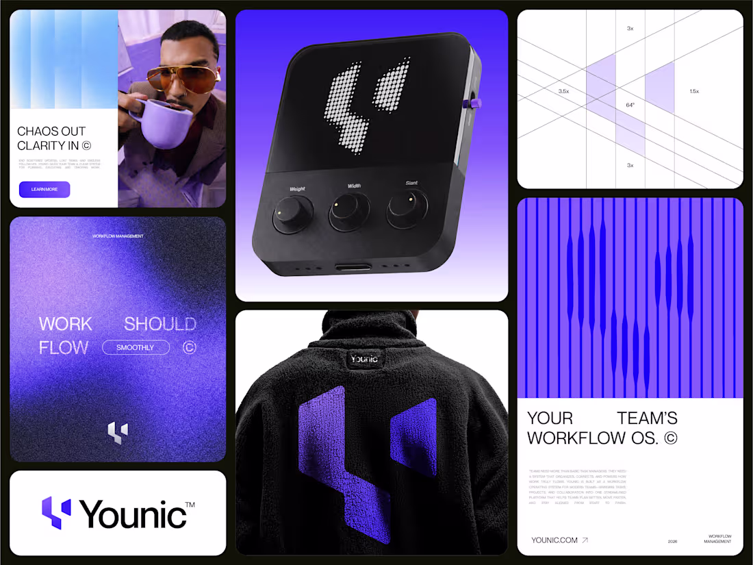
Just finished this branding exploration for Younic a Workflow Management Software.
The identity is built around the letterform Y, symbolizing connection, guided paths, and growth.
Purple drives the core system with light blue supporting flow and clarity.
Would love to hear honest feedback from fellow designers.
What works? What would you improve?
Your critique will help refine it further.
1
42
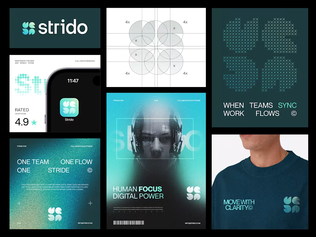
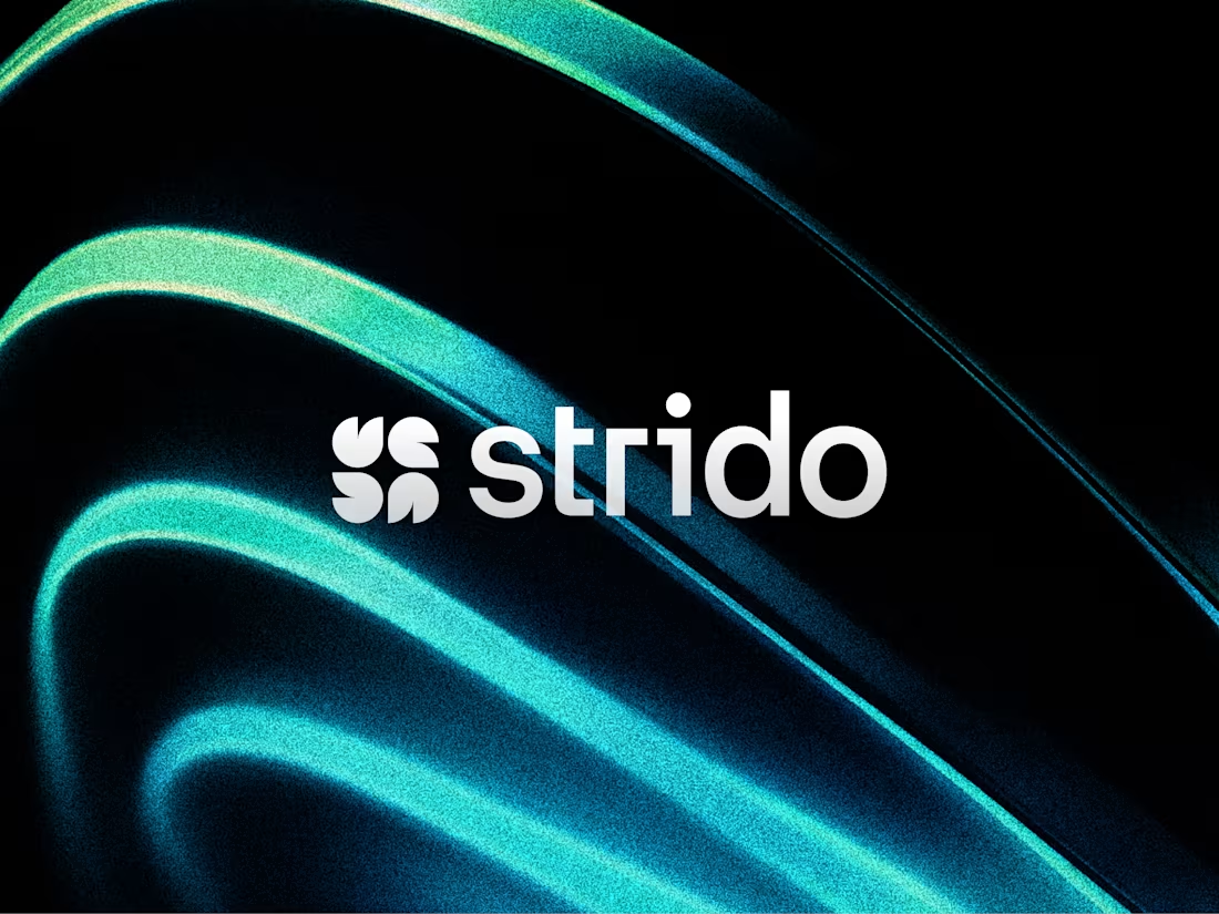
Just wrapped up this branding exploration for Strido a collaboration software brand built around sync, flow, and connection.
The core idea combines Letterform S + flames + sparkles + connection to create a mark that feels energetic, modern, and digital first.
Color direction: Teal, light blue, light green, with black & white accents.
Wanted the identity to feel like:
when teams sync, work flows.
Would love to hear your feedback from fellow designers especially on the logo concept, color system, and overall brand vibe.
1
43
Logo Design for a Workflow management Collaboration SaaS.
The concept blends:
Letterform S
Flames
Sparkle
Feedbacks are welcome!
1
50
Just finished branding for a cybersecurity startup, Cybersec.
The concept blends a Letterform “C” + Shield to represent silent, proactive protection.
We moved away from fear based visuals and focused on confidence instead.
Primary color: Purple.
Accent: Red for urgency.
Would love feedback from fellow designers
Does the mark clearly communicate security?
1
62
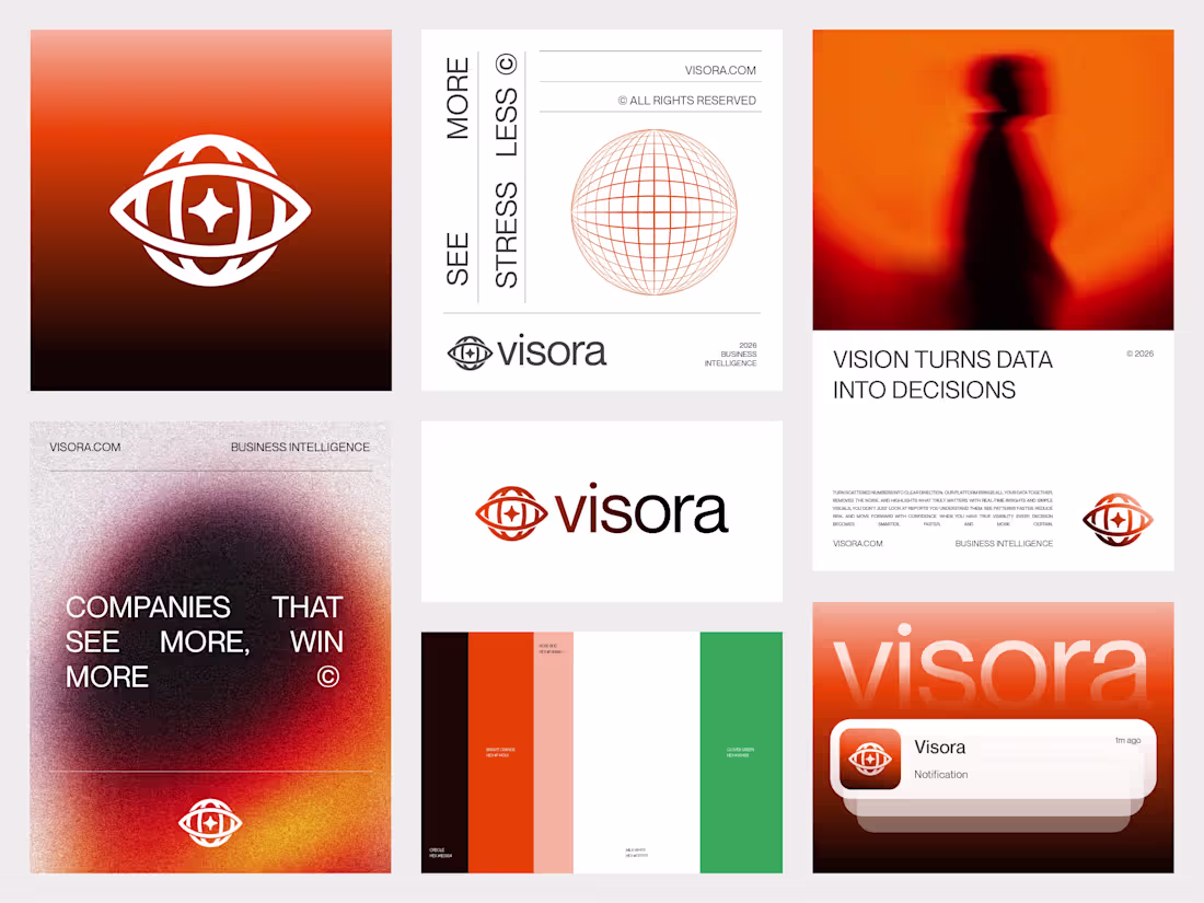
Just finished this branding for Visora™ a BI SaaS built on the idea of vision turning data into decisions.
We used bold orange instead of the usual tech blue, with green for growth and black/white for contrast.
Would love your feedback:
Does the concept feel clear?
Would you change anything?
1
6
125
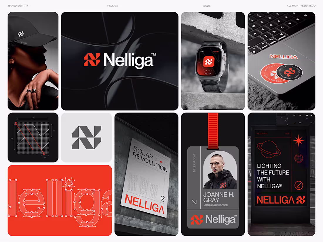
Nelliga ®
0
2
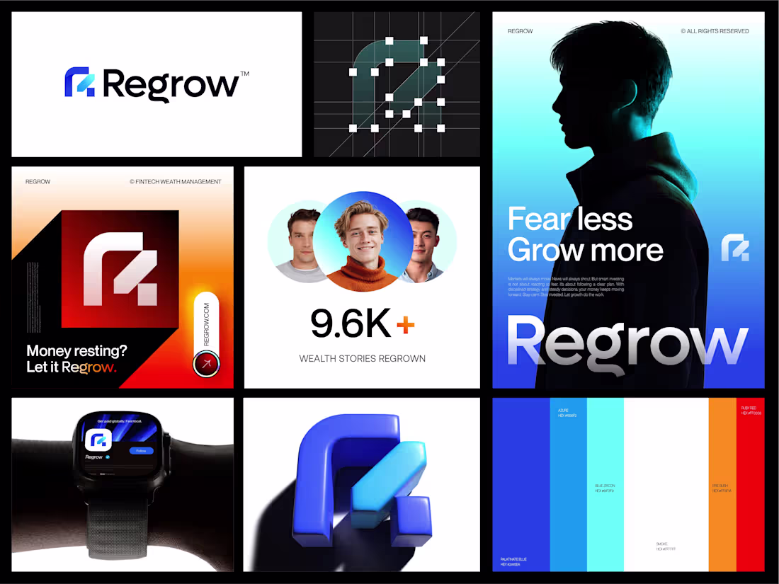
Designers, meet Regrow
A fintech brand built on one simple idea, growth should feel smart, not scary.
The identity blends:
• Letter R
• Tech inspired nodes
• A double sided arrow for growth & Scale
Blue builds trust.
Orange drives momentum.
Clean. Scalable. Fearless.
Would love to hear your thoughts
0
69
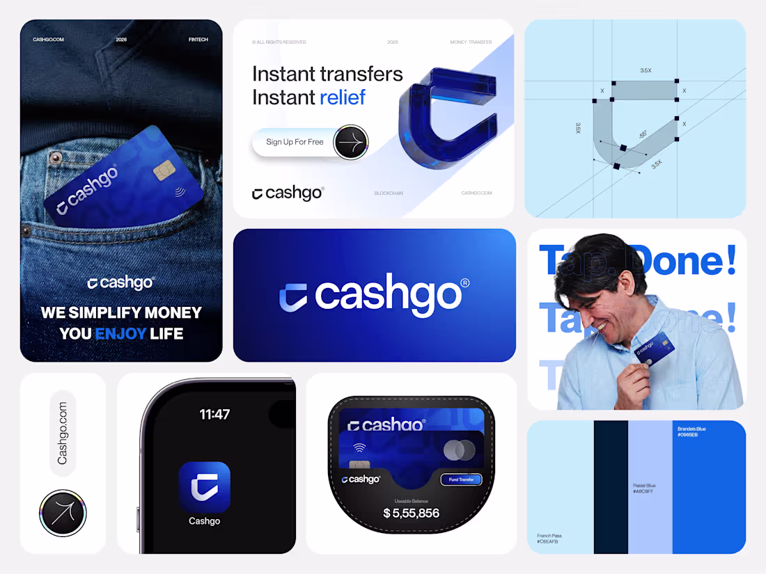
Just finished a fintech branding project for Cashgo.Built around speed, flow, and simplicity.
Would love honest designer feedback
2
86
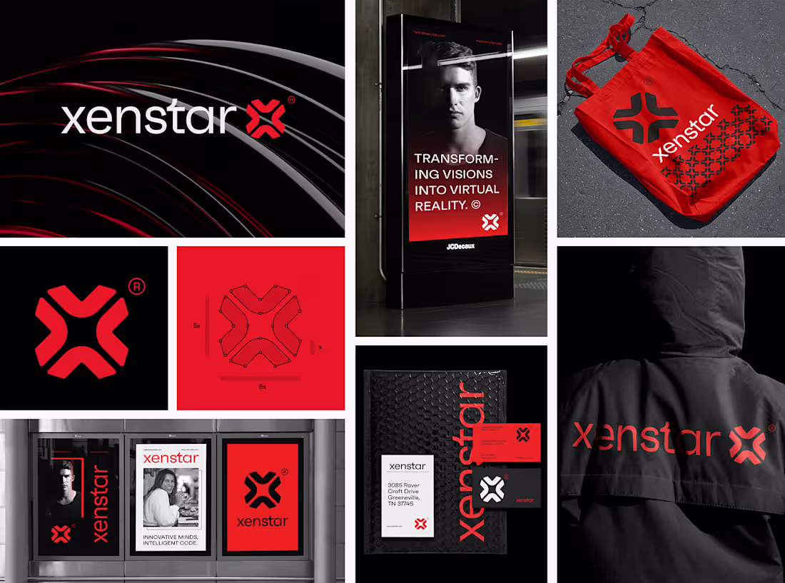
Xenstar®
0
2
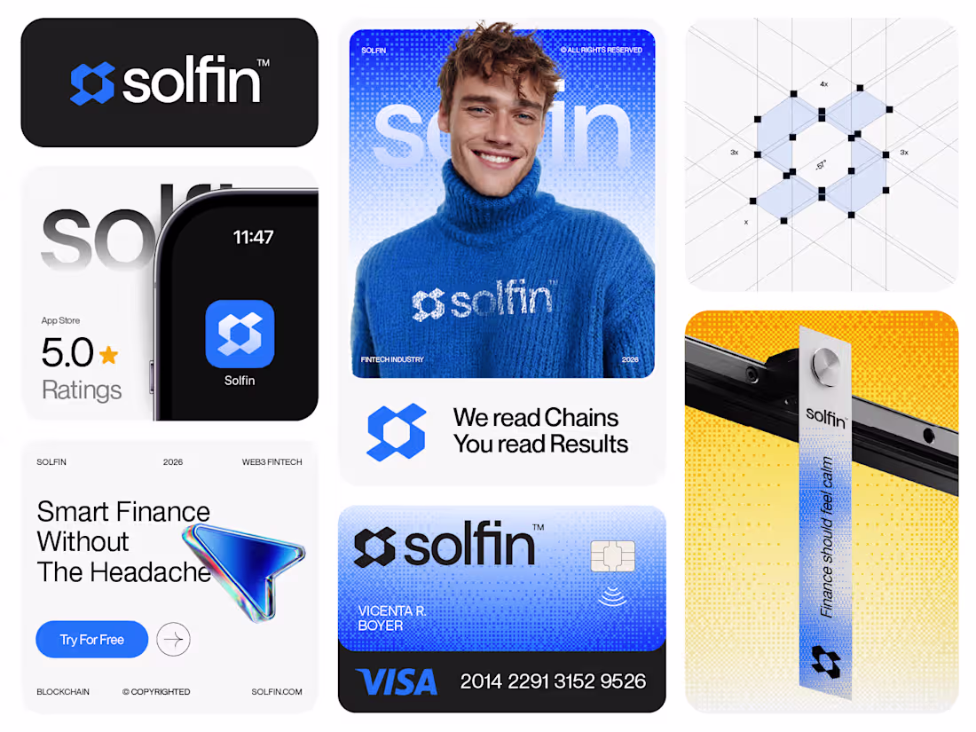
Solfin™ Branding Case Study
Solfin is a Web3 fintech platform that turns complex blockchain data into clear outcomes. The challenge was to build a brand that feels intelligent without feeling overwhelming. The identity is centered around the idea “We read chains. You read results.”
The logo combines the letter S, directional arrows, and a hexagon blockchain structure symbolizing flow, analysis, and trust. A blue led palette with green and yellow accents reinforces clarity, confidence, and growth.
The result is a calm, modern, and scalable fintech identity focused on results, not noise.
5
173
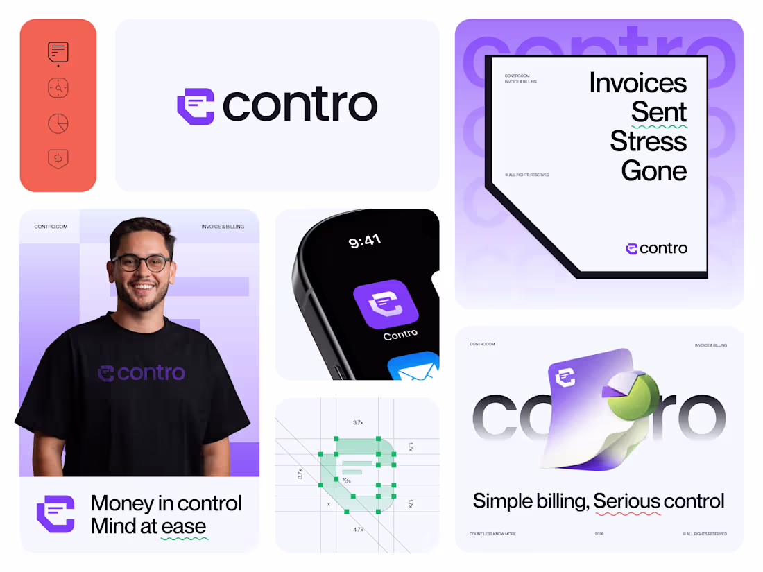
Hey Designers ,
Just finished this branding for Contro (billing & invoicing) built around a folded invoice “C” and the idea of Money in control. Mind at ease. Would love your honest feedback .
0
69
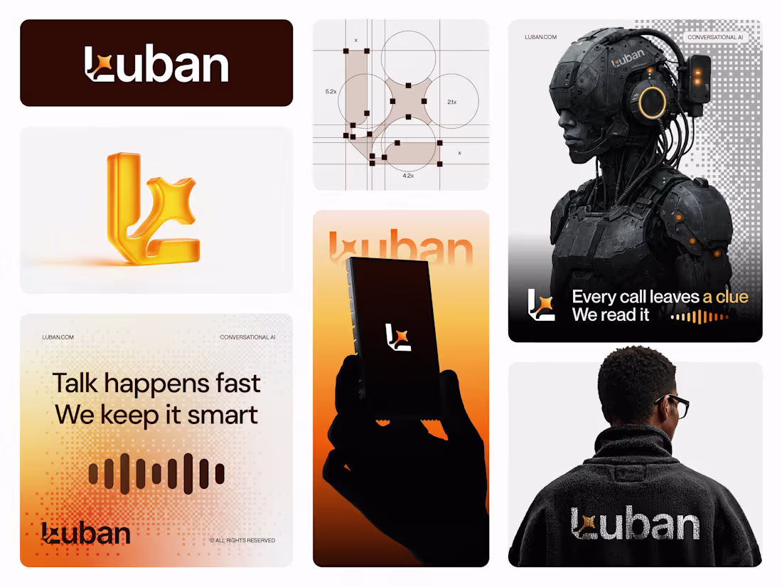
Luban™ Branding Case Study, Conversational AI Platform.
Most Conversational AI brands feel either too technical or too abstract. Luban needed an identity that felt intelligent yet human.
I created a modern, minimal system that balances machine logic with empathy calm, confident, and enterprise ready. The concept centers on Listening is intelligence.
The logo combines the letter L with a subtle AI sparkle, symbolizing signal to insight. A warm amber palette with deep neutrals adds energy without noise.
The result is a scalable, future ready brand that truly understands conversations.
2
172
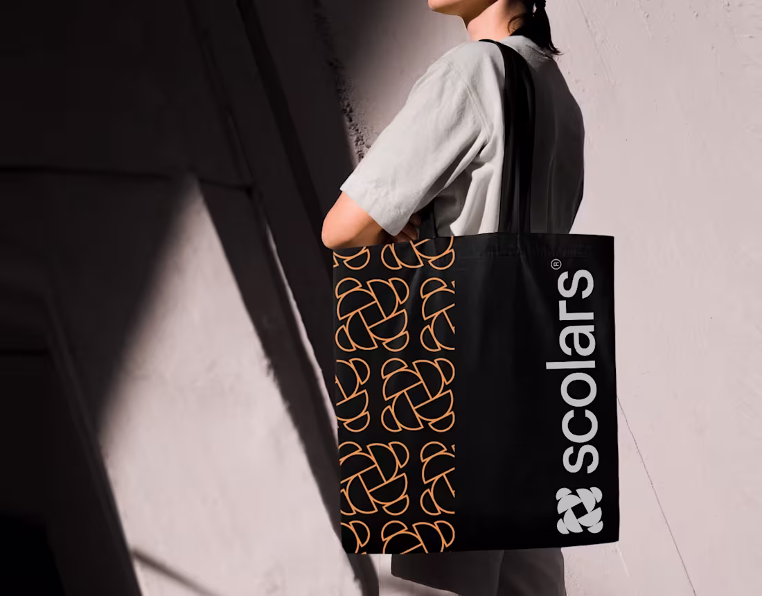
Scholars ®
0
0
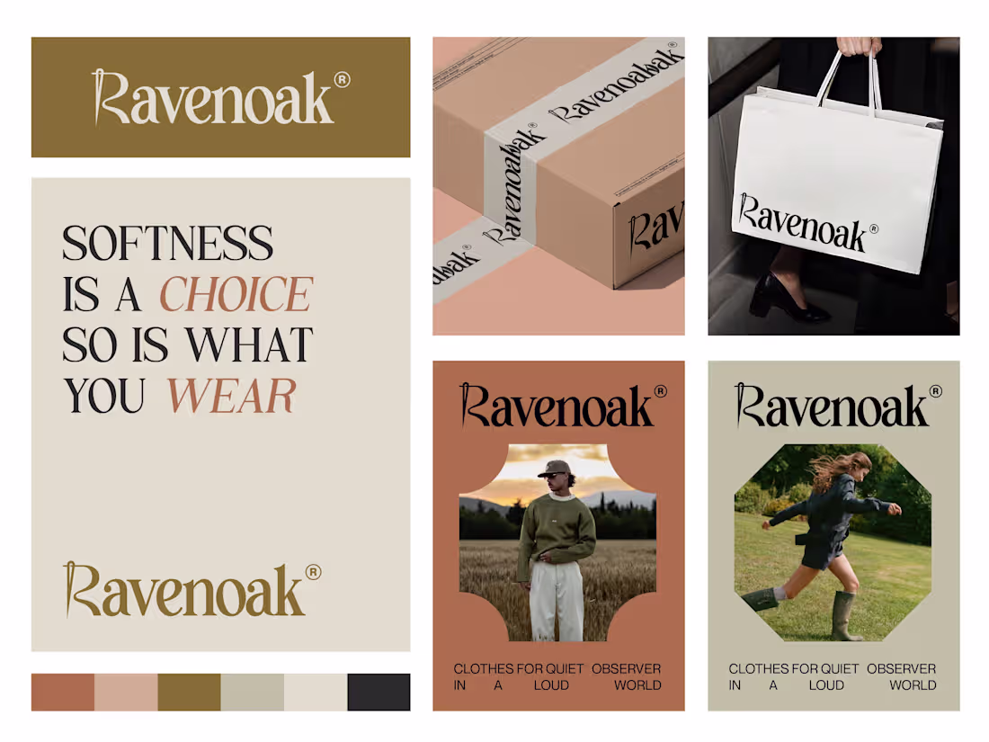
Just wrapped this branding for Ravenoak a fashion identity built around quiet confidence, softness, and restraint.
Focused on subtle symbolism (R as a needle), editorial typography, and earthy tones.
Would love fellow designers’ thoughts, what works, what you’d push further?
2
100