pro
Pooja Pawar
Design partner for startups | Product - Web & Mobile
Ready for work
Pooja is ready for their next project!
I had zero budget for a campaign this week.
What I had was a photo of a monkey clinging to a plushie in a Japanese zoo.
That's Chang (My Cat and Cofounder). That's every pet we're building Chonky Paws for.
So I built a whole story around it. Chang visiting Japan. Bringing his...
Which tool works best for product image generation? I am working on my personal project, would love to know your thoughts...
2 voted
40%
3 voted
60%
5 votes
Closed
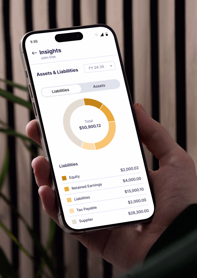
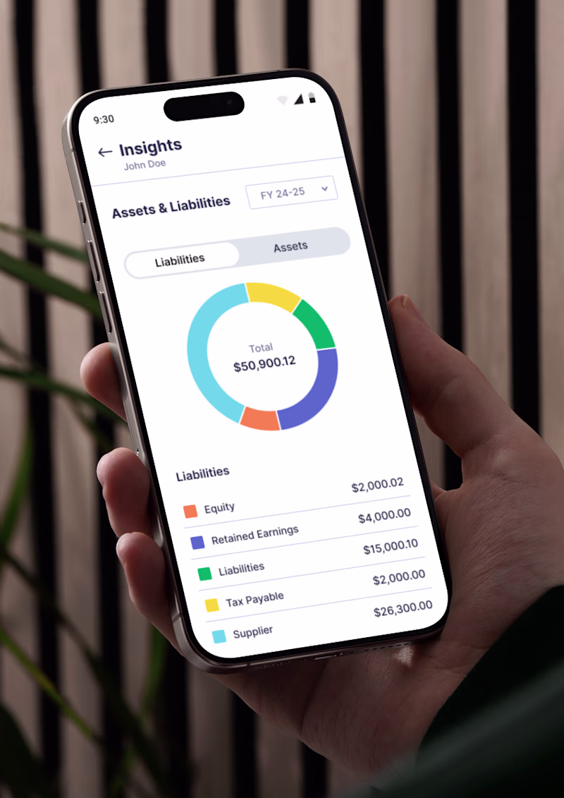
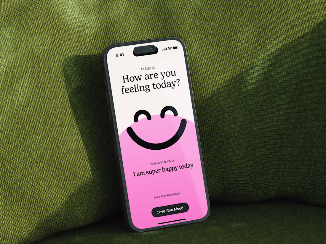
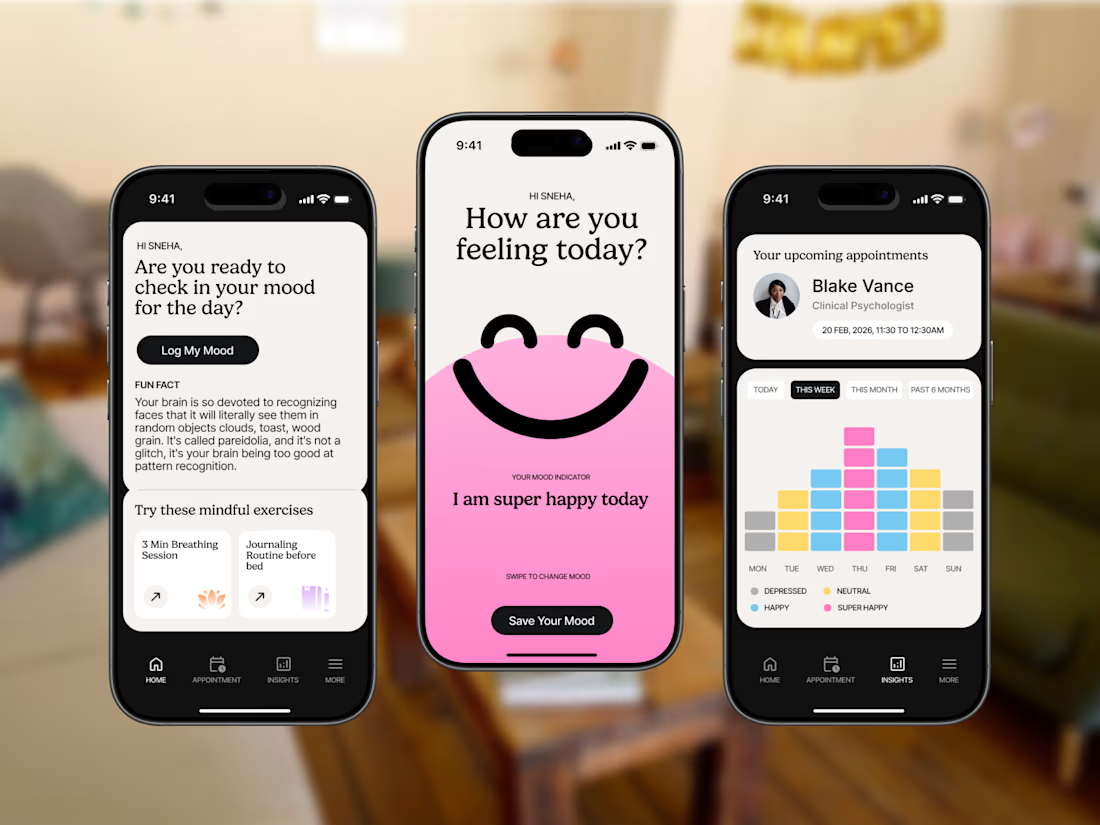
Mindful: Mental Health Mood Tracking App
Designed a calming yet engaging mobile experience for daily mental wellness check-ins. The app combines mood logging, therapist appointment tracking, and behavioral insights all wrapped in a warm, approachable visual system that makes...
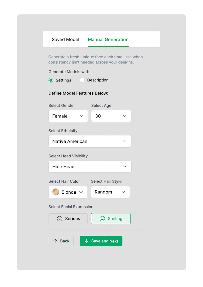
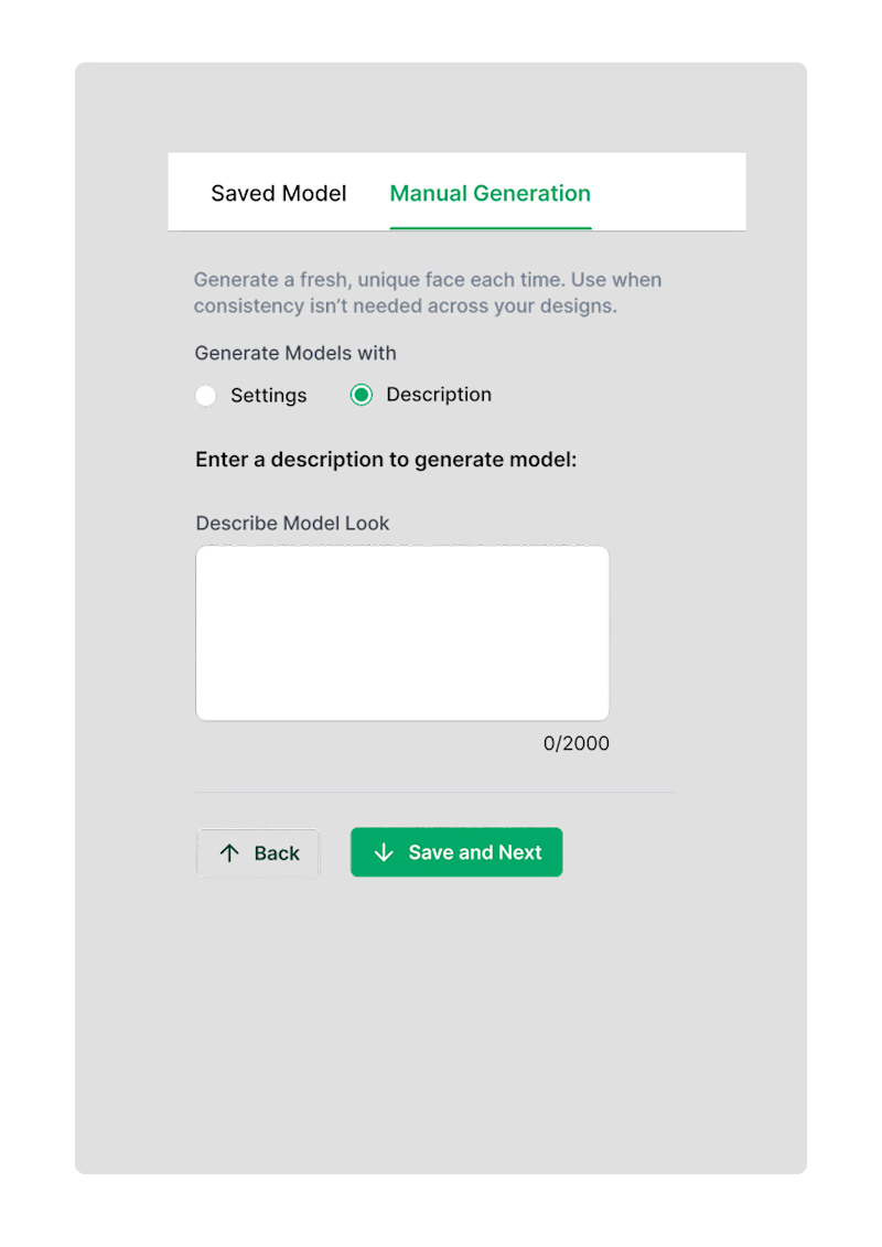
Working for one the client project, client insisting on having two seperate feature to get output.
One is custom setting for users who struggle with prompt.
Two is purely prompt based feature which opens possibility of unlimited customisation.
What would you choose?
0 voted
0%
1 voted
100%
1 vote
Closed