The network for creativity
Join 1.25M professional creatives like you
Connect with clients, get discovered, and run your business 100% commission-free
Creatives on Contra have earned over $150M and we are just getting started
Back to feedPost
Taste Test
Comment
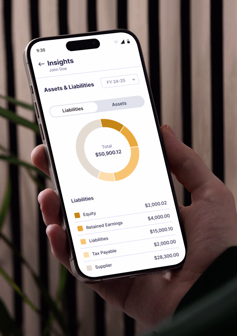
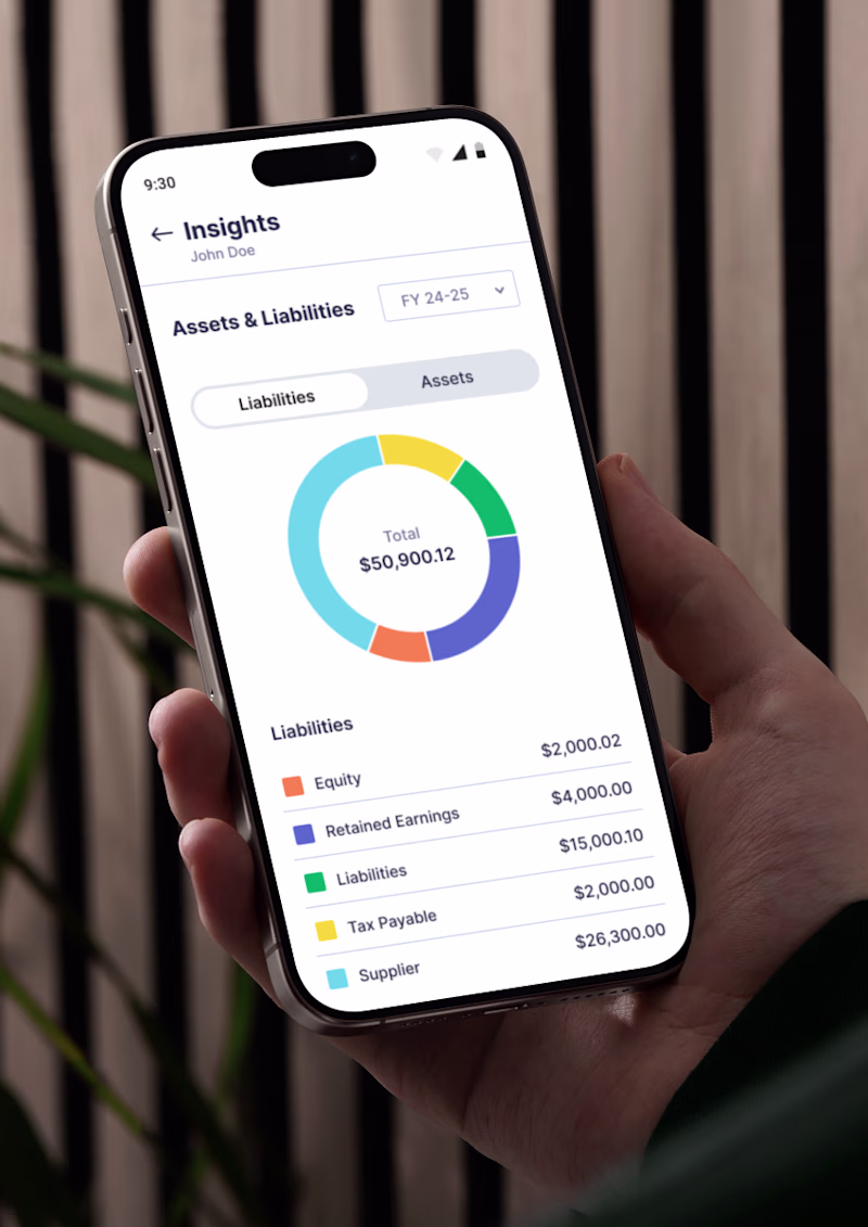
Context-driven.
Monochrome gradients → lower cognitive load, better for trends & magnitude.
Multi-color → works when color encodes meaning (categories, states, comparisons).
Curious : Is color communicating data or just styling?
For me, selecting color is definitly based on context. If elements belong to same category I would choose monochrome, but if not then multi-color makes more sense.
Well put — that’s a very practical way to frame it.
Category similarity is a great anchor for color decisions. Monochrome helps preserve cohesion, while multi-color naturally supports differentiation and scanning efficiency.
Context really drives everything here.
The network for creativity
Join 1.25M professional creatives like you
Connect with clients, get discovered, and run your business 100% commission-free
Creatives on Contra have earned over $150M and we are just getting started
Related posts
Lately, I've been exploring what I call "Mutant Abilities" in image generation models, the ability to seamlessly combine multiple visual systems within a single image.
This experiment blends:
• cinematic nature photography
• expressive color grading
• large-format editorial typography
• atmospheric storytelling
Which one of these do you like more?
25 voted
61%

16 voted
39%

41 votes
Closed
Beautiful
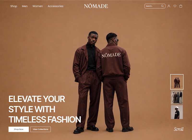
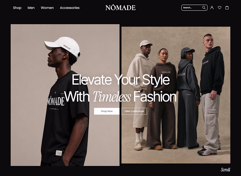
Exploring two hero directions for an ecommerce website
Which direction do you prefer?
A- Split Hero Layout
B- Single Hero Layout
5 voted
45%
6 voted
55%
11 votes
Closed
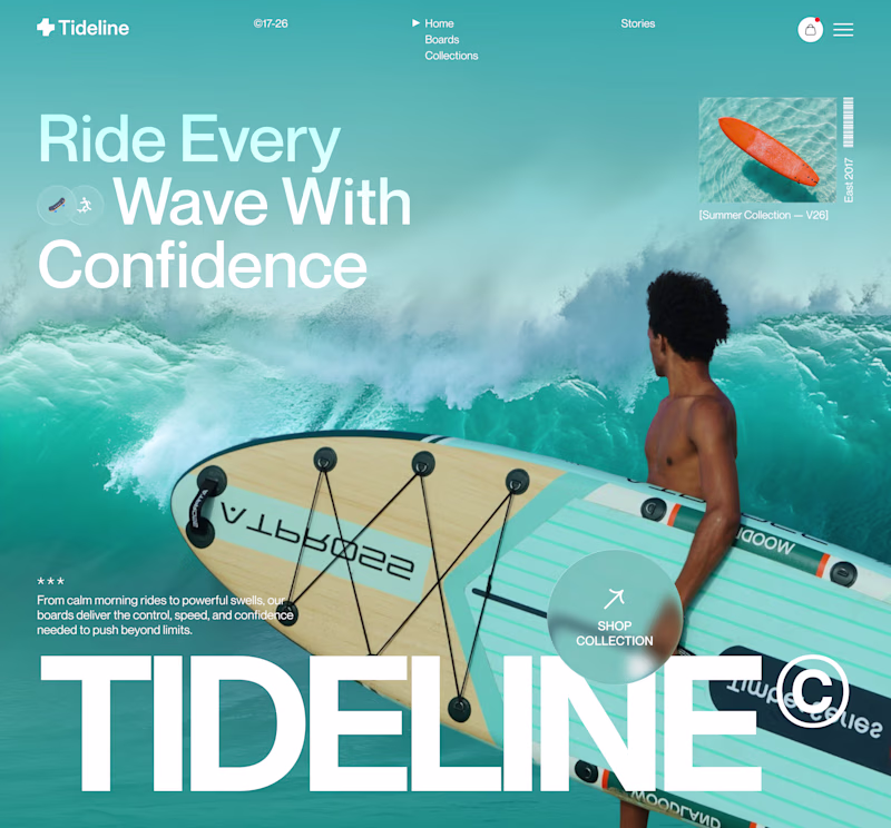
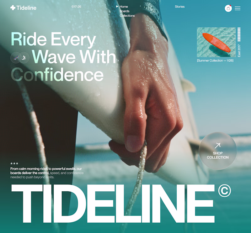
Design is rarely about making things prettier. It's about making better decisions.
For this surf brand concept, I explored two hero directions.
A → Product-first. Puts the board and experience at the center.
B → Lifestyle-first. Creates a stronger emotional connection before introducing the product.
Which hero creates a stronger first impression?
A or B — and why?
Your feedback helps shape better design decisions.
#UIDesign #LandingPage #WebDesign #Figma #UXDesign #ProductDesign #CreativeDirection #BrandDesign #JuiceLab #DesignProcess
11 voted
32%
23 voted
68%
34 votes
Closed
Both work well, but B feels more premium to me.
Trending
Claude
Claude has entered the design space. How are you using Claude Design?
Contra University
Learn from expert creatives how to earn more using next-gen AI tools.
fifaworldcup2026
The World Cup is here and the whole world's watching. How are you designing for the world stage?
creativeaiflow
Creative AI workflows are evolving. What tools do you use, and what are their strengths and weaknesses?
freelancerlife
Freelancer life is wins, pivots, and everything in between. What’s yours right now?