The network for creativity
Join 1.25M professional creatives like you
Connect with clients, get discovered, and run your business 100% commission-free
Creatives on Contra have earned over $150M and we are just getting started
Back to feedPost
Taste Test
Option 1 — Bold & Editorial
Two directions. One brand. Which one wins? 👀
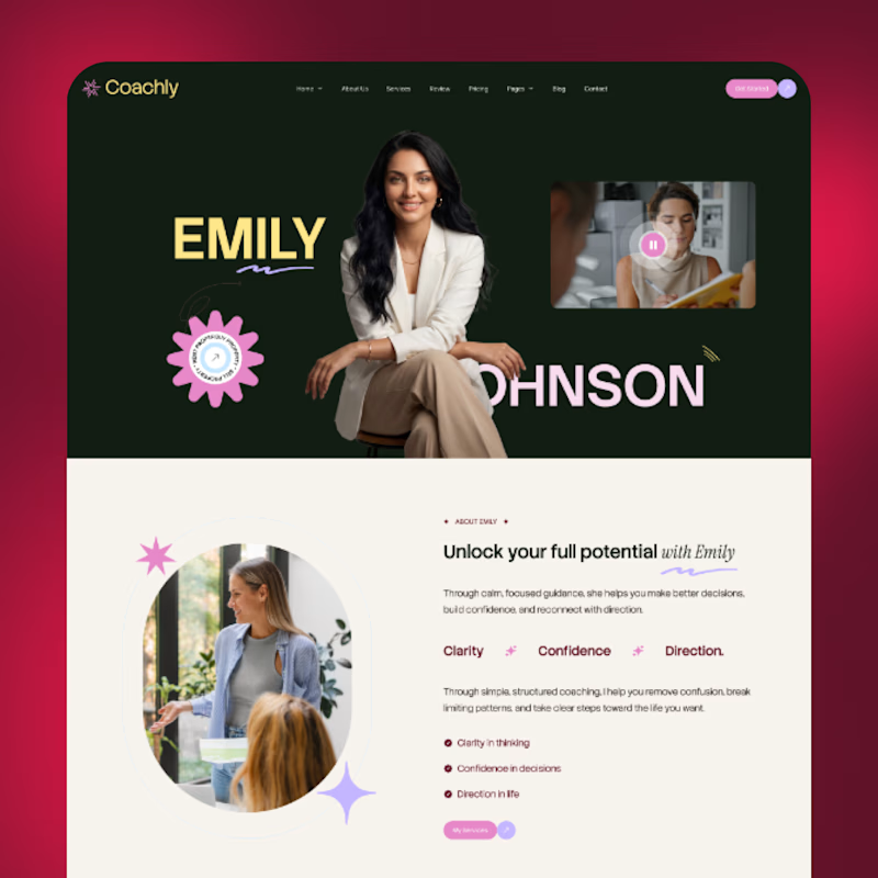
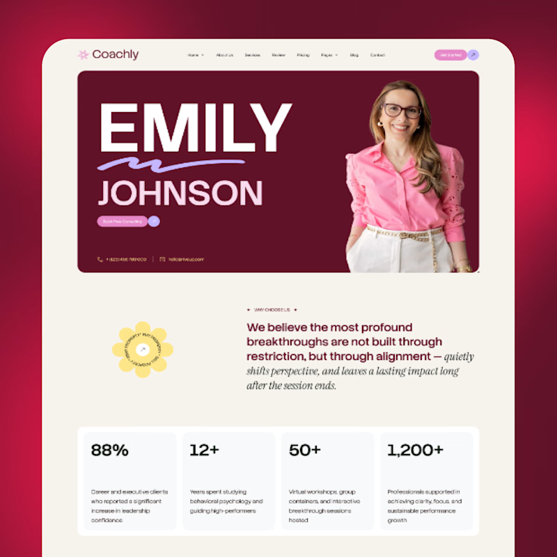
I explored two different visual approaches for the same coaching website — each with its own personality, typography, color, and visual energy.
A — Bold, dark & editorial
B — Bright, elegant & modern
If you were the client, which direction would you choose?
Cast your vote and tell me what made you pick it. 👇
#UIDesign #WebDesign #Framer #WebDesignInspiration #DesignPoll #Framer


75 voted
72%
29 voted
28%
104 votes
Closed


I’d go with A. The bold editorial direction has more character and feels more memorable.

Appreciate it, Kabir! 🙌 A definitely has that bold editorial character.

I like the option b
Thanks, Sevki! 🔥 Option B is a strong choice!

A transmits more power 🙌
Thank you, Celia! 🙌 A definitely brings more power.

Both looks🔥 🔥
Haha, thank you! 🔥🔥 Glad you like both!

Both are amazing
Appreciate it, Afnan! ❤️ Both have their own vibe.

Option A with Option B hero would look more attractive ig
That’s an interesting combo! 🔥 A with B’s hero could definitely be a strong direction.
Yeah, try it and you can share if you want

Thanks! 🙌 Glad Option A works for you!

Really appreciate that! 🔥 The distinct editorial direction was exactly the goal.

I go with A
Thank you! A definitely has a strong visual presence. 🙌

The layout designs are great but the option A looks better
Thank you, Samuel! Glad Option A stood out to you. Appreciate the feedback!

C'mon option A takes the crown, B looks so generic.
Haha, thank you! 😄 A definitely has a stronger personality, and I’m glad that came through.

Going with A on this one. For a coaching brand, editorial and bold does more to build trust before someone even reads a word. B is clean, but it could belong to almost anyone. A already feels like it has a point of view.
Thank you, Reem! I really appreciate the insight. Building that sense of trust and personality was a big part of the direction for A. 🙌


I’d go with A.
Thank you


Sexiest designssss ❤😭

Put the option A lady to the background B. The other thing is option A, ''J'' covered by the big back.
Thank you

I will go for option A.

Option A

Option A for me. The dark hero section gives it a super high end premium feel and makes the brand look very authoritative.

Option A

It was really hard to decide since both are looking amazing! But Dark & Bold has something special for me.

Option B just has a cleaner eye to me, maybe it's the full bleed at the top!

great choice option A, the client would prefer at a glance.
@all Thank you everyone


Really nice work and B is a stronger concept.

option A is better

Option A feels more personal and has good vibes that clients need to feel before joining (i believe it can increase the conversion)

Love the personality that is in Option A

For a coaching brand I lean A on first impression: the dark editorial hero reads as authority, which is what earns trust before anyone reads a word. One note though, the name gets partly covered by the portrait in A, so I would lift the type clear of her shoulder. B is cleaner but reads closer to a template.

Haha, I can imagine! 😄 Safari shots can be so unpredictable, but you handled it beautifully. The movement and timing came together really well 🔥 Great work!

Option A lands stronger for a coaching brand. The bold type creates presence and authority which is exactly what clients want to feel when they first land on your site.
The network for creativity
Join 1.25M professional creatives like you
Connect with clients, get discovered, and run your business 100% commission-free
Creatives on Contra have earned over $150M and we are just getting started

Challenges
View all


Related posts


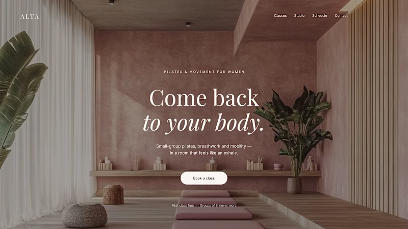
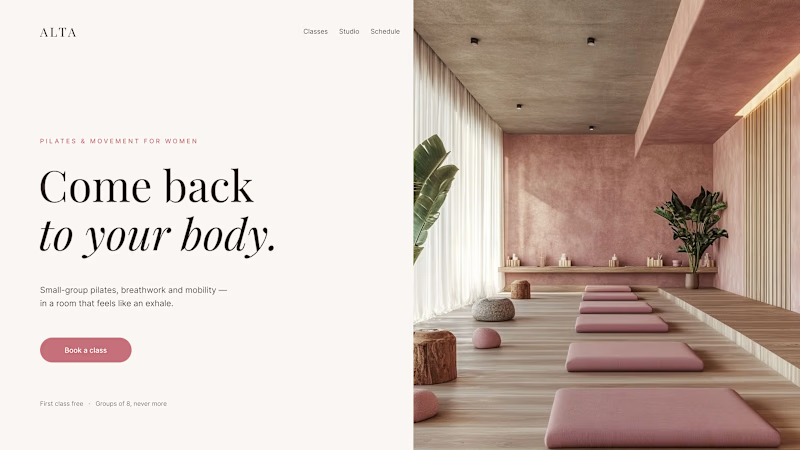
Where should the photo live - behind the words or beside them?
Same pilates studio, same headline.
01 - Photo as the background. Full-bleed atmosphere: the room wraps around the words. Immersive and cinematic, but the text only survives thanks to a darkening overlay laid over the image.
02 - Photo beside the text. A clean split: words on calm ground, the room in its own column. Everything readable at a glance, the trade is a little less drama.
One sells the feeling. The other sells the clarity. Which hero would make you book the class?

80 voted
75%
27 voted
25%
107 votes
Closed

1 nails it


Engaging website for a New York–based architecture and construction studio, balancing bold typography, immersive imagery and a minimal editorial layout.


A or B? 😇👈
Which design delivers the better luxury feel and overall visual experience?

3 voted
17%
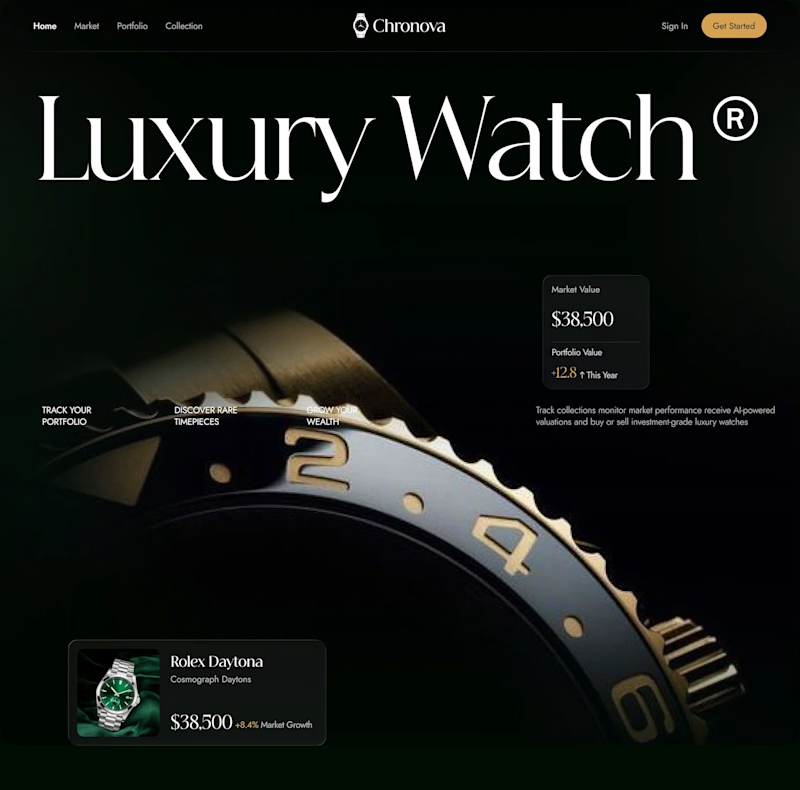
15 voted
83%
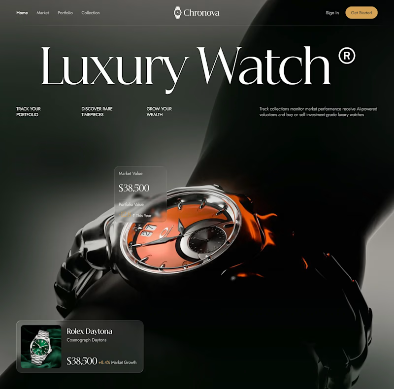
18 votes
Closed

Option B feels more luxurious to me—the watch gets a clearer hero moment and the warmer accent adds just enough energy against the dark field. The typography and product scale also make the comparison feel polished.


